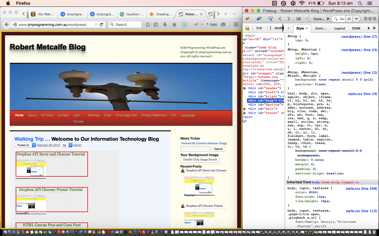
The CSS we show today, thanks in huge part to the excellent advice of this wonderful link, is both about putting a border around the body of a web page (even though we never, once, refer to the “body” element as such) and also an exercise in conditional CSS.
So what is “conditional CSS”? We talk about it here as the way in CSS you can differentiate between the mobile platforms and the non-mobile platforms, and in today’s case, also, the difference between Internet Explorer versions before 6, and the rest. Life in the CSS world can be quite complex if you try to cater for lots of platforms, but the Internet and the search engines are here to help … we got onto our useful link via the Google search …
Today we show the basic CSS work involved, and tomorrow we show some once a day Linux Crontab Curl “smarts” for a bit of variety regarding this (with CSS Body Border Linux Crontab Curl Tutorial), which involves the use of external CSS files, via the header.php changes (number 1 below) outlined below being reduced to the simple (between <head> and </head>) …
<link rel='stylesheet' type='text/css' href='//www.rjmprogramming.com.au/HTMLCSS/body_border.css' />
So let’s look at how the WordPress “good ‘ol” header.php changed for this, in its first principles, in bold as two sections …
- … around the “style” bits (and like it says, thanks to this very useful link) …
<style>


#btop, #bbottom, #bleft, #bright {  /* thanks to https://css-tricks.com/body-border/ */

	background: gold; /* #a5ebff; */

	position: fixed;

	}

	#bleft, #bright {

		top: 0; bottom: 0;

		width: 5px; /* 15px; */

		}

		#bleft { left: 0; }

		#bright { right: 0; }

	#btop, #bbottom {

		left: 0; right: 0;

		height: 5px; /* 15px; */

		}

		#btop { top: 0; }

		#bbottom { bottom: 0; }

</style>

<!--[if lte IE 6]>

	<style>#btop, #bbottom, #bleft, #bright { display: none; }</style>

<![endif]-->

<style>

@media

/* Fairly small screens including iphones */

only screen and (max-width: 500px),

/* iPads */

only screen and (min-device-width: 768px) and (max-device-width: 1024px)

{

	#btop, #bbottom, #bleft, #bright { display: none; }

}


/* ... */

/* ... */

/* ... */

/* ... */

</style>
- … at the end …
	</div><!-- #header -->


<div id="bleft"></div>

<div id="bright"></div>

<div id="btop"></div>

<div id="bbottom"></div>


	<div id="main">
Maybe you can try the leads that these ideas could give you regarding a small “makeover” to your webpages.
Did you know?
The investigations and analysis of HTML required by this “DIY” HTML/CSS were facilitated by the use of the Firefox web browser and a very useful add-on called Firebug which you may want more information about here, and which is commonly used to debug client-side Javascript and HTML. As for today’s usage, Firebug is also extremely useful in deconstructing how a web page was created. The other simple wonderful tool for this is the web browser’s equivalent menu command like View->Page Source (or sometimes equivalent of right-click Page Source). Firebug has a sister product called FirePHP which helps debug server-side PHP and Ajax work. Please don’t mind me … am sold on Firebug with Firefox, but there are many alternatives (eg. Safari and Inspector (built into Safari) via Develop->Show Web Inspector) … and there are others (with other web browsers).
If this was interesting you may be interested in this too.


