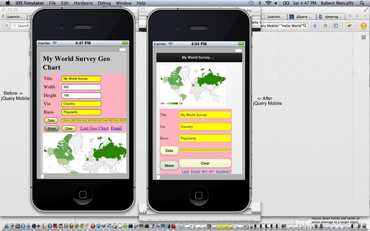
Ever feel like you are just seeing the tip of the iceberg? This is what jQuery Mobile feels like when you are first introduced to it.
A lot of the things people like about the Web are to do with JavaScript and client-side activities. Adding to that experience are Javascript libraries packed full of features. Probably the best known of these is jQuery. The Mobile App world meets the jQuery world with the wonderful jQuery Mobile suite of software.
jQuery Mobile is a touch-optimized web framework (additionally known as a JavaScript library or a mobile framework) currently being developed by the jQuery project team. The development focuses on creating a framework compatible with a wide variety of smartphones and tablet computers,[2] made necessary by the growing but heterogeneous tablet and smartphone market.[3] The jQuery Mobile framework is compatible with other mobile app frameworks and platforms such as PhoneGap, Worklight[4] and more.
jQuery is a multi-browser JavaScript library designed to simplify the client-side scripting of HTML.[4] It was released in January 2006 at BarCamp NYC by John Resig. It is currently developed by a team of developers led by Dave Methvin. Used by over 55% of the 10,000 most visited websites, jQuery is the most popular JavaScript library in use today.[5][6]
jQuery is free, open source software, licensed under the MIT License.[7] jQuery’s syntax is designed to make it easier to navigate a document, select DOM elements, create animations, handle events, and develop Ajax applications. jQuery also provides capabilities for developers to create plug-ins on top of the JavaScript library. This enables developers to create abstractions for low-level interaction and animation, advanced effects and high-level, theme-able widgets. The modular approach to the jQuery library allows the creation of powerful dynamic web pages and web applications.
Click on picture above to go to jQuery Mobile page for a tutorial on the download of jQuery Mobile and its simplistic styling application to a Mobile App, the classic before and after scenario.
The gist of the jQuery Mobile usage in this tutorial is:
<html>
<head>
…
<meta name=”viewport” content=”width=device-width, initial-scale=0.75″>
<link rel=”stylesheet” href=”http://code.jquery.com/mobile/1.2.0/jquery.mobile-1.2.0.min.css” />
<script src=”http://code.jquery.com/jquery-1.8.2.min.js”></script>
<script src=”http://code.jquery.com/mobile/1.2.0/jquery.mobile-1.2.0.min.js”></script>
…
</head>
<body style=’background-color:lightgray;’>
<div data-role=’page’>
<div data-role=’header’>
<h2>My World Survey Geo Chart</h2>
</div><!– /header –>
<div data-role=’content’>
…
</div><!– /content –>
…
</div><!– /page –>
</body>
</html>
Link to jQuery Mobile information … via Wikipedia, from where quote way above is derived.
Link to jQuery information … via Wikipedia, from where quote just above is derived.
Link to jQuery Mobile spiritual home page … via jQuery Foundation.
Link to jQuery spiritual home page … via jQuery Foundation.
Link to jQuery Mobile download page … download jQuery Mobile here.
Link to jQuery download page … download jQuery here.
The Mobile App of this tutorial is downloadable here.
If this was interesting you may be interested in this too.


