When last talking about our Android App “Learning Programming” we ventured to say, with respect to the “user experience” (UX … which isn’t me burping, but please read more below at Android App Learning Programming UX Primer Tutorial) with Android App (or other mobile apps generally) …
… “paring down of functionality” for smaller screen sizes sounds like a bit of a “cop-out” …
… well, we haven’t changed our mind about this, exactly, but we believe in a tiered thought pattern regarding the “user experience” for a variety of users. What we mean by that is that there are users with vastly differing motives who want to use the Android App “Learning Programming”. We think there would be …
- users answering quiz questions to learn programming, alone
- users answering quiz questions to learn programming, collaboratively
- users who are just exercising their mind in “play”
- users venturing into a completely unknown world for them, but curious about programming
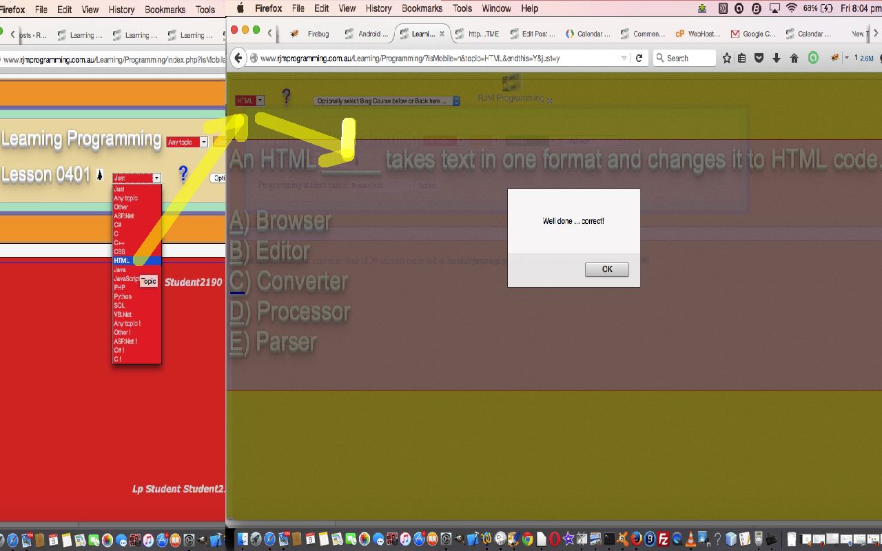
The “users answering quiz questions to learn programming, alone” could benefit from a further “pared down” version that gets to the crux of what they aim to achieve without all the scoring and collaboration features. For those users, in particular, but not exclusively, we are adding a dropdown HTML select element titled “Just” sitting to the left of the question mark link (that attributes thanks to sources). So “Just ?” is a piece of functionality we want to encapsulate in an external piece of Javascript.
Perhaps you are wondering why the change is “external Javascript” when there are files on a web server involved (this is not rhetorical … there are “files on a web server involved”)? Well, yes, we adjust some PHP serverside code, but so little I’ll show you below … somewhere between <head> and </head> we place …
<script src='just.js' type='text/javascript'></script>
How can these changes be changing an Android App? Well, the Android App uses a WebView, and the innards of the WebView are what the PHP and Javascript represent … cute, huh?
It behoves us to show you the external Javascript code then, there, here … just.js
This external Javascript does some “overlay” work … we’ve gone “high rise” thanks to our usual CSS suspects (for “overlay” work) …
- position:absolute property
- z-index
So, if you have no room for McMansions, go “up”, we say. The “upper” (bigger z-index) floor contains a “Just ?” widget pared down “just questions” version of the app we think might more suit the needs (and curiosities) of that user category 1 above.
You can try this yourself by getting the Android App (if you have an Android mobile device) or this live run link, the latter being the basis of the tutorial image today.
Previous relevant Android App Learning Programming UX Primer Tutorial is shown below.
The term “user experience” (or UX … you now have UX Experts) refers to the ease with which users use your web or mobile or desktop applications. For me, a list of some of the considerations could include …
- ease of navigation
- size of elements that that navigation involves
- amount of paring down of functionality relative to screen dimensions … if any?
- user emotions
- user behaviour regarding the application
- interest
- colour
- speed of response
- robustness of functionality
- security considerations
… you could probably go on and on, but, today, taking our Android App called “Learning Programming” as an example wanted to talk a bit about the relationships of those first three points above.
To me, “paring down of functionality” for smaller screen sizes sounds like a bit of a “cop-out”, so we try not to do that, if possible. This has meant that the “Learning Programming” Android App has been a challenging project, with its design, but have been giving it a bit of thought and have made some “UX” improvements recently. And do you know what? The two changes, designed to only change mobile device usage, involved the enlarging of elements, not the shrinking … pretty counter-intuitive, wouldn’t you say?
Think perhaps in the first three points of above, for mobile use, if we stick by our principle of “not paring down any functionality for smaller screen sizes”, an overarching “UX” principle is more the question …
For the usual application functionality flow are the navigational elements required emphasised so that they are the prominent and obvious features?
… and for the “Learning Programming” Android App we have, with this view in mind …
- for mobile platforms only, make the question marks bigger
- for mobile platforms only, make the answer labels bigger
… which, to me, creates a much better app … and reminds me, that another way to think of this is to ask the question …
For the usual application functionality flow, for mobile devices, do we need to (use the) “stretch” or “pinch” (gestures on) the screen to see what’s going on?
… and we hope the answer is “no” … or noooooooooooooooooo … or perhaps nooooooooooooo way … and yet, you want people to reach those more obscure parts of the (mobile) functionality should they choose to venture there … that is where allowing the “stretch” or “pinch” (or scaling) gesture to work (big time), makes for the best of both worlds, methinks … via the use of a meta tag viewport like …
<meta name="viewport" content="width=device-width, initial-scale=1, minimum-scale=0.25, maximum-scale=8, user-scalable=yes" />
Software code wise the changes to do this were in PHP to return a string that isn’t “” (ie. nothing) when the device is a mobile one … pretty specific to requirements (and thanks to this webpage), but this looks like code snippets as below …
<?php

function maybetwo() {   // regarding size of question mark

  if (preg_match("/(android|avantgo|blackberry|bolt|boost|cricket|docomo|fone|hiptop|mini|mobi|palm|phone|pie|tablet|up.browser|up.link|webos|wos)/i", $_SERVER["HTTP_USER_AGENT"])) {  // thanks to http://stackoverflow.com/questions/6524301/detect-mobile-browser

    return '4';

  }

  return '';

}

?>
<?php

function maybeone() {    // regarding size of answer labels

  if (preg_match("/(android|avantgo|blackberry|bolt|boost|cricket|docomo|fone|hiptop|mini|mobi|palm|phone|pie|tablet|up.browser|up.link|webos|wos)/i", $_SERVER["HTTP_USER_AGENT"])) {   // thanks to http://stackoverflow.com/questions/6524301/detect-mobile-browser

    return '1';

  }

  return '';

}

?>
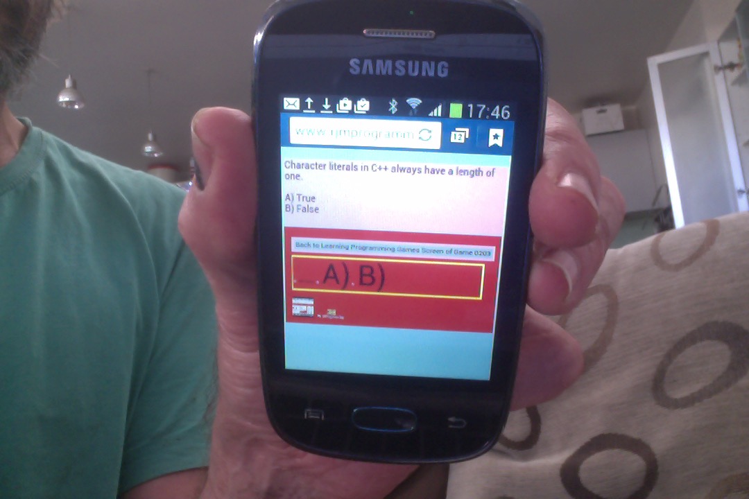
We hope you get some ideas out of today’s tutorial showing usage on a MacBook Pro laptop, an iPad, and an Android mobile phone … so we’ll sign off for now … and hope to see you again soon.
If this was interesting you may be interested in this too.
If this was interesting you may be interested in this too.


6 Responses to Android App Learning Programming UX Overlay Tutorial