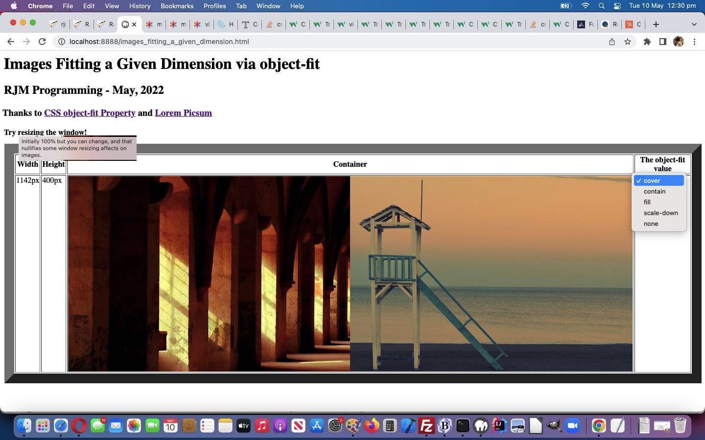
One of the most “catered for” part of webpage design involves the display of images. Our recent “stumbling upon” …
- the excellent Lorem Picsum resource for beautiful images suiting a given width x height … had us looking around for an interesting image related theme to “tutorialize” and “stumbled upon” …
- the excellent CSS object-fit Property explanation of CSS “object-fit” property …
… facilitating the interest in the scenario …
- you are presented with “webpage real estate” of a given width x height … into which …
- you want to display two images side by side …
… and in this scenario the use of “object-fit” property values …
Here is where the object-fit property comes in. The object-fit property can take one of the following values:
fill – This is default. The image is resized to fill the given dimension. If necessary, the image will be stretched or squished to fit
contain – The image keeps its aspect ratio, but is resized to fit within the given dimension
cover – The image keeps its aspect ratio and fills the given dimension. The image will be clipped to fit
none – The image is not resized
scale-down – the image is scaled down to the smallest version of none or contain
… creates interesting variety in how you can configure this scenario depending on your (constraint) interest in …
- you are constrained by fact you must see all the image’s content in original aspect ratio … think … contain or scale-down
- you are constrained by fact you must see all the image’s content but not necessarily with original aspect ratio … think … fill or contain or scale-down
- you are constrained by fact that your “webpage real estate” of the given width x height must be filled (by imagery) … think … fill or cover (or (quite often, but not always) none)
- you must keep original image dimensions but clipping okay … think … none
- you must keep original aspect ratio of images but clipping okay … think … contain or cover or none or scale-down
… and then there is …
What happens when you resize your webpage window?
Feel free to try our proof of concept CSS (styling) “object-fit” experimenting web application …
If this was interesting you may be interested in this too.


