If you’re like me, you’ll have many flyers come into your “radar” over the course of the day … the week … etcetera etcetera etcetera. Many of these receive scant attention, as they often come with other junk “snail” mail. The ones that might get more of my attention are … shallow me … the ones with some aesthetically pleasing aspect, but, alas, me being the “client web design hungry” being that I am, “shallow me” might only be paying more attention to it interested in the aesthetics achieved by that flyer’s designers … more so, at least for me, than its contents. Today, we’re going to start off on the journey towards developing a Course Flyer from its component parts. So, for these purposes, imagine you are designing a course for a reputable educational institution, and want to design (and distribute … but “distribute” is another “art” altogether … a … r … t … now together … art … ta muchly) a Course Flyer.
Today’s component of the Course Flyer design revolves around the bulk of what you might want to present as the wording. Guess if you want a Course Flyer to have any affect whatsoever, you’ll be hoping the reader gets to the “wording”. Once there, and I know there’ll be marketing people out there that can say how few people get to this “wording” reading as a proportion of all people who have viewed your flyer … but let’s not let this put us off … you’ll want “wording” with a combination of …
- clear concise detail of “administrative” information … and yet, in amongst that, some …
- reasonably detailed course content detail that both indicates what will be achieved, as well as being a “lead in” to the “juices” of the reader’s imagination, to inspire and convince and excite
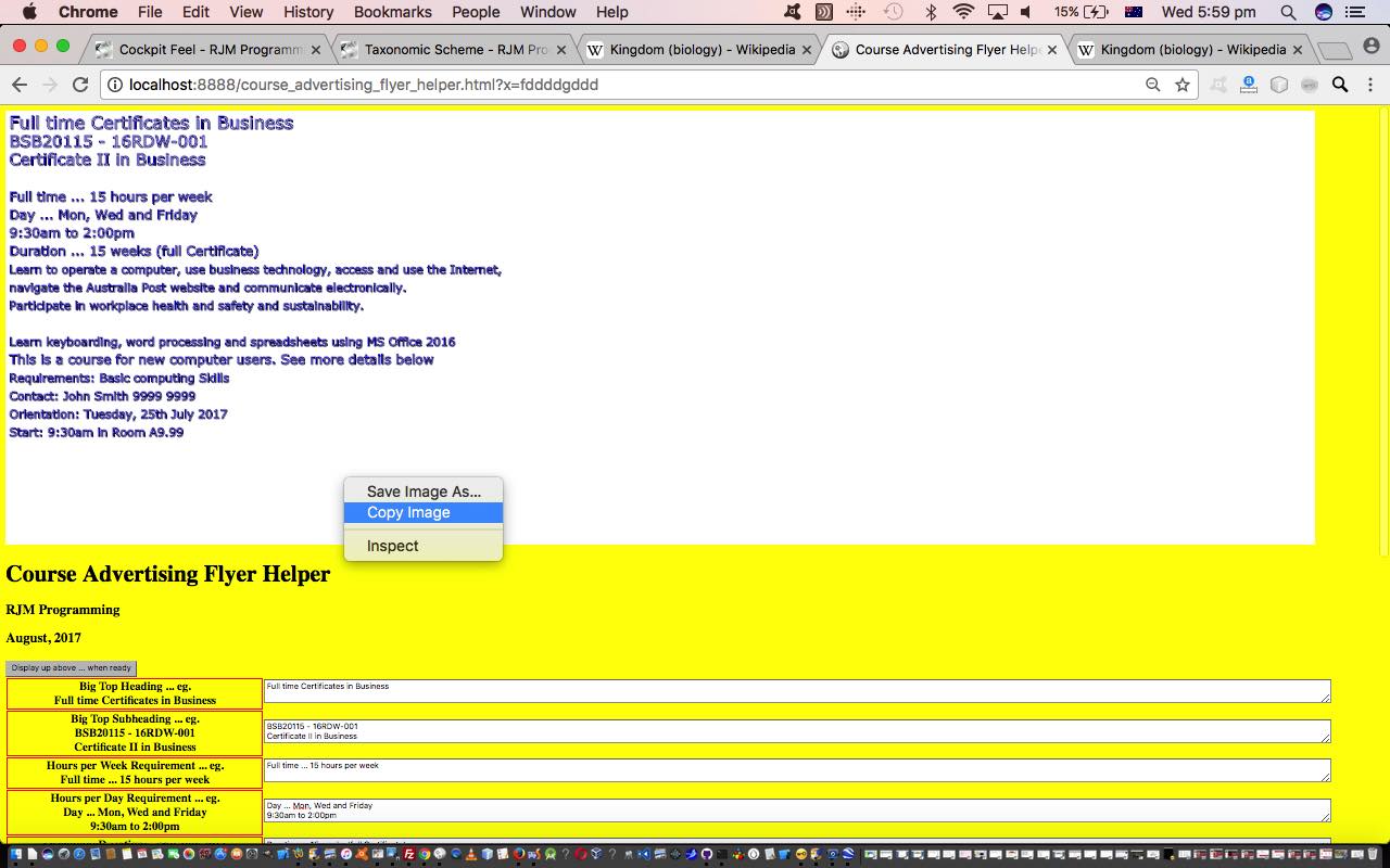
… and so, basing the “wording” content requirements on a NSW TAFE flyer (“Training in Business Administration and Technology”, Office Technology by Sydney Institute, TAFE NSW, Randwick College) we had picked up, thanks, we resolved that the information capture “data points” (for Course Flyer wording) should be …
- Big Top Heading
- Big Top Subheading
- Hours per Week Requirement
- Hours per Day Requirement
- Duration
- Description
- Footer
- Requirements
- Contact
- Orientation
- Start
… and arrived at, after adding some accountability via an HTML canvas element redisplay of the user’s words, our live run link for a Course Flyer “wording” using HTML and Javascript and CSS you could call course_advertising_flyer_helper.html and you could peruse for ideas, we hope. To augment your understanding, perhaps, watch a PDF slideshow of us capturing the text in HTML textarea elements, redisplaying this in an HTML canvas, using the web browser’s own “Copy” (the canvas contents) capabilities, and Pasting that “redisplay” into the body section of an email created using the Mac OS X Mail desktop application, and sending this Course Flyer “wording” off to someone in an email.
We hope you continue on with our Course Flyer creation journey.
If this was interesting you may be interested in this too.


