Sometimes when you combine, within the one web application …
- user interactive input … and …
- event management involving user interaction … eg. drag
… like for yesterday’s CSS 3D Transformation Matrix Antikludge Tutorial the “timing” of when you allow things for the various HTML elements involved can become … “involved”.
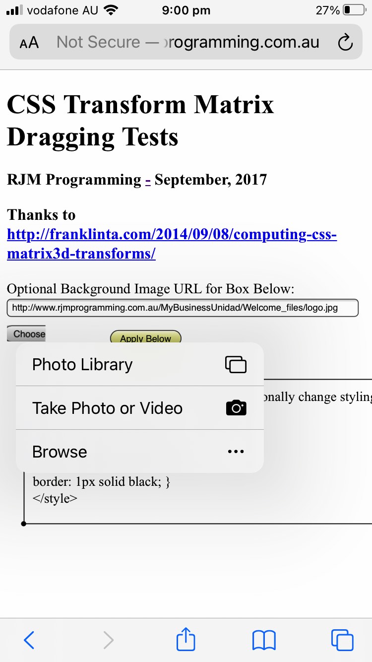
We found that yesterday’s incarnation left little time for a mobile user to decide on their non-drag matters before the drag matters kicked in … ?
And so we decided to break that up into click separated compartments of web application execution “timing” for our mobile users … and all because … ?
We got sick, on behalf of mobile users, again, regarding the forced prompt window asks about sharing, and so we felt kludgy, just after feeling antikludgy when we changed the code as per …
function touchHandler(event) { // thanks to https://stackoverflow.com/questions/5186441/javascript-drag-and-drop-for-touch-devices

    if (('' + event.target.id) == 'mybemail') { emailsnapshot(); } else if (('' + event.target.id) == 'myar') { location.href=document.URL.split('#')[0].split('?')[0]; } else {

    var touch = event.changedTouches[0];


    var simulatedEvent = document.createEvent("MouseEvent");

        simulatedEvent.initMouseEvent({

        touchstart: "mousedown",

        touchmove: "mousemove",

        touchend: "mouseup"

    }[event.type], true, true, window, 1,

        touch.screenX, touch.screenY,

        touch.clientX, touch.clientY, false,

        false, false, false, 0, null);


    touch.target.dispatchEvent(simulatedEvent);

    event.preventDefault();

    }

}
… opening the door to “antigenericity” … ?
See our mildly and timely changed web application more_transform.html‘s live run link.
Previous relevant CSS 3D Transformation Matrix Windows Snip and Sketch Tutorial is shown below.
Yesterday’s CSS 3D Transformation Matrix Share Tutorial said …
Up to yesterday’s CSS 3D Transformation Matrix Mobile Mousemove Tutorial sharing and/or collaboration was up to the user taking their own screenshots and perhaps communicating that information themselves.
And so, today, we backtrack a little to show one of those web browser helpers, the brilliant Windows 10 desktop application called “Snip and Sketch”, the independent of your work “screenshotter” of your activity for the entire Windows screen in these modes of screenshotting …
- Rectangular Snip
- Freeform Snip
- Window Snip
- Fullscreen Snip
In today’s animated GIF presentation related to some of this Windows 10 screenshotting, you can see lots of “Rectangular Snip” generic testing and a specific “Freeform Snip” example related to our recent CSS 3D Transformation Matrix web application of recent postings.
Previous relevant CSS 3D Transformation Matrix Share Tutorial is shown below.
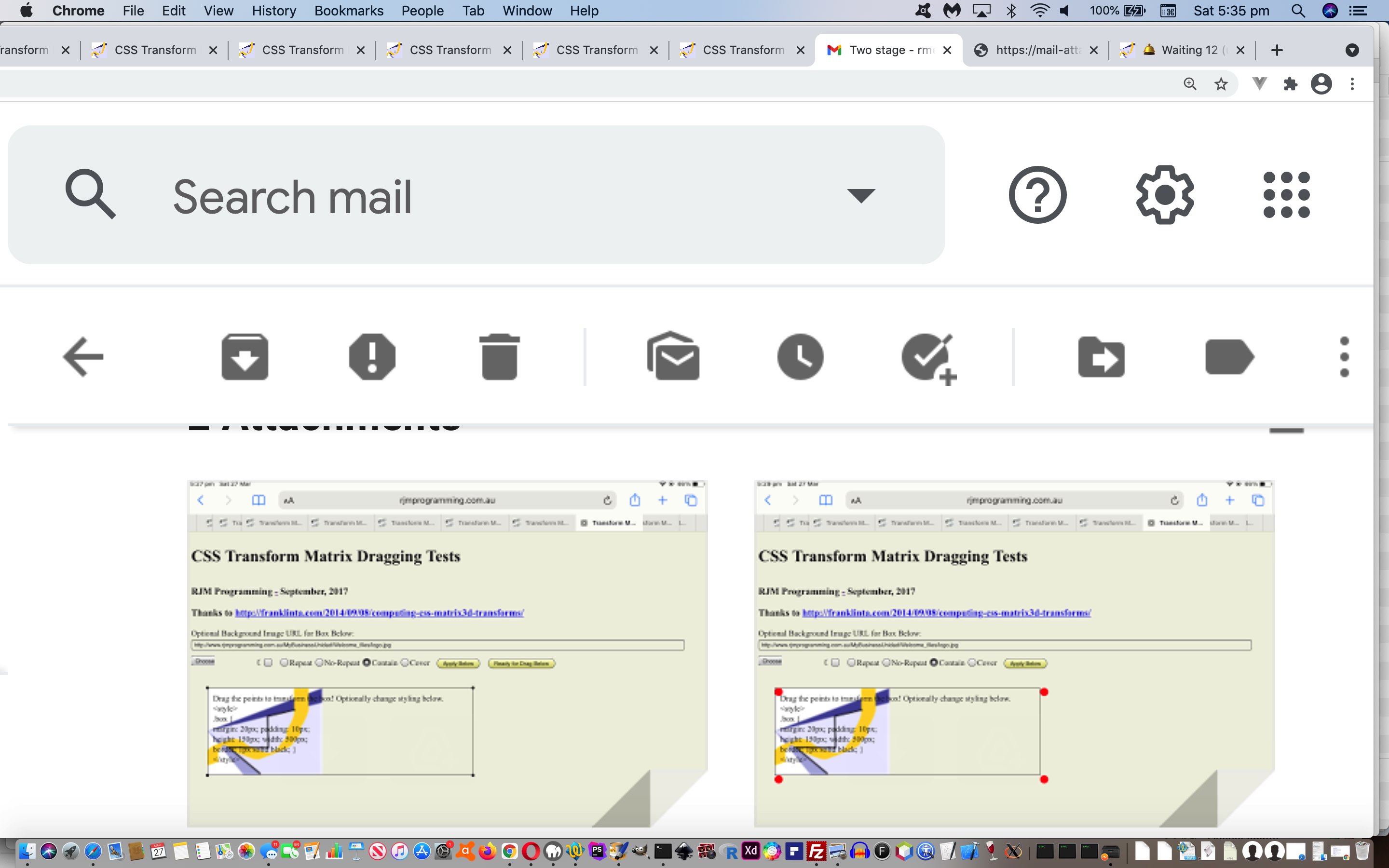
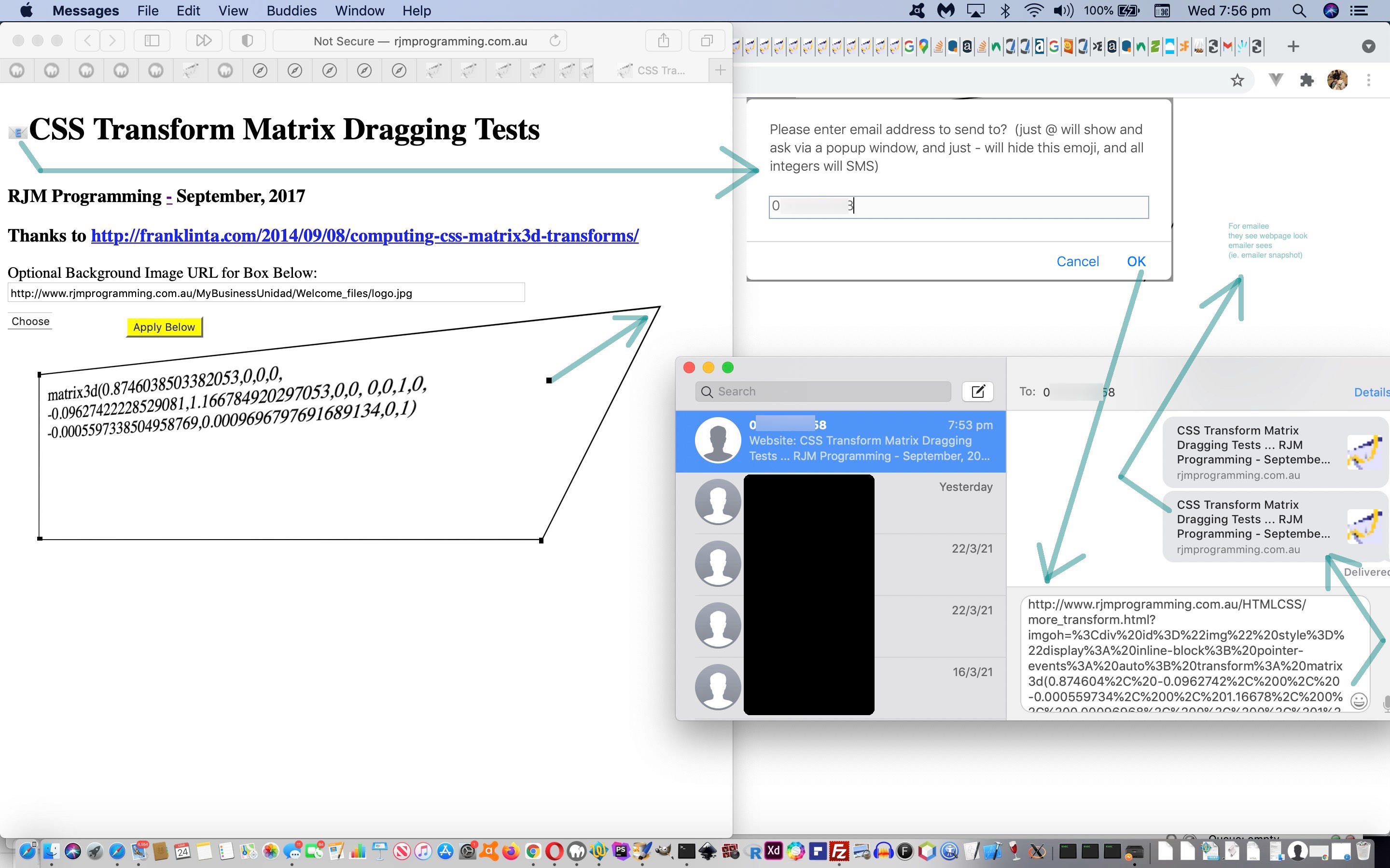
Up to yesterday’s CSS 3D Transformation Matrix Mobile Mousemove Tutorial sharing and/or collaboration was up to the user taking their own screenshots and perhaps communicating that information themselves. Today we make sharing that little bit easier with the inclusion of a new emoji 📧 “button” …
<h4 id=mybemail ondblclick="this.style.display='none';" title='Email snapshot (double click makes this emoji disappear)' style='display:none;' onclick=emailsnapshot();>📧</h4>
… see how emoji usage can make so many HTML element types into pseudo “button” types.
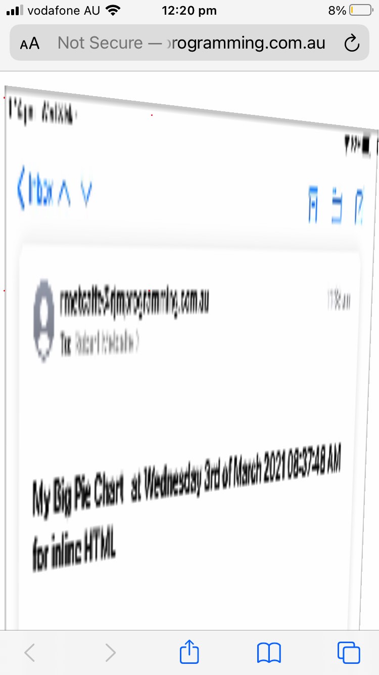
The two sharing “conduits” we programmatically cater for are …
| Conduit type | “a” link clicked with long URL | Attachment | Inline HTML |
|---|---|---|---|
| Yes | No (alas, no client liked the HTML) |
||
| SMS | Yes (but not if background images involved) |
… using the new Javascript function code that uses a couple of “midair techniques” …
… in …
  function emailsnapshot() {

  var tois=gtois.trim(), zbigstr='', zs='';

  var smssuffix='', plussms='';

  var wastitle='' + document.getElementById('img').title;

  document.getElementById('img').title='';

  if (eval('' + encodeURIComponent(document.getElementById('img').outerHTML.split(' contenteditable=')[0] + ' contenteditable="true">' + (document.getElementById('img').innerText || document.getElementById('img').contentWindow || document.getElementById('img').contentDocument) + '</div>').length) < 800) {

    smssuffix=', and all integers will SMS';

    plussms=' or SMS';

    if (tois.trim() != '' && tois.replace(/0/g,'').replace(/1/g,'').replace(/2/g,'').replace(/3/g,'').replace(/4/g,'').replace(/5/g,'').replace(/6/g,'').replace(/7/g,'').replace(/8/g,'').replace(/9/g,'') == '') {

      zs='@';

    }

  }

  if ((tois + zs).indexOf('@') == -1) {

    //gtois=prompt('Please enter email address to send to?  (just @ will show and ask via a popup window and all uppercase will use an inline HTML technique rather than an HTML file attachment)', '');

    if (optionally) {

    //optionally=false;

    if (gtois == '') {

    gtois=prompt('Optionally enter email address to send to?  (just @ will show and ask via a popup window, and just - will not ask again' + smssuffix + ')', '');

    }

    } else {

    gtois=prompt('Please enter email address to send to?  (just @ will show and ask via a popup window, and just - will hide this emoji' + smssuffix + ')', '');

    }

    if (gtois == null) { gtois=''; }

    tois=gtois;

  }

  if (tois == '-') {

  if (navigator.userAgent.match(/Android|BlackBerry|iPhone|iPad|iPod|Opera Mini|IEMobile/i)) {

  gtois=' ';

  } else {

  gtois='';

  }

  document.getElementById('mybemail').style.display='none';

  document.getElementById('img').title=wastitle;

  return '';

  } else if (tois == '@') {

  gtois='';

  document.getElementById('mybemail').style.display='none';

  zbigstr='<html><head>' + document.head.innerHTML.split('<scr')[0].replace('</style>', ' .ui-draggable { visibility:hidden; } </style>') + '</head>' + document.body.outerHTML.replace(/\"\;/g,"'").replace('</h4>','</h4> <input style=display:inline-block; placeholder="Email' + plussms + ' address to send to" type=text value="" onblur=" window.opener.document.getElementById(' + "'result'" + ').innerHTML=this.value; "></input>') + '</html>';

  wois=window.open('','_blank','top=30,left=30,width=500,height=500');

  wois.document.write(zbigstr);

  document.getElementById('img').title=wastitle;

  return '';

  } else if (tois.indexOf('@') == -1) {

  if (tois.trim() != '' && tois.replace(/0/g,'').replace(/1/g,'').replace(/2/g,'').replace(/3/g,'').replace(/4/g,'').replace(/5/g,'').replace(/6/g,'').replace(/7/g,'').replace(/8/g,'').replace(/9/g,'') == '') {

  var elea=document.createElement('a');

  elea.target='_blank';

  elea.href='sms:' + tois + '&body=' + ourencodeURIComponent(encodeURIComponent(document.URL.split('?')[0].split('#')[0] + '?imgoh=' + encodeURIComponent(document.getElementById('img').outerHTML.split(' contenteditable=')[0] + ' contenteditable="true">' + (document.getElementById('img').innerText || document.getElementById('img').contentWindow || document.getElementById('img').contentDocument) + '</div>')));

  elea.click();

  }

  document.getElementById('img').title=wastitle;

  return '';

  }

  document.getElementById('mybemail').style.display='none';

  zbigstr='<html><head>' + document.head.innerHTML.split('<scr')[0].replace('</style>', ' .ui-draggable { visibility:hidden; } </style>') + '</head>' + document.body.outerHTML.replace(/\"\;/g,"'") + '</html>';


  var zzhr = new XMLHttpRequest();

  var zzform=new FormData();

  zzform.append('to', tois);

  zzform.append('subj', 'My 3D Transformed Webpage');

  if (tois == tois.toUpperCase() && 1 == 7) {

  zzform.append('inline', '');

  }

  zzform.append('tdhuhta', encodeURIComponent(zbigstr));

  zzhr.open('post', '//www.rjmprogramming.com.au/PHP/emailhtml.php', true);

  zzhr.send(zzform);

  if (!gtoviaresult) {

  wois=window.open('','_blank','top=30,left=30,width=500,height=500');

  wois.document.write(zbigstr);

  } else if (wois) {

  wois.close();

  wois=null;

  }

  document.getElementById('mybemail').style.display='inline-block';

  gtoviaresult=false;

  document.getElementById('img').title=wastitle;

  return ' ';

  }
… in our changed web application more_transform.html‘s live run link.
Previous relevant CSS 3D Transformation Matrix Mobile Mousemove Tutorial is shown below.
The key to getting mobile platforms take that extra step of allowing the user to drag the div contenteditable=truefalse into a 3D transformed element, on top of the progress of yesterday’s CSS 3D Transformation Matrix Mobile Tutorial centred around the following question …
Can we simulate a mousemove event from a touchmove touch event on a smart device?
… and the answer is “yes”, and we’d recommend you first read Javascript Drag and drop for touch devices as far as that goes, where the enacted recommendation …
function touchHandler(event) {

    var touch = event.changedTouches[0];


    var simulatedEvent = document.createEvent("MouseEvent");

        simulatedEvent.initMouseEvent({

        touchstart: "mousedown",

        touchmove: "mousemove",

        touchend: "mouseup"

    }[event.type], true, true, window, 1,

        touch.screenX, touch.screenY,

        touch.clientX, touch.clientY, false,

        false, false, false, 0, null);


    touch.target.dispatchEvent(simulatedEvent);

    event.preventDefault();

}
… can dynamically convert all the touchstart, touchend and touchmove events into mouse event equivalents, and then feed into the existant smarts of our changed web application more_transform.html‘s live run link.
That is good, leaving the touchmove event of the four draggable guides (div that we make bigger and red on mobile platforms) of interest to us to follow up and further amend, as per …
divs[idivs].addEventListener('touchmove', function(evt) { if (1 == 1) { alert('Drop now.'); } var nevent = new Event('mousemove'); evt.target.dispatchEvent(nevent); evt.preventDefault(); });
… us helping out the “drag” with our interrupted “drop”.
Previous relevant CSS 3D Transformation Matrix Mobile Tutorial is shown below.
Yesterday’s CSS 3D Transformation Matrix Browse Tutorial was not the best as far as mobile platforms went when coming up against sizeable image data sources.
As such, we are going to stop “recalls” of our web application when a mobile user takes or browses for an image. This in turn stops window.sessionStorage being needed, but means we have to move the drag and drop guides ourselves as per …
function fixstyle(stih) {

  var idivs=0, boxrect=null, kdivs=0;

  stih=stih.replace(/\&\;lt\;/g, '<').replace(/\&\;gt\;/g, '>').replace(/\<\;/g, '<').replace(/\>\;/g, '>');

  //alert('0:' + stih);

  if (stih.indexOf('<style>') != -1 && stih.indexOf('</style>') != -1) {

    document.getElementById('dstyle').innerHTML='<style>' + stih.split('</style>')[0].split('<style>')[1] + '</style>';

    //alert('<Style>' + stih.split('</style>')[0].split('<style>')[1] + '</style>');

    var divs=document.getElementsByTagName('div');

    for (var jdivs=0; jdivs<2; jdivs++) {

    if (kdivs == 0) {

    for (idivs=0; idivs<divs.length; idivs++) {

      if (('' + divs[idivs].className).indexOf('ui-draggable') != -1) {

        if (boxrect) {

          if (kdivs == 0 && !navigator.userAgent.match(/Android|BlackBerry|iPhone|iPad|iPod|Opera Mini|IEMobile/i)) {

            kdivs++;

            divs[idivs].style.left=('' + boxrect.left) + 'px';

            divs[idivs].style.top=('' + boxrect.top) + 'px';

          } else if (kdivs == 1 && !navigator.userAgent.match(/Android|BlackBerry|iPhone|iPad|iPod|Opera Mini|IEMobile/i)) {

            kdivs++;

            divs[idivs].style.left=('' + boxrect.left) + 'px';

            divs[idivs].style.top=('' + boxrect.bottom) + 'px';

          } else if (kdivs == 2 && !navigator.userAgent.match(/Android|BlackBerry|iPhone|iPad|iPod|Opera Mini|IEMobile/i)) {

            kdivs++;

            divs[idivs].style.left=('' + boxrect.right) + 'px';

            divs[idivs].style.top=('' + boxrect.top) + 'px';

          } else if (kdivs == 3 && !navigator.userAgent.match(/Android|BlackBerry|iPhone|iPad|iPod|Opera Mini|IEMobile/i)) {

            kdivs++;

            divs[idivs].style.left=('' + boxrect.right) + 'px';

            divs[idivs].style.top=('' + boxrect.bottom) + 'px';

            //alert('<stylE>' + stih.split('</style>')[0].split('<style>')[1] + '</style>');

            location.href=document.URL.split('?')[0].split('#')[0] + '?styling=' + encodeURIComponent('<style>' + stih.split('</style>')[0].split('<style>')[1] + '</style>');

          } else if (kdivs == 0 && navigator.userAgent.match(/Android|BlackBerry|iPhone|iPad|iPod|Opera Mini|IEMobile/i)) {

            kdivs++;

            divs[idivs].style.left='' + eval(eval('' + boxrect.left) + eval('' + window.scrollX)) + 'px';

            divs[idivs].style.top='' + eval(eval('' + boxrect.top) + eval('' + window.scrollY)) + 'px';

            divs[idivs].addEventListener('click', function(e){ document.getElementById('img').style.borderStyle='dotted'; }, { passive: false });

          } else if (kdivs == 1 && navigator.userAgent.match(/Android|BlackBerry|iPhone|iPad|iPod|Opera Mini|IEMobile/i)) {

            kdivs++;

            divs[idivs].style.left='' + eval(eval('' + boxrect.left) + eval('' + window.scrollX)) + 'px';

            divs[idivs].style.top='' + eval(eval('' + boxrect.top) + eval('' + boxrect.height) + eval('' + window.scrollY)) + 'px';

            divs[idivs].addEventListener('click', function(e){ document.getElementById('img').style.borderStyle='dashed'; }, { passive: false });

          } else if (kdivs == 2 && navigator.userAgent.match(/Android|BlackBerry|iPhone|iPad|iPod|Opera Mini|IEMobile/i)) {

            kdivs++;

            divs[idivs].style.left='' + eval(eval('' + boxrect.left) + eval('' + boxrect.width) + eval('' + window.scrollX)) + 'px';

            divs[idivs].style.top='' + eval(eval('' + boxrect.top) + eval('' + window.scrollY)) + 'px';

            divs[idivs].addEventListener('click', function(e){ document.getElementById('img').style.borderStyle='double'; }, { passive: false });

          } else if (kdivs == 3 && navigator.userAgent.match(/Android|BlackBerry|iPhone|iPad|iPod|Opera Mini|IEMobile/i)) {

            kdivs++;

            divs[idivs].style.left='' + eval(eval('' + boxrect.left) + eval('' + boxrect.width) + eval('' + window.scrollX)) + 'px';

            divs[idivs].style.top='' + eval(eval('' + boxrect.top) + eval('' + boxrect.height) + eval('' + window.scrollY)) + 'px';

            divs[idivs].addEventListener('click', function(e){ document.getElementById('img').style.borderStyle='groove'; }, { passive: false });

            //alert('<stylE>' + stih.split('</style>')[0].split('<style>')[1] + '</style>');

            if (!navigator.userAgent.match(/Android|BlackBerry|iPhone|iPad|iPod|Opera Mini|IEMobile/i)) {

            location.href=document.URL.split('?')[0].split('#')[0] + '?styling=' + encodeURIComponent('<style>' + stih.split('</style>')[0].split('<style>')[1] + '</style>');

            } else {

            //alert('' + window.scrollY + ' ' + boxrect.left + ' ' + boxrect.width + ' ...      Left=' + eval(eval('' + boxrect.left) + eval('' + boxrect.width) + eval('' + window.scrollX)) + ' top=' + '' + eval(eval('' + boxrect.top) + eval('' + boxrect.height) + eval('' + window.scrollY)) + 'px');

            noscrollbutzoom(); //document.getElementById('resultav').innerHTML+="<script> document.body.addEventListener('touchstart', function(e){ e.preventDefault(); }); </s" + "cript> ";

            }

          }

        }

      } else if (('' + divs[idivs].className).indexOf('box') != -1 && !boxrect) {

        boxrect=divs[idivs].getBoundingClientRect();

      }

    }

    }

    }

  } //else {

    //alert(stih);

  //}

}
Also for mobile platforms, on browsing for an image, we are going to try, on our div contenteditable=true …
- remove the contenteditable attribute
- stop scrolling on div (but allow around it)
- stop zoom on div (but allow around it)
- start down the road for mobile users seeing events for those drag and drop guides
… as per …
function noscrollbutzoom() {

  document.getElementById('img').addEventListener('touchmove', function(e){ e.preventDefault(); }, { passive: false });

  document.getElementById('img').addEventListener('touchdown', function(e){ e.preventDefault(); }, { passive: false });

  document.getElementById('img').style.marginRight='50px';

  document.getElementById('img').removeAttribute('contenteditable');

}
Again, we figure it’s worth you (re)trying this HTML and Javascript (mostly jQuery) and CSS more mobile user controllable and user controlled image data selection web application more_transform.html‘s live run to see what we mean?
Previous relevant CSS 3D Transformation Matrix Browse Tutorial is shown below.
When we mentioned in CSS 3D Transformation Matrix Tool Tutorial …
We have bigger plans than this. Perhaps you can guess the direction we might go next?!
… we had in mind what is involved with today’s tutorial topic, but our day’s coding started with another direction we’re keen on seeing whether we can see it through (alas not today), that being …
- allow mobile platforms work the drag and drop logic of the web application … and so the code changes start this but also consider today’s nominal …
- allow images be defined not only via …
- image textbox entered image URL … but also by, as of today …
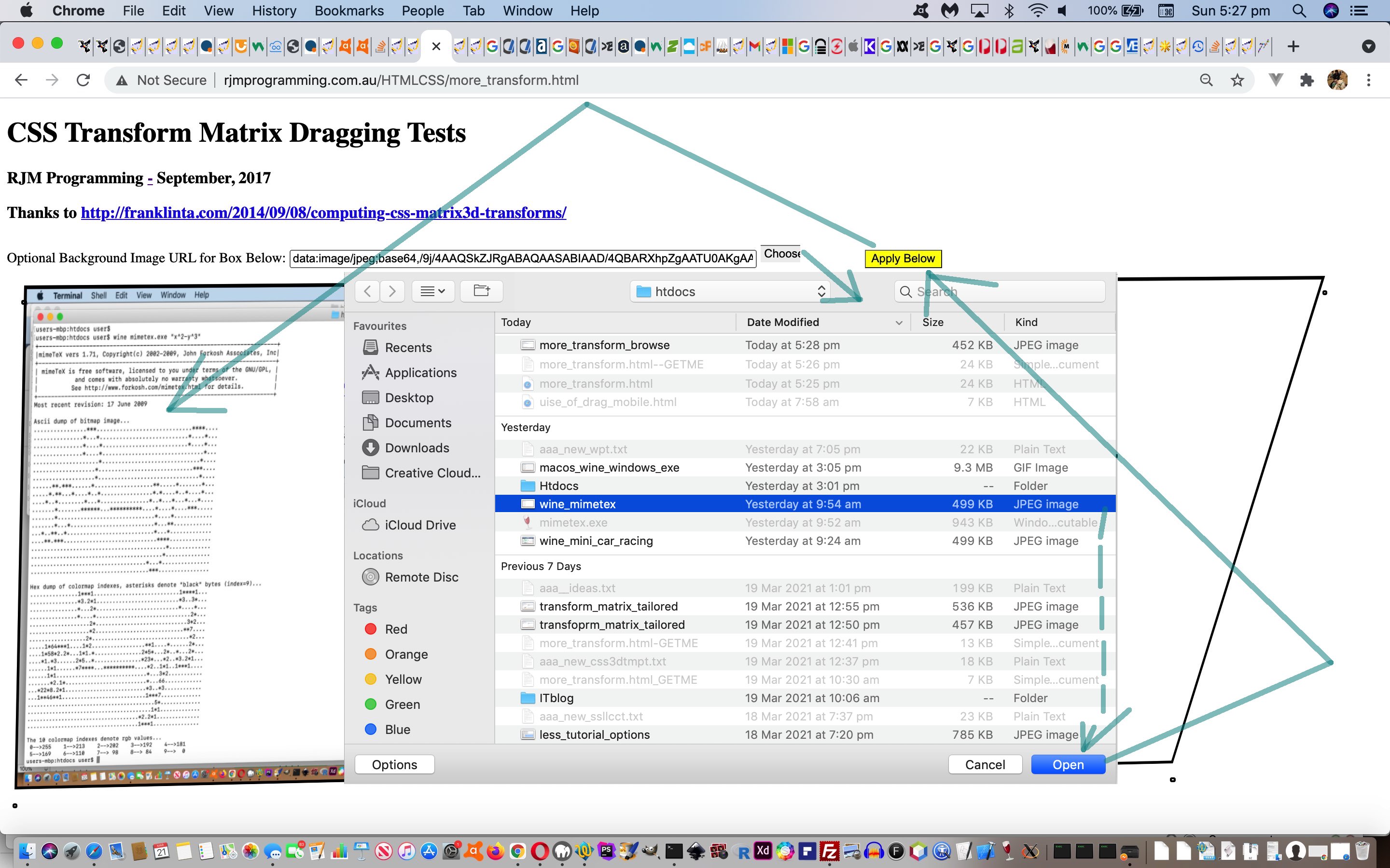
- image browsed for either as an existant local device image file, or, as in the case for a smart device, take the image photo there and then and use it with that “Apply Below” button to establish 3D transformable background images
You may recall yesterday introduced …
- background-repeat:no-repeat;
- background-size:cover;
- background-size:contain;
- elements above become style=’visibility:hidden;’ (as required)
… also, respective requiring URL suffixes of …
- single space
- three spaces
- two spaces
- before any spaces the use of a hash (#) character near the end of the URL
? Well, we have this special combination below quickly getting us to an “image transforming editor” piece of functionality we are quite fond of. Should the user …
- append three spaces to an initially presented image URL in that textbox … then …
- click the new “Choose File” browsing button and select an image file of choice(or take that image photo then and then on a smart device) … then …
- inhouse, the web application clicks the “Apply Below” button for you causing a windows.sessionStorage saving (adding a hash (#) even if not specified) of the resultant image data URI be stored, and in the meantime determine the width and height of that image data URI data, apply it in that div contenteditable=true CSS styling place ahead of that programmatic “Apply Below” button programmatic click, causing a reload whose document.body “short time after” onload event re-establishes the data URI in the textbox and reclicks the “Apply Below” button, to end up with the user being presented with our “image transforming editor” piece of functionality in action, awaiting user drags and drops to transform the box (and its underlying background-size:cover; with image dimensions (equivalent to background-size:contain;)) completely covered by image data, so that the user just sees a transformable image under their complete control
Kludgy, so far, but lots of scope to make it less kludgy as time goes on.
We figure it’s worth you (re)trying this HTML and Javascript (mostly jQuery) and CSS more user controllable and user controlled image data selection web application more_transform.html‘s live run to see what we mean?
Previous relevant CSS 3D Transformation Matrix Tool Tutorial is shown below.
The brilliance of others, thanks, and of jQuery, thanks, were behind the “proof of concept” feel to the CSS 3D Transformation Matrix Primer Tutorial “CSS 3D Transformation Matrix” topic we are revisiting today.
Today, practicalities and usefulness, and the development of a user controlled set of outputs, take over our thoughts.
On a revisit, as a start, we wondered whether …
- we could make the styling of the initial HTML div “box” element styling user definable
- we could make the background image CSS properties …
- background-repeat:no-repeat;
- background-size:cover;
- background-size:contain;
- elements above become style=’visibility:hidden;’ (as required)
… be user definable
… and the answers are “yes” and “ya” …
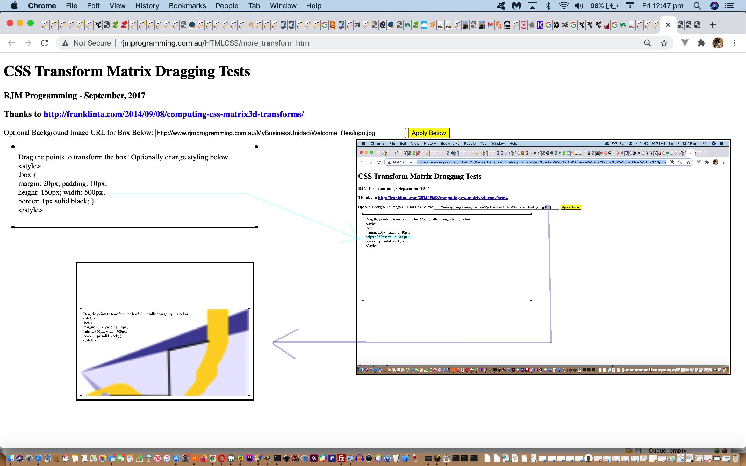
- we could make the styling of the initial HTML div “box” element styling user definable … keeping the jQuery happy by refreshing when user changes the styling …
function fixstyle(stih) {

  var idivs=0, boxrect=null, kdivs=0;

  stih=stih.replace(/\&\;lt\;/g, '<').replace(/\&\;gt\;/g, '>').replace(/\<\;/g, '<').replace(/\>\;/g, '>');

  //alert('0:' + stih);

  if (stih.indexOf('<style>') != -1 && stih.indexOf('</style>') != -1) {

    document.getElementById('dstyle').innerHTML='<style>' + stih.split('</style>')[0].split('<style>')[1] + '</style>';

    //alert('<Style>' + stih.split('</style>')[0].split('<style>')[1] + '</style>');

    var divs=document.getElementsByTagName('div');

    for (var jdivs=0; jdivs<2; jdivs++) {

    if (kdivs == 0) {

    for (idivs=0; idivs<divs.length; idivs++) {

      if (('' + divs[idivs].className).indexOf('ui-draggable') != -1) {

        if (boxrect) {

          if (kdivs == 0) {

            kdivs++;

            divs[idivs].style.left=('' + boxrect.left) + 'px';

            divs[idivs].style.top=('' + boxrect.top) + 'px';

          } else if (kdivs == 1) {

            kdivs++;

            divs[idivs].style.left=('' + boxrect.left) + 'px';

            divs[idivs].style.top=('' + boxrect.bottom) + 'px';

          } else if (kdivs == 2) {

            kdivs++;

            divs[idivs].style.left=('' + boxrect.right) + 'px';

            divs[idivs].style.top=('' + boxrect.top) + 'px';

          } else if (kdivs == 3) {

            kdivs++;

            divs[idivs].style.left=('' + boxrect.right) + 'px';

            divs[idivs].style.top=('' + boxrect.bottom) + 'px';

            //alert('<stylE>' + stih.split('</style>')[0].split('<style>')[1] + '</style>');

            location.href=document.URL.split('?')[0].split('#')[0] + '?styling=' + encodeURIComponent('<style>' + stih.split('</style>')[0].split('<style>')[1] + '</style>');

          }

        }

      } else if (('' + divs[idivs].className).indexOf('box') != -1 && !boxrect) {

        boxrect=divs[idivs].getBoundingClientRect();

      }

    }

    }

    }

  } //else {

    //alert(stih);

  //}

}
… Javascript teamed with the changed HTML/Javascript (behind it) …
<div id="img" class="box" contenteditable=true onblur="fixstyle((this.innerText || this.contentWindow || this.contentDocument).replace(/\<br\>/g, ' ').replace(/\&\;lt\;/g, '<').replace(/\&\;gt\;/g, '>').replace(/\<\;/g, '<').replace(/\>\;/g, '>'));">

    Drag the points to transform the box!  Optionally change styling below.<br>

<script type='text/javascript'>

  var xstyis=location.search.split('styling=')[1] ? decodeURIComponent(location.search.split('styling=')[1].split('&')[0]) : '';

  if (xstyis != '') {

    while (xstyis.indexOf(String.fromCharCode(10)) != -1) {

      xstyis=xstyis.replace(String.fromCharCode(10), '<br>');

    }

    //alert(xstyis.replace(/\</g,'<').replace(/\>/g,'>'));

    document.write(xstyis.replace(/\<s/g,'<s').replace(/\<\//g,'</').replace(/e\>/g,'e>'));

  } else {

    document.write('<style><br>.box {<br>margin: 20px;  padding: 10px;<br>height: 150px; width: 500px;<br>border: 1px solid black; }<br></style><br>');

  }

</script>

</div>
- we could make the background image CSS properties …
- background-repeat:no-repeat;
- background-size:cover;
- background-size:contain;
- elements above become style=’visibility:hidden;’ (as required)
… be user definable … allow us to stay on the current incarnation of the webpage …
function applythis(tv) {

  var hides, ihides=0;

  if (tv != "") {

   if (tv.trim() == tv) {

    document.getElementById(selector.replace('#','')).style.background='URL(' + tv + ')';

    document.getElementById(selector.replace('#','')).style.backgroundRepeat='repeat';

   } else {

    if (tv.indexOf(tv.trim() + '   ') != -1) {

    document.getElementById(selector.replace('#','')).style.background='URL(' + tv.trim() + ')';

    document.getElementById(selector.replace('#','')).style.backgroundSize='cover';

    document.getElementById(selector.replace('#','')).style.backgroundRepeat='no-repeat';

    } else if (tv.indexOf(tv.trim() + '  ') != -1) {

    document.getElementById(selector.replace('#','')).style.background='URL(' + tv.trim() + ')';

    document.getElementById(selector.replace('#','')).style.backgroundSize='contain';

    document.getElementById(selector.replace('#','')).style.backgroundRepeat='no-repeat';

    } else {

    document.getElementById(selector.replace('#','')).style.background='URL(' + tv.trim() + ')';

    document.getElementById(selector.replace('#','')).style.backgroundRepeat='no-repeat';

    }

   }

   if (tv.indexOf('#') != -1) {

     hides=document.getElementsByTagName('h1');

     for (ihides=0; ihides<hides.length; ihides++) {

       hides[ihides].style.visibility='hidden';

     }

     hides=document.getElementsByTagName('h3');

     for (ihides=0; ihides<hides.length; ihides++) {

       hides[ihides].style.visibility='hidden';

     }

     hides=document.getElementsByTagName('p');

     for (ihides=0; ihides<hides.length; ihides++) {

       hides[ihides].style.visibility='hidden';

     }

   }

  }

}
So why don’t you (re)try this HTML and Javascript (mostly jQuery) and CSS more user controllable web application more_transform.html‘s live run to see what we mean? It still feels weird, and wonderful!
We have bigger plans than this. Perhaps you can guess the direction we might go next?!
Previous relevant CSS 3D Transformation Matrix Primer Tutorial is shown below.
The tutorial CSS3 3D Rotation and Transformation Primer Tutorial discussed CSS styling regarding element transformations, and referred to the wonderful content of Computing CSS matrix3d transforms | Franklin Ta, involving matrix mathematics to transform HTML elements and the matrix3d() CSS function … great stuff, thanks. Also, coming at this topic of transformations from another angle, the previous ImageMagick and Three Ps Charcoal Implode Quality Tutorial touches on this aspect of transformations, in its case “affine” transformations, whereby an actual image element is transformed and presented in a downloadable way.
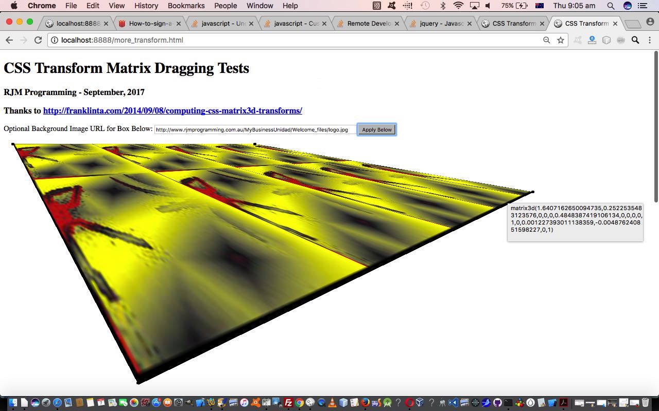
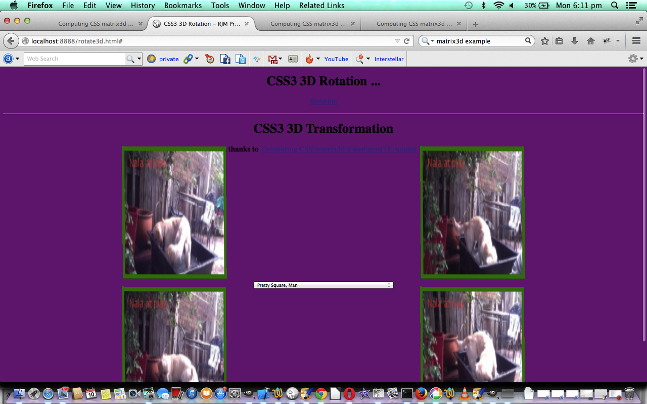
Today we recreate that work with the CSS matrix3d() function of Frank Ta to turn this into a web application where you can drag the edges of an HTML div element to derive the underlying CSS matrix3d() function parameter set would be used to recreate this HTML div display, perhaps elsewhere. We also allow for the user to enter in an image URL that if they click a button will apply that image as the background image to the HTML div element, as you can see play out with today’s tutorial picture. The jQuery Javascript here helps the day enormously, though Frank used the CoffeeScript (compiled into Javascript) within the CodePen “Front End Developer Playground and Code Editor” environment … worth taking a skeg … when doing a cuter looking web application at that aforesaid mentioned link.
Is the power of the modern device going to mean these types of transformations will “power” our online world, rather than trying to make the original media “fit the bill”, always? We’d say, probably, but we’d also say …
“Nala! Put down that
matrix3d(0.7751,1.854,0,0,
0,1.3861,0,0, 0,0,1,0,
-0.0004308,0.003552,0,1)
‘deformed’ soft toy, we think
you’ll find belongs to Luna …
Naaaalllllaaaa!”Nala! Put down that matrix3d(0.775105,1.85444,0,0, 0,1.386120,0,0, 0,0,1,0,
-0.000430821,0.00355248,0,1)
“deformed” soft toy, that
we think you’ll find belongs to Luna … Naaaalllllaaaa!… and don’t think that’s going to cut the mustard at the next World Symposium of Transformation Matressesices 2017 … “The Future Is Ahead of Onesies“.
Why don’t you try this HTML and Javascript (mostly jQuery) and CSS web application more_transform.html‘s live run to see what we mean? It can be weird, and wonderful!
Previous relevant CSS3 3D Rotation and Transformation Primer Tutorial is shown below.
Cascading Style Sheets (CSS) is a style sheet language used for describing the presentation semantics (the look and formatting) of a document written in a markup language. Its most common application is to style web pages written in HTML and XHTML, but the language can also be applied to any kind of XML document, including plain XML, SVG and XUL.
Tutorial …
Cascading Style Sheet methodology is a good technique in order to separate document content from document presentation. For the same content, two different CSS approaches can produce vastly different browser outputs.
With today’s tutorial we concentrate on CSS within HTML and specifically the CSS3 3D Rotation and Transformation functionality you can read about CSS3 3D Transforms at w3schools.
With the transformations section there are 16 elements in a 4×4 matrix to define, and so there is a fair degree of mathematical geometry that would be good to know here. This mathematics is explained well at Computing CSS matrix3d transforms | Franklin Ta … thanks a lot.
You can download source code and rename to rotate3d.html or you can use the live run to wake up all those ants on the footpath that have been thinking their life is just grand and dandy.
Thanks to Wikipedia for the quote above.
If this was interesting you may be interested in this too.
If this was interesting you may be interested in this too.
If this was interesting you may be interested in this too.
If this was interesting you may be interested in this too.
If this was interesting you may be interested in this too.
If this was interesting you may be interested in this too.
If this was interesting you may be interested in this too.
If this was interesting you may be interested in this too.
If this was interesting you may be interested in this too.
If this was interesting you may be interested in this too.

