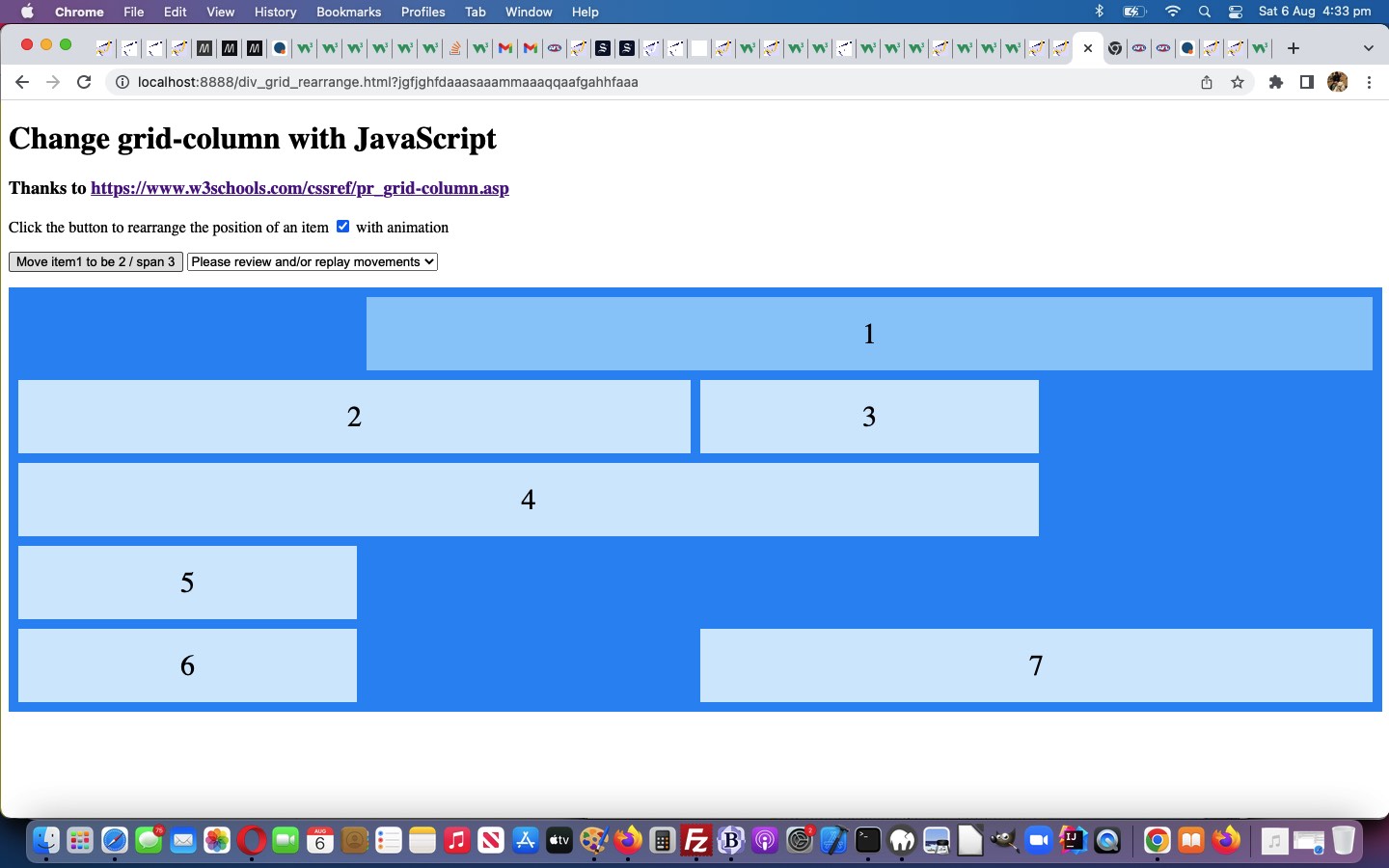
CSS @keyframes rule animations can add “pizazz” to your webpages. And, because yesterday’s CSS Grid Column Primer Tutorial‘s web application‘s actions could take place in the blink of an eye before registering “what just happened” for the user, we offer optional “pizazz” as of today. It’s amazing what CSS properties you can animate, and you can do more than one property at a time doing it! Using a second property can help clarify an explanation, as we think we are improving with the animation related Javascript function logic below …
function myFunction() {

  if (document.getElementById('cbanima').checked) {

     mmcnt++;

     if (('' + document.getElementById("myDIV" + one).style.gridColumn) == '') {

     document.getElementById('anima').innerHTML+='<style>  #' + "myDIV" + one + ' {  animation: mymove' + mmcnt + ' 2s 2; } @keyframes mymove' + mmcnt + ' { from {grid-column: ' + was[eval('' + one)] + '; background-color: rgba(255, 255, 255, 0.2);} to {grid-column: ' + rto + '; background-color: rgba(255, 255, 255, 0.8);} } </style>';

     } else {

     document.getElementById('anima').innerHTML+='<style>  #' + "myDIV" + one + ' {  animation: mymove' + mmcnt + ' 2s 2; } @keyframes mymove' + mmcnt + ' { from {grid-column: ' + ('' + document.getElementById("myDIV" + one).style.gridColumn) + '; background-color: rgba(255, 255, 255, 0.2);} to {grid-column: ' + rto + '; background-color: rgba(255, 255, 255, 0.8);} } </style>';

     }

     setTimeout(postonl, 2200);

  } else {

  document.getElementById("myDIV" + one).style.gridColumn = rto;

  if (document.getElementById("mysel").innerHTML == '') {

    document.getElementById("mysel").innerHTML+='<option value="">Please review and/or replay movements</option>';

  }

  document.getElementById("mysel").innerHTML+='<option value="' + one + ':' + rto + '">' + document.getElementById("mybut").innerHTML + '</option>';

  onl();

  }

}
… applying “on the fly” dynamic CSS styling to our changed div_grid_rearrange.html “proof of concept” CSS grid-column tester below.
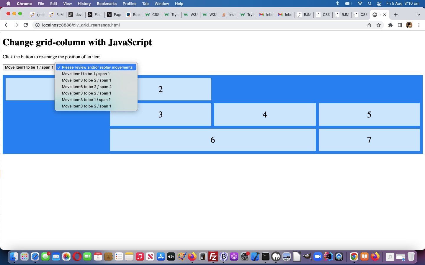
Previous relevant CSS Grid Column Primer Tutorial is shown below.
Continuing on with the theme of “HTML div element looking like an HTML table element” regarding a “grid look”, onto yesterday’s CSS Row Gap Primer Tutorial start, today we turn our attention to the CSS “grid-column” property …
The grid-column property specifies a grid item’s size and location in a grid layout, and is a shorthand property for the following properties:
grid-column-start
grid-column-end
Why the interest? Well, we’d reference yesterday’s tutorial here …
And yes, HTML div is more favoured than HTML table regarding responsive design.
… as an “interest point”, at least for us. In “table talk” these are a bit like “colspan” and “rowspan”.
In assembling today’s “proof of concept” css_row_gap_usage.html HTML/CSS parts of the design, we add a little Javascript to with the web application we thank as a major code source of inspiration, thanks.
Want to see what we mean?
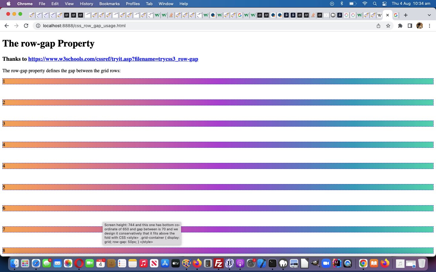
Previous relevant CSS Row Gap Primer Tutorial is shown below.
Yes, an HTML div element innerHTML content can be organized like an HTML table in a “grid” like way via CSS like …
<style>

div.grid-container {

  display: grid;

  row-gap: 50px;

}

</style>
… thanks to https://www.w3schools.com/cssref/tryit.asp?filename=trycss3_row-gap here, too!
And yes, HTML div is more favoured than HTML table regarding responsive design.
And so, yes, we thought you might be interested in our proof of concept css_row_gap_usage.html web application trying to fit some subdiv into window.innerHeight “real estate”.
And …
… we think you could also try this out for yourself, below …
If this was interesting you may be interested in this too.
If this was interesting you may be interested in this too.
If this was interesting you may be interested in this too.


