Responsive design is an important aspect to modern web design, because of the realities of the online world’s push to mobile devices, with their smaller device widths. As the W3Schools website says …
The Flexible Box Layout Module, makes it easier to design flexible responsive layout structure without having to use floats or positioning.
… and, yes, using the display: flex property is much more comprehensive a (CSS styling) concept than the float usage options web designers often relied on for this time of styling pre-CSS3.
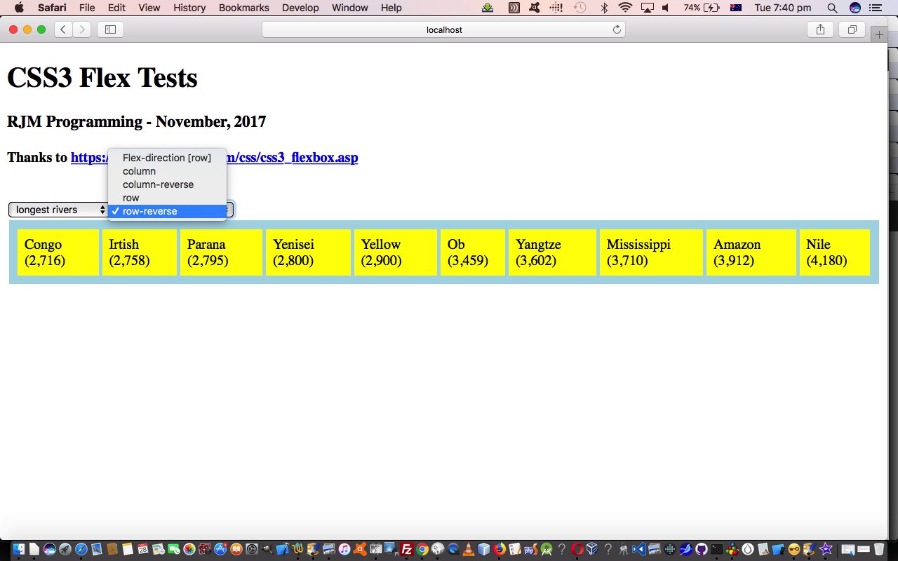
So, today, to try to show you a bit of how this new Flexbox Layout works, we write a proof of concept HTML and CSS and Javascript (source code file) you could call flextest.html offering …
- all the four CSS flex-direction property variations (row, row-reverse, column, column-reverse) are offered for user-definement in an HTML select “dropdown” element … and …
- content of the “parent” HTML element that Flexbox Layout makes sense to apply to, are also offered for user-definement (with some generic lists, which always reminds me of the genius of Paul Kelly’s Careless (whenever I think of lists))
Why not try it out with a live run link yourself.
If this was interesting you may be interested in this too.


