A change can be as good as a holiday. Right? Left Correct? Erroneofy Erroneofy … what’s that? Here, have a laugh at how even Funk and Wagnalls misspells it.
Here is a tutorial that re-introduces (see CSS3 Transformations Primer Tutorial as shown below) you to the idea that you can use CSS (CSS3) to perform image transformation and animation tasks, building on the ideas of the previous CSS3 Image Animation Primer Tutorial as shown below. One such idea is to use CSS3 @keyframes Rules (as for the 12/1/2014’s CSS3 @keyframes Rule Primer Tutorial shown way below) on web browsers (for Internet Explorer you would need Internet Explorer 10 or above). On 13/1/2014 we showed a smoother animation result using the “from” and “to” syntax with the CSS3 Animation Primer Tutorial. On 14/1/2014 we showed that smoother animation technique applied to images, and we added some sound, but this is done with HTML embed tag (ohhhh wellll). Here today, we use Javascript to move between the CSS3 transformation ideas, but the workings are CSS.
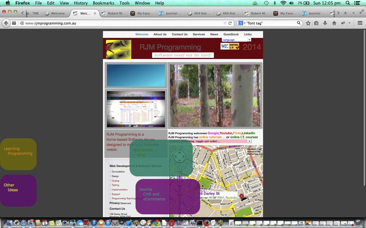
Today we practically apply it to rjmprogramming.com.au’s landing page to add a bit more colour and movement … though you may have thought that it was too busy already. However, in its defence, this new work’s HTML objects end up (and start) out of the way of the other active parts of the webpage (except perhaps on a mobile phone view) in the background areas, as the original design created via the Mac iWeb application on a laptop, has a narrow width to be more immediately friendly towards the mobile platforms. Also, it cannot be overstated how important it is to get users to understand as much as possible about what you are about on the landing page, without going overboard with the clutter. You will see other really simple and elegant web page landing pages which punch above their weight with representational meaning and, often, aesthetic pleasure … this skill by web designers is always great to see on the net.
Here are two code segments of the parts of the landing page with additional code … first goes before </style> because it represents internal CSS and the second part should go after the <body … > tag because it represents some HTML (with Javascript referenced by onclick event parameters) …
- CSS:
#mywordpressdiv
{
width:160px;
height:140px;
background:yellow;
position:absolute;
border: 5px dotted teal;
-moz-border-radius: 55px;
border-radius: 35px;
filter: alpha(opacity=80);
-moz-opacity:0.8;
-khtml-opacity: 0.8;
opacity: 0.8;
animation:myfirst 8s;
-webkit-animation:myfirst 8s; /* Safari and Chrome */
z-index:9;
}@keyframes myfirst
{
from {top:0px; left:0px; width:160px; height:300px; opacity:1.00; background:yellow;}
to {top:533px; left:620px; width:288px; height:148px; opacity:0.80; background:teal;}
}@-webkit-keyframes myfirst /* Safari and Chrome */
{
from {top:0px; left:0px; width:160px; height:300px; opacity:1.00; background:yellow;}
to {top:533px; left:620px; width:288px; height:148px; opacity:0.80; background:teal;}
}#myjoomladiv
{
width:160px;
height:140px;
top:160px;
background:pink;
position:absolute;
border: 5px dotted teal;
-moz-border-radius: 55px;
border-radius: 35px;
filter: alpha(opacity=80);
-moz-opacity:0.8;
-khtml-opacity: 0.8;
opacity: 0.8;
animation:mysecond 7s;
-webkit-animation:mysecond 7s; /* Safari and Chrome */
z-index:9;
}@keyframes mysecond
{
from {top:150px; left:0px; width:160px; height:300px; opacity:1.00; background:red;}
to {top:683px; left:620px; width:288px; height:148px; opacity:0.80; background:purple;}
}@-webkit-keyframes mysecond /* Safari and Chrome */
{
from {top:150px; left:0px; width:160px; height:300px; opacity:1.00; background:red;}
to {top:683px; left:620px; width:288px; height:148px; opacity:0.80; background:purple;}
}#mymoodlediv
{
width:160px;
height:140px;
top:320px;
background:green;
position:absolute;
border: 5px dotted teal;
-moz-border-radius: 55px;
border-radius: 35px;
filter: alpha(opacity=80);
-moz-opacity:0.8;
-khtml-opacity: 0.8;
opacity: 0.8;
animation:mythird 6s;
-webkit-animation:mythird 6s; /* Safari and Chrome */
z-index:9;
}@keyframes mythird
{
from {top:300px; left:0px; width:160px; height:300px; opacity:1.00; background:blue;}
to {top:833px; left:620px; width:288px; height:148px; opacity:0.80; background:white;}
}@-webkit-keyframes mythird /* Safari and Chrome */
{
from {top:300px; left:0px; width:160px; height:300px; opacity:1.00; background:blue;}
to {top:833px; left:620px; width:288px; height:148px; opacity:0.80; background:white;}
}#mylpdiv
{
width:160px;
height:140px;
top:480px;
background:olive;
position:absolute;
border: 5px dotted teal;
-moz-border-radius: 55px;
border-radius: 35px;
filter: alpha(opacity=80);
-moz-opacity:0.8;
-khtml-opacity: 0.8;
opacity: 0.8;
animation:myfourth 5s;
-webkit-animation:myfourth 5s; /* Safari and Chrome */
z-index:9;
}@keyframes myfourth
{
from {top:450px; left:0px; width:160px; height:300px; opacity:1.00; background:silver;}
to {top:983px; left:620px; width:288px; height:148px; opacity:0.80; background:orange;}
}@-webkit-keyframes myfourth /* Safari and Chrome */
{
from {top:450px; left:0px; width:160px; height:300px; opacity:1.00; background:silver;}
to {top:983px; left:620px; width:288px; height:148px; opacity:0.80; background:orange;}
}#myoidiv
{
width:160px;
height:140px;
top:640px;
background:purple;
position:absolute;
border: 5px dotted teal;
-moz-border-radius: 55px;
border-radius: 35px;
filter: alpha(opacity=80);
-moz-opacity:0.8;
-khtml-opacity: 0.8;
opacity: 0.8;
animation:myfifth 4s;
-webkit-animation:myfifth 4s; /* Safari and Chrome */
z-index:9;
}@keyframes myfifth
{
from {top:600px; left:0px; width:160px; height:300px; opacity:1.00; background:darkgray;}
to {top:1133px; left:620px; width:288px; height:148px; opacity:0.80; background:pink;}
}@-webkit-keyframes myfifth /* Safari and Chrome */
{
from {top:600px; left:0px; width:160px; height:300px; opacity:1.00; background:darkgray;}
to {top:1133px; left:620px; width:288px; height:148px; opacity:0.80; background:pink;}
}
- HTML (in actuality all window.open calls below are windowopen Javascript function calls … due to cross-browser issues):
    <div title='Wordpress Blog' id='mywordpressdiv' onclick='window.open("http://www.rjmprogramming.com.au/wordpress/","_blank");'><br><br><p style="font-family:verdana;color:green;font-size:18px;">   Wordpress<br>      Blog</p></div>

    <div title='Joomla CMS and eCommerce' id='myjoomladiv' onclick='window.open("http://www.rjmprogramming.com.au/myfavourites/","_blank"); windowopen("http://www.rjmprogramming.com.au/vmcommerce/","_blank");'><br><br><p style="font-family:verdana;color:teal;font-size:18px;">   Joomla<br>      CMS and<br>      eCommerce</p></div>

    <div title='Moodle Course Design' id='mymoodlediv' onclick='window.open("http://rjmprogramming.com.au/moodle20/","_blank");'><br><br><p style="font-family:verdana;color:pink;font-size:18px;">   Moodle<br>      Course<br>      Design</p></div>

    <div title='Learning Programming' id='mylpdiv' onclick='window.open("http://www.rjmprogramming.com.au/Learning/Programming/?isMobile=n","_blank");'><br><br><p style="font-family:verdana;color:orange;font-size:18px;">   Learning<br>    Programming</p></div>

    <div title='Other Ideas' id='myoidiv' onclick='window.open("http://www.rjmprogramming.com.au/About_Us.html","_blank");'><br><br><p style="font-family:verdana;color:yellow;font-size:18px;">   Other<br>      Ideas</p></div>
Hope the tutorial’s live run (ie. landing page) offers food for thought about the ideas above in their practical application.
Previous relevant CSS3 Transformations Primer Tutorial is shown below.
Here is a tutorial that introduces you to the idea that you can use CSS (CSS3) to perform image transformation tasks, building on the ideas of the previous CSS3 Image Animation Primer Tutorial as shown below. One such idea is to use CSS3 @keyframes Rules (as for the 12/1/2014’s CSS3 @keyframes Rule Primer Tutorial shown way below) on web browsers (for Internet Explorer you would need Internet Explorer 10 or above). On 13/1/2014 we showed a smoother animation result using the “from” and “to” syntax with the CSS3 Animation Primer Tutorial. On 14/1/2014 we showed that smoother animation technique applied to images, and we added some sound, but this is done with HTML embed tag (ohhhh wellll). Here today, we use Javascript to move between the CSS3 transformation ideas, but the workings are CSS.
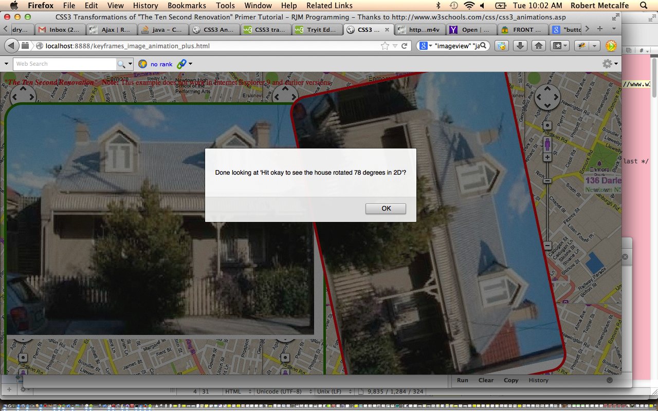
So the transformation words of interest are “rotate”, “scale”, “translate”, “skew” and “matrix”.
As mentioned in the tutorial WordPress CSS Change helped by Firebug Primer Tutorial CSS works with static scenarios where you can define everything ahead of time, with no new dynamic resources, but the effect of animation can make it seem that dynamic things are going on, and can add great interest to your websites.
In addition to the links of the 14/1/2014, 13/1/2014 and 12/1/2014, the tutorials and resources here were very useful (thanks):
The Gimp Old Photo Tutorial would assist should you be interested in (digital) sepia toning (of photographs).
Here is a link to some downloadable HTML programming source code which you may want to rename to keyframes_image_animation_plus.html
And here is a live run.
Previous CSS3 Image Animation Primer Tutorial is shown below.
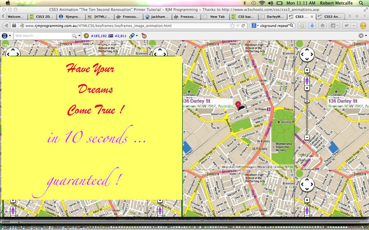
Here is a tutorial that introduces you to the idea that you can use CSS (CSS3) to perform image animation tasks. One such idea is to use CSS3 @keyframes Rules (as for the day before yesterday’s CSS3 @keyframes Rule Primer Tutorial shown way below) on web browsers (for Internet Explorer you would need Internet Explorer 10 or above). Yesterday we showed a smoother animation result using the “from” and “to” syntax with the CSS3 Animation Primer Tutorial. Today we show that smoother animation technique applied to images, and we add some sound, but this is done with HTML embed tag (ohhhh wellll).
As mentioned in the tutorial WordPress CSS Change helped by Firebug Primer Tutorial CSS works with static scenarios where you can define everything ahead of time, with no new dynamic resources, but the effect of animation can make it seem that dynamic things are going on, and can add great interest to your websites.
In addition to the links of yesterday’s tutorial, and the day before, the tutorials and resources here were very useful (thanks):
- CSS3 Animation
- CSS3 2D Transforms
- Freesound.org – "Sound FX – Jackhammer.wav" by fauxpress
- HTML <embed> Tag
- Google Maps (help with background image)
The Gimp Old Photo Tutorial would assist should you be interested in (digital) sepia toning (of photographs).
Here is a link to some downloadable HTML programming source code which you may want to rename to keyframes_image_animation.html
And here is a live run.
Previous CSS3 Animation Primer Tutorial is shown below.
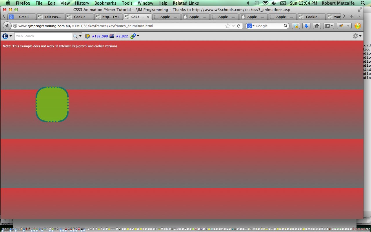
Here is a tutorial that introduces you to the idea that you can use CSS (CSS3) to perform animation tasks. One such idea is to use CSS3 @keyframes Rules (as for yesterday’s CSS3 @keyframes Rule Primer Tutorial shown below) on web browsers (for Internet Explorer you would need Internet Explorer 10 or above). Today we show a smoother animation result using the “from” and “to” syntax.
As mentioned in the tutorial WordPress CSS Change helped by Firebug Primer Tutorial CSS works with static scenarios where you can define everything ahead of time, with no new dynamic resources, but the effect of animation can make it seem that dynamic things are going on, and can add great interest to your websites.
In addition to the links of yesterday’s tutorial the tutorial here was very useful (thanks):
Here is a link to some downloadable HTML programming source code which you may want to rename to keyframes_animation.html
And here is a live run.
Previous CSS3 @keyframes Rule Primer Tutorial is shown below.
Here is a tutorial that introduces you to the idea that you can use CSS (CSS3) to perform animation tasks. One such idea is to use CSS3 @keyframes Rules on web browsers (for Internet Explorer you would need Internet Explorer 10 or above).
As mentioned in the tutorial WordPress CSS Change helped by Firebug Primer Tutorial CSS works with static scenarios where you can define everything ahead of time, with no new dynamic resources, but the effect of animation can make it seem that dynamic things are going on, and can add great interest to your websites. You could try your animations right in front (the distance being inversely proportional to your regard for your regal beasting) of your cat (no cat … try origami … but the results are unpredictable).
Useful tutorials for the contents here (thanks) were:
Here is a link to some downloadable HTML programming source code which you may want to rename to keyframes_test.html
And here is a live run.
If this was interesting you may be interested in this too.
If this was interesting you may be interested in this too.
If this was interesting you may be interested in this too.
If this was interesting you may be interested in this too.
If this was interesting you may be interested in this too.


18 Responses to CSS3 Landing Page Primer Tutorial