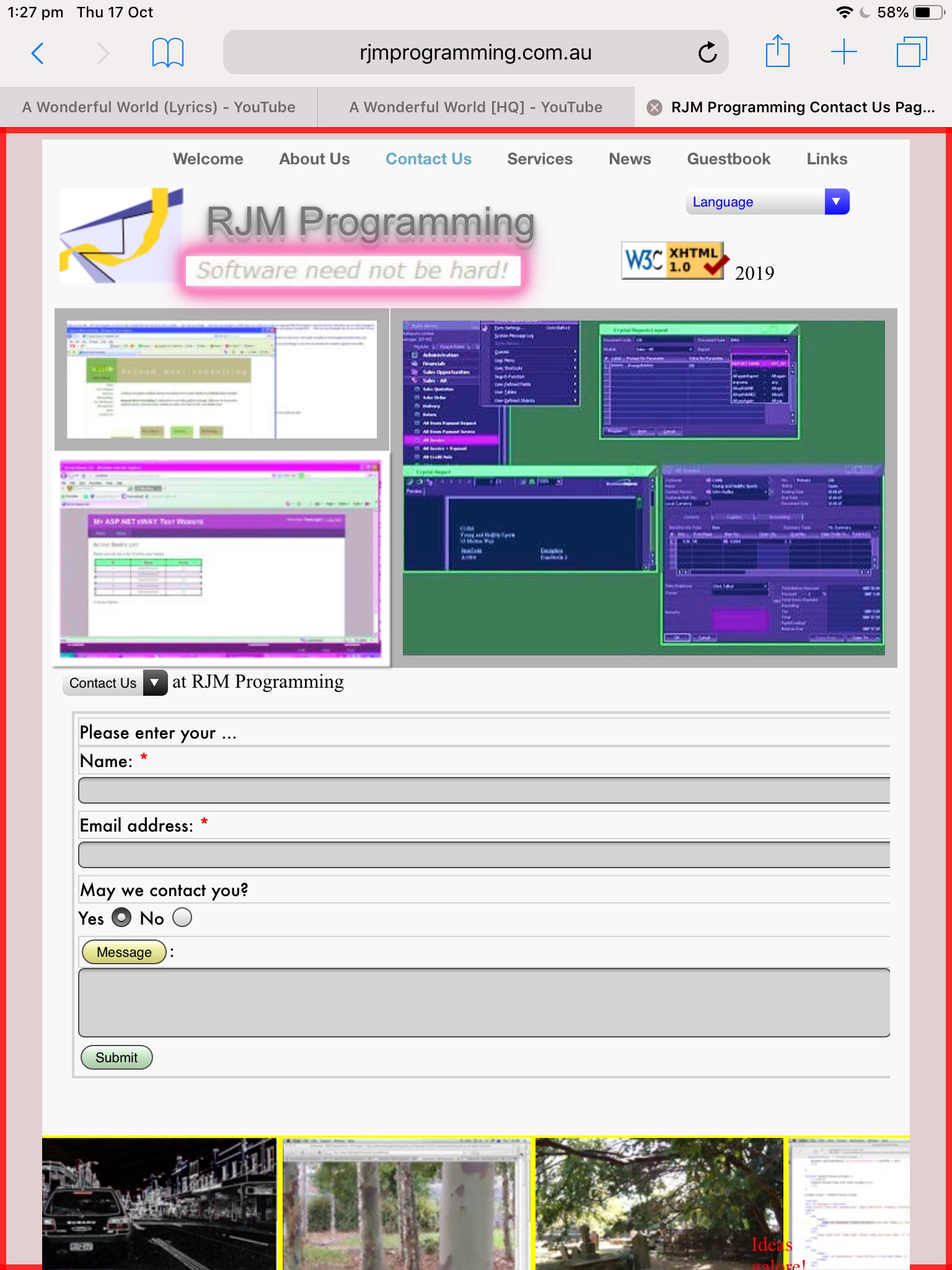
Take a look at the CSS styling snippet below …
<style>


.glow {

  -webkit-animation: glow 1s ease-in-out infinite alternate;

  -moz-animation: glow 1s ease-in-out infinite alternate;

  animation: glow 1s ease-in-out infinite alternate;

  }


/* Thanks to https://www.w3schools.com/howto/tryit.asp?filename=tryhow_css_glowing_text */


@-webkit-keyframes glow {

  from {

    box-shadow: 0 0 3px #fff, 0 0 5px #fff, 0 0 37px #e60073, 0 0 9px #e60073, 0 0 11px #e60073, 0 0 13px #e60073, 0 0 15px #e60073;

  }


  to {

    box-shadow: 0 0 24px #fff, 0 0 6px #ff4da6, 0 0 8px #ff4da6, 0 0 10px #ff4da6, 0 0 12px #ff4da6, 0 0 14px #ff4da6, 0 0 16px #ff4da6;

  }

}


@media only screen and (max-width: 768px) {

  #widget2 {

  -webkit-animation: glow 5s ease-in-out infinite alternate;

  -moz-animation: glow 5s ease-in-out infinite alternate;

  animation: glow 5s ease-in-out infinite alternate;

  }

}


@media only screen and (max-width: 480px) {

  #widget2 {

  -webkit-animation: glow 4s ease-in-out infinite alternate;

  -moz-animation: glow 4s ease-in-out infinite alternate;

  animation: glow 4s ease-in-out infinite alternate;

  }

}


@media only screen and (max-width: 320px) {

  #widget2 {

  -webkit-animation: glow 3s ease-in-out infinite alternate;

  -moz-animation: glow 3s ease-in-out infinite alternate;

  animation: glow 3s ease-in-out infinite alternate;

  }

}

</style>
Apart from the “glow” ideas we last talked about with WordPress Blog TwentyTen Theme Glow Tutorial, that being the “what” of what we are doing, “where” are we applying it? Anyone, anyone? Yes, Casper Brindle, we’re differentiating “what” to do by device width.
And the “@” in CSS indicates a “rule”. So … yes, Casper Brindle? Indeed, they are called CSS @media Rules but no, Casper, it does not cover “Netflix After 10” rules, OK?
And so, on our RJM Programming Landing Page set of HTML/Javascript/CSS “Software Need Not Be Hard” will glow for a lot of mobile users, and very few laptop users. As you can imagine, the use of such CSS can be invaluable.
If this was interesting you may be interested in this too.


