Pretty obviously, its’s not just your more sophisticated graphical editors, as with Gimp Vignette Primer Tutorial that are capable of vignetting a photograph, the example task for today’s tutorial.
For your iOS mobile devices like the iPad and iPhone, on the way to sharing that photograph, and today’s tutorial title dedicates itself to the idea of Email Sharing, but there are many more Sharing options than Email with iOS mobile devices. These days, on the way to that Sharing with recent iOS versions you will see an “Edit” link or “Edit Photo” link that can take you to an image editor on the way through to Sharing, meaning that …
- tap Camera icon
- set Photo mode
- take photo with round white button click
- tap the “Photo taken” icon
- tap “Edit” link
- edit your photo … and today’s work is the last one … Vignette 100% … as shown in today’s PDF presentation
- tap “Done” link
- choose a Sharing option such as Email to continue sharing your Adjusted photo with someone
- Auto
- Exposure
- Brilliance
- Highlights
- Shadows
- Contrast
- Brightness
- Black Point
- Saturation
- Vibrance
- Warmth
- Sharpness
- Definition
- Noise Reduction
- Vignette
- Open Gimp graphical editor application
- File->Open … pick your image file
- Layer->New Layer (we’ll call “Vg”) … pick Foreground Colour
- In the Layers dialog, click on your “Vg” layer to select it, and select Soft light from the “Mode” drop-down box
- Right click on your “Vg” layer and go to Add Layer Mask. In the dialog that pops up, you want “Initialise Layer Mask to” set to “White (full opacity)”. Click “Add”
- Below Opacity bar select Link icon next to Eye icon, which will already be showing
- Use the freeform select tool (press F to bring this up) and draw a selection somewhere around the primary point of interest in your photo
- Use your bucket tool (Shift+B) and click within the selection to fill it
- Deselect your selection with Select->None
- Go to Filters->Blur->Gaussian Blur. In the dialog that comes up, you want “Radius” set to a very large amount; a tenth of the longest edge of the photo is not too much
- Click on your “Vg” layer to select it (if it isn’t already selected), and then slide the opacity slider towards the right until the effect is subtle enough. Our (ever so subtle) example of Nala, in the tutorial, used an opacity of about 66%
- Click Export button in two windows (NB. this overwrites the image file, so if this is not desirable, export to a different image file name and/or type)
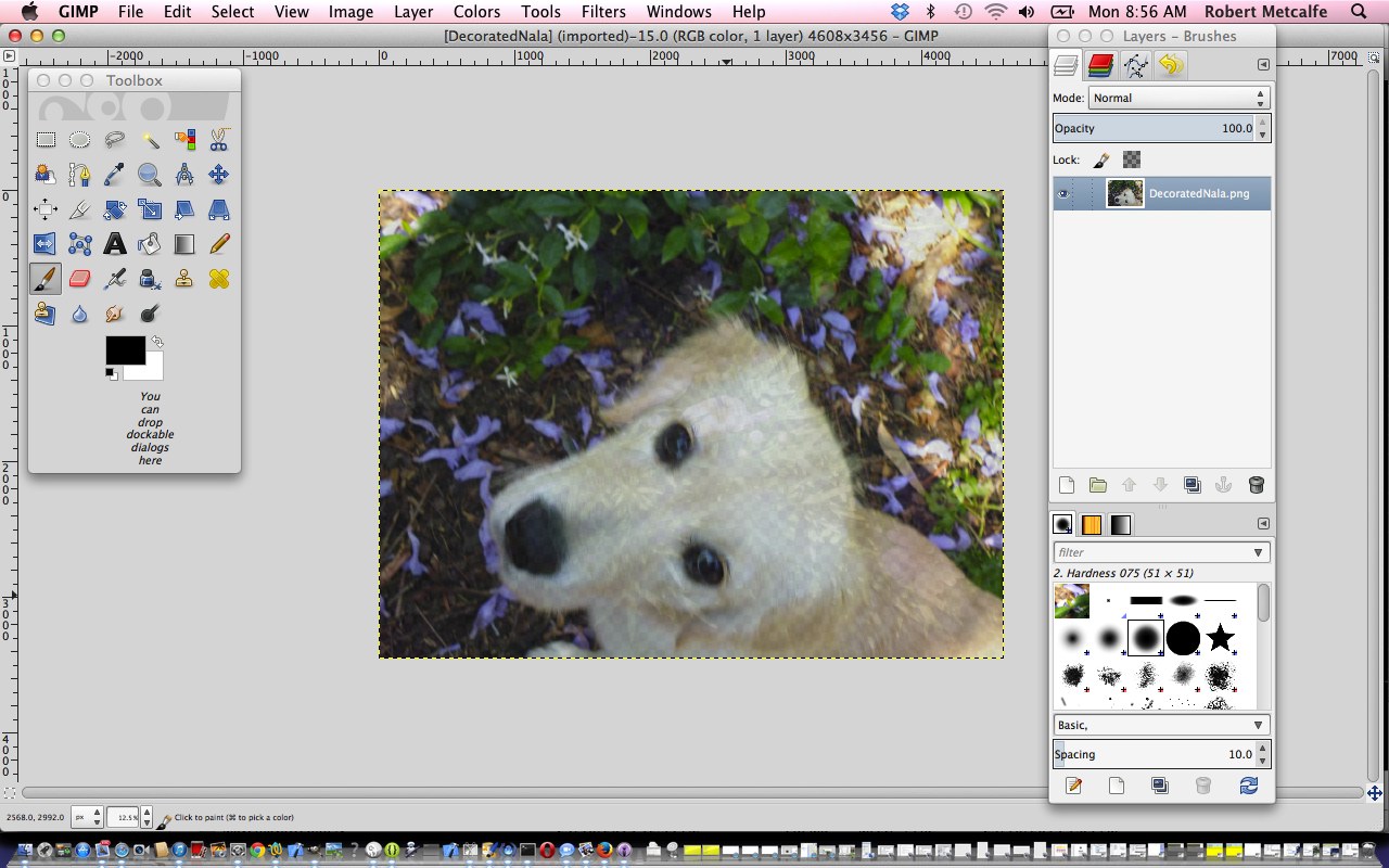
- Open Gimp graphical editor application
- File->Open Layers … pick your image file
- If Layers window not showing, make it show via Windows->Layers – Brushes
- Below Opacity bar select Link icon next to Eye icon, which will already be showing
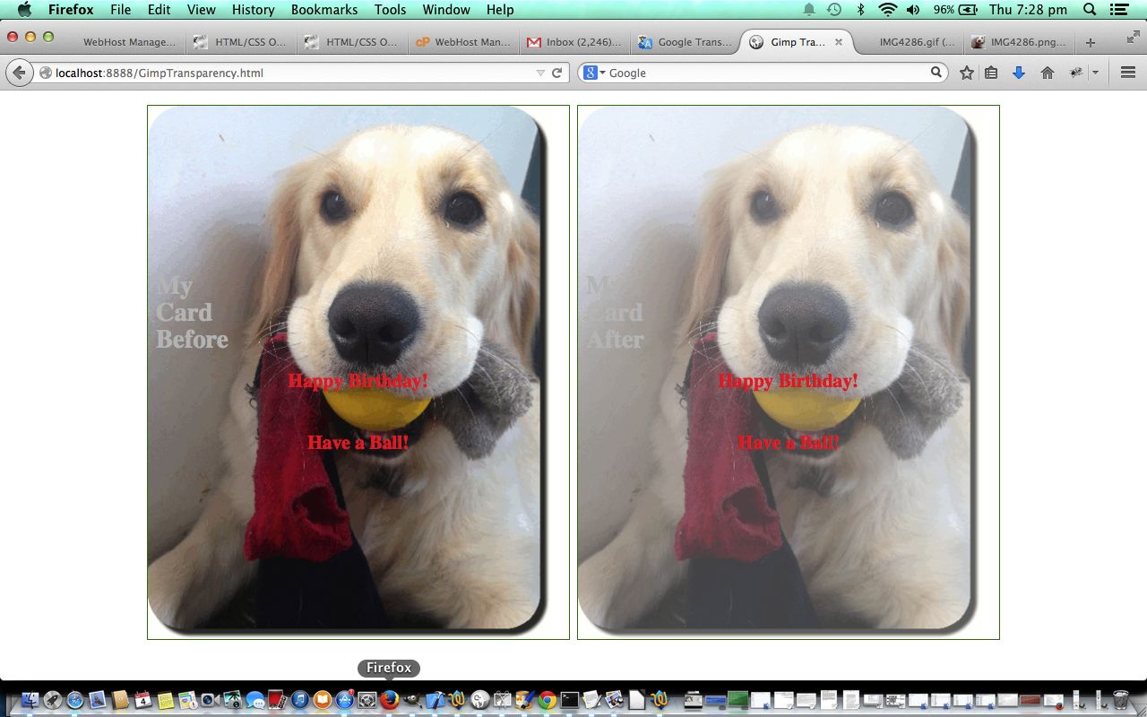
- Change Opacity bar setting to a value of Transparency (100% is Opaque, 0% is Transparent) that suits … today we do 70%
- File->Export
- Click Export button in two windows (NB. this overwrites the image file, so if this is not desirable, export to a different image file name and/or type)
… to edit and fix on the run! After all, you can join the …
Everyone's a critic
… crowd, but get in ahead of the game, being your own critic before others do?! Cute functionality, huh?!
The iOS edit options for iOS 13.7 are …
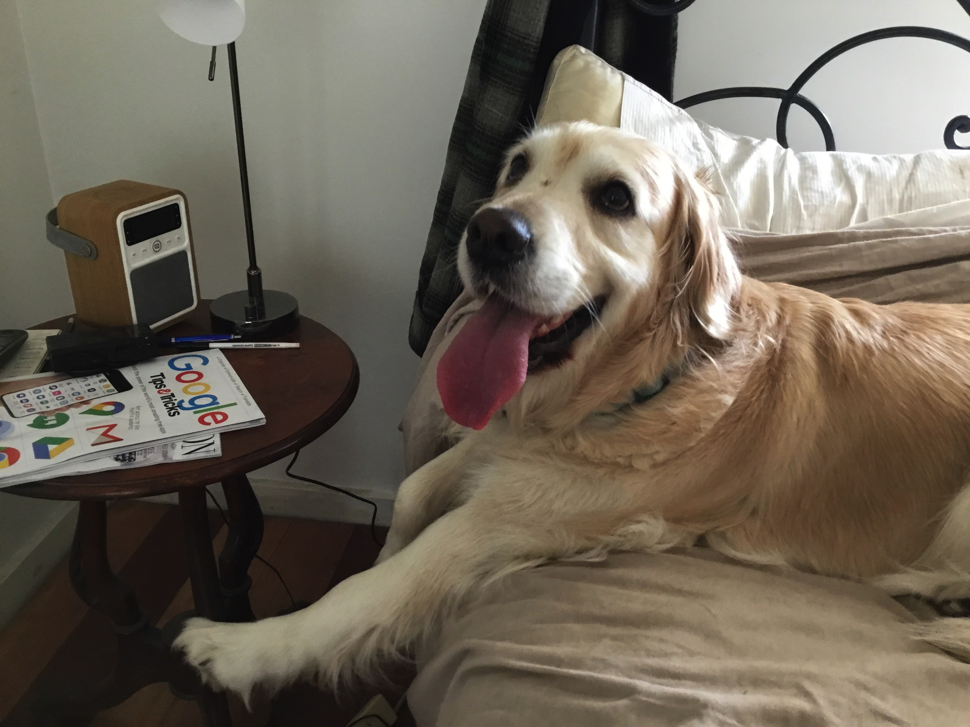
… and we’ll leave you with a before and after (vignette) of Nala …
| Before | After |
|---|---|
 |
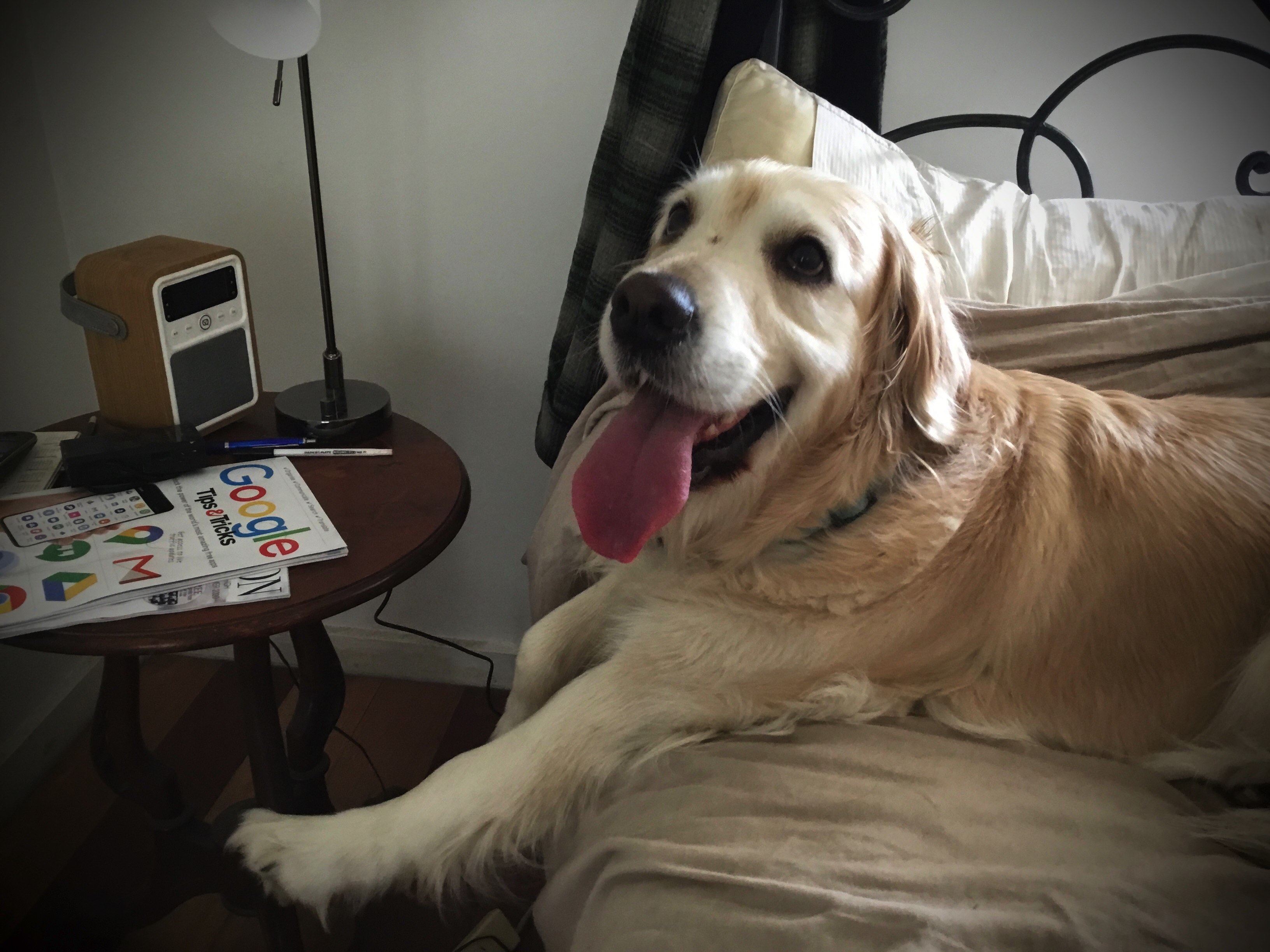 |
Previous relevant Gimp Vignette Primer Tutorial is shown below.
The last time we talked about the miraculous, redolent and amazing image editor called Gimp am sure there was someone in a shower … it stands to reason … and one of those showerers, surely, would have been singing The Gimp Song … and if not … why not? … but we digress … anyway we had the Gimp Transparency Primer Tutorial as shown below go into some image transparency issues with Gimp.
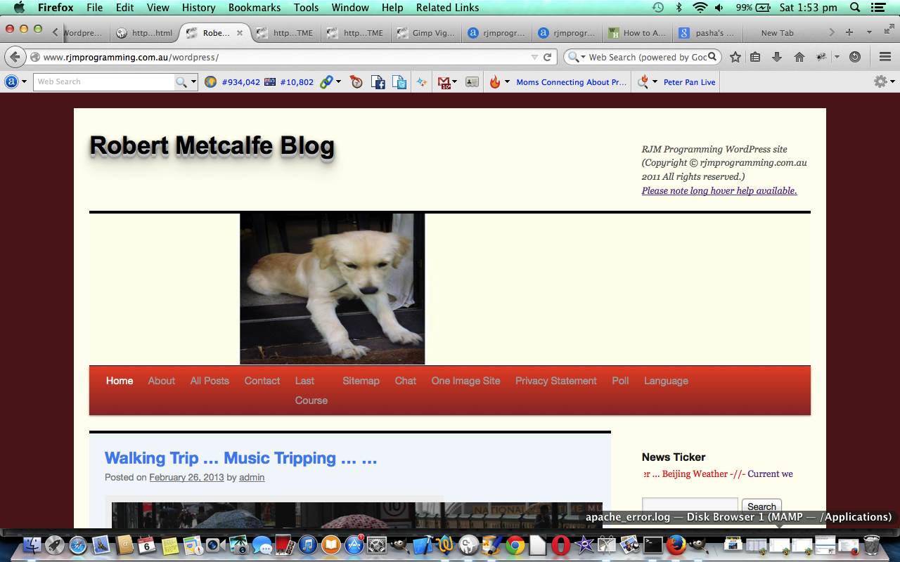
In today’s tutorial we make use of a great tutorial (even so far as with direct quotes below) called Add a Vignette to a Photograph with GIMP (thanks) to try a photographic technique called vignetting on one of the photographs we added, recently, into the mix of those of the Custom Header Image mix at this blog … specifically the one of Nala, the dog, on the door ledge. Need to warn you here and now that if there was the time all over again, it would be better achieved that second time around, but this is not the point with learning, but rather getting some starting point with a great “product” like Gimp, and trying it yourself, once you have a method. It boils down to:
Here is an image comparison link.
As with most Gimp ideas, jump in and give it a go, as you’ll find your own ways and means of using this great product … am pretty sure.
Link to Gimp “spiritual home” … here.
Link to Gimp forum … here.
Previous relevant Gimp Transparency Primer Tutorial is shown below.
Here is a tutorial that adds to a previous Gimp Layers Primer Tutorial as shown below, and gives you more insight into the massive possibilities of using a sophisticated image editor and use layers with various amounts of transparency, especially suited to use with png image files.
Today’s tutorial where we construct a Birthday Card that needs tweaking for the words in front to be seen a bit more clearly, by making the image behind a bit more transparent, changes the transparency of a single image via:
As with most Gimp ideas, jump in and give it a go, as you’ll find your own ways and means of using this great product … am pretty sure.
Link to Gimp “spiritual home” … here.
Link to Gimp forum … here.
Previous relevant Gimp Layers Primer Tutorial is shown below.
Here is a tutorial that gives you an insight into the massive possibilities of using a sophisticated image editor and use layers with various amounts of transparency, especially suited to use with png image files.
Transparency (or its obverse, opacity) can be used to have the one image achieve several “ends” (ie. purposes). Although it is a bit of a clumsy example in the tutorial, you can see that the technique can be used for artistic purposes … often called “Photoshopping” (named after the more famous, and also brilliant, rival product, Photoshop).
Lots of those classic “Photoshopping” techniques can be achieved in Gimp, and some other tutorials at this blog touch on that.
Am sure you can imagine what the concept of a layer is with regard to image manipulation. Within Gimp, for beginners not used to this concept, you find yourself underestimating and underplaying what can be achieved with the various layers of a multi-layered image. In simplistic terms each layer has the functionality in Gimp to be treated as a whole new image, and this is the best way to think of it when trying to achieve what you want to achieve with Gimp.
Link to Gimp “spiritual home” … here.
Link to Gimp forum … here.
If this was interesting you may be interested in this too.
If this was interesting you may be interested in this too.
If this was interesting you may be interested in this too.
If this was interesting you may be interested in this too.

