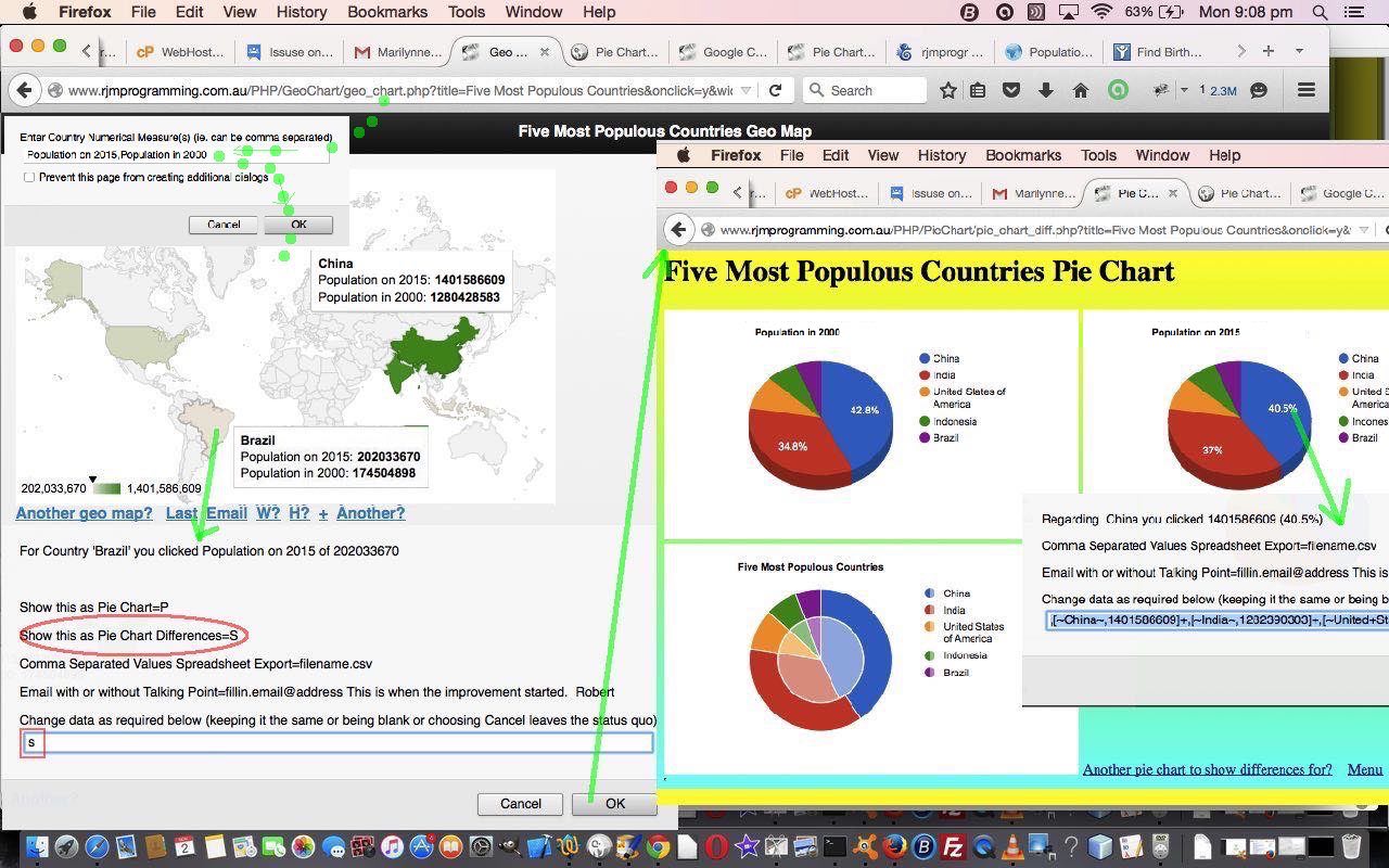
Our Google Graphs API, or Google Chart Tools, web and mobile applications changes today are specific, so far, to the Google Charts Geo Chart and its relationship with the Pie Chart and Pie Chart Differences (really specifically), as intimated in yesterday’s Google Chart Onclick Pie Chart Differences Tutorial as shown below, allowing for onclick functionality to be added for …
- Geo Chart (and its synergies with)
- Pie Chart (data wise) and Pie Chart Differences (for trend analysis, perhaps)
So we offer a conversion from Geo Chart to Pie Chart, and Pie Chart Differences, when the Geo Chart data has two numerical data types defined, but we’ve baulked at the likelihood of the reverse being very applicable.
These Google Chart Geo and Pie Chart changes involved …
- geo_chart.php is the changed PHP programming source code as per changes
- pie_chart_diff.php (as of yesterday) is the changed PHP programming source code as per changes (from before yesterday)
We think ideas like this can help with trend analysis, and we may be adding sophistication to this over time.
Link to Google Chart Tools “spiritual home” … via Google.
Link to Google Chart Tools Geo Chart information … via Google.
Link to Google Chart Tools Pie Chart information … via Google.
Link to Google Chart Tools Diff Charts information … via Google.
We’d like to thank Worldometers for the interesting population data.
This extra functionality, available via the suffix “&onclick=y” applied to the Google Chart Geo and Pie and Pie Differences Chart titles, flow on directly to the iPad iOS App we created and talked about, last, with Xcode Swift iOS Application End Game Primer Tutorial.
So please try creating your own emailable Google Chart live run for …
Previous relevant Google Chart Onclick Pie Chart Differences Tutorial is shown below.
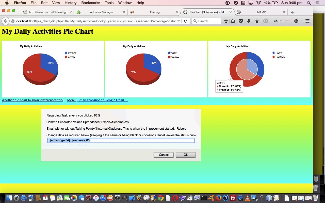
Our Google Graphs API, or Google Chart Tools, web and mobile applications changes today are specific, so far, to the Google Charts Pie Chart Differences, building on recent work such as yesterday’s Google Chart Select Event Geo Pie Synergy Tutorial as shown below, allowing for onclick functionality to be added for …
- Pie Chart Differences
… in the sense that there is a known limitation with this chart using the preferred Google Chart “select” event.
You will understand from this, that the mechanisms by which Google Charts works differs from chart to chart, and, especially regarding event programming, and the display options, every chart should be considered to be “a different kettle of fish”.
Tomorrow we want to relate this chart in a more useful way to the Geo Chart, but that is (probably) for tomorrow.
In the meantime these Google Chart Pie Chart Difference changes involved …
- pie_chart_diff.php is the changed PHP programming source code as per changes
Link to Google Chart Tools “spiritual home” … via Google.
Link to Google Chart Tools Diff Charts information … via Google.
This extra functionality, available via the suffix “&onclick=y” applied to the Google Chart Pie Chart Differences title, flows on directly to the iPad iOS App we created and talked about, last, with Xcode Swift iOS Application End Game Primer Tutorial.
So please try creating your own emailable Google Chart live run for …
Previous relevant Google Chart Select Event Geo Pie Synergy Tutorial is shown below.
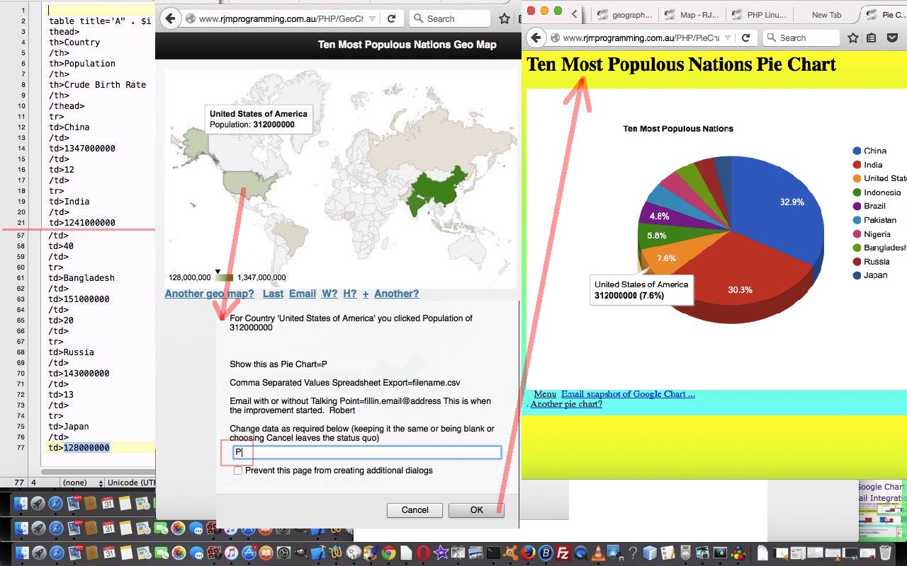
Our Google Graphs API, or Google Chart Tools, web and mobile applications changes today are specific, so far, to the Google Charts Geo Chart and its relationship with the Pie Chart, building on recent work such as yesterday’s Google Chart Select Event Map Overlay Lines Tutorial as shown below, allowing for onclick functionality to be added for …
- Geo Chart (and its synergies with)
- Pie Chart (data wise)
So we offer a conversion from Geo Chart to Pie Chart, but we’ve baulked at the likelihood of the reverse being very applicable.
These Google Chart Geo and Pie Chart changes involved …
- geo_chart.php is the changed PHP programming source code as per changes
- pie_chart.php is the changed PHP programming source code as per changes
- csv.php is the changed CSV spreadsheet export functionality supervised PHP programming source code as per changes
Link to Google Chart Tools “spiritual home” … via Google.
Link to Google Chart Tools Geo Chart information … via Google.
Link to Google Chart Tools Pie Chart information … via Google.
This extra functionality, available via the suffix “&onclick=y” applied to the Google Chart Geo Chart title, flows on directly to the iPad iOS App we created and talked about, last, with Xcode Swift iOS Application End Game Primer Tutorial.
So please try creating your own emailable Google Chart live run for …
Previous relevant Google Chart Select Event Map Overlay Lines Tutorial is shown below.
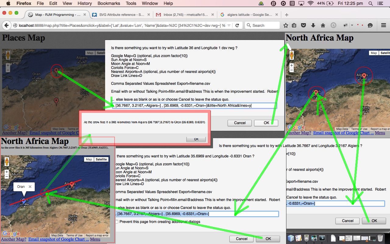
Our Google Graphs API, or Google Chart Tools, web and mobile applications changes today are specific, so far, to the Google Charts Map Chart, building on yesterday’s Google Chart Select Event Cache Issue Tutorial as shown below, allowing for the concept of drawing link lines overlayed onto the …
- Map Chart
… adding to our …
- “overlay” blog postings
- study of HTML SVG elements
- the “where” feel of our geographical themed blog postings
The CSS “overlay” usual suspects coming into play were …
- position:absolute property
- z-index
And what function do we allow once the SVG line is there, overlayed, in place, ready to be hovered over or clicked? We calculate a crow flying distance via …
function great_circle_distance(talis, gnolis, latis, longis) {

  var ourdist=0.0;

  var rgnol=eval((gnolis) * Math.PI / 180.0);

  var rtal=eval((talis) * Math.PI / 180.0);

  var rlong=eval((longis) * Math.PI / 180.0);

  var rlat=eval((latis) * Math.PI / 180.0);

  var deltalong = Math.abs(eval(((gnolis)-(longis)) * Math.PI / 180.0));

  var acof = eval(Math.sin(rtal) * Math.sin(rlat)) + (Math.cos(rtal) * Math.cos(rlat) * Math.cos(deltalong)); // via http://en.wikipedia.org/wiki/Great-circle_distance ... thanks

  ourdist = eval(Math.round((Math.acos(acof) * 6371000.0) + 0.00001) * 100) / 100;

  return ourdist;

}
These Google Chart Map Chart changes involved …
Link to Google Chart Tools “spiritual home” … via Google.
Link to Google Chart Tools Map Chart information … via Google.
This extra functionality, available via the suffix “&onclick=y” applied to the Google Chart Map title, flows on directly to the iPad iOS App we created and talked about, last, with Xcode Swift iOS Application End Game Primer Tutorial.
So please try creating your own emailable Google Chart live run for …
and/or
See this functionality in action applied to two of our recent blog postings …
- HTML/Javascript Where Does It Get Me To Primer Tutorial live run uses HTML/Javascript programming source code distance_from.html (changed as per distance_from.html for overlay line functionality)
- PHP Modularization for Lighthouses in Australia Tutorial live run uses PHP programming source code http://www.rjmprogramming.com.au/PHP/australian_lighthouses.php (changed as per distance_from.html for overlay line functionality)
Previous relevant Google Chart Select Event Cache Issue Tutorial is shown below.
We’re still trying for yet more “genericity” with our Google Graphs API, or Google Chart Tools, web and mobile applications today, building on yesterday’s Google Chart Select Event Email Integration Tutorial as shown below, with integration involving email, yesterday more for non-mobile usage and today, more for mobile platform usage, that we first tried on our recent “guinea pig” “guinea fowl” (so yesterday) “guinea baboon” functionalities (of recent times) …
- Area Chart
- Bar Chart (and Bar Chart Differences)
- Column Chart (and Column Chart Differences)
- Line Chart
- Map Chart
- Pie Chart
It probably comes as no surprise that chart data can be a great conversation starter for meetings or online discussions conducted via email, for example. They say “a picture tells a thousand words” … MMM look at that pie chart over yonder … see … three thousand words … chortle, chortle.
Do you remember yesterday? …
We use mailto links to direct the user to their default client mail supervisors to make all this happen. You will find, with PHP, that you can email without this client email via the use of the mail method.
… Well, our concentration on mailto (that works fine on non-mobile platforms) needed to be balanced with some mobile platform consideration that uses that PHP mail method, so as not to navigate too far away in our iOS app’s WebView.
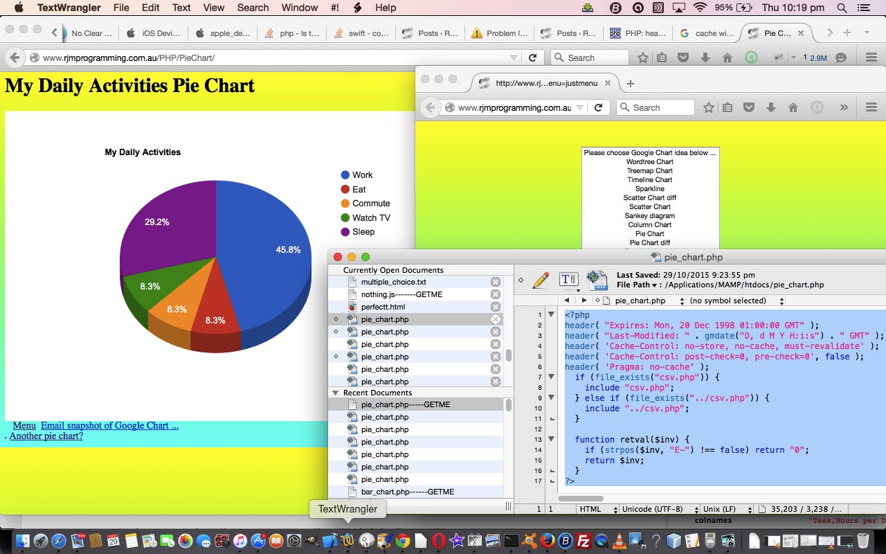
And we did some work with Google Chart Pie Charts today to add “select” event functionality, and to try to stop it using the cache, as we want the iOS app reflect changes we make to things, and be able to let the iOS app user recover from an unforseen problem exacerbated by the return to a bad caching scenario.
We found good advice about this cache issue at this useful link, so, thanks. You may read from this page that there is an HTML meta tag approach to this, but we prefer a PHP approach, and use, up the top of the PHP the code snippet …
header( "Expires: Mon, 20 Dec 1998 01:00:00 GMT" );

header( "Last-Modified: " . gmdate("D, d M Y H:i:s") . " GMT" );

header( 'Cache-Control: no-store, no-cache, must-revalidate' );

header( 'Cache-Control: post-check=0, pre-check=0', false );

header( 'Pragma: no-cache' );
… you will find up the top of the PHP pie_chart.php programming source code.
These Google Chart Pie/Line/Bar/Area/Column/Map Chart changes involved …
- area_chart.php is the changed PHP programming source code as per changes
- bar_chart.php (bar_chart_diff.php) is the changed PHP programming source code as per changes (and changes)
- column_chart.php (column_chart_diff.php) is the changed PHP programming source code as per changes (and changes)
- line_chart.php is the changed PHP programming source code as per changes
- map.php is the changed PHP programming source code as per changes
- pie_chart.php is the changed PHP programming source code as per changes
Link to Google Chart Tools “spiritual home” … via Google.
Link to Google Chart Tools Area Chart information … via Google.
Link to Google Chart Tools Bar Chart information … via Google.
Link to Google Chart Tools Column Chart information … via Google.
Link to Google Chart Tools Line Chart information … via Google.
Link to Google Chart Tools Map Chart information … via Google.
Link to Google Chart Tools Pie Chart information … via Google.
This extra functionality, available via the suffix “&onclick=y” applied to the Google Chart Area and Bar and Column and Line and Map and Pie Chart title, flows on directly to the iPad iOS App we created and talked about, last, with Xcode Swift iOS Application End Game Primer Tutorial.
So please try creating your own emailable Google Chart live runs for …
No guinea pigs (nor guinea fowl, nor guinea baboons) were harmed in the making of this blog post. Honest, hen!
Previous relevant Google Chart Select Event Email Integration Tutorial is shown below.
We’re still trying for yet more “genericity” with our Google Graphs API, or Google Chart Tools, web and mobile applications today (as with WordPress 4.1.1’s Google Chart Select Event Email Integration Tutorial), building on yesterday’s Google Chart Select Event Spreadsheet Integration Tutorial as shown below, with integration involving email, that we are first trying on our recent “guinea pig” “guinea fowl” functionalities (of recent times) …
- Area Chart
- Bar Chart (and Bar Chart Differences)
- Column Chart (and Column Chart Differences)
- Line Chart
- Map Chart
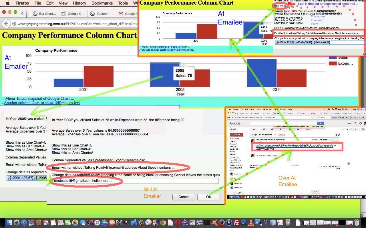
It probably comes as no surprise that chart data can be a great conversation starter for meetings or online discussions conducted via email, for example. They say “a picture tells a thousand words” so imagine how many a “chart” tells?!
So today we make use of the fact that for small amounts of data the Google Charts can be shared via the emailing of a URL link as the body of an email. For larger amounts of data we may have to think some more into the future, though we’re half ready because …
- we are using a server side language, PHP … which means that …
- the $_POST[] mentions in our PHP code can eventually be put to good use here, down the track
These Google Chart Line/Bar/Area/Column/Map Chart changes involved …
- area_chart.php is the changed PHP programming source code as per changes
- bar_chart.php (bar_chart_diff.php) is the changed PHP programming source code as per changes (and changes)
- column_chart.php (column_chart_diff.php) is the changed PHP programming source code as per changes (and changes)
- line_chart.php is the changed PHP programming source code as per changes
- map.php is the changed PHP programming source code as per changes
We use mailto links to direct the user to their default client mail supervisors to make all this happen. You will find, with PHP, that you can email without this client email via the use of the mail method.
Link to Google Chart Tools “spiritual home” … via Google.
Link to Google Chart Tools Area Chart information … via Google.
Link to Google Chart Tools Bar Chart information … via Google.
Link to Google Chart Tools Column Chart information … via Google.
Link to Google Chart Tools Line Chart information … via Google.
Link to Google Chart Tools Map Chart information … via Google.
This extra functionality, available via the suffix “&onclick=y” applied to the Google Chart Area and Bar and Column and Line and Map Chart title, flows on directly to the iPad iOS App we created and talked about, last, with Xcode Swift iOS Application End Game Primer Tutorial.
So please try creating your own emailable Google Chart live runs for …
No guinea pigs (nor guinea fowl) were harmed in the making of this blog post. Honest, hen!
Previous relevant Google Chart Select Event Spreadsheet Integration Tutorial is shown below.
We’re trying more “genericity” with our Google Graphs API, or Google Chart Tools, web and mobile applications today, building on yesterday’s Google Chart Line/Bar/Area/Column Select Event Tutorial, as shown below, with integration involving spreadsheets, that we are first trying on our recent “guinea pig” functionalities (of recent times) …
- Area Chart
- Bar Chart (and Bar Chart Differences)
- Column Chart (and Column Chart Differences)
- Line Chart
- Map Chart
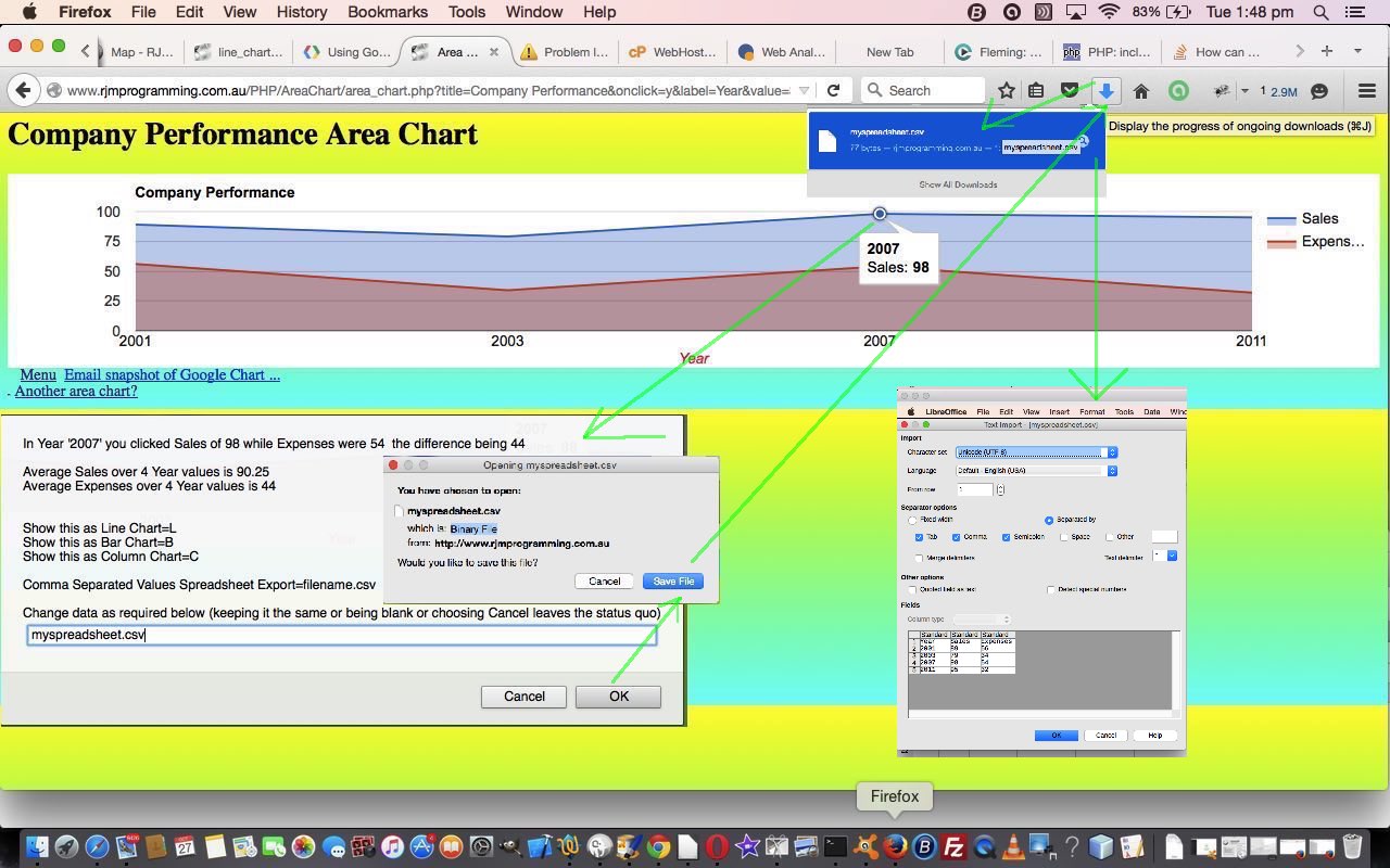
It probably comes as no surprise that chart data can be turned into spreadsheet data, especially if you have ever spent much time in those great spreadsheet applications like Microsoft Office’s Excel, where there are various pathways to display charts from your spreadsheet data. So, today, we just turn that thought around a bit, and use Comma Separated Value (CSV) files as a conduit to be able to convert our chart data into a spreadsheet. We leave it up to whatever is the default application you have to open CSV files … it doesn’t even have to be a spreadsheet application as such, but our applications today offer a downloading capability to get the spreadsheet (CSV) data down to your hard disk (or perhaps midair solutions like Google Docs).
So we see this as a good candidate as a generic Google Chart “select” event tool for users looking to integrate with spreadsheet tools.
These Google Chart Line/Bar/Area/Column/Map Chart changes involved …
- area_chart.php is the changed PHP programming source code as per changes
- bar_chart.php (bar_chart_diff.php) is the changed PHP programming source code as per changes (and changes)
- column_chart.php (column_chart_diff.php) is the changed PHP programming source code as per changes (and changes)
- line_chart.php is the changed PHP programming source code as per changes
- map.php is the changed PHP programming source code as per changes
You’ll see with the PHP code that a crucial technique with today’s work, which involves huge use of PHP’s header method, revolves around the use of the PHP include statement (as well as its closely related require statement). What we “included” in the PHP of above was PHP source code csv.php to aid with constructing the PHP header statements necessary to make the functionality happen. We’d like to thank this very useful link for help here.
Link to Google Chart Tools “spiritual home” … via Google.
Link to Google Chart Tools Area Chart information … via Google.
Link to Google Chart Tools Bar Chart information … via Google.
Link to Google Chart Tools Column Chart information … via Google.
Link to Google Chart Tools Line Chart information … via Google.
Link to Google Chart Tools Map Chart information … via Google.
This extra functionality, available via the suffix “&onclick=y” applied to the Google Chart Area and Bar and Column and Line and Map Chart title, flows on directly to the iPad iOS App we created and talked about, last, with Xcode Swift iOS Application End Game Primer Tutorial.
So please try creating your own emailable Google Chart live runs for …
No guinea pigs were harmed in the making of this blog post. Honest, guv’!
Previous relevant Google Chart Line/Bar/Area/Column Select Event Tutorial is shown below.
Today we continue on (from yesterday’s Google Chart Line and Map Chart Select Event Prompt Tutorial) with more integration involving Google Graphs API, or Google Chart Tools, and its “select” event (like onclick) involving …
- Area Chart
- Bar Chart (and Bar Chart Differences)
- Column Chart (and Column Chart Differences)
- Line Chart
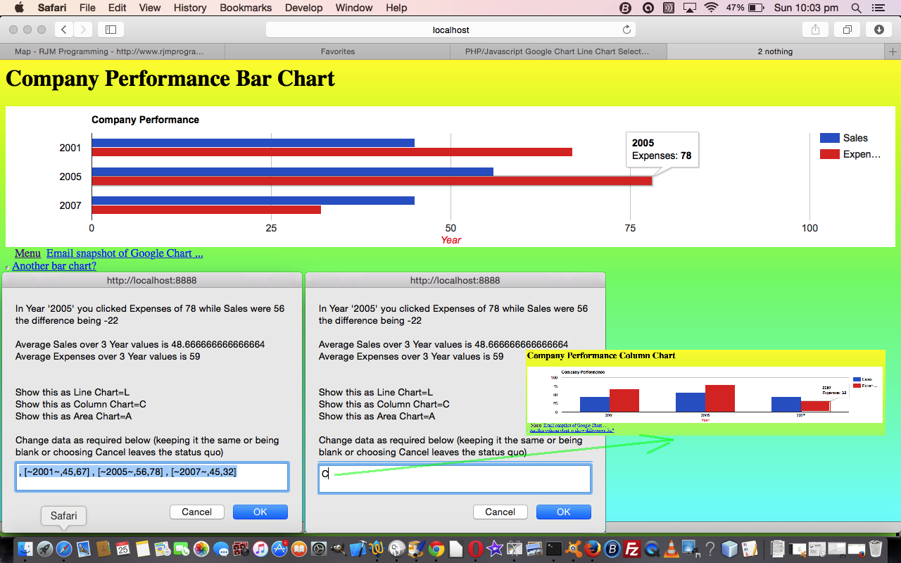
… involve similar data requirements, so we can integrate by offering a redraw of the Google Chart you are currently in, to another type of Google Chart in the list above, and allow this, as an additional “business logic” piece of functionality offered to users when they “click/touch” on the Google Chart, firing off the onclick (or Google Chart “select”) event.
This piece of functionality can be useful, even in terms of aesthetics, as some Google Charts display better than others depending on the density of the data set(s) displayed.
Along the way we also present to the user a moving average of values relevant to each data column of interest.
From yesterday, you may also recall that we can allow a redraw of one the Google Chart types as above (and for lots of others eventually) by allowing user amendment of the data.
And from the day before yesterday we outlined that first bit of “select” event business logic allowing the user to see the difference between values, on “click/touching” any one of them and on doing this firing the “select” event.
These Google Chart Line/Bar/Area/Column Chart changes involved …
- area_chart.php is the changed PHP programming source code as per changes
- bar_chart.php (bar_chart_diff.php) is the changed PHP programming source code as per changes (and changes)
- column_chart.php (column_chart_diff.php) is the changed PHP programming source code as per changes (and changes)
- line_chart.php is the changed PHP programming source code as per changes
Link to Google Chart Tools “spiritual home” … via Google.
Link to Google Chart Tools Area Chart information … via Google.
Link to Google Chart Tools Bar Chart information … via Google.
Link to Google Chart Tools Column Chart information … via Google.
Link to Google Chart Tools Line Chart information … via Google.
This extra functionality, available via the suffix “&onclick=y” applied to the Google Chart Area and Bar and Column and Line Chart title, flows on directly to the iPad iOS App we created and talked about, last, with Xcode Swift iOS Application End Game Primer Tutorial.
So please try creating your own emailable Google Chart live runs for …
Previous relevant Google Chart Line and Map Chart Select Event Prompt Tutorial is shown below.
Here is a tutorial that further reacquaints you, maybe, with the Google Graphs API, or Google Chart Tools, and its Line Chart functionality, last talked about at this blog with PHP/Javascript/HTML Google Chart Line Chart Tutorial as shown way below, and Map Chart, for its first mention and Google Chart Map Chart Select Event Primer Tutorial, for its last mention.
There is no magic relationship between these two chart types today, rather it is the case that they are the “guinea pigs” for “generic thoughts”.
“Generic” is a favourite word for what we try to achieve here, but it can be like “nirvana” for lots of reasons …
- do you have a market for the investment you need to put in to push for “genericity”
- in similar mind, does the project size make it worthwhile
- is catering for all the web browser and application platforms allow for “genericity” anyway?
… in a big organization, such queries can progress quite nicely by using teams and having planning discussions and setting timelines and deadlines between project groups, but in smaller teams it can be the case of “seeing what problems” come up, to decide on the push for “genericity” with the product, down, eventually, to the level of deciding where “business logic” code should sit (ie. in a “library” or “called” piece of code, or otherwise). So, we’re trying some “generic” thoughts and using these two disparate Google Charts to see whether there is some onclick (ie. Google Charts “select” event, which you can read a lot about here … thanks, Google) logic that, in a business sense (because we like to think of onclick being really closely tied to “business logic”, the reason being, some user “clicked/touched” something, so you better present something heading towards specific interest, to do with business, when they do this.
And we think an approach would be to offer an onclick reworking of the data of a chart should they get to the “click/touch” stage with a chart. And we decided that it is not so bad to present this in an overall “one string” chance to change the chart, because, presumanly the user went through the whole rigmarole of answering questions to get this far, and by this stage will “get the hang” of what to do to make more sweeping changes by using this new functionality. Think, too, a “faster way to do things” presented to “advanced users” willing to give things a go (otherwise they wouldn’t still be reading?!) help to improve the UX (“user experience”) of the application, whether that be web or mobile or desktop or seascape (just checking you’re still awake).
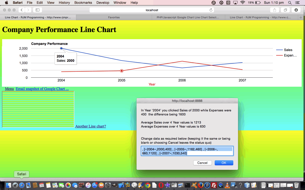
And so, in practical terms, with these two charts, we’ve recently added onclick (Google Charts “select” event) Javascript alert and prompt boxes recently, respectively, for Line Charts and Map Charts. Well, today, we make them both Javascript prompt windows to offer this chance for the user to “reshape” their chart via “click/touch” chart control.
These Google Chart Line Chart and Map Chart changes involved …
- line_chart.php is the changed PHP programming source code as per changes
- map.php is the changed PHP programming source code as per changes
Link to Google Chart Tools “spiritual home” … via Google.
Link to Google Chart Tools Line Chart information … via Google.
Link to Google Chart Tools Map Chart information … via Google.
This extra functionality, available via the suffix “&onclick=y” applied to the Google Chart Map Chart title, flows on directly to the iPad iOS App we created and talked about, last, with Xcode Swift iOS Application End Game Primer Tutorial.
So please try creating you own emailable Google Chart Line Chart here or Map Chart here.
Previous Previous relevant PHP/Javascript Google Chart Line Chart Select Event Tutorial is shown below.
Here is a tutorial that reacquaints you, perhaps, with the Google Graphs API, or Google Chart Tools, and its Line Chart functionality, first talked about at this blog with PHP/Javascript/HTML Google Chart Line Chart Tutorial as shown below.
Google Chart Tools provide a perfect way to visualize data on your website. From simple line charts to complex hierarchical tree maps, the chart galley provides a large number of well-designed chart types. Populating your data is easy using the provided client- and server-side tools.
The reason for the revisit concerns a push to make more use of the onclick “feeling” Google Chart “select” event, an event triggered when you click on a feature of, in this case, a Google Chart Line Chart that our web application helps you create.
Here is some PHP code in live action for this tutorial where you define your line chart characteristics and data, where am appending of “&onclick=y” to your line chart title means the additional “select” event functionality can kick in.
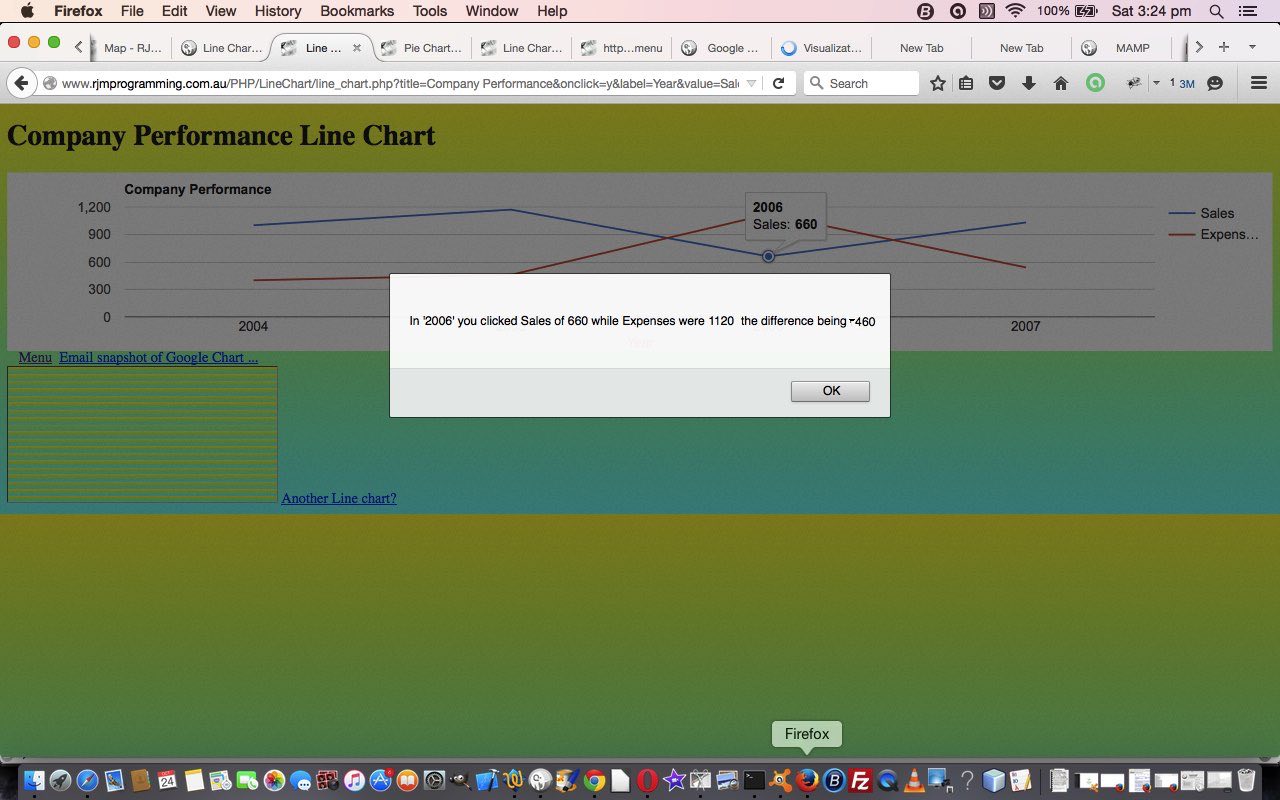
The “select” event functionality (which you can read a lot about here … thanks, Google) would be full of business logic and specific to how you want to use the chart, so it is a bit hard to pin down how you should use it, but in today’s tutorial picture you can see that in a Company Performance line chart showing Sales and Expenses if you click on a Sales figure for any given Year the “select” event business logic brings up a Javascript alert() box that informs the user of the Expenses for that same Year, along with the difference between Sales and Expenses. The logic is not tied down to the exact words “Sales” and “Expenses”, and it will work this out from what you entered in for this earlier on.
Some findings here led to some small changes to that generic Javascript behind the scenes of these Google Chart suite of web applications as well so, all told, the changes involved …
- line_chart.php is the changed PHP programming source code as per changes
- gchartgen.js is the changed Javascript programming source code as per changes
Link to Google Chart Tools “spiritual home” … via Google.
Link to Google Chart Tools Line Chart information … via Google.
So please try creating you own emailable Google Chart Line Chart here.
Previous relevant PHP/Javascript/HTML Google Chart Line Chart Tutorial is shown below.
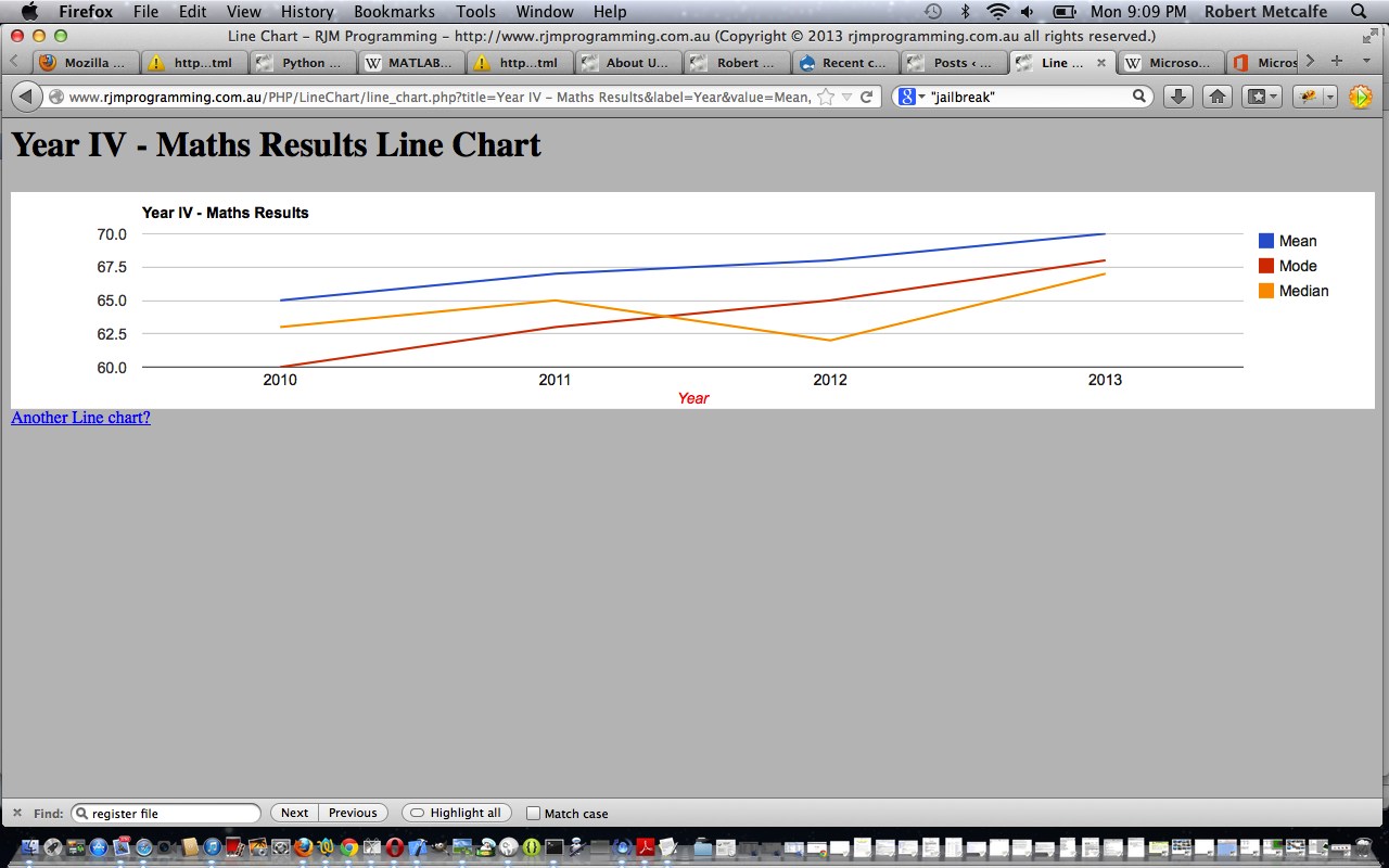
Here is a tutorial that introduces you to Google Graphs API, or Google Chart Tools, and its Line Chart functionality.
Google Chart Tools provide a perfect way to visualize data on your website. From simple line charts to complex hierarchical tree maps, the chart galley provides a large number of well-designed chart types. Populating your data is easy using the provided client- and server-side tools.
Let’s see some PHP code in live action for this tutorial where you define your line chart characteristics and data.
Link to Google Chart Tools “spiritual home” … via Google.
Link to Google Chart Tools Line Chart information … via Google.
Link to some downloadable PHP programming code … rename to line_chart.php.
If this was interesting you may be interested in this too.
If this was interesting you may be interested in this too.
If this was interesting you may be interested in this too.
If this was interesting you may be interested in this too.
If this was interesting you may be interested in this too.
If this was interesting you may be interested in this too.
If this was interesting you may be interested in this too.
If this was interesting you may be interested in this too.
If this was interesting you may be interested in this too.
If this was interesting you may be interested in this too.
If this was interesting you may be interested in this too.



4 Responses to Google Chart Select Event Geo Pie Trend Tutorial