Building on the recent Google Chart via CSV or JSON Filtering Tutorial we have a dual purpose set of improvements for you today regarding our CSV or JSON to Google Chart web application, that being …
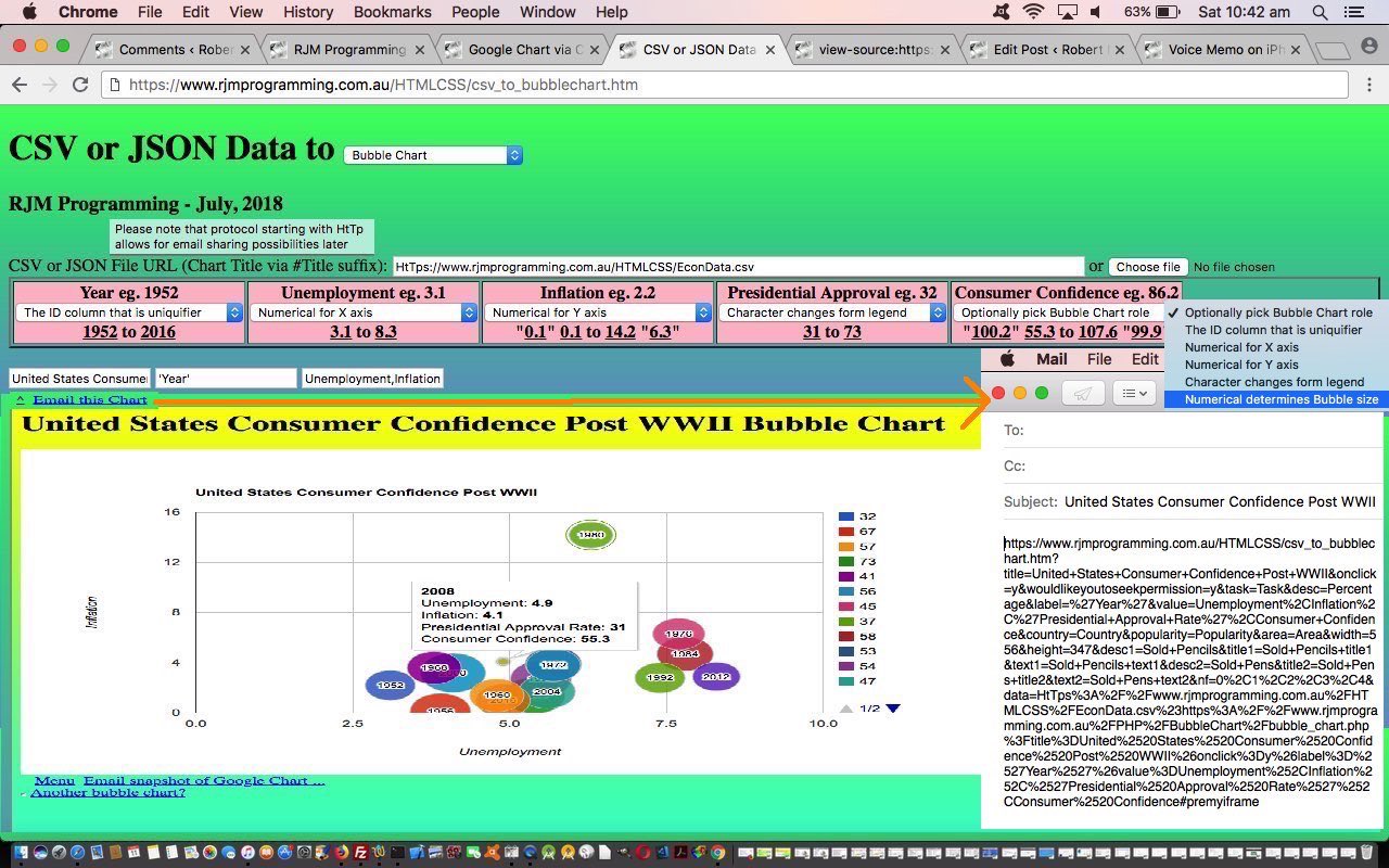
- email sharing of scenarios where your input CSV or JSON data is a URL via the user’s email client application means of emailing … and that long promised …
- correlation data examples for the Bubble Chart are shown today
You may know that whenever we talk about “user’s email client application” that means we are excluding PHP method=POST mail function approaches, and using, quite often large URLs (but not large enough to spill outside the URL length limits of the web server involved). How can we do this with the amounts of data involved? We break the issue into two parts …
- initial pass collects header information including, crucially, an input data URL arrangement that is started with “HtTp” the bother of using is the user’s way to flag that they may want to share the eventual output Google Chart via email (using the client email application … ie. “a” “mailto:” link) … that navigates to the same HTML and Javascript that has enough information to have a …
- second pass uses an Ajax approach to then fleshing out the “data” part to the whole issue, augmenting the header data passed in so as to be able to use HTML iframe element as an HTML form’s target=[iframeName] method=POST so that it can show the Google Chart asked for and be able to allow for emails that are making use of new HTML as per …
<div id=dpremyiframe><a id=premyiframe href='#myh1' title='Back to top'>^</a></div><br>
… to have the new Javascript DOM statement as per …
document.getElementById('dpremyiframe').innerHTML+=' <a id=aemail href="mailto:?subject=' + encodeURIComponent(document.getElementById('title').value) + '&body=' + encodeURIComponent(document.URL) + '" title="Email Chart">Email this Chart</a>';
… allow for this new email sharing functionality to happen
Now let’s show you a couple of Bubble Chart data correlation ideas we are thankful to this great webpage for sharing.
- U.S. Consumer Confidence Post WWII Data Example //www.rjmprogramming.com.au/HTMLCSS/csv_to_bubblechart.htm?title=United+States+Consumer+Confidence+Post+WWII&onclick=y&wouldlikeyoutoseekpermission=y&task=Task&desc=Percentage&label=%27Year%27&value=Unemployment%2CInflation%2C%27Presidential+Approval+Rate%27%2CConsumer+Confidence&country=Country&popularity=Popularity&area=Area&width=556&height=347&desc1=Sold+Pencils&title1=Sold+Pencils+title1&text1=Sold+Pencils+text1&desc2=Sold+Pens&title2=Sold+Pens+title2&text2=Sold+Pens+text2&nf=0%2C1%2C2%2C3%2C4&data=HtTps%3A%2F%2Fwww.rjmprogramming.com.au%2FHTMLCSS%2FEconData.csv%23https%3A%2F%2Fwww.rjmprogramming.com.au%2FPHP%2FBubbleChart%2Fbubble_chart.php%3Ftitle%3DUnited%2520States%2520Consumer%2520Confidence%2520Post%2520WWII%26onclick%3Dy%26label%3D%2527Year%2527%26value%3DUnemployment%252CInflation%252C%2527Presidential%2520Approval%2520Rate%2527%252CConsumer%2520Confidence
- World Poverty Data Example //www.rjmprogramming.com.au/HTMLCSS/csv_to_bubblechart.htm?title=Female+Life+Expectancy+and+Birth+Rate+Correlation+to+GNP+Worldwide&onclick=y&wouldlikeyoutoseekpermission=y&task=Task&desc=Percentage&label=%27Country%27&value=Female+Life+Expectancy%2CBirth+Rate%2C%27Region%27%2CGNP&country=Country&popularity=Popularity&area=Area&width=556&height=347&desc1=Sold+Pencils&title1=Sold+Pencils+title1&text1=Sold+Pencils+text1&desc2=Sold+Pens&title2=Sold+Pens+title2&text2=Sold+Pens+text2&nf=7%2C4%2C0%2C6%2C5&data=HtTps%3A%2F%2Fwww.rjmprogramming.com.au%2FHTMLCSS%2FPoverty.csv%23https%3A%2F%2Fwww.rjmprogramming.com.au%2FPHP%2FBubbleChart%2Fbubble_chart.php%3Ftitle%3DFemale%2520Life%2520Expectancy%2520and%2520Birth%2520Rate%2520Correlation%2520to%2520GNP%2520Worldwide%26onclick%3Dy%26label%3D%2527Country%2527%26value%3DFemale%2520Life%2520Expectancy%252CBirth%2520Rate%252C%2527Region%2527%252CGNP
So see what we did to get to where we are today after yesterday’s Google Chart Date Time Charts via CSV Tutorial …
- supervisor CSV to Bubble Chart csv_to_bubblechart.htm‘s live run link web application changed this way … calls and uses …
- external Javascript csv_to_bubblechart.js needed no changes today
Previous relevant Google Chart via CSV or JSON Filtering Tutorial is shown below.
One of the more challenging parts of data representation can be filtering out too much data, for presentation purposes. We are going to refer to this issue as a “filtering” issue.
Building on yesterday’s Google Chart via CSV or JSON Tutorial this filtering doesn’t care about the format of the data, just if the user is interested to apply it to any column of interest to them within a CSV (as the common denominator) column. As you can imagine, this involves reading through all the CSV data to arrive at some …
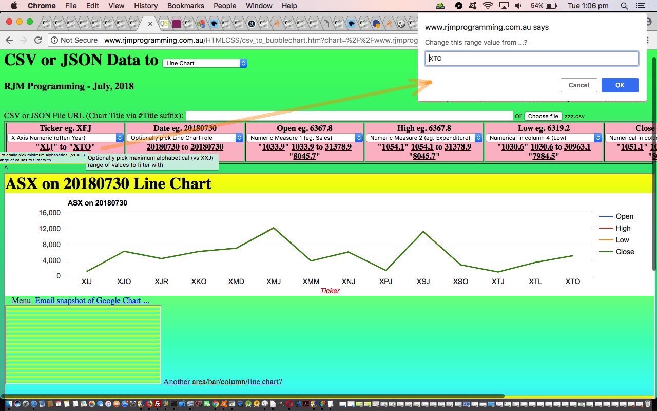
minimum range to maximum range
…. values for each column, always in terms of …
- alphabetical sorting … and sometimes also in terms of …
- numerical sorting … depending on the nature of the column data involved
… and once collected, in a Javascript function called via a setTimeout timer so as not to interfere with the main workflow of the web application, we present to a user who hovers or clicks on a column dropdown “a” links to the up to 4 potential ranges of interest, ready for the user to redefine as they wish to “filter” data that goes to the Google Chart interfacer of interest.
Think the search engines, and they have algorithms to determine what shows above the fold for search results. This is a “filtering” mechanism they apply to a set of data too complex to present in a first come, first served way.
Again, see what we did to get to where we are today, below …
- supervisor CSV to Bubble Chart csv_to_bubblechart.htm‘s live run link web application changed this way … calls and uses …
- external Javascript csv_to_bubblechart.js changed this way
You can also see this play out at WordPress 4.1.1’s Google Chart via CSV or JSON Filtering Tutorial.
Previous relevant Google Chart via CSV or JSON Tutorial is shown below.
Our progression with the “CSV to Google Charts” web application today, building on yesterday’s Google Chart via CSV Header Data Tutorial, is to widen the net and name the web application “CSV or JSON to Google Charts”. The JSON protocol represents a common means by which hierarchical data can be represented in the online world. As such, though we cannot guarantee the more complex hierarchy of data found in JSON data, we thank the contributors to this great webpage for the all but tinkering Javascript function we end up with that converts JSON data to CSV for usage in our web application.
Also, today, now that we can edit header column data we can help out the “statistical” Google Charts …
- Area Chart
- Bar Chart
- Column Chart
- Line Chart
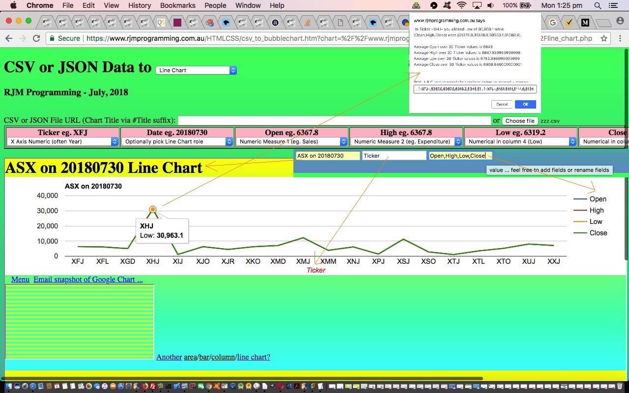
… by allowing the user to add fields or rename fields of the default 3 fields expected by these chart types. With this, we expect any new such fields to be numerical.
The implication of this is that some quite complex scenarios can be reflected through the use of these chart types with this web application.
So see what we did to get to where we are today, below …
- supervisor CSV to Bubble Chart csv_to_bubblechart.htm‘s live run link web application changed this way … calls and uses …
- external Javascript csv_to_bubblechart.js changed this way
Thanks to the data of ASX Historical Data for the underpinnings of today’s Line Chart some ASX Stocks data on 20180730 tutorial picture.
Previous relevant Google Chart via CSV Header Data Tutorial is shown below.
Many jobs that involve data form themselves into a …
- header
- details
… data model. It happens all the time in Information Technology. Just think of General Ledgers in accounting. At the database table level supporting these arrangements there’ll be a smaller sized header table off which there will be a mechanism to “drill down” into the details database table.
In our current project, up until today, we’ve only taken a cursory interest in the “header” data thinking for it, offering only a pretty awkward and clunky mechanism for the user to enter a Google Chart title with that “#” method on the top textbox. In our priorities for this job we were much more focussed on how to deal with the larger volumes of data, and this is always associated with the “details” of the Google Chart data.
Within what we categorize into a “header” data categorization of the Google Chart data we would include …
- chart title
- chart axis labelling
- chart legend wording
- chart menu wording (on the Annotated Timeline Chart for instance)
… the data items needed to “personalize” (or “particularize”) the data into the “business logic” associated with the CSV data (or subset of that data, being as we can select columns of interest with our web application) of the job.
Behind the scenes even before today we’d hidden the “header” data into the HTML form (type=hidden) textboxes POSTed to the Google Chart interfacers, but today we …
- change relevant type=hidden textboxes in the HTML form to type=text style=display:inline (so that they line up in one row across the screen below the column selectors, and the use of HTML input placeholder attributes we think does away with the need for labels)
- make sure the HTML form “action” attribute reflects any user changed textbox fields
- add an HTML form onsubmit event function that makes these textboxes disappear once the CSV columns of interest are decided upon
- add a user entered “?” for the “title” textbox be a mechanism to preview the Google Chart of interest that shows the (often) complex user interactivity possibilities for that Google Chart, so that the user can do this with that “title” textbox as well should they be more advanced users
So see what we did to get to where we are today after yesterday’s Google Chart Date Time Charts via CSV Tutorial …
- supervisor CSV to Bubble Chart csv_to_bubblechart.htm‘s live run link web application changed this way … calls and uses …
- external Javascript csv_to_bubblechart.js needed no changes today
Previous relevant Google Chart Date Time Charts via CSV Tutorial is shown below.
With the recent Google Chart More Charts via CSV Tutorial‘s CSV file interfacing to our interfacings to Google Charts …
- Bubble Chart
- Pie Chart
- Histogram Chart
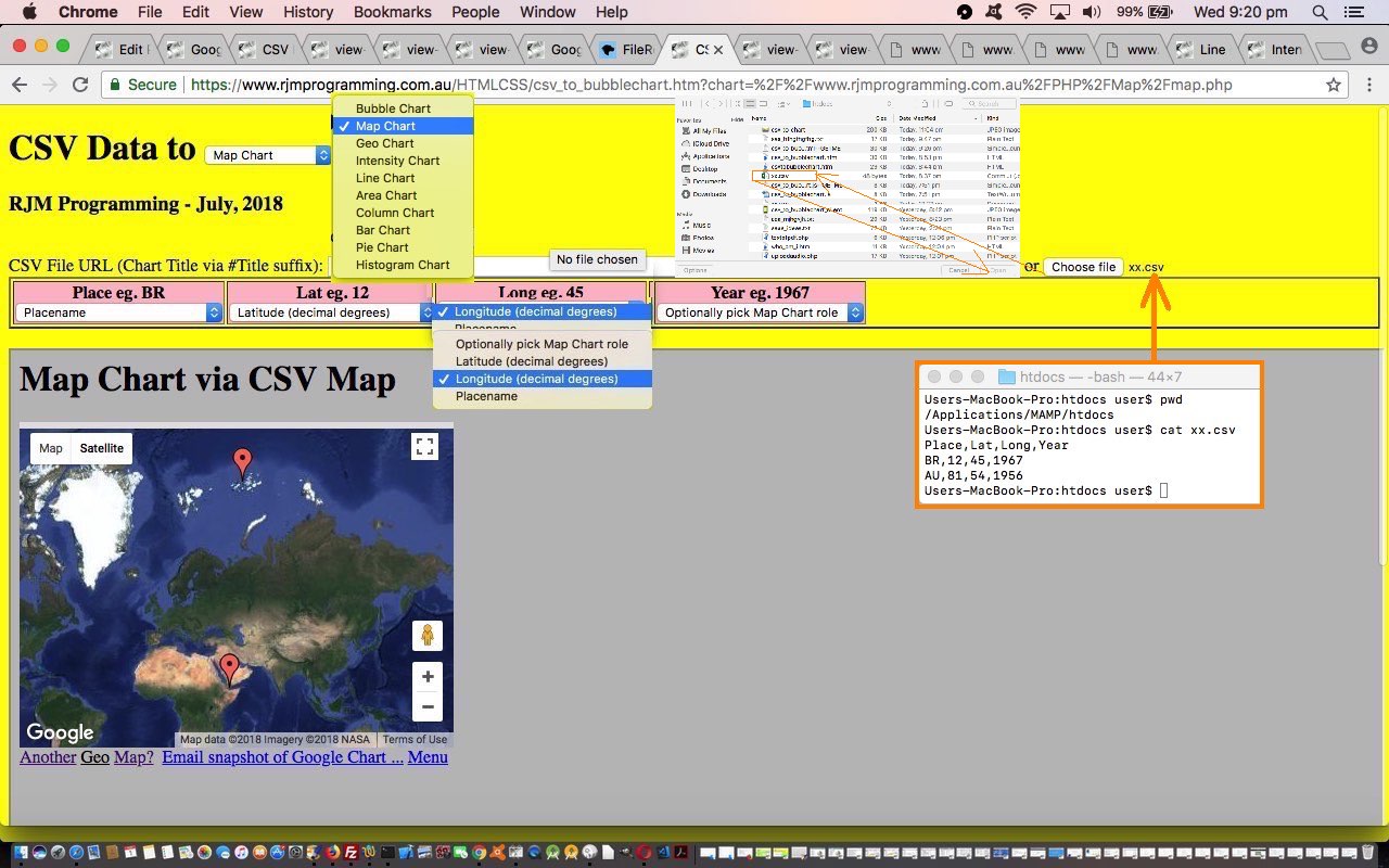
- Map Chart
- Geo Chart
- Intensity Chart
- Area Chart
- Bar Chart
- Column Chart
- Line Chart
… did you notice a common theme, or perhaps a common non-theme?! Yes, none of the Google Charts above involved date nor datetime fields. So, today, we add …
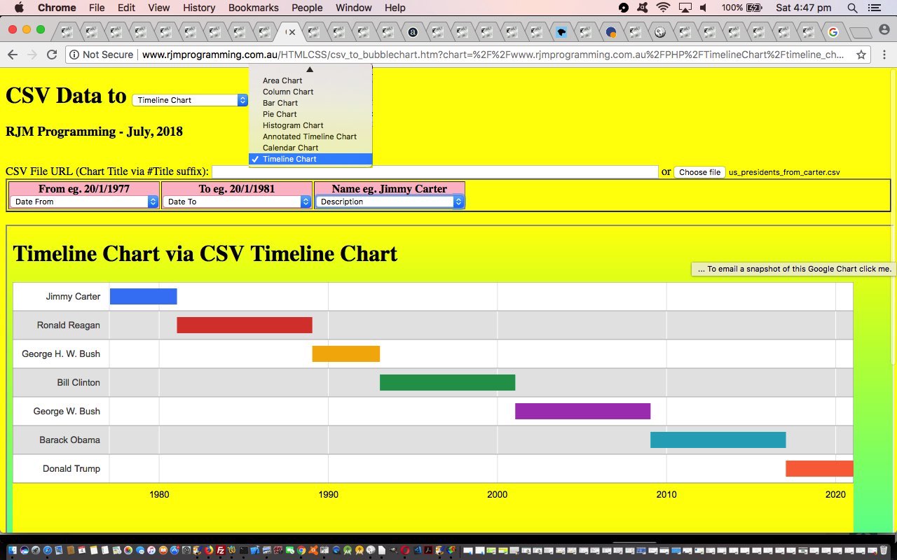
- Annotated Timeline Chart
- Calendar Chart
- Timeline Chart
… to the list, and so add some “when of life” interest to the potential for converting CSV data into meaningful chart data representations of that data.
You might wonder, “Where’s the complication there? Why didn’t this get scheduled earlier?” Well, like we’ve mentioned before at this blog, really appreciate the times when you, as the programmer, are in charge of the form of the data, but this job is not such a case, alas. We just do our best trying to imagine what might be thrown at the PHP (actually done in the Javascript client realms) as far as representing a date goes. Sadly though, there are many ways to represent a date, and we just try to imagine what is likely here. One difficult issue is the common way some countries represent dates in MM/DD/YYYY format. We like a default set of thinking that a user will use DD/MM/YYYY and if MM/DD/YYYY is being used, we hope the first instance of its use is one where the “DD” used is bigger than “12”, and we can know the date format being used is more likely to be MM/DD/YYYY. But please be aware there are many more delimiter and inhouse approaches that might pass by code that allows for date and/or datetime based data.
Later, at the interfacing to the Google Chart, the Google Chart wants dates or datetimes to be represented by a Date object (“constructor”). Plain sailing once you get to this, as long as one last quirk is attended to …
A date of 13 July 2018

 ... needs a Google Chart date "constructor" of the form ...

new Date(2018, 6, 13)
… Go Monthly DeficitFigure?!
As for the HTML and Javascript supervisors …
- supervisor CSV to Bubble Chart csv_to_bubblechart.htm‘s live run link web application changed this way … calls and uses …
- external Javascript csv_to_bubblechart.js changed this way
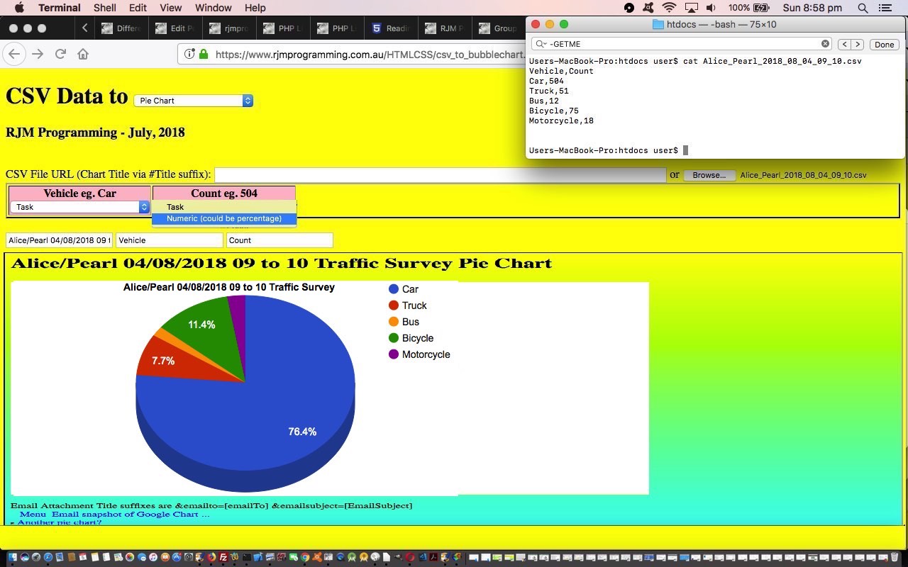
… interfacing to the changed Google Chart interfacer PHP code report HTTP://www.rjmprogramming.com.au/PHP/Geographicals/prediff.php?dpath=HTTP://www.rjmprogramming.com.au/&dfilespec=PHP/*/*.*GETME&dmdates=2018-08-04&dmdateb=2018-08-05 …
Previous relevant Google Chart More Charts via CSV Tutorial is shown below.
Yesterday’s Google Chart Bubble Chart via CSV Primer Tutorial set us up with a strategy to move forward today, so that by end of day we have CSV to Google Chart …
- Bubble Chart
- Pie Chart
- Histogram Chart
- Map Chart
- Geo Chart
- Intensity Chart
- Area Chart
- Bar Chart
- Column Chart
- Line Chart
… interfacing functionalities in play, involving coding, unit testing and implementing …
PHP or HTML (supervisor) combination of non-“data*” named arguments transferred via $_GET[] (or $_SERVER[‘QUERY_STRING’] off the ? and & non-“data*” arguments of a form action=[URLPlusArguments] usage) ? and & argument calls (via HTML form enctype=application/x-www-urlencoded method=POST action=[(Google Chart interfacing) PHP]?title=etcetera) and $_POST[] (or php://input, or a blank such result then uses parent.document.getElementById(‘data’).value) “data*” arguments via HTML input “id=data name=data type=hidden” elements of a form enctype=application/x-www-urlencoded method=POSTed data …
//

// ... This scenario above results in $GETdata="";  // from that last code block above ... and so, then, further down ...

//

      echo ' function drawChart() { ' . "\n";

      if ($GETdata == "") {

      echo ' var wert="data=google.visualization.arrayToDataTable([ ' . ' [' . $GETlabel . ',' . $GETval . ']"; ' . "\n";

      echo " wert+=parent.document.getElementById('data').value.replace(/\~/g,\"'\").replace(/\'\'\'\'/g,\"''\"); " . "\n";

      echo ' wert+=" ])";' . "\n";

      echo ' eval(wert); ' . "\n";

      } else {

      echo ' data = google.visualization.arrayToDataTable([ ' . "\n";

      echo " [" . $GETlabel . "," . $GETval . "] \n";

      echo str_replace("''" . "''", "''", str_replace("~", "'", $GETdata));

      echo "        ]);\n";

      }

      echo "        var options = { \n";

      if (isset($hdgs[3])) {

      echo "        title: '" . $GETtitle . "', \n";

      echo "        hAxis: {title: '" . $hdgs[0] . "'}," . " \n";

      echo "        vAxis: {title: '" . $hdgs[1] . "'}," . " \n";

      echo "        bubble: {textStyle: {fontSize: 11}} \n";

      } else {

      echo "        colorAxis: {colors: ['yellow', 'red']} \n";

      }

      echo "       }; \n";
… which we discovered today worked for the $_GET[] bit but not for the $_POST[] nor php://input bits, but did for the parent.document.getElementById(‘data’).value idea on iOS mobile platform web browsers … and if cornered into the future we are yet to resort to …
… type changes for the Google Chart interfacers. As for the supervisors …
- supervisor CSV to Bubble Chart csv_to_bubblechart.htm‘s live run link web application changed this way … calls and uses …
- external Javascript csv_to_bubblechart.js changed this way
… they needed to follow patterns off the Bubble Chart “guinea pig” leads of the last couple of days.
Days of “consolidation” like this can build on “slog work”!
You can see Google Chart changes, today, via the report HTTP://www.rjmprogramming.com.au/PHP/Geographicals/prediff.php?dpath=HTTP://www.rjmprogramming.com.au/&dfilespec=PHP/*/*.*GETME&dmdates=2018-08-01&dmdateb=2018-08-02
Previous relevant Google Chart Bubble Chart via CSV Primer Tutorial is shown below.
The Google Chart Bubble Chart is a great tool to show correlations, and we’ll get more on that soon, but today, we wanted to use it to display some more United States data resource website data.gov derived data regarding “First Names of Babies in New York from 2011 to 2014”, as you can see happening in today’s tutorial picture.
Google Chart Bubble Charts can handle 5 data properties as per …
- ID (could be character data) … uniquifier
- X position on X axis
- Y position on Y axis
- Legend (character data, the different values of, can form the Bubble Chart legend)
- Sizer numerical value affects diameter of Bubble
… for each data point. Later, in today’s CSV to Bubble Chart csv_to_bubblechart.html‘s live run link web application these data property choices make up the options of HTML select (dropdown) elements associated with each CSV (ie. comma separated values format) column where the user can assign a CSV column with a Bubble Chart “data property” role, and so give the web application a means by which to create the Bubble Chart, created after 5 of these dropdowns are given values.
A CSV file URL completes the user data requirements here. We thank this useful link, thanks, for good Ajax Javascript code to avoid a CSV being downloaded (as happens a lot when setting a CSV as an HTML iframe element ‘src’ property value).
The external Javascript today is csv_to_bubblechart.js completing the supervisory code team for the HTML iframe child Google Chart Bubble Chart interfacing bubble_chart.php changed this way for today’s work.
You can enter your own data here or simulate today’s tutorial picture. There’s more to work on here, we’re thinking, and we hope you find this interesting.
Previous relevant Google Chart Bubble Chart Select Event Primer Tutorial is shown below.
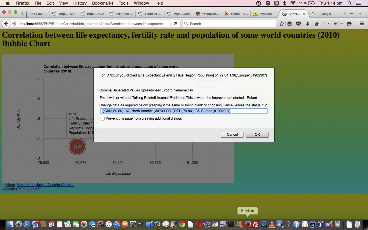
Maybe you tried yesterday’s Worldbank data web application (via PHP Worldbank Growth of Merchandise Trade Tutorial) on a mobile device and tried to zero in on a bubble … zero, bubble … guess you had to be there … and got so disappointed with the “dead fish” response that you ignored the vegemite sandwich for lunch, which caused a butterfly in Brazil to heave a huge sigh … the world headlines followed … but you have my complete discretion on this!
Anyway … for those inquisitive mobile users out there interested in Worldbank trade figures … please, not all at once … let’s get Google Chart Bubble Charts working for their Select event, which is like a mobile touch event, while not interfering with the usual vegemite eating habits of your average laptop user … vege UP . vege DOWN . my body is a wigwam . my body is a teepee . aside (to gobsmacked audience with mouths open 😲): “patently they’re twoo tentsse”.
Software wise our new Google Chart Bubble Chart (Select event) integration involved …
- bubble_chart.php changes (to cater for select event (mobile touch) functionality) and live run link
- growth_of_merchandise_trade.php changes (to cater for select event (mobile touch) functionality) and live run link for yesterday’s web application
Link to Google Chart Tools “spiritual home” … via Google.
Link to Google Chart Bubble Charts information … via Google.
This extra ‘select’ event functionality, available via the suffix “&onclick=y” applied to the Google Chart Bubble Chart title, flows on directly to the iPad iOS App we created and talked about, last, with Xcode Swift iOS Application End Game Primer Tutorial.
So please try creating your own emailable Google Chart live run for …
If this was interesting you may be interested in this too.
If this was interesting you may be interested in this too.
If this was interesting you may be interested in this too.
If this was interesting you may be interested in this too.
If this was interesting you may be interested in this too.
If this was interesting you may be interested in this too.
If this was interesting you may be interested in this too.
If this was interesting you may be interested in this too.

