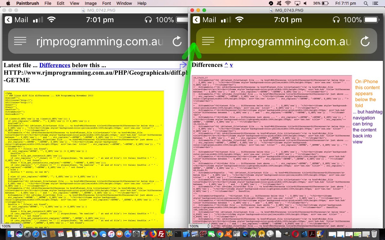
Maybe hashtag navigation usage is a mystery to you? Surely the navigation coming into a webpage should suffice, and any internal (to that webpage) navigation not be that useful? Well, that’s true in a world where the webpage contents can be categorized as either …
- be so short it sits within the screensize of any known device … and/or …
- be only of interest on devices whose screensize is big enough to contain the width and breadth of the content involved
… but this, as all those avid “swipers” and “pinchers” out there know, is not much about reality. Suppose your contents does not fit, then, the next best thing would be to see a “chapter” of content plus the heading of the next “above the fold”. That is an improvement. But an alternative to “dumbing down” content, perhaps to make it fit, is to use “hashtag navigation” ideas.
We’re going to show a “long in the tooth” (can’t believe we didn’t see it before) application of “hashtag navigation” improvements to our “differences of code” PHP web application we use around here. In its “component” design it has the simple setup of …
- HTML h1 element as “Latest File” heading
- HTML iframe element whose content is that “Latest File” content
- HTML h1 element as “Differences” heading
- HTML iframe element whose content is that “Differences” content
- HTML h1 element as “Older File” heading
- HTML iframe element whose content is that “Older File” content
… which, unembellished (with “hashtag navigation” smarts) we’d never blinked an eye at because we’d mainly practically made use of it with a (MacBook Pro) laptop size screen where that …
next best thing would be to see a “chapter” of content plus the heading of the next “above the fold”
… has been, mostly, the go. The other day though, was out and about with the iPhone curious about some code, accessed this “differences report” web applications work, and found it “tiring” the thought of scrolling down to the Differences Content” I was after. It lacked that “hashtag” navigation that could be useful, because the second “heading” (not “content”, as we’ll explain later) was not within view above the fold. It’s not that hard a problem to fix via …
- HTML h1 element as “Latest File” heading … id=latest_file … Differences below this …
- HTML iframe element whose content is that “Latest File” content
- HTML h1 element as “Differences” heading … id=differences … ^ v
- HTML iframe element whose content is that “Differences” content
- HTML h1 element as “Older File” heading … id=older_file … Differences just above …
- HTML iframe element whose content is that “Older File” content
… which makes the functionality much more practically useful on mobile platforms.
Why “hashtag navigate” to “headings” rather than “contents”? It’s all about context. We’re trying to save you from “swiping” or “pinching” too much here, and we need the context of the “heading” just above the “contents” all “above the fold” as the navigation scenario that we figure leads to less need to “swipe” and “pinch”. It is a web browser “thang” that, except for the “end of webpage hitting end of screen” scenario, the webpage display off a “hashtag navigation” event will not allow for any “leeway” above the HTML element defined by the hashtag navigation definition element, so in our scenario should you “hashtag navigate” to the “Differences Content”, for instance, you will not see the “Differences Heading” just above this, unless you have to go to the effort to scroll up (ie. “swipe” a little bit) just above it (but it makes me tired just thinking about it … is it nap time yet?!).
We hope you think so too? If you desire to see the source code we’ve hidden up until now then take a skeg at diff.php … and how we got there below (where the new hashtag navigation should help no matter what the HTML iframe height relative to content amount) or in a new window here …
… for your perusal, and we’ll show you this in action hosted within this blog posting’s HTML iframe below, for you to judge for yourself on whatever platform you are reading this blog posting. And may your day be a happy one … two … three … etcetera etcetera etcetera.
Did you know?
To our mind, the ultimate use of hashtag navigation can occur in a single (huge) webpage (or PDF document, maybe) that consists of the contents of a book, fronted by a table of contents, whose links (presumably to “Chapters” or “Sections” or “Articles”) are almost exclusively “hashtag navigation” elements. Wonder if that’s where the concept of “hashtag navigation” originated?
Stop Press
You may notice in the changed code links above, just now (8:30am AEST), we added a suffix to our hashtag IDs involving an “_” underscore character and a great big integer (derived from a PHP rand() call). Well, if you look through blog postings involving diff.php’s prediff.php supervisor reporter of file difference via since and before dates and file specification user entries, it nagged away at us overnight that for groups of difference reports the non-unique IDs of the diff.php old scenario before this Stop Press would have offered up “hampered” navigation only within the first such difference report “subset” but not others, while the introduction of this random uniquifier could get around this problem, in large part.
If this was interesting you may be interested in this too.


