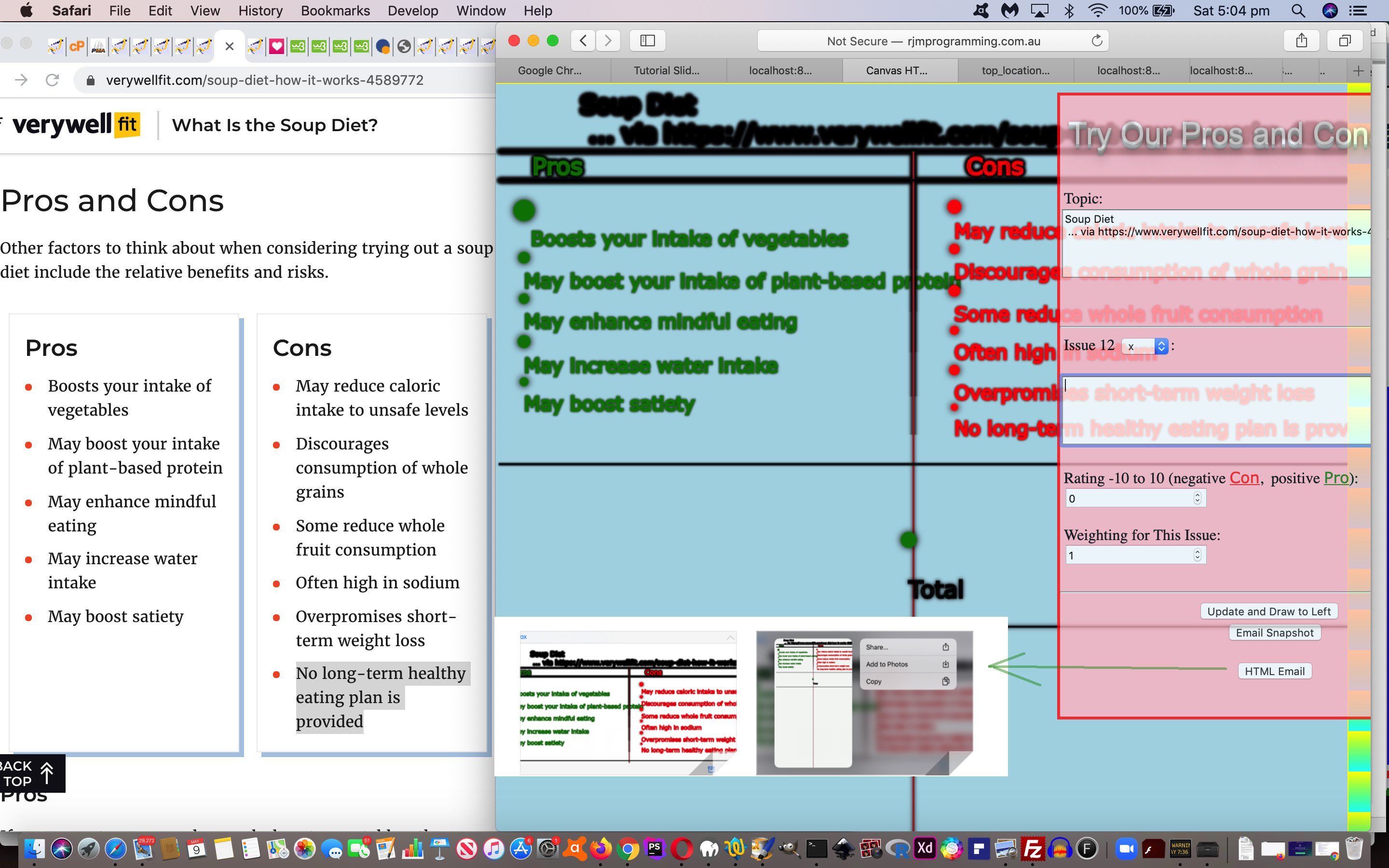
Keeping with the theme of HTML(5) canvas elements lately, let’s revisit the “Pros and Cons” web application of HTML Canvas Pros and Cons Font Colours Tutorial, because it is common for the “blank canvas” things of life to be the most intriguing and open to a lifetime of learning. The other feature of a “blank canvas” is that the user has scope to use their imagination more fully.
Today’s improvements to “Pros and Cons” are both …
| Aesthetic | … as well as … | Collaboration Functional |
|---|---|---|
| Font size tweaking (bigger) | Inline HTML Email (new) button … uses … | |
| Use of shadowBlur property gives 3D look | Ajax and FormData objects … so that … | |
| Positional tweaking … allows for … | Emailee of Inline HTML Email “Pros and Cons” report can Save to Photos (at least on iPhone and iPad via two finger gesture option in iOS Mail app) … via … | |
function emailhtmlit() {

 var pemail=prompt("Who do you want to email to?  Comma separate a To emailee from optional From emailer.", document.getElementById('mylemail').value);

 if (pemail != null) {

   if (pemail.replace("fill.in.email@address", "").indexOf("@") != -1) {

   document.getElementById('mylemail').value=pemail;

  var zhr = new XMLHttpRequest();

  var zform=new FormData();

  zform.append('inline', encodeURIComponent('<body><img src="' + document.getElementById('canvaselement').toDataURL() + '"></img></body>'));

  if (pemail.replace(/\;/g,',').indexOf(',') != -1) {

  zform.append('to', pemail.replace(/\;/g,',').split(',')[0]);

  zform.append('bcc', pemail.replace(/\;/g,',').split(',')[1]);

  zform.append('subj', 'My Pros and Cons ... ' + topic.split('<')[0].split(String.fromCharCode(10))[0] + ' from ' + pemail.replace(/\;/g,',').split(',')[1]);

  } else {

  zform.append('to', pemail);

  zform.append('subj', 'My Pros and Cons ... ' + topic.split('<')[0].split(String.fromCharCode(10))[0]);

  }

  zform.append('tdhuhta', encodeURIComponent('<body><img src="' + document.getElementById('canvaselement').toDataURL() + '"></img></body>'));

  zhr.open('post', '//www.rjmprogramming.com.au/HTMLCSS/emailhtml.php', true);

  zhr.send(zform);

   }

 }

}
… this Inline HTML Email technique (where emailee sees the report as soon as they open the email, at least for macOS and iOS Mail app email client applications) requiring no web server files hanging around bar mail server log files (that get recycled anyway).
Please feel free to try the changed prosandcons.html‘s live run link, to see this in action. Thanks to Soup Diet webpage for the inspiration for “Pros and Cons” report featured in today’s tutorial picture.
Previous relevant HTML Canvas Pros and Cons Font Colours Tutorial is shown below.
Yesterday’s HTML Canvas Pros and Cons Report Primer Tutorial as shown below, was the start of our push for improvement, and today we continue with that task.
We think the Pros and Cons report can benefit from user control over report colours for the circles and the text, as well as the size and font family of that text.
Lots of people think better with colour coding. Think, on occasions, it certainly helps me, especially when skimming for information, it feels natural to skim effectively when colours guide your eyes in their task.
The font size can certainly help in a similar way, and, with so much information passing our notice from the web font family styles are quietly conditioning expectations about content.
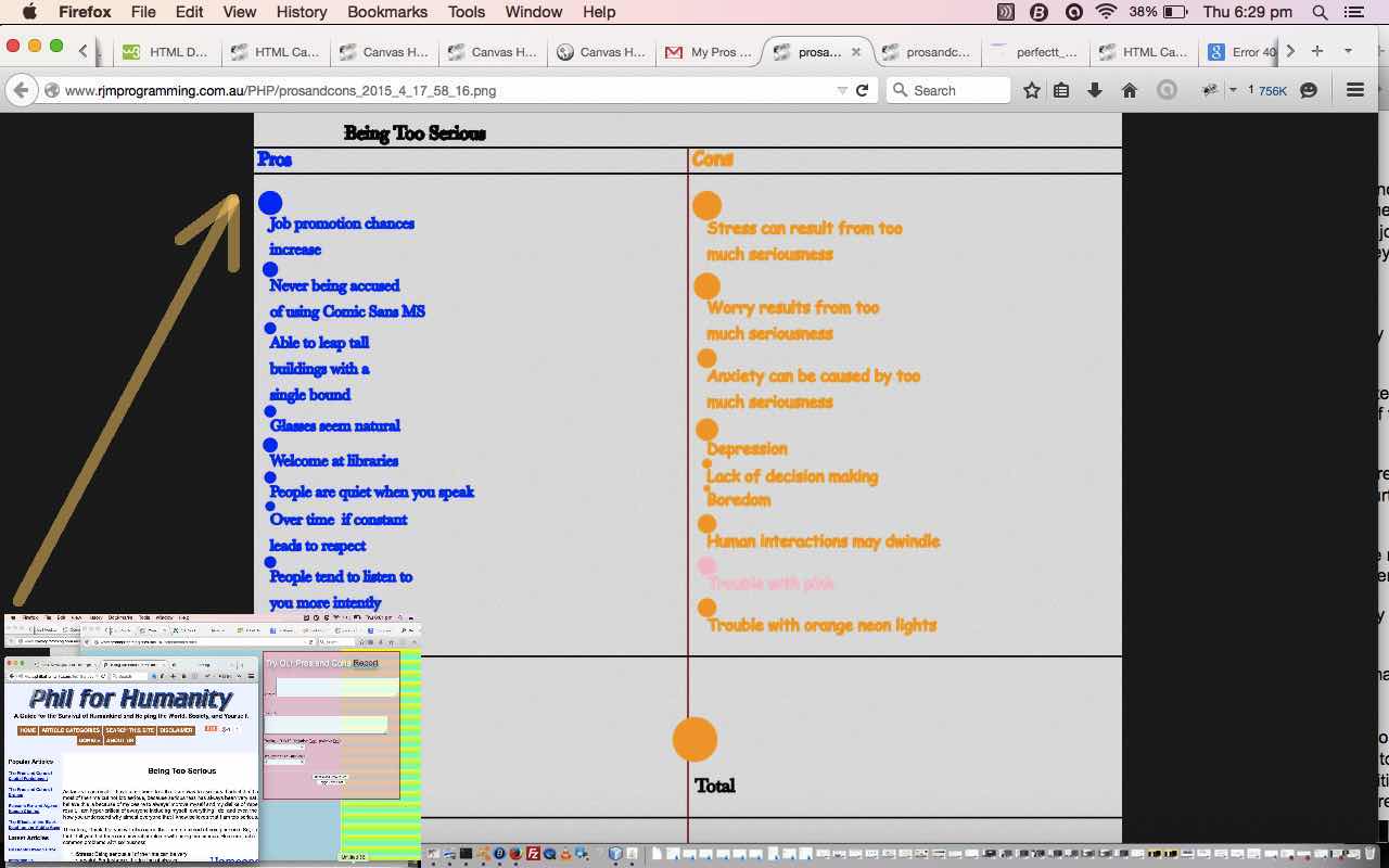
So today we critique the humorous “topic” of “Being Too Serious”. And why is that? Well, wanted to show you that I.T. classic font “Comic Sans MS” and what I found to be a candidate for the most serious web font “Baskerville”. Thanks to this link for ideas.
There is a serious message here though … just think Shakespeare and his “fools” … if you are serious with a Pros and Cons Report and you want to be taken seriously, words like “Too” in “Being Too Serious” show valued judgements even before you have started, and you can be accused of bias. The best way to utilize the “objective” qualities of a program recording your Pros and Cons, is to start out with a topic with no valued judgements in the wording of its topic … so “Being Very Serious” is better than “Being Too Serious” and perhaps “Being Serious” is better still, but not very attention grabbing.
As with yesterday’s scenario, we continue to use the HTML Canvas element, as a great tool for many types of games or other types of functionality, especially where you draw your own graphics based on interaction from the user.
So what does today’s additional font and colours functionality need for its total implementation (reflected by these HTML source code changes featuring huge use for the JavaScript eval function)?
- a place to put the functionality … we decide on putting it within the HTML form element
- a mechanism on which to put the functionality … we decide on using a HTML link elements … why?
- they take very little additional room as a HTML link elements … and we are running short of room
- the a HTML link elements can be hovered over for non-touch users, at least, to receive information regarding the current settings
- the a HTML link elements can be clicked on to cause JavaScript prompt boxes to open to facilitate user changes to font and colour settings
- the a HTML link elements can be styled with the colours and font families chosen … cute, huh?
- a change to the canvas element’s logic for clearing itself before each new reassessment of canvas contents … now a total clearing is conditional, apart from when issues are deleted or topics reset … otherwise only the total section is cleared … enabling mixed font and colour Con and Pro bubble “issue” records
Continuing on with yesterday’s thinking, also, it occurred to me that there was enough complexity here, with our “Being Too Serious” Pros and Cons Report, to think about how to design a tool to help. Have always thought the concept of an “issue”, or a set of “issues” to do with a “topic” sounds the go. However, it occurs to me that this is not a great model without some mechanism for a user-defined “weighting” of the importance of any one “issue” to their thought patterns. And so that’s what we have today … a “topic” with a set of “issues” that the user supplies with a “rating” that is positive for a Pro and negative for a Con, and finally that “issue” is given a user-defined “weight”, to add that personal touch possibility to the decision making process, but objective enough, in that the user will keep thinking of “issues”, methinks … “me hopes”.
Here is the HTML programming source code for today’s tutorial you could call prosandcons.html and it changed from yesterday as per this link.
There is (unchanged) functionality in this game to email a snapshot of the game and the PHP programming source code that helps facilitate this functionality for today’s tutorial you could call prosandcons.php
Our “Being Too Serious” topic personalized thinking came up with the email linking you to this Pros and Cons report.
Try a pros versus cons issue yourself, and email your opinions forward, as you wish with our live run here. Hope to see you again soon.
Previous relevant HTML Canvas Pros and Cons Report Primer Tutorial is shown below.
Yesterday’s HTML Canvas Pros and Cons Game Primer Tutorial as shown below, had lots of scope for improvement, but feel that it is a good idea, so let’s set out on that task.
A Pros and Cons report, by the very nature of it, could be wordy, and it would be good to be able to have a wider left hand side canvas element.
How do you do this when the right hand side form is so critical to the whole premise? And I say to all you believers …
… let things float …
manperson …
… and so we do today as the default approach, though we let you go back to the older method should you prefer that … for a limited period … what “sale” doesn’t have a “limited period” after all?
The CSS ideas revolve around similar ones which kept cropping up with our “overlay” series of blog posts, namely (to treat the form with styling such as) …
As we mentioned yesterday, the HTML Canvas element is great for many types of games especially where you draw your own graphics based on interaction from the user.
Today we drop the Pros and Cons “game” nomenclature and call it for what it is, more, by referring to it as a “report”. Perhaps it may suit you as a way to be more objective about your decision making.
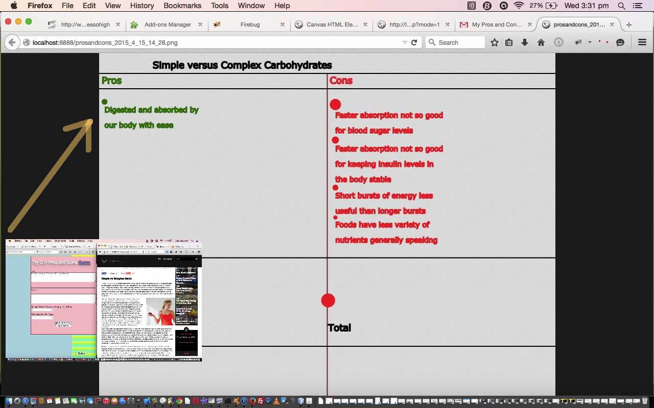
So the thoughts behind this version came from a topic of interest I’ve been looking into recently … the benefits and otherwise of Simple Carbohydrates versus Complex Carbohydrates, to your health and diet. One inspirational website for the research was here … thanks.
Continuing on with yesterday’s thinking, it occurred to me that there was enough complexity here to think about how to design a tool to help. Have always thought the concept of an “issue”, or a set of “issues” to do with a “topic” sounds the go. However, it occurs to me that this is not a great model without some mechanism for a user-defined “weighting” of the importance of any one “issue” to their thought patterns. And so that’s what we have today … a “topic” with a set of “issues” that the user supplies with a “rating” that is positive for a Pro and negative for a Con, and finally that “issue” is given a user-defined “weight”, to add that personal touch possibility to the decision making process, but objective enough, in that the user will keep thinking of “issues”, methinks … “me hopes”.
Here is the HTML programming source code for today’s tutorial you could call prosandcons.html and it changed from yesterday as per this link.
There is (unchanged) functionality in this game to email a snapshot of the game and the PHP programming source code that helps facilitate this functionality for today’s tutorial you could call prosandcons.php
Our “Simple versus Complex Carbohydrates” topic personalized thinking came up with the email linking you to this Pros and Cons report.
Try a pros versus cons issue yourself, and email your opinions forward, as you wish with our live run here. Hope to … see ‘ya in a while Croc O. Dial.
Previous relevant HTML Canvas Pros and Cons Game Primer Tutorial is shown below.
The HTML Canvas element is great for many types of games especially where you draw your own graphics based on interaction from the user.
Today you may consider our Pros and Cons “game” to be more of a “decision making tool” perhaps. Perhaps it may suit you as a way to be more objective about your decision making.
So the thoughts behind this first version came from a topic of interest I’ve been looking into recently … the benefits and otherwise of WordPress.com blog websites versus WordPress.org blog websites, as this blog is, by the way. One inspirational website for the research was here … thanks.
It occurred to me that there was enough complexity here to think about how to design a tool to help. Have always thought the concept of an “issue”, or a set of “issues” to do with a “topic” sounds the go. However, it occurs to me that this is not a great model without some mechanism for a user-defined “weighting” of the importance of any one “issue” to their thought patterns.
So that’s what we have today … a “topic” with a set of “issues” that the user supplies with a “rating” that is positive for a Pro and negative for a Con, and finally that “issue” is given a user-defined “weight”, to add that personal touch possibility to the decision making process, but objective enough, in that the user will keep thinking of “issues”, methinks … “me hopes”.
Here is the HTML programming source code for today’s tutorial you could call prosandcons.html
There is functionality in this game to email a snapshot of the game and the PHP programming source code that helps facilitate this functionality for today’s tutorial you could call prosandcons.php
Our “WordPress.com versus WordPress.org” topic personalized thinking came up with the email linking you to this Pros and Cons report.
Try a pros versus cons issue yourself, and email your opinions forward, as you wish with our live run here. Hope to … see ‘ya later Alli Gator.
Did you know?
The fact that we felt like putting things so much in double quotes above is pretty much a “lay down misere” indicator that this web application could well suit an (alternative) Object Oriented (ie. OOP) solution also, where the double quoted words could well be classes in your software design. Even though the basis of this web application only needs the HTML (the PHP usage is a bit optional, but useful (because the server-side is needed to create the snapshot image file, on the server, later used as a link in the email)) you may wonder how OOP ideas relate to HTML, but OOP can very much play a part in the way you code your JavaScript, and in seeking out solutions here, you may even end up exploring Ajax techniques. The combination of JavaScript and Ajax can make your web application be, or at least feel, as if it is totally client-based.
If this was interesting you may be interested in this too.
If this was interesting you may be interested in this too.
If this was interesting you may be interested in this too.
If this was interesting you may be interested in this too.


