There are lots of things to be “cross” about trying to code for all eventualities to do with web applications … we’ll just limit it to that …
- computer device … cross platform
- web browser … cross browser … and add to that, on occasions …
- supervision “mode”
… and by supervision “mode” we mean that surprising “assumptions” may be thrown out the “window” (tee hee), we’ve found out usually relating to using mobile devices, when your web application is hosted in an HTML iframe things do not function anything like it does as “top.document” (ie. the first “call” of the web browser address bar) even when everything else is the same. Okay, in our experience, this is rare, but think we remember when on other occasions this issue has reared up in front of us, it was, as with today, to do with issues revolving around …
- horizontal hashtagging … and associated …
- horizontal scrolling … when your …
- content extends to the right beyond the physical width of the (we’ve always found it to be, mobile) device
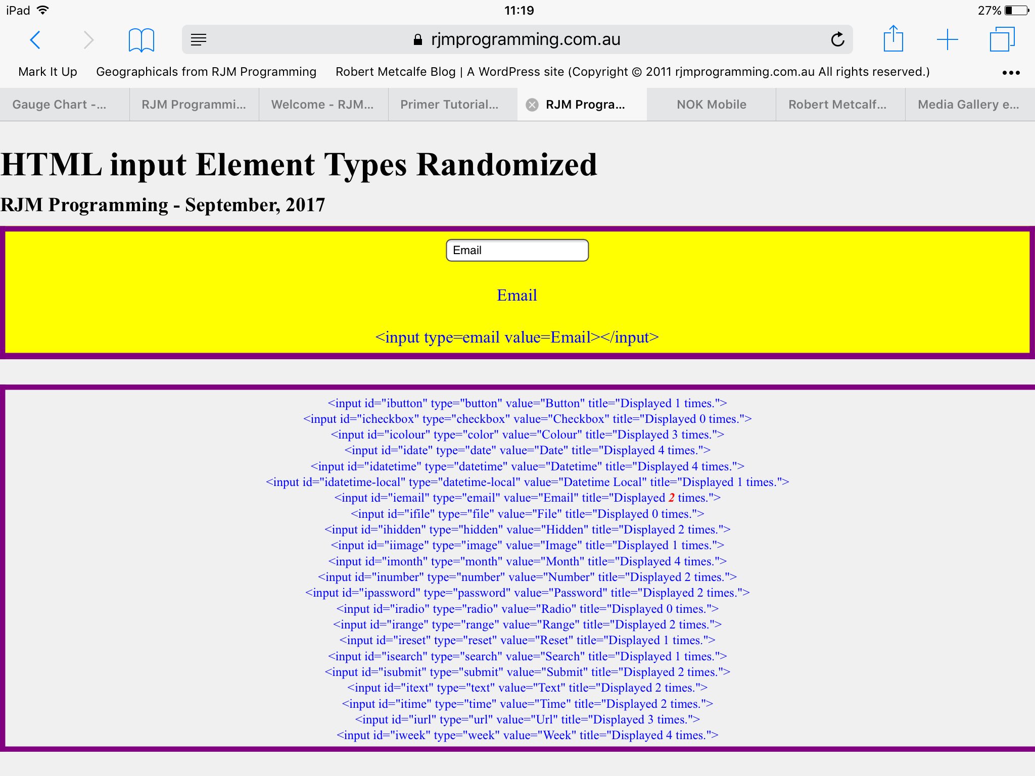
And so, we’re revisiting yesterday’s HTML Input Element Types Randomized Primer Tutorial because we found that when we hosted its associated “HTML input Element Types Randomized” (mini) web application in an HTML iframe element, as we did at the blog posting, here, we hadn’t tested this on an iPad, for instance, and found to our horror the next morning that it worked okay as “top.document” (via a “click picture”) execution, but showed very little content when hosted by the iframe and when using any of the web browsers (we tested Safari and Chrome) on an iPad (mobile) tablet.
We spent several fruitless hours persisting with our stubborn “horizontal scrolling” approach, and we’ve left that struggle in the code, for others to take up, if they feel adventurous, but the solution required a little bit of simplistic thinking.
We live in a three dimensional world. To be “stuck on” the idea of “horizontal scrolling” is to ignore the Y and Z dimensional “view”, in favour of “X” thinking. What about “Y” thinking? Well, after the “X” struggle, we thought about it, and thought maybe this was feasible with less talk on Google about “vertical scrolling mobile issues” than the heaps about “horizontal scrolling mobile issues”, but then the “vertical” “Y” thinking has its own problems. The “height” of a device is a bit of a vague concept too, and it has the complication that if you want to specify a height that equals the device height, we’ve found success using units in “vh” rather than “%”, and we started thinking this aspect alone will lead to as much complication with “Y” thinking as “X” thinking.
So, what about “Z” thinking? Well, there is the joy with CSS’s wonderful (and we normally talk about with “overlay” thoughts) …
… as the web application equivalent of our geographical talk regarding “elevation”. Let’s “cherry pick” our way out of the issues! The problem can be solved really simply with the MVC (C represents Javascript) “wresting of control” from the default MVC (V represents CSS) percentage definition of HTML div element’s …
- left property … and for our problem cases, which we bit the bullet and classified as “all mobile devices” we “wrested control of left to 0” (via Javascript DOM, once, at the first call) and started, instead, to make the dynamic property, be …
- z-index which we, on a first call case, set to an “order indexed value” (Javascript DOM wise), and increase for a particular “focussed” “HTML input Element Type” (and then later defaulted back to its “order indexed value”) as execution of the web application proceeds
… as a much simpler solution, where for these problematic cases, think (a web design involving) “a wad of A4 sheets” (like vertical stacking) versus the default “film strip” (in X) (ie. horizontal scrolling) approach and the coalescing “concepts” of …
- overlay … and/or …
- reveal
There’s that issue, and then there’s the other “forward move” with our web application. Did you end up reading HTML Textarea and Div Talents Primer Tutorial as you were invited to yesterday? There, you would have seen a table as below explaining …
But their strengths and weaknesses go like this, at least to us, in the limited HTML text view of things …
Text Functionality Issue HTML Element Type Strength Weakness (where a “Yes” is like … “Oh No!”) Display Monocolour Text Textarea Yes Div Yes Display Editable Text Textarea Yes Div Yes Display Multicolour Text Textarea Yes Div Yes
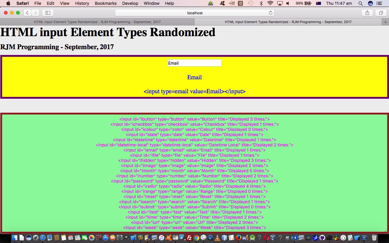
As you would have viewed yesterday’s incarnation of the web application, your eye may have not known where to rest, with respect to the middle bit or the report bit, because both change, but the “middle” is immediately relevant whereas the bottom HTML textarea element report can sometimes be of diverting interest. Well, that is the scenario, where something of “diverting interest” but with quite a lot of content to take in, can benefit the user greatly with a “focussing” technique, such as just highlighting the tiny bit of its content that changed just recently. You can’t achieve this “highlighting” with the HTML textarea element, but you can with an HTML div element, which we … you guessed it … separated from the HTML textarea by establishing different, and Javascript DOM dynamically controlled …
… the “star” of today’s work.
The “top.document” live run link hopefully has an execution look the same as the HTML iframe HTML iframe hosted live run (below), especially on a mobile device. The HTML and CSS and Javascript is now downloadable as hashtag_idea.html and changed this way.
Previous relevant HTML Input Element Types Randomized Primer Tutorial is shown below.
We are quite pleased here, with a web application design (mini) project, when all three of …
- HTML
- Javascript
- CSS
… get a relatively even workload, and also that you can think of their roles as being quite separate in code presentation. Sort of like that separatism I remember leaving the best bits (ie. the “Javascript” of the “food” world) of the meal to last as a kid. And so it came to pass here, as the order of attending to the code was …
- HTML
- CSS
- Javascript
… and it occurs to us, if you like compartmentalization yourself as a creed you are going to see some MVC‘ism (Model-View-Controller … we venture HTML-CSS-Javascript (DOM)) in all this. We find the use of HTML with inner CSS and inner Javascript irresistible generally, but it is satisfying taking a rest from this.
What’s the go with today’s “HTML input Element Types Randomized” (mini) web application project today? It was inspired by yesterday’s “horizontal hashtag” talk when we presented Zipfiles in PHP Image Gallery Navigation Tutorial and coalesced into those web design “staples” …
- overlay … or …
- reveal
… we use around here to pare down the web design process into our most popular two constructs, today’s falling into that reveal “staple”. We’re doing a “horizontal” “reveal” off the user’s screen today via CSS concepts of …
- position:absolute property … teamed, primarily, with the control of …
- left property … using percentage values off the screen, such as 500% being for the sixth “reveal” “webpage” of interest (and so things don’t “jigger” too much we make the HTML div width be almost 100% (ie. 98%)) … and making use of …
- window.location=’#place’; // Horizontal hashtagging, as being in web page and (you will really quickly go to) HTML element id=place position on the webpage … facilitated by our, so often used, “randomosity” Javascript construct …
choice = Math.floor(Math.random() * diarray.length); // where diarray array is a collection of what is today's "content" idea, that being ...- HTML input element type properties “presentation” within HTML div elements showing the look, a type and the HTML outerHTML property (where we use the CSS pseudo-element
#dbutton::after { content:'\A\A Button\A\A <input type=button value=Button></input>'; }type of syntax to effectively add “captions”) in the middle of the web page … with a top heading (h1 and h3), as well as … - HTML textarea element (and it occurs to us a read of HTML Textarea and Div Talents Primer Tutorial would be good, again, here) containing a report of the “randomosity” and being pulled along “horizontally (as with the h1 and h3) via …
document.getElementById('myta').style.left=window.getComputedStyle(diarray[choice], null).getPropertyValue('left').replace('px','') + 'px'; // powered by a self calling and self timing ...setTimeout(randomize,3000); // call of the one Javascript function of our (mini) web application project ... as you can see happening with ...
… to end up with a “horizontal hashtagging” “reveal” “HTML input Element Types Randomized” web application you can try at this live run link and with this HTML/CSS/Javascript hashtag_idea.html source code (all together, but really suited to redesigning with external CSS and external Javascript).
If this was interesting you may be interested in this too.
If this was interesting you may be interested in this too.


