Yesterday’s HTML Nested Centering via CSS and Javascript DOM Tutorial “started us” (we think we’ll need time to refine setTimeout delays by letting the usage be tested over time over more non-mobile web browsers to see what happens here) down the road of involving Javascript DOM in adding dynamics to our latest web application involving “Nesting Centrism”.
Today we augment that with a long running dream for us, the concept of a “timed multiple selection mode HTML select element dropdown” … guess you had to be there … you see we were in amongst some beach dunes … the reeds were blowing in the wind … a beachball came from nowhere … nowhere, I kid you not … hit the ol’ noggin’ just here … here, not there … here … and well … the idea of a “timed multiple selection mode HTML select element dropdown” was born … and am not predicting am alone wanting to do this. Trouble is, with mobile platforms that sort of capture multiple mode select element dropdowns into their own “little web” of functionality, and only release it when all is done, but for those other platforms … sorry, but we admit defeat, perhaps forevvvvveeeeerrrr, on mobile ones … we are going to start down that road of timed multiple mode selections, the only aim of which is to do away with the need for HTML input type=button (or some other button idea) to accompany the HTML select (dropdown) multiple mode entry element.
Is it all worth it? Maybe not, but will tell you, for this project’s functionality that is “stateless” (ie. can be done anytime from any vantage point, and will be alright without that context of past “goings on”), a timed multiple mode HTML select element (for non-mobile platforms) can perform multiple tasks very quickly. And we add a lot more types of tasks to yesterday’s …
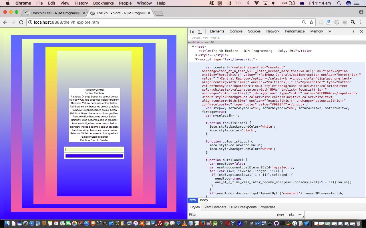
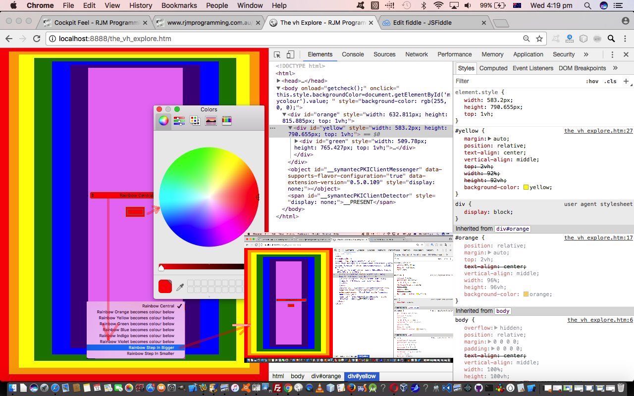
- replace the “Rainbow Central” text with an HTML select (dropdown) element full of Javascript DOM controlled client functionality via a Javascript global variable included into the “content” picture by using the document.write method to initially populate and have a document.body onload event method of overriding that content with user supplied $_GET[] argument data, should there be some curious users out there … all of which …
- allow the user to change background colours via a “new to HTML5” input type=color element (that we last referred to with PHP/Javascript SVG Colour Picker Tutorial)
- allow the user to increase or decrease the “step into” size of the HTML div element nesting
- allow the user to change background colour gradients via another “new to HTML5” input type=color element (that we last referred to with PHP/Javascript SVG Colour Picker Tutorial) because a color gradient is defined by two colours
As a result, the HTML and Javascript (DOM) and CSS code now looks like the_vh_explore.htm and changed in this way for these multiple mode select element and multiple input type=color element changes, today.
Previous relevant HTML Nested Centering via CSS and Javascript DOM Tutorial is shown below.
Today we’re adding to the “looks good” but “doesn’t do much” web application emanating from HTML Nested Centering via CSS Primer Tutorial by adding Javascript DOM into the mix. Without scripting such as Javascript (and using the Document Object Model (DOM)) or VBScript (only for Internet Explorer) web pages tend to be “not doing much” but maybe “looking good”, though we did show you an awkward way to use CSS to “do a little” when we presented Do It Yourself HTML Textarea Editor CSS Pseudo Element Tutorial.
But back to more conventional approaches, how do we “value add” to our Javascript DOM changed web application today?
- replace the “Rainbow Central” text with an HTML select (dropdown) element full of Javascript DOM controlled client functionality via a Javascript global variable included into the “content” picture by using the document.write method to initially populate and have a document.body onload event method of overriding that content with user supplied $_GET[] argument data, should there be some curious users out there … all of which …
- allow the user to change background colours via a “new to HTML5” input type=color element (that we last referred to with PHP/Javascript SVG Colour Picker Tutorial
- allow the user to increase or decrease the “step into” size of the HTML div element nesting
In order to do the latter we channel a technique we used back at Textarea Width and Height Control Primer Tutorial …
… and this type of change checks on widths and heights within the input type=range Javascript global variable tadw93 and tadh93 (sanity check, based on proportions involving current dimensions versus those right at the beginning in that default “93” look)
… except that our magic number for today is 96, which is the first HTML div’s percentage width whose real (physical) dimensions in pixels (px) we derive by using code like …
var firstgo=true;

var odivs=document.getElementsByTagName('div');

for (var idivs=0; idivs<odivs.length; idivs++) {

 if (firstgo) {

   var sofarwunit=eval(eval(('' + window.getComputedStyle(document.getElementById(odivs[idivs].id), null).getPropertyValue("width").replace('px','').replace('%','').replace('vh',''))) / 96);

   var sofarhunit=eval(eval(('' + window.getComputedStyle(document.getElementById(odivs[idivs].id), null).getPropertyValue("height").replace('px','').replace('%','').replace('vh',''))) / 96);

   firstgo=false;

 }

}
We try to keep everything centered, but centering HTML select element option tag text is quite difficult across all the browsers and platforms, and we settled for some new CSS that goes …
select { text-align-last:center; direction: rtl; }
… inspired from some advice from this useful link, thanks.
And this results in variables sofarwunit and sofarhunit being pixel (px) numericals representing 1% of width and 1vh of height (for your current screen window) respectively. Once we know this, we can add or subtract offsets proportionally, because the order of getElementsByTagName HTML div elements will be in that “rainbow nesting” order.
The HTML and Javascript (DOM) and CSS code now looks like the_vh_explore.htm and changed in this way for these, mainly Javascript DOM, changes, today.
Previous relevant HTML Nested Centering via CSS Primer Tutorial is shown below.
We’ve talked before about why with our HTML webpage design we so often turn to the HTML table element when it comes to “precision” alignment requirements. We find the HTML table element “gels” well with what we grew up to be comfortable with “geometry wise”. Nevertheless, what must be said, is that as you read about the “net” regarding webpage design, you will be pointed towards using HTML div elements ahead of the HTML table element, and so we want to dedicate some “centering” alignment blog postings that at their “heart” use HTML div elements as their centerpiece (boom, boom) rather than our “comfort zone” tables.
Perhaps a good first read here regarding alignment, as far as inhouse blog postings go, would be to read HTML/Javascript/CSS Reveal Top Left to Bottom Right Tutorial below.
Now thinking about this topic, one quite dear to us, as we always go around adjusting mal-aligned pictures on walls, we were encouraged by a recent “reading something while surfing the net”, the discovery of which we also used in Textarea Width and Height Control Primer Tutorial, about the CSS “vh” vertical units syntax, that we are keen to “harness” because we think we might be able to build a mobile-friendly web application that does not need an “explicit” meta tag “viewport” setting. It’s not for us any “war” against the meta “viewport” tag as such, but it is just that am a little skeptical of concepts not needed before a certain point of time, and if you tell me of one, I’d prefer the more “fundamental” original approach where this is possible and feasible and sensible … and just for the purposes of finding out “if” something can be done, and that help finding out “how” things work.
In this first “Primer” (CSS and HTML only) web application blog posting …
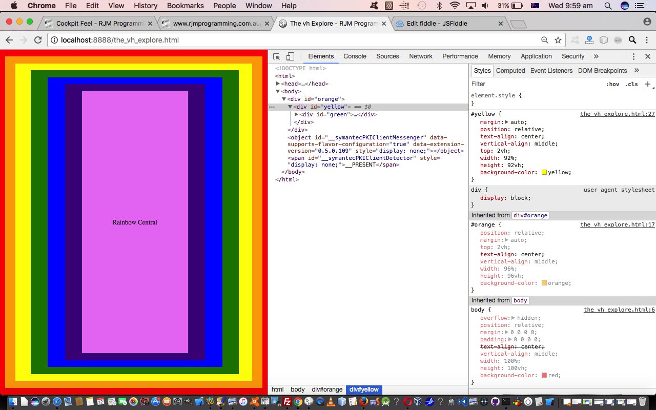
- we only use CSS to style nested HTML div elements, along with one “content” nested HTML table featuring the colours of the rainbow … meaning …
- the only properties used within the HTML are id properties
… so that the look of the left side of today’s tutorial picture is created via the inline CSS (ie. CSS within HTML) …
<!doctype html>

<html>

<head>

<title>The vh Explore - RJM Programming - July, 2017</title>

<style>

body {

  overflow: hidden;

  position: relative;

  margin: 0 0 0 0;

  padding: 0 0 0 0;

  text-align: center;

  vertical-align: middle;

  width: 100%;

  height: 100vh;

  background-color: red;

}

#orange {

  position: relative;

  margin: auto;

  top: 2vh;

  text-align: center;

  vertical-align: middle;

  width: 96%;

  height: 96vh;

  background-color: orange;

}

#yellow {

  margin: auto;

  position: relative;

  text-align: center;

  vertical-align: middle;

  top: 2vh;

  width: 92%;

  height: 92vh;

  background-color: yellow;

}

#green {

  margin: auto;

  position: relative;

  left: 0.5%;

  text-align: center;

  vertical-align: middle;

  top: 2vh;

  width: 88%;

  height: 88vh;

  background-color: green;

}

#blue {

  margin: auto;

  position: relative;

  text-align: center;

  vertical-align: middle;

  top: 2vh;

  width: 84%;

  height: 84vh;

  background-color: blue;

}

#indigo {

  margin: auto;

  position: relative;

  text-align: center;

  vertical-align: middle;

  top: 2vh;

  width: 80%;

  height: 80vh;

  background-color: indigo;

}

#violet {

  margin: auto;

  position: relative;

  text-align: center;

  vertical-align: middle;

  top: 2vh;

  width: 76%;

  height: 76vh;

  background-color: violet;

}

#themiddle {

  position:relative;

  top: 0%;

  text-align: center;

  vertical-align: middle;

  display: table-cell;

}

table { width:100%; height:100%; }

</style>

</head>

<body>

<div id='orange'>

<div id='yellow'>

<div id='green'>

<div id='blue'>

<div id='indigo'>

<div id='violet'>

<table><tr><td id='themiddle'>Rainbow Central</td></tr></table>

</div>

</div>

</div>

</div>

</div>

</div>

</body>

</html>
Now with styling it is incredibly important to start out correctly, because CSS inherits a lot, so let’s look at …
body {

  overflow: hidden;

  position: relative;

  margin: 0 0 0 0;

  padding: 0 0 0 0;

  text-align: center;

  vertical-align: middle;

  width: 100%;

  height: 100vh;

  background-color: red;

}
… and as you can see the height “vh” is syntax akin to “%” is for width, as a general principle. What else is going on here, in layman’s terms?
- overflow: hidden; is there to see, and it is not immediately obvious with such a simple web application, yet, that scrolling is not necessary
- position: relative; says to position according to HTML elements already “rendered” in place
- margin: 0 0 0 0; and padding: 0 0 0 0; get rid of any element dimensions not to do with the actual “rendering” of the actual “element”
- width: 100%; and height: 100vh; are the statements to say the document.body (sorry about the Javascript DOM reference, in this CSS only blog posting) element show cover the whole web browser window (or screen)
- text-align: center; and vertical-align: middle; are the “centrists” here, and in what follows, but be warned that the nub of the issue of “vertical centering” (of “content within” those HTML div elements, in today’s case) and the use of the CSS property “vertical-align” is that many other HTML element types ignore these settings (as far as the “content within” goes) … not so HTML tabular ones!
The nested div elements that follow (as colours of the rainbow) all follow a pattern (hint for the Javascript DOM “sequel”), so let’s look at one, and discuss anything new …
#orange {

  position: relative;

  margin: auto;

  top: 2vh;

  text-align: center;

  vertical-align: middle;

  width: 96%;

  height: 96vh;

  background-color: orange;

}
… and guess the first thing to note is the CSS # syntax to flag elements by property id so that #orange CSS syntax is saying “match this CSS styling to any HTML element with id=’orange'”. As far as margin: auto; goes, this useful webpage, thanks, says …
margin:0 auto;
0 is for top-bottom and auto for left-right. It means that left and right margin will take auto margin according to the width of the element and the width of the container.
Generally if you want to put any element at center position then margin:auto works perfectly. But it only works in block elements.
… and though we say nothing about “left” we do say in all “nested” HTML div elements, “top: 2vh;” as the “rainbow colour” stepping (“into the nest”) is 2% (horizontal) and 2vh (vertical) (so far hardcoded … and hint for the Javascript DOM “sequel”).
Which brings us to that little bit of “Rainbow Central” text, and it is where that “vertical-align” concern mentioned above comes into play. In practice, we tried HTML span and div elements before settling on …
<table><tr><td id='themiddle'>Rainbow Central</td></tr></table>
… with its associated CSS styling (note, here, no need for vertical “vh” units (in favour of “%” everywhere now) any more) …
#themiddle {

  position:relative;

  top: 0%;

  text-align: center;

  vertical-align: middle;

  display: table-cell;

}

table { width:100%; height:100%; }
… because it appears to us to be very difficult to vertically center “content within” elements (within parents defined with CSS styling “vertical-align: middle;”) that are not HTML tabular by nature, though we readily admit we may have lots more to learn here.
Anyway, if you want to “see” this in action … and that’s all you can do, so far … hint for the Javascript DOM “sequel” … try the HTML/CSS the_vh_explore.html source code’s live run link.
Previous relevant HTML/Javascript/CSS Reveal Top Left to Bottom Right Tutorial is shown below.
We need to revisit the “Reveal” series of blog postings, and elaborate a bit. The reason is that something we were doing yesterday with presenting the top left “subset” picture (of the main tutorial picture at the top) you can see at Trip Mobile Device Usage Clock Tutorial reminded us of the powerful HTML div element CSS overflow: hidden; style property’s usefulness. Hence the reference to a “Reveal” tutorial of relevance below called HTML/Javascript/CSS Reveal Top to Bottom Primer Tutorial as shown below, which is built upon, with its top to bottom revealing talents, to present, today, a reveal from top to bottom and left to right. You will find with writing this code that all of the previous tutorial’s …
- CSS overflow: hidden; style property
- Encasing working visible HTML elements within div element for ease of:
- positioning
- scrolling, or not
- visibility control
- Javascript setInterval and clearInterval timer functionality
- Javascript DOM methods to dynamically change HTML (over time)
- HTML/CSS body element background URL (with fallback background colour) and the Javascript control of its fallback to just the background colour and that it is Clickable
… remain relevant, and some additional ideas as below …
- There were a lot of those old “sinful” align=’center’ usage we talked about at W3C XHTML Nu Checker Validation Primer Tutorial going on which we diligently changed to style=” width:100%;text-align:center; “ for most HTML elements, in order to preserve horizontal centering, which meant that …
- Window.getComputedStyle Javascript functionality that is needed to combine with …
- CSS margin-left style property
- Events onload helps us out initially and onresize helps us out should the window size change to contribute to the document.body width calculation required to derive a good margin-left value to use
… are needed to make the whole thing work.
We hope this is food for thought for you, and we’ll leave you with …
- Live Run
- HTML programming source code you could call reveal_lefttoright_toptobottom.html
- How we got there from the top to bottom logic of tutorial below can be seen here
Previous relevant HTML/Javascript/CSS Reveal Top to Bottom Primer Tutorial is shown below.
Welcome to a new discussion regarding HTML, Javascript and CSS on the theme of “reveal”. We’ll be doing several postings on this theme, and today we have the first.
Do you often wish to make webpages that hide things until the user interacts with the webpage or some time period has expired, so that there is some sort of element of surprise?
No?
Do you sometimes wish to make webpages that hide things until the user interacts with the webpage or some time period has expired, so that there is some sort of element of surprise?
Still no, huh? (Aside: two can play this little game)
Do you occasionally wish to make webpages that hide things until the user interacts with the webpage or some time period has expired, so that there is some sort of element of surprise … OR …
will allow those who have never had this thought in their life on Earth?
No again, huh? (Aside: two planets can play this puerile little game!)
Do you ever wish to make webpages that hide things until the user interacts with the webpage or some time period has expired, so that there is some sort of element of surprise … OR …
will allow those who have never had this thought in their life on Earth, nor Mars?
Non? Nicht? Good nicht! (chortle, chortle)
Well, that’s fixed their little red wagon.
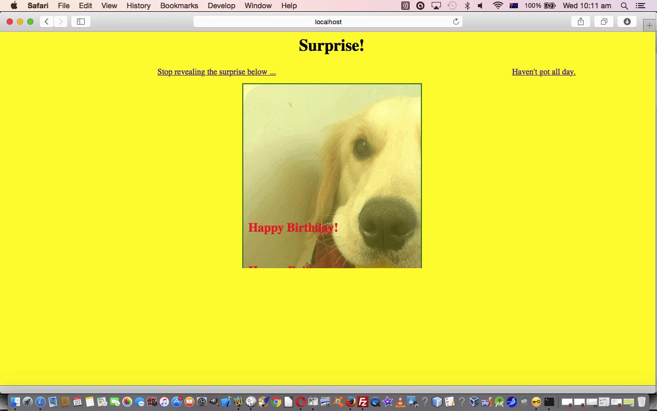
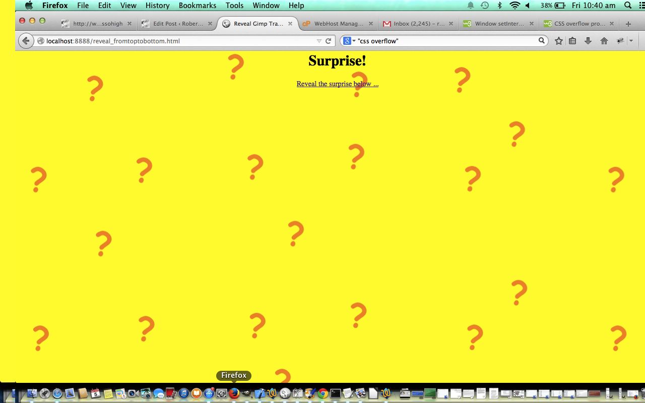
Here is a tutorial that “reveals” a surprise from top to bottom using HTML, Javascript and CSS, featuring:
- CSS overflow: hidden; style property
- Encasing working visible HTML elements within div element for ease of:
- positioning
- scrolling, or not
- visibility control
- Javascript setInterval and clearInterval timer functionality
- Javascript DOM methods to dynamically change HTML (over time)
- HTML/CSS body element background URL (with fallback background colour) and the Javascript control of its fallback to just the background colour and that it is Clickable
So here is today’s tutorial’s live run, and here is the HTML programming source code you could call reveal_fromtoptobottom.html which called on the content of this tutorial.
Chow for now, brown cow (she’s always on(line), you know … but is anything sinking in?! … I haven’t been able to moo respectfully in public after 63.5 lessons?! … she still owes me that half lesson when she didn’t get up in time for milking).
If this was interesting you may be interested in this too.
If this was interesting you may be interested in this too.
If this was interesting you may be interested in this too.
If this was interesting you may be interested in this too.
If this was interesting you may be interested in this too.

