HTML/Javascript Overlay Primer Tutorial... click shows animation which is best seen with window scrunched up to show no deep red background colour ahead of clicking
Today we're continuing on with the HTML overlay ideas and showed, yesterday, with HTML/CSS Overlay Primer Tutorial, some CSS to do with the idea of overlaying HTML elements, and today we give Javascript a turn, and show some animation as well, using the Javascript function setTimeout used in a recursive way (you might remember this being important with HTML/Javascript Canvas Rummy Card Game Primer Tutorial). It features a cheesy welcome that moves down and out of view to become an even more cheesy marquee style Eat at Joe's. We talked a bit about this approach with Javascript in Your WordPress Post Primer Tutorial too.
Try a live run click, but please note that the click shows animation which is best seen with your web browser window scrunched up to show no deep red background colour ahead of clicking ... some room for your improvement!
The prototype HTML and Javascript source code you could call do_our_animation.html and its "proof of concept" unit test live run will show you the background to the idea, and it may pan out that you might want to contrast that code with the WordPress post code below, because it changed quite a bit to do with WordPress blog styling for the TwentyTen theme we use on this blog (will bid you happy blogging for now ... chow ... after the Did you know?, that is):
var topis = 0, leftis = 0, widthis = 940, heightis = 198, cimage = "", nextis = eval((Math.abs(0) + 1) % 12);
if (document.body.innerHTML.indexOf('my' + 'overlay') == -1) {
if (document.getElementById("mytopimage").top == undefined) {
topis = document.getElementById("mytopimage").clientTop;
} else {
topis = document.getElementById("mytopimage").top;
}
if (document.getElementById("mytopimage").left == undefined) {
leftis = document.getElementById("mytopimage").clientLeft;
} else {
leftis = document.getElementById("mytopimage").left;
}
if (document.getElementById("mytopimage").width == undefined) {
widthis = document.getElementById("mytopimage").clientWidth;
} else {
widthis = document.getElementById("mytopimage").width;
}
if (document.getElementById("mytopimage").height == undefined) {
heightis = document.getElementById("mytopimage").clientHeight;
} else {
heightisis = document.getElementById("mytopimage").height;
}
heightis = 285;
//alert(topis + " " + leftis + " " + widthis + " " + heightis);
//cimage = "<" + "img width='" + eval(widthis + 40) + "' height='" + eval(heightis + 10) + "' alt='Our animation' ";
cimage = "<" + "img onclick=' location.href=" + '"' + "http://rjmprogramming.com.au/wordpress" + '"' + ";' width='100%' height='" + eval(heightis + 10) + "' alt='Our animation' ";
cimage = cimage + " src='overthetop" + eval(Math.abs(nextis)) + ".png' id='my" + "overlay' style=' z-index:999; opacity:0.7; position:absolute;";
nextis = eval((Math.abs(nextis) + 1) % 12);
cimage = cimage + " top:" + topis + "; left:" + leftis + ";'" + ">" + "<" + "/img" + ">" + "<" + "input type='hidden' id='nextis' title='0' style='display:none;' value='" + nextis + "'" + ">" + "<" + "/input" + ">";
//alert(cimage);
//document.title = cimage;
document.getElementById("site-title").innerHTML = cimage + document.getElementById("site-title").innerHTML;
//window.scroll.left = 0;
document.body.style.backgroundPosition="0% 0%";
} else {
nextis = document.getElementById("nextis").value;
document.getElementById("my" + "overlay").src = "overthetop" + eval(nextis) + ".png";
nextis = eval((Math.abs(nextis) + 1) % 12);
if (eval(nextis) == 0) {
if (document.getElementById("nextis").title.length < 5) {
nextis = "7";
document.getElementById("nextis").title = document.getElementById("nextis").title + "0";
} else {
document.getElementById("nextis").title = "0";
}
}
document.getElementById("nextis").value = nextis;
}
setTimeout(do_our_animation, 1000);
}</script>
Did you know?
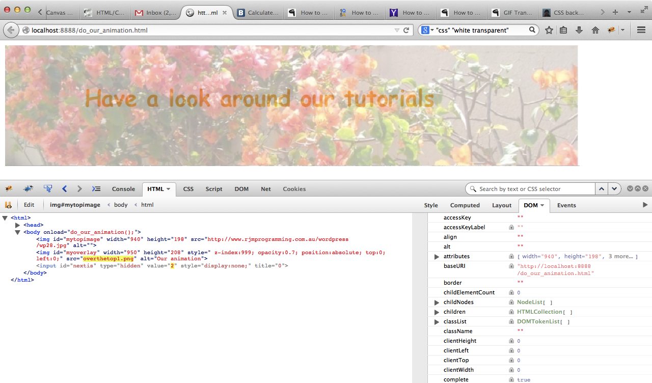
The tutorial picture today features the Firefox web browser and a very useful add-on called Firebug which you may want more information about here, which is commonly used to debug client-side Javascript and HTML. As for today's usage, Firebug is also extremely useful in deconstructing how a web page was created. The other simple wonderful tool for this is the web browser's equivalent menu command like View->Page Source (or sometimes equivalent of right-click Page Source). Firebug has a sister product called FirePHP which helps debug server-side PHP and Ajax work.
Previous relevant HTML/CSS Overlay Primer Tutorial is shown below.
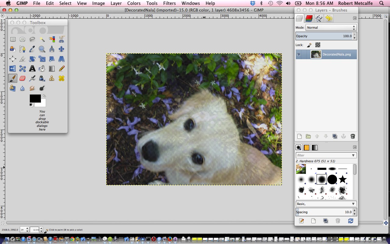
A previous Gimp Layers Primer Tutorial (as shown below) gave you an insight into the massive possibilities of using a sophisticated image editor and use layers with various amounts of transparency, especially suited to use with png image files, and today we build on that idea to present another idea along those same wavelengths ("permanent wave" for those having a bad hair day or have a hand that wants to wave ... don't we all?!) in the use of HTML and CSS and use the concepts of:
- z-index
- position:absolute
- opacity
- same size for elements (optional idea, but good for ease of use)
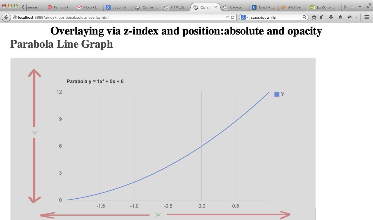
In that previous Gimp Layers Primer Tutorial (as shown below) transparency (or its obverse, opacity) can be used to have the one image achieve several "ends" (ie. purposes). The same thing happens today by overlaying an image on top of a Google Line Chart plotting a parabola (presented in an iframe, whose dimensions are arranged to match the dimensions and positioning of our image ... hence the "optional idea" above), to have the image content help out the Google chart, to clarify axis names and hence, help refine the purpose of the chart.
In that previous Gimp Layers Primer Tutorial (as shown below) we mentioned that lots of those classic "Photoshopping" techniques can be achieved in Gimp, and some other tutorials at this blog touch on that. What we can say today is that CSS can help out as well, to achieve similar ends, or you can adopt a combination of approaches, perhaps.
In that previous Gimp Layers Primer Tutorial (as shown below) we imagined what the concept of a layer was with regard to image manipulation. Today we see it in terms of layering HTML elements using the CSS z-index idea ... the bigger the z-index the closer the "layer" is to the viewer's eye (read about the Earth geoid here and as a space traveller you'd be tempted to give Mt Everest a z-index of about z-index:8000 and the Dead Sea a z-index of z-index:-418 ... except that Mt Everest doesn't sit on top of the Dead Sea, the last time I did the R&D ... mind you?! ... z-index:80008848 vs z-index:-418-422), and then we allow opacities less than one (one is opaque, zero is transparent) to make room for multiple layer see through effects. The use of position:absolute opens the door to the web browser sort of being fooled into doing something that doesn't come naturally to it ... overlay HTML elements (possibly) on top of each other ... another CSS parameter you may be interested in for overlay is the use of negative values for margin-top.
Link to some HTML and CSS programming source code is here and you could call zindex_positionabsolute_overlay.html and try the live run while you are at it. In isolation the overlay is pretty simple and can be called xaxis.png
Previous relevant Gimp Layers Primer Tutorial is shown below.
Here is a tutorial that gives you an insight into the massive possibilities of using a sophisticated image editor and use layers with various amounts of transparency, especially suited to use with png image files.
Transparency (or its obverse, opacity) can be used to have the one image achieve several "ends" (ie. purposes). Although it is a bit of a clumsy example in the tutorial, you can see that the technique can be used for artistic purposes ... often called "Photoshopping" (named after the more famous, and also brilliant, rival product, Photoshop).
Lots of those classic "Photoshopping" techniques can be achieved in Gimp, and some other tutorials at this blog touch on that.
Am sure you can imagine what the concept of a layer is with regard to image manipulation. Within Gimp, for beginners not used to this concept, you find yourself underestimating and underplaying what can be achieved with the various layers of a multi-layered image. In simplistic terms each layer has the functionality in Gimp to be treated as a whole new image, and this is the best way to think of it when trying to achieve what you want to achieve with Gimp.
Link to Gimp "spiritual home" ... here.
Link to Gimp forum ... here.
If this was interesting you may be interested in this too.
If this was interesting you may be interested in this too.
If this was interesting you may be interested in this too.


