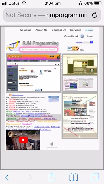
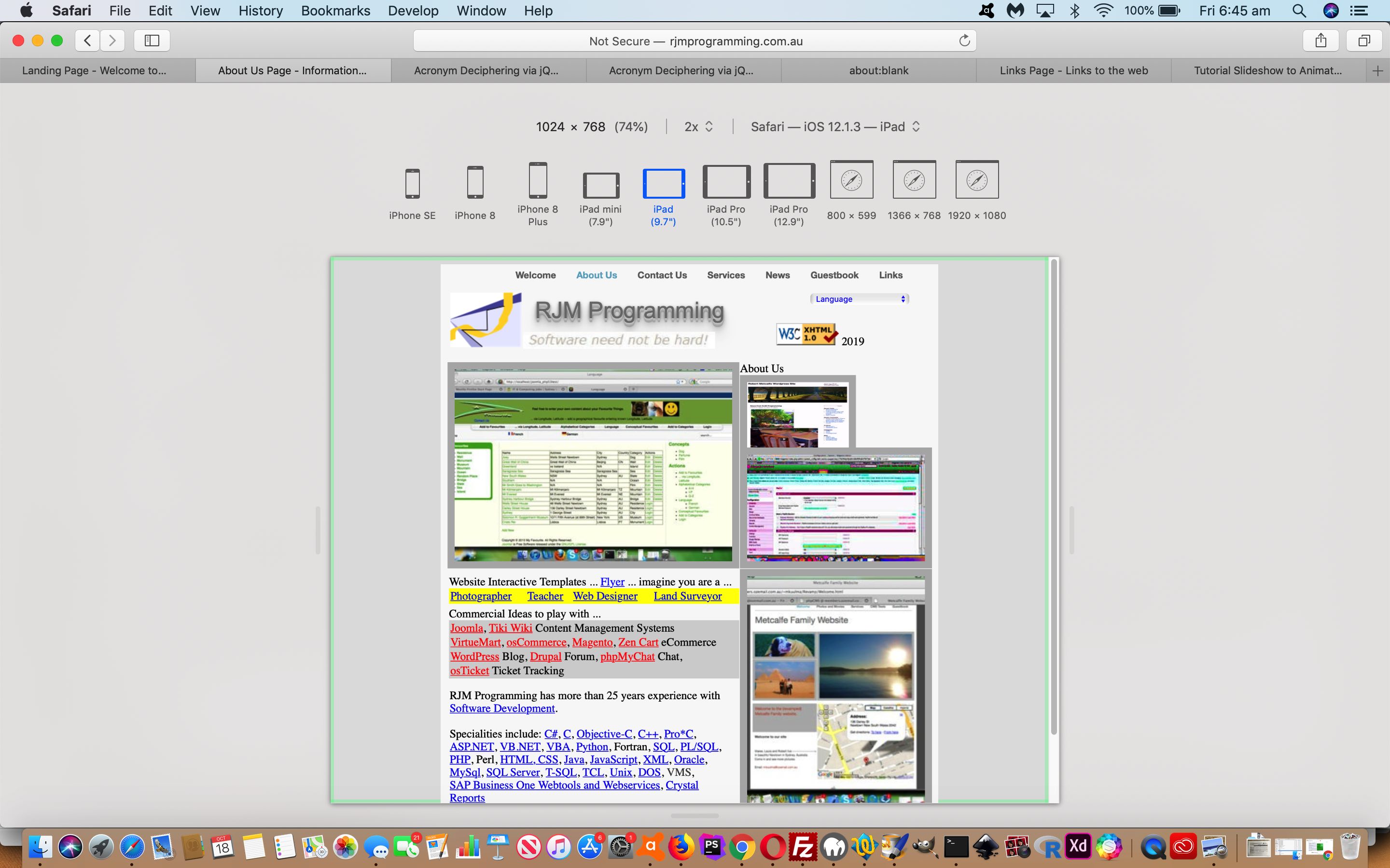
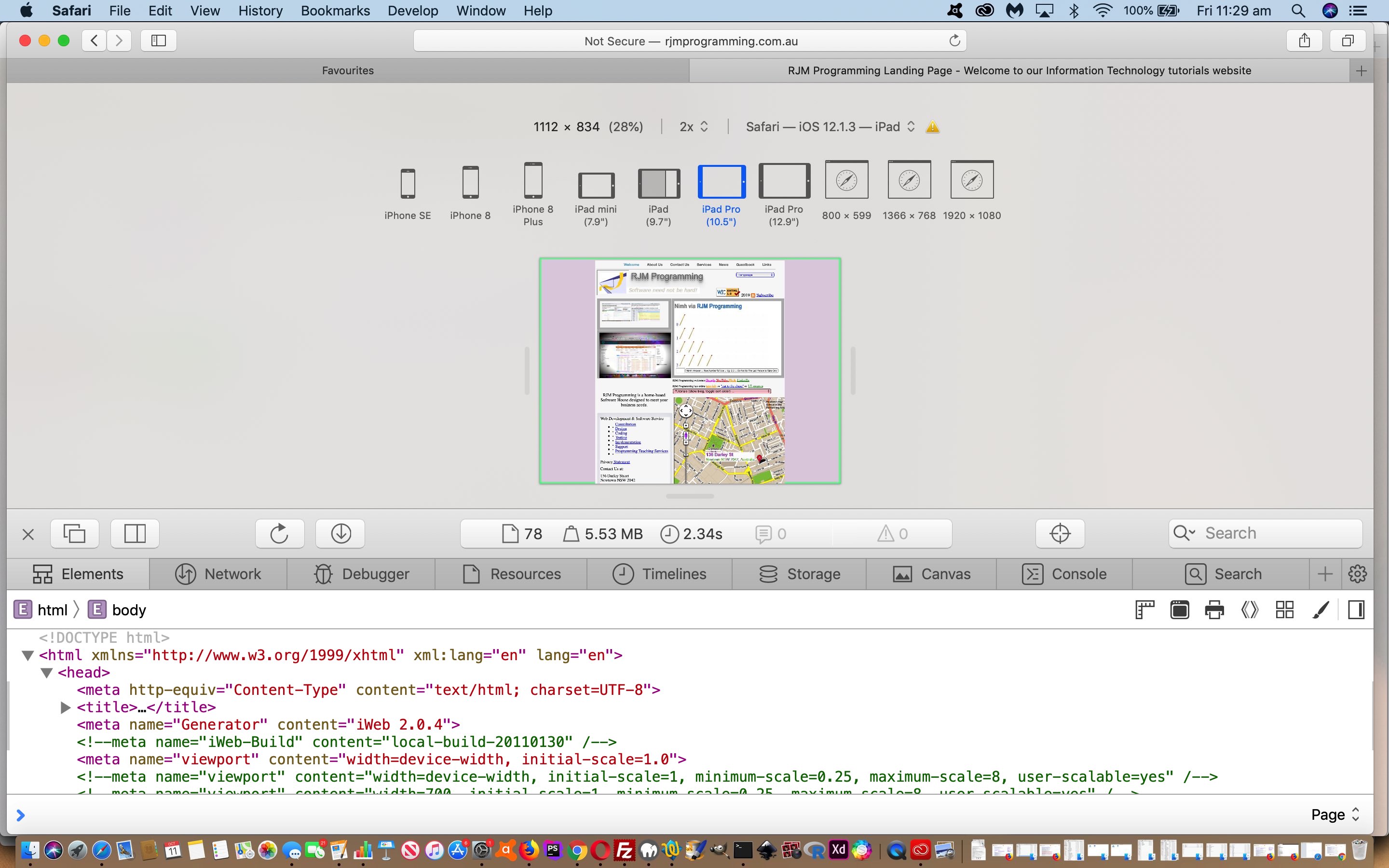
The recent Responsive Design Viewport Initial Scale Tutorial represented a …
- CSS viewport, and after that, “glow styling”, set of improvements specific to mobile platforms … and you can probably guess that we’re also interested, today, in …
- Javascript client event code improvement specific to mobile platforms aiding navigation with the top menus … where the idea is to introduce the concept of …
Look, Mum, no fingers!
… navigation between Landing Page HTML/Javascript/CSS webpages from left to right just by changing the orientation of your mobile device from/to Portrait/Landscape (having not acted any other way within the current webpage)
We’ve never done this before, and daresay am not sure I’ve seen it on many other websites, so went about informing the user of the navigational possibility here by placing the 🔁 ( ie. 🔁 ) emoji next to the menu item an orientation change can navigate you to (clearing the emoji on any other action on that webpage). So, this is not technically difficult, but we did find iOS problems with a “screen.orientation” always coming back “undefined” and so (thanks to the great advice of this webpage) we ended up checking for “undefined” and resorting to the use of window.matchMedia in this scenario.
This new Javascript code …
var wasso='';
var spanemoji='';
function orwork() {
if (navigator.userAgent.match(/Android|BlackBerry|iPhone|iPad|iPod|Opera Mini|IEMobile/i)) {
screen = screen || window;
wasso='' + screen.msOrientation || screen.mozOrientation || (screen.orientation || {}).type;
if (('' + wasso) == 'undefined') {
var mql=window.matchMedia("(orientation: portrait)");
// If there are matches, we're in portrait
if(mql.matches) {
wasso="Portrait"; // Portrait orientation
} else {
wasso="Landscape"; // Landscape orientation
}
}
if (('' + wasso) != '') {
var lis=document.getElementsByTagName('li');
var candidate=null, cfound=false;;
for (var il=0; il<lis.length; il++) {
if (lis[il].outerHTML.indexOf('current-page') != -1) {
if (candidate == null) {
if (('' + document.URL).indexOf('/Link') != -1) {
candidate=lis[il];
cfound=true;
spanemoji='🔁';
} else if (!cfound && lis[il].outerHTML.indexOf('noncurrent-page') == -1) {
cfound=true;
} else if (cfound) {
candidate=lis[il];
cfound=true;
spanemoji='🔁';
}
}
}
}
if (candidate) {
candidate.innerHTML+="<span id='sdrot' title='Navigate to here on device rotation'>" + spanemoji + "</span>";
}
// Listen for orientation changes ... thanks to https://davidwalsh.name/orientation-change
window.addEventListener("orientationchange", function() {
// Announce the new orientation number
var thisso='' + screen.msOrientation || screen.mozOrientation || (screen.orientation || {}).type;
if (('' + thisso) == 'undefined') {
var mql=window.matchMedia("(orientation: portrait)");
// If there are matches, we're in portrait
if(mql.matches) {
thisso="Portrait"; // Portrait orientation
} else {
thisso="Landscape"; // Landscape orientation
}
}
if (('' + wasso) != '') { // && wasso != ('' + thisso)) {
if (('' + document.URL).indexOf('/Link') != -1) {
location.href=document.URL.split('/Link')[0] + '/Welcome.html';
} else if (('' + document.URL).indexOf('/Guestbook') != -1) {
location.href=document.URL.split('/Guestbook')[0] + '/Links.html';
} else if (('' + document.URL).indexOf('/News') != -1) {
location.href=document.URL.split('/News')[0] + '/Guestbook.html';
} else if (('' + document.URL).indexOf('/Service') != -1) {
location.href=document.URL.split('/Service')[0] + '/News.html';
} else if (('' + document.URL).indexOf('/Contact') != -1) {
location.href=document.URL.split('/Contact')[0] + '/Services.html';
} else if (('' + document.URL).indexOf('/About') != -1) {
location.href=document.URL.split('/About')[0] + '/Contact_Us.html';
} else {
location.href=document.URL.split('.au')[0] + '.au/About_Us.html';
}
}
}, false);
window.addEventListener("onmousedown", function() {
if (document.getElementById('sdrot')) { document.getElementById('sdrot').innerHTML=''; }
wasso='';
}, false);
window.addEventListener("touchstart", function() {
if (document.getElementById('sdrot')) { document.getElementById('sdrot').innerHTML=''; }
wasso='';
}, false);
}
}
}
… only makes sense for mobile platforms, and we have that “if” statement helping out too that is called into play an additional line of code as per …
function widthfix() {  //

 if (navigator.userAgent.match(/Android|BlackBerry|iPad|iPhone|iPod|Opera Mini|IEMobile/i)) { // it is a mobile device

   if (screen.width < 700) {

    var mvp = document.getElementById('myviewport');

    mvp.setAttribute('content','width=device-width, initial-scale=' + eval(screen.width / 768));

   }

 }

 orwork();

 // Below is as per the previous posting

 if (1 == 7 && navigator.userAgent.match(/Android|BlackBerry|iPhone|iPod|Opera Mini|IEMobile/i)) { // it is a mobile device

   document.getElementById('body_content').style.width='100%';

   document.getElementById('nav_layer').style.width='100%';

   document.getElementById('widget0').style.width='100%';

 }

}
Previous relevant Responsive Design Viewport Initial Scale Tutorial is shown below.
The recent Responsive Design Viewport Width Considerations Tutorial was a Responsive Design improvement step for our Landing Page series of HTML/Javascript/CSS webpages at RJM Programming, but what it addressed was “what not to do”.
Today, it is more the case, with mobile devices less than 700px wide, viewport wise, what is a “good step to do”?
In really simple terms it is getting the head around …
- treating the meta tag viewport (within the head tag of a webpage) like a lot of other HTML tags within the body tag, do not hold off from giving it an ID attribute (actually restoring, somewhat) how we used to do it) … so we did …
<meta id=”myviewport” name="viewport" content="width=device-width, initial-scale=1.0">
… and then … - add into that Javascript function widthfix the new code …
function widthfix() {  //

 if (navigator.userAgent.match(/Android|BlackBerry|iPad|iPhone|iPod|Opera Mini|IEMobile/i)) { // it is a mobile device

   if (screen.width < 700) {

    var mvp = document.getElementById('myviewport');

    mvp.setAttribute('content','width=device-width, initial-scale=' + eval(screen.width / 768));

   }

 }

 // Below is as per the previous posting

 if (1 == 7 && navigator.userAgent.match(/Android|BlackBerry|iPhone|iPod|Opera Mini|IEMobile/i)) { // it is a mobile device

   document.getElementById('body_content').style.width='100%';

   document.getElementById('nav_layer').style.width='100%';

   document.getElementById('widget0').style.width='100%';

 }

}
… adjusting that “Initial Scale” setting of the viewport for those smaller devices, off the webpage document onload event
If you are on such a mobile device, perhaps you see this improvement when accessing the RJM Programming Landing Page.
You can also see this play out at WordPress 4.1.1’s Responsive Design Viewport Initial Scale Tutorial.
Previous relevant Responsive Design Viewport Width Considerations Tutorial is shown below.
Regarding our Landing Page series of HTML/Javascript/CSS webpages here at RJM Programming, we’re streamlining our device width (Responsive Web Design) considerations of …
- Mobile Friendly Meta Viewport Tag Zoom Tutorial by now going with …
Was .. Now is …
<meta id=”myviewport” name=”viewport” content=”width=device-width, initial-scale=1, minimum-scale=0.25, maximum-scale=8, user-scalable=yes” />
<meta name="viewport" content="width=device-width, initial-scale=1.0">
- Google PageSpeed and Firebug Mobile Friendly Primer Tutorial by now going with …
Was ..
function widthfix() {  //

 if (navigator.userAgent.match(/Android|BlackBerry|iPhone|iPod|Opera Mini|IEMobile/i)) { // it is a mobile device

   document.getElementById('body_content').style.width='100%';

   document.getElementById('nav_layer').style.width='100%';

   document.getElementById('widget0').style.width='100%';

 }
Now is …
function widthfix() {  //

 if (1 == 7 && navigator.userAgent.match(/Android|BlackBerry|iPhone|iPod|Opera Mini|IEMobile/i)) { // it is a mobile device

   document.getElementById('body_content').style.width='100%';

   document.getElementById('nav_layer').style.width='100%';

   document.getElementById('widget0').style.width='100%';

 }
Why?
- viewport advice of W3School’s Responsive Web Design – The Viewport useful link, thanks … to keep it simple …
<meta name="viewport" content="width=device-width, initial-scale=1.0">
- we were able to use Safari (web browser) Develop Menu “Responsive Design Mode” functionality (as per Safari Develop Menu Responsive Design Primer Tutorial) to see for ourselves the improvement where our previous width based Javascript logic amendments had been interfering with the meta viewport suggestions better in keeping with Responsive Design thoughts
Food for thought, we hope, for those chipping away at responsive design amalgamations!
If this was interesting you may be interested in this too.
If this was interesting you may be interested in this too.
If this was interesting you may be interested in this too.


