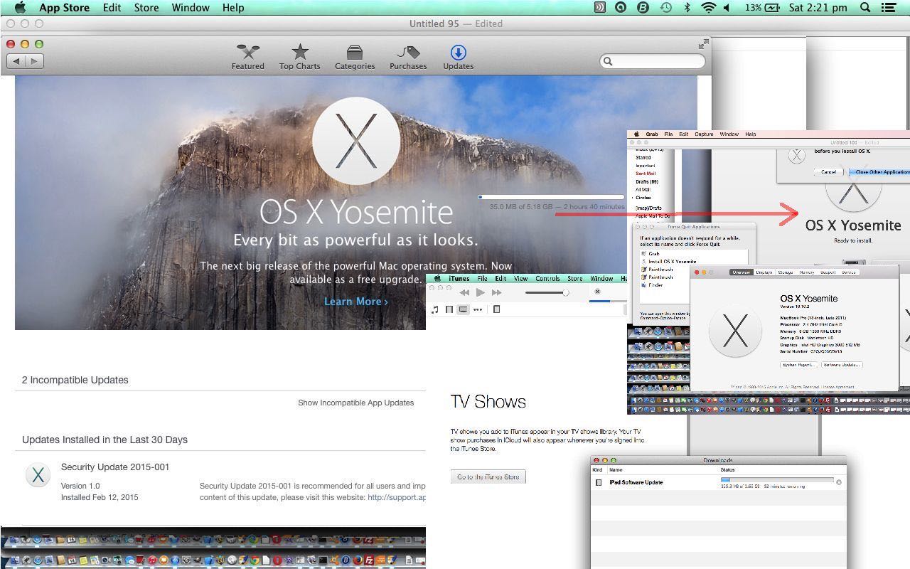
Do you have “install” days … where you’ve saved up a couple of long download installs that can proceed at the same time … perhaps arranged because if you are interrupted with something, you may as well bank up all the interruptions? Today is such a day here. Have been prompted for changes to Mac OS X and iOS for a while with the Apple Mac laptop (MacBook Pro) and iPad respectively, recently, so bit the banana bullet and did it today.
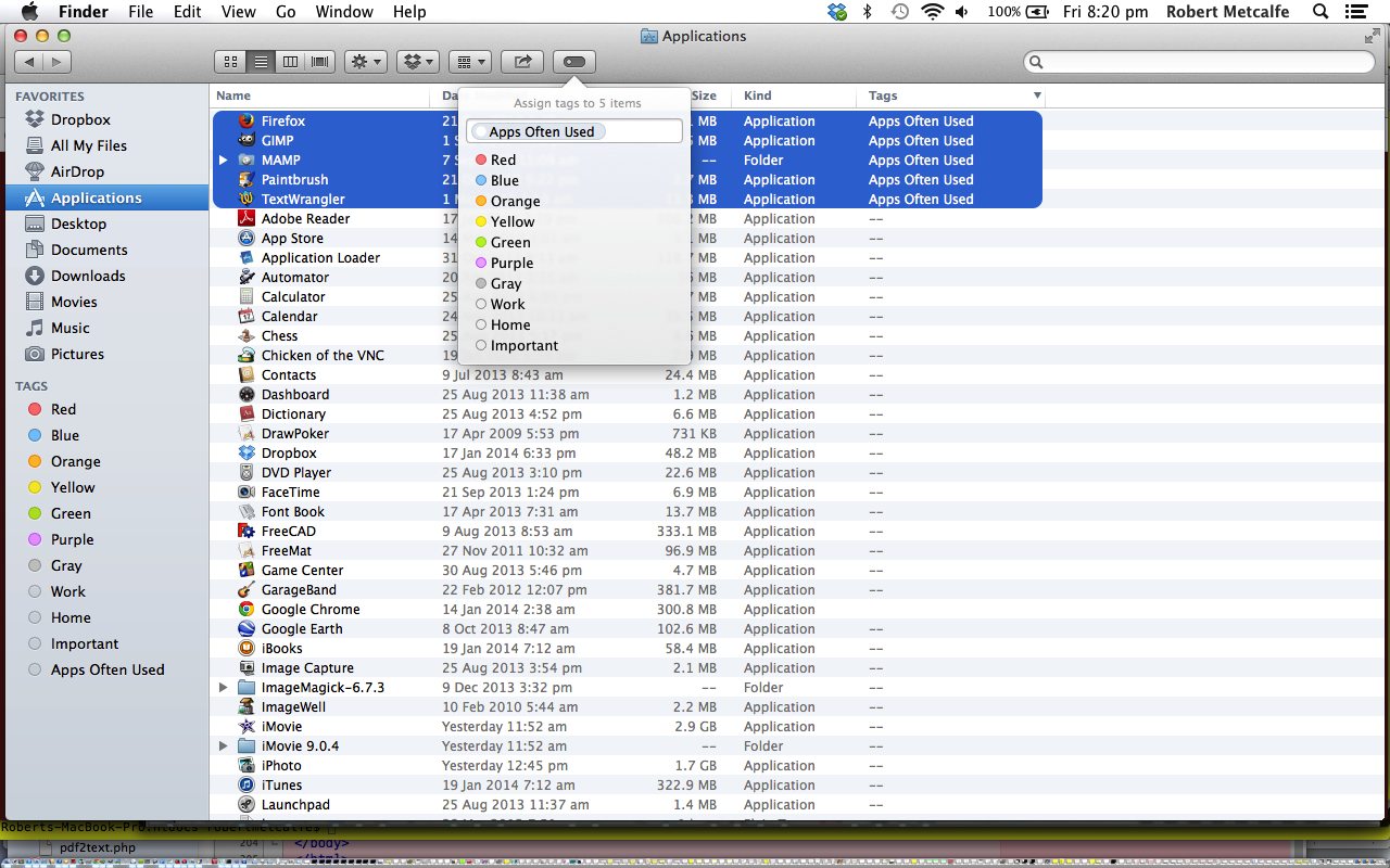
In previous times we upgraded Mac OS X to Mavericks when we talked about it first, we think, with Mac Finder Tags in Mavericks Primer Tutorial as shown below, so will see what happens that is interesting to tell you about it as the days go on. The Mavericks upgrade introduced interesting new ideas and am hoping for the same this time around. Before you try, though, please backup your Mac laptop hard disk via Time Machine, before you start.
If your Mac setup is anything like mine, you’ll download …
- Mac OS X Yosemite to your laptop via the Apple Store desktop application
- iOS 8.1.3 to your iPad via the iTunes (laptop) desktop application (as a result of testing an Xcode Swift mobile application to this iPad via the USB white lead)
My experience with the Mac OS X Yosemite 10.10.2 install was that the downloading went okay, but over quite a few hours and the first login got stuck at 50% for longer than I could take, and looked up the great advice here and had success with the advice to boot into safe mode, which you can see a description of at this webpage … thanks everybody.
Previous relevant Mac Finder Tags in Mavericks Primer Tutorial is shown below.
The Finder application on Mac is a very valuable tool to learn to explore your hard disks and control your removable media. Recently a new version of Mac OS X (Mavericks or 10.9) introduced some new features for all those busy Apple Mac laptop users.
The new Finder Tags functionality could be just what you want for another tier of organisational possibilities when arranging your working life. Have you ever wanted to tag your most frequently used applications and float them to the top of your Finder view? Today’s tutorial shows one idea here. You may want to compare and contrast with older Finder tutorial called Mac Finder Primer Tutorial as shown below. This is not the only change that comes with the upgrade to 10.9.1 (especially if you came from 10.7.5) and in future weeks we’ll talk more about Mac OS X Mavericks (10.9.1).
Read from Wikipedia about the finder below:
The Finder is the default file manager used on Mac OS and OS X operating systems. It is responsible for the overall user-management of files, disks, network volumes and the launching of other applications. Finder acts like the shell on other operating systems, but using a graphical user interface, and is described in its ‘About’ window as The Macintosh Desktop Experience. It was introduced with the very first Macintosh computer, and also existed as part of GS/OS on the Apple IIGS. It underwent a complete rewrite with Apple’s switch to a UNIX-based OS in OS X.
The Finder is the first application a user interacts with after logging into a Mac. One could compare it to Windows Explorer in Microsoft Windows, the Tracker in BeOS, Nautilus in GNOME, and Dolphin or the file management aspect of Konqueror in KDE.
The Finder maintains a view of the file system that is rendered using a desktop metaphor – that is, the files and folders are represented as appropriate icons, volumes are displayed on the desktop, and there is a trash can (on the Dock in OS X, on the desktop in previous versions) to which files can be dragged to mark them for deletion. Part of the system core services in OS X, the Finder.app application bundle is located at /System/Library/CoreServices/.
Link to Mac Finder information from Wikipedia as shown above.
Link to Mac Mavericks Finder Tag information here from Apple.
Link to Mac Mavericks Finder Tag information called New to the Mac? New to Mavericks? Here’s what you need to know | Macworld.
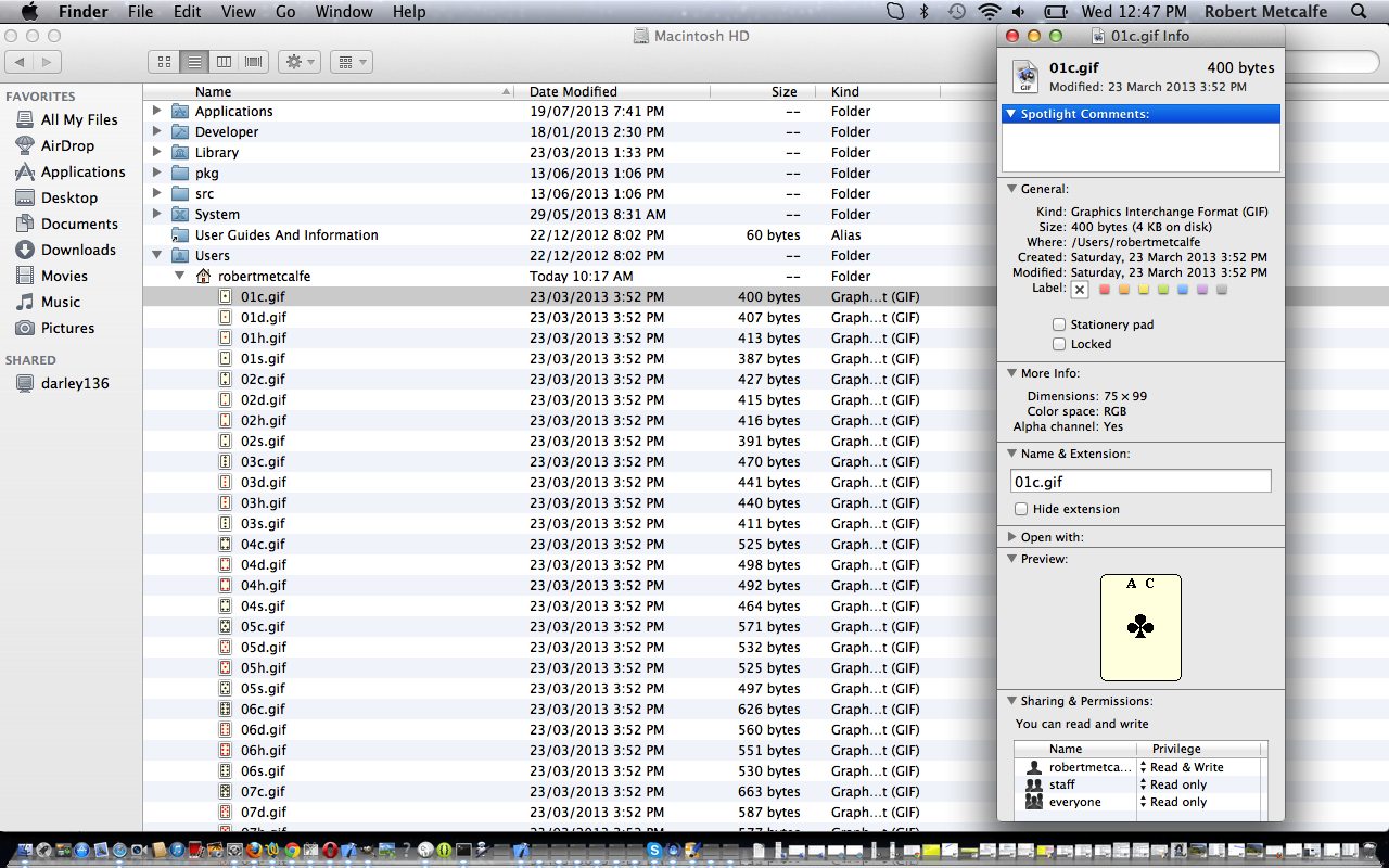
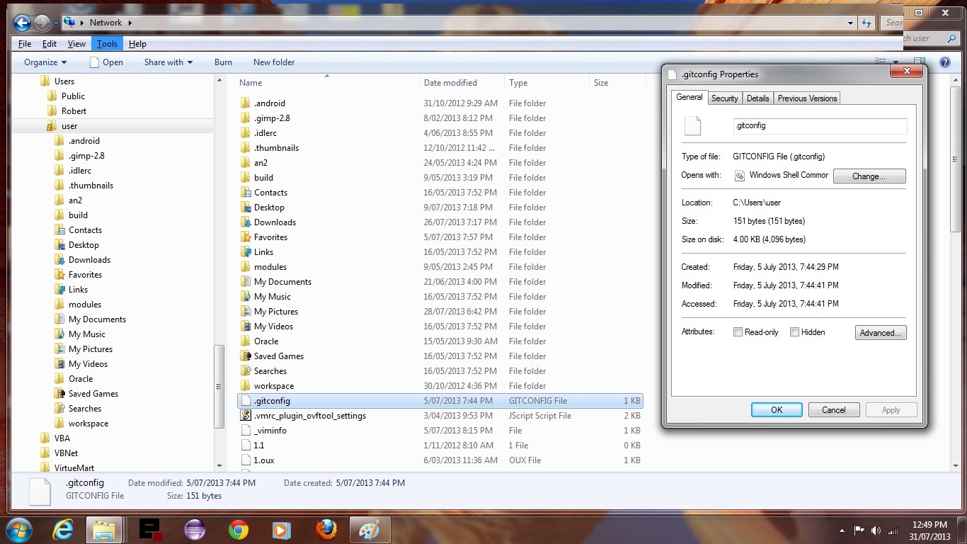
Previous relevant Mac Finder Primer Tutorial is shown below.
The Explorer program on Windows and the Finder application on Mac are two very valuable tools to learn to explore your hard disks and control your removable media. Since they have many similarities we present them in tandem for you to compare and contrast, and maybe for people new to one or the other, the “other” will become a “doddle” … stop doodling!
Read from Wikipedia about them below:
File Explorer, previously known as Windows Explorer, is a file manager application and also a navigation tool that is included with releases of the Microsoft Windows operating system from Windows 95 onwards. It provides a graphical user interface for accessing the file systems. It is also the component of the operating system that presents many user interface items on the monitor such as the taskbar and desktop. Controlling the computer is possible without Windows Explorer running (for example, the File | Run command in Task Manager on NT-derived versions of Windows will function without it, as will commands typed in a command prompt window). Located in the C:Windows directory, it is sometimes referred to as the Windows shell, explorer.exe, or simply “Explorer”.
Link to Windows Explorer information from Wikipedia as shown above.
Link to Windows Explorer usage advice from Microsoft as shown above.
The Finder is the default file manager used on Mac OS and OS X operating systems. It is responsible for the overall user-management of files, disks, network volumes and the launching of other applications. Finder acts like the shell on other operating systems, but using a graphical user interface, and is described in its ‘About’ window as The Macintosh Desktop Experience. It was introduced with the very first Macintosh computer, and also existed as part of GS/OS on the Apple IIGS. It underwent a complete rewrite with Apple’s switch to a UNIX-based OS in OS X.
The Finder is the first application a user interacts with after logging into a Mac. One could compare it to Windows Explorer in Microsoft Windows, the Tracker in BeOS, Nautilus in GNOME, and Dolphin or the file management aspect of Konqueror in KDE.
The Finder maintains a view of the file system that is rendered using a desktop metaphor – that is, the files and folders are represented as appropriate icons, volumes are displayed on the desktop, and there is a trash can (on the Dock in OS X, on the desktop in previous versions) to which files can be dragged to mark them for deletion. Part of the system core services in OS X, the Finder.app application bundle is located at /System/Library/CoreServices/.
Link to Mac Finder information from Wikipedia as shown above.
Link to Mac Finder usage advice from Apple as shown above.
If this was interesting you may be interested in this too.
If this was interesting you may be interested in this too.
If this was interesting you may be interested in this too.


10 Responses to Mac OS X Yosemite and iOS 8.1.3 Install Tutorial