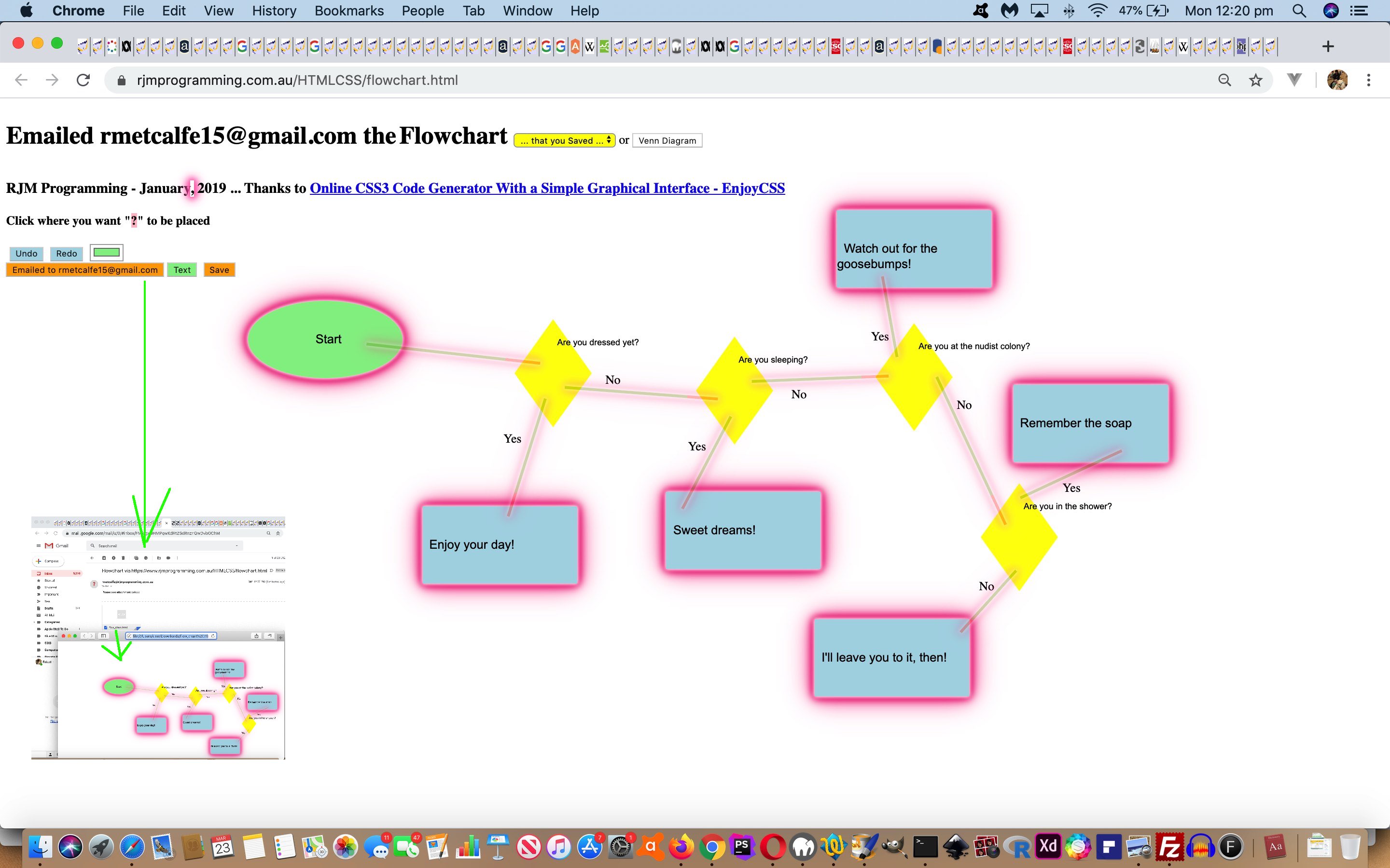
The SMS (text messaging) sharing capabilities of yesterday’s Mind Map and Flowchart and Venn Diagram SMS Feedback Tutorial just involved …
- feedback words … but just as with the email sharing capabilities, we think it would be good to additionally offer …
- one co-ordinate set of positional information
… as supplied by the collaborator (back to the originator).
“Easy peasy” you might think, us being there with that Javascript prompt window asking for feedback words with yesterday’s work, and we did just say “additionally” above. And we did think it would be easier than it panned out. There were two major issues, the first of which, is a pretty mandatory concern with most software integration like this, but the second, a bit of an eye opener for us, as per …
- finding good intervention points, and doing the correct thing at these points, not interfering with existant workings …
- SMS urls (that become SMS message body content) misbehave for characters like “(” and “)” … as we eventually tweaked to with the MacBook Pro’s “Messages” application’s highlight in blue way of voicing concern …

… the first character of concern here being a “)”
To start on the software integration the obvious “intervention” thinking would go …
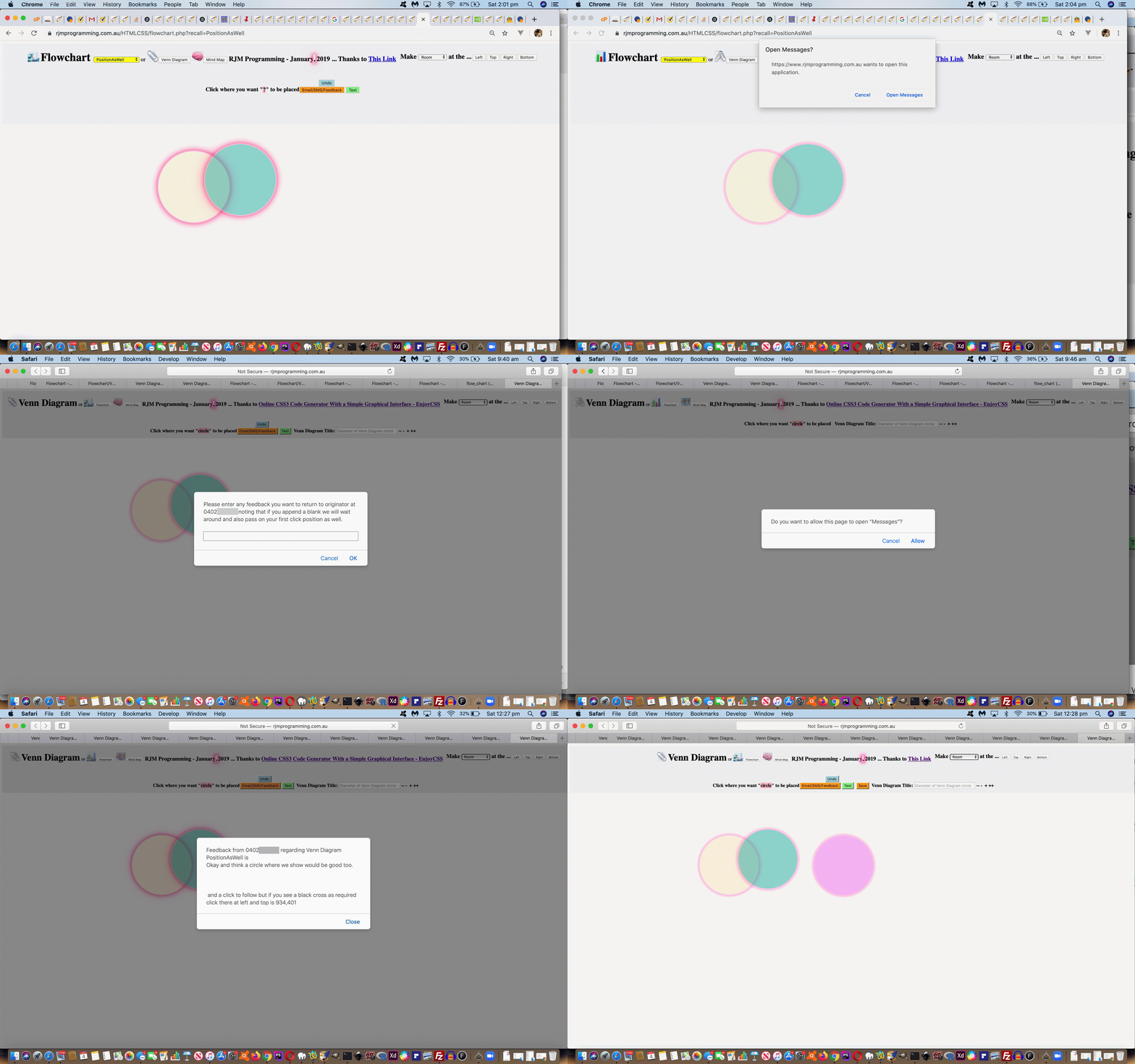
At that Javascript prompt window set up a mechanism the collaborator can tell the web application they want to hang around until the first click they make after any feedback words they supply, that click/touch position representing where they want the originator to know they are interested, and then send off the SMS then.
… and for that we just made it that to add blank character(s) at the end would suffice.
And that’s it for the collaborator, but not for the web application, alas. We have to intervene in a way that means something different to the way the SMS is constructed the other way. And that is where we remember …
- via the user clicking on a grid of input type=submit uniquely named (ie. grid_[left]_[top]) …
… in yesterday’s work. If we can slot “grid_[left]_[top]=y” into the URL arguments at the right spot, we’d be rejoining some apt methodologies in the Email positional feedback parts of the code. True, and the spoiler alert is that did work, in the HTML parent’s view of it going …
- initialize global variables in HTML as per …
var gridxy='', gfbk='';
… used by the helper PHP (which leaves its navigation with a reworked version of the code of this HTML) via … - a crucial PHP codeline going from …
<?php
      // $zzx="Please enter any feedback you want to return to originator at " . str_replace("+"," ",urldecode($_GET['emailcc'])) . "',''); if (fbk == null) { fbk='';  } else { if (fbk.length > 0) { location.href=document.URL.replace('recall=','recim=').replace('.php','.html').split('#')[0] + encodeURIComponent(fbk); }  } var xfbk=(fbk";

      // ... to ...

         $zzx="Please enter any feedback you want to return to originator at " . str_replace("+"," ",urldecode($_GET['emailcc'])) . " noting that if you append a blank we will wait around and also pass on your first click position as well.',''); if (fbk == null) { fbk='';  } else { if (fbk.length > 0) {  gfbk=document.URL.replace('recall=','recim=').replace('.php','.html').split('#')[0] + encodeURIComponent(fbk.trim()); if (fbk == fbk.trim()) { location.href=gfbk;  } else { gridxy=' '; } }  } var xfbk=(fbk";
?> - that global variable gridxy becoming one blank crucial to (basis of) “intervention” thinking because wherever we have document.body onclick logic we now (do something like) …
       if (event.touches) {

         var touches1 = event.changedTouches;

         var first1 = touches1[0];

         x = first1.clientX;

         y = first1.clientY;

       } else if (event.clientX || event.clientY) {

       x = event.clientX; // - elemLeft;

       y = event.clientY; // - elemTop;

       } else {

       x = event.pageX; // - elemLeft;

       y = event.pageY; // - elemTop;

       }

       if (gridxy == ' ') {

         gridxy='&suggestionxy=' + x + ',' + y; //'&grid_' + x + '_' + y + '=y';

       }
- making it so that at the end of that document.body onclick logic we can go …
       if (gridxy.trim() != '') {

         location.href=((gfbk.replace('.html?', dummyencodeURIComponent('.html?grid_') + gridxy.split('&suggestionxy=')[1].split(',')[0] + '_' + gridxy.split('&suggestionxy=')[1].split(',')[1] + '=y' + dummyencodeURIComponent('&')) + dummyencodeURIComponent(encodeURIComponent(' and a click to follow but if you see a black cross as required click there')))) + '&rand=' + Math.floor(Math.random() * 67543);

         gridxy='';

       }
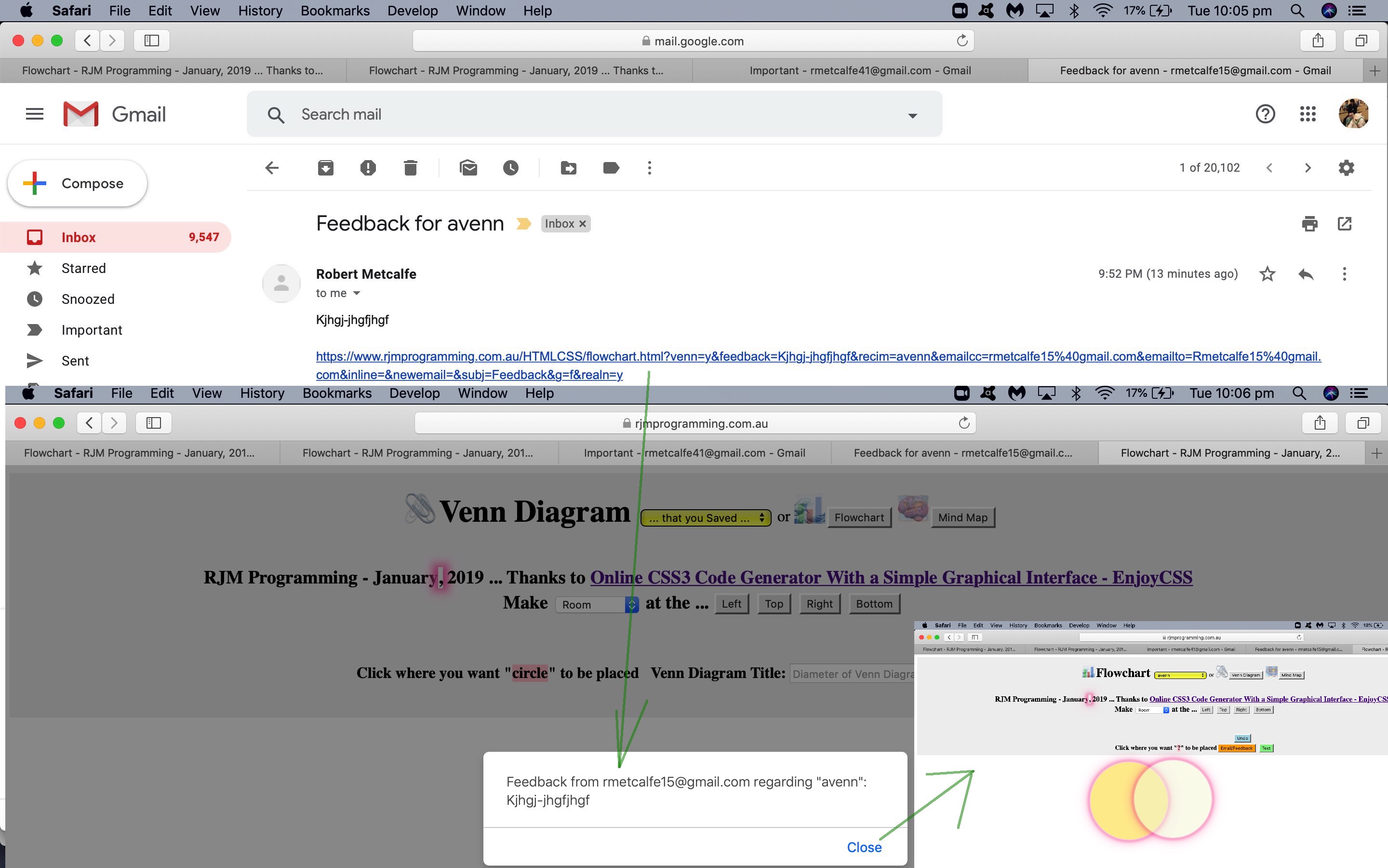
… to make that difference as that … - HTML webpage call constructs an SMS going to the originator from the collaborator that the originator clicks/touches to navigate back to the HTML webpage with …
- any feedback words (for the originator (from the collaborator)) … and followed by (after a Javascript prompt window) …
- an attempt to click at that same position as indicated by the collaborator, else showing a black “x” cross where that is
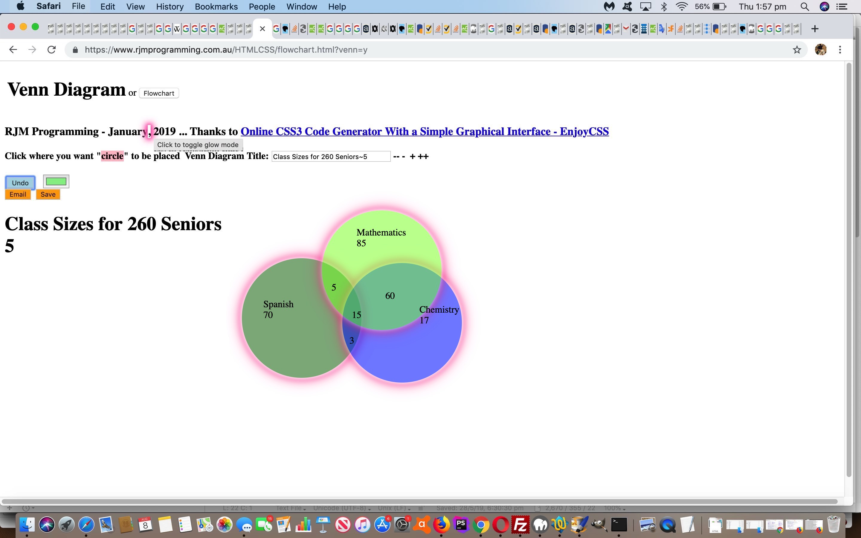
And so today’s tutorial animated GIF shows you a bit of what this SMS Feedback Positioning would look like, and today’s progress leaves the changed HTML and CSS and Javascript flowchart.html‘s live run link there for you to again click a reworded “Email/SMS/Feedback” button, to which you could supply numerical SMS numbers to try out these new SMS communication conduits. Additionally, today, the changed PHP flowchart.php helps out with SMS work, including the optional positional feedback functionality.
Previous relevant Mind Map and Flowchart and Venn Diagram SMS Feedback Tutorial is shown below.
Perhaps you are running out of the (small amount of) patience required to collaborate via the …
- email … communication conduit … well, how about a step more immediate and interface with a …
- SMS … “text messaging” communication conduit
… adding onto yesterday’s Mind Map and Flowchart and Venn Diagram Click Feedback Tutorial work with our Flowchart/Venn Diagram/Mind Map (web application) creator?
No PHP mail to help us with this SMS. Still, the rjmprogramming.com.au is an “honest broker” (this time regarding the domain’s web server (only) rather than its mail server (and web server help)) creating …
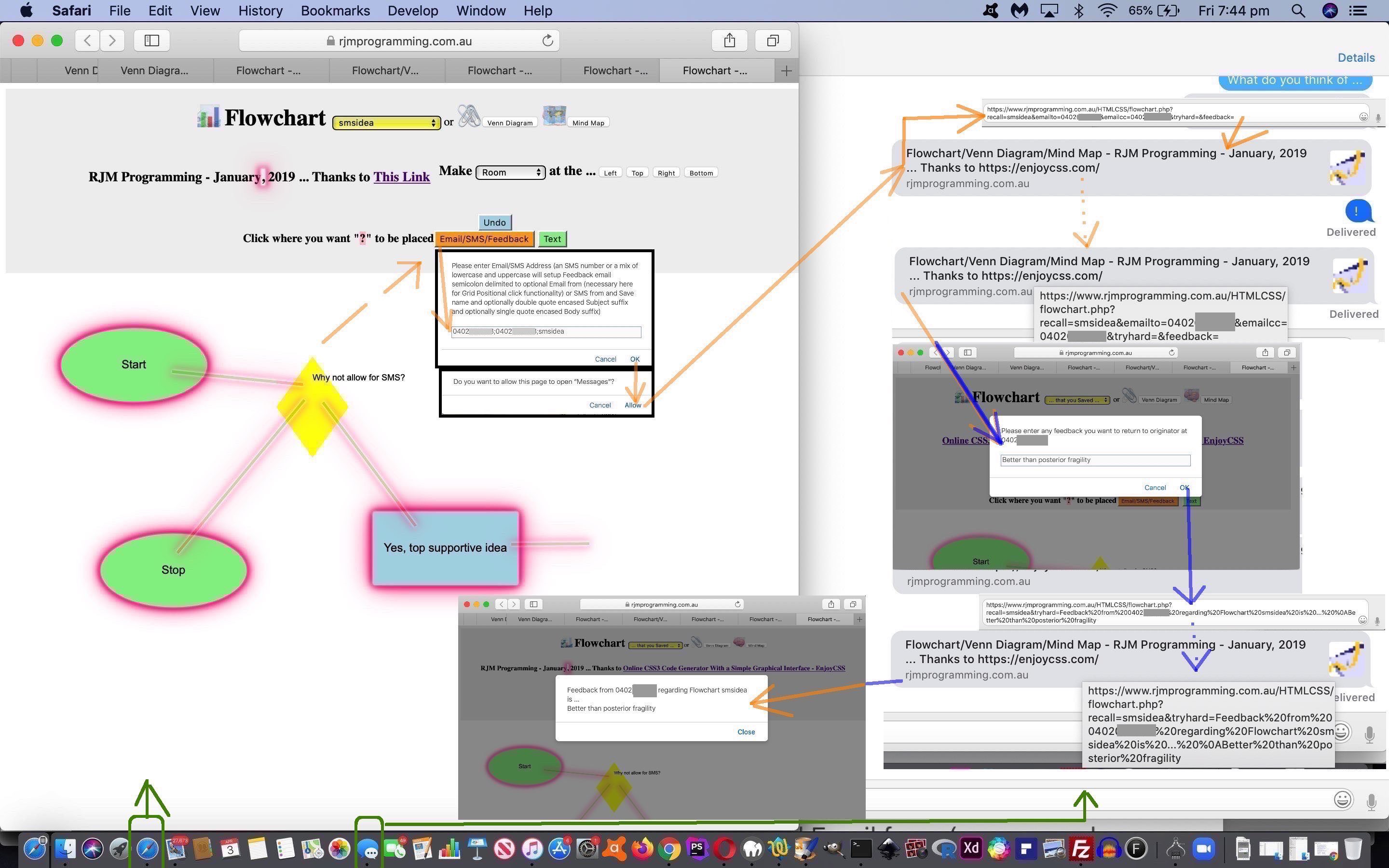
- SMS from the Feedback originator to the collaborator via that originator’s computer’s SMS client application (that being “Messages” here on the desktop of our MacBook Pro using macOS Mojave) … and …
- collaborator is presented with a Javascript prompt window chance to enter their Feedback and/or Sharing and/or Collaboration thoughts … a genuine response causing a …
- SMS from the Feedback collaborator to the originator via that collaborator’s computer’s SMS client application
What is the link of an “originator/collaborator’s computer’s web browser” to an “originator/collaborator’s computer’s SMS client application”? The programmatical or user clicking/touching of an “a” tag’s “sms:[SMSnumber]&body=[message]” href attribute (in a web application) is the link we use, but readily admit this technique may not work on every platform. The equivalent idea for an email client application interfacing from a web application is via an “a” tag’s “mailto:[Email@Address]?subject=[Subject]&body=[message]” href attribute.
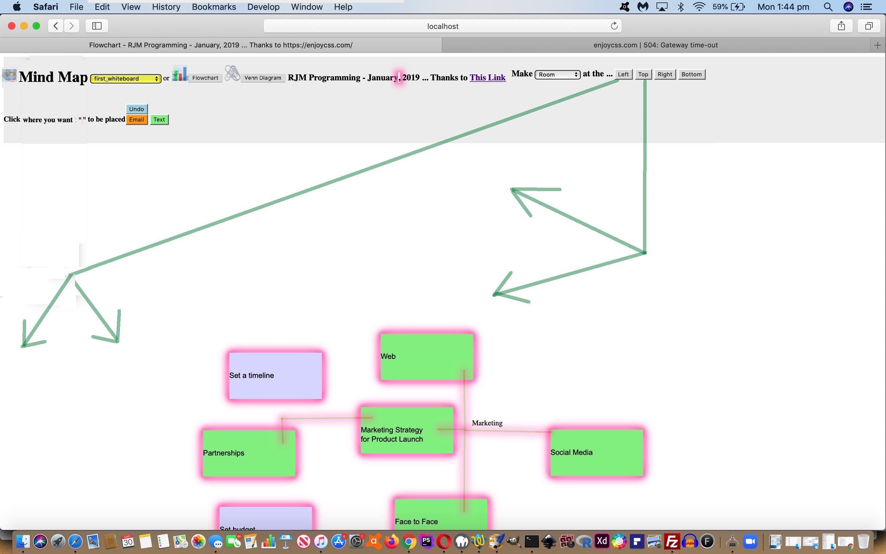
Today’s tutorial picture shows you a bit of what this would look like, and today’s progress leaves the changed HTML and CSS and Javascript flowchart.html‘s live run link there for you to again click a reworded “Email/SMS/Feedback” button, to which you could supply numerical SMS numbers to try out these new SMS communication conduits. Additionally, today, the changed PHP flowchart.php helps out with SMS work.
Previous relevant Mind Map and Flowchart and Venn Diagram Click Feedback Tutorial is shown below.
You’ll have gleaned from yesterday’s Mind Map and Flowchart and Venn Diagram Feedback Form Tutorial with respect to today’s “proof of concept” ideas to allow for Feedback collaboration that can share one positional co-ordinate set …
- given the Inline HTML Email Form being the communication conduit …
- we are without access to Javascript so any onclick event logic is not available … then …
“if the mountain will not come to Muhammad, then Muhammad must go to the mountain”
…
- we harness the ideas presented in HTML Form Multiple Submit Buttons Primer Tutorial to glean (the optional) (left,top) co-ordinates of a click …
- via the user clicking on a grid of input type=submit uniquely named (ie. grid_[left]_[top]) …
- within an Inline HTML Email Form method=GET action=[backToOurHTML] …
- that can pass on a mouse/touch click collaborator suggestion via an examination of document.URL as per …
var suggestionxy='';

if (document.URL.indexOf('grid_') != -1) { suggestionxy='&suggestionxy=' + document.URL.split('grid_')[1].split('=')[0].split(encodeURIComponent('='))[0].replace('_',',');  }

var vennis='', feedback='', recim='', emailcc='', emailto='', equ='=', xfeedback='';

if (document.URL.indexOf('feedback') != -1 && document.URL.indexOf('feedback=') == -1) { equ=encodeURIComponent('=');  }


feedback=location.search.split('feedback' + equ)[1] ? decodeURIComponent((location.search).split('feedback' + equ)[1].split('&')[0].split('----')[0]).replace(/\+/g,' ') : '';

if (suggestionxy != '' && feedback == '') { feedback=' '; }
… that “optionality” assured because the previous input type=submit (as of yesterday’s work) is still present should positional Feedback not be part of what the collaborator wants to communicate
That grid “proof of concept” we’d been referencing earlier on in this blog posting thread needs more explanation on top of the …
While doing getBounding calculate grid min max whereby just before email formation add invisible grid of type=submit buttons later passed on visibly
… email we sent ourselves as far as a plan goes here, especially as it was more to do with when the HTML div position:absolute elements get created that the one new “hardcoded HTML” (placed after other “hardcoded HTML div elements”) …
<div id="grid"></div>
… combines with the initialized (Javascript) …
var gridminx=0, gridminy=0, gridmaxx=0, gridmaxy=0;
… gets updated the most in function andthen …
 function andthen() {

   var rightx=0, bottomy=0, topy=0;

   // other code follows

         if (h1is.indexOf('"myh1">Venn') != -1) { // Venn Diagram

         topy=eval(syoff + yoff + y);

         bottomy=topy;

         bottomy+=eval(document.getElementById('idiam').style.width.replace('px',''));

         rightx=eval(sxoff + xoff + x);

         rightx+=eval(document.getElementById('idiam').style.width.replace('px',''));

         if (rightx > gridmaxx) { gridmaxx=rightx; }

         if (gridminy == 0 || topy < gridminy) { gridminy=topy; }
         if (bottomy > gridmaxy) { gridmaxy=bottomy;  }

   // other Venn Diagram div placement code follows

         } else {

         topy=eval(syoff + yoff + y);

         bottomy=topy;

         bottomy+=100;

         rightx=eval(sxoff + xoff + x);

         rightx+=200;

         if (rightx > gridmaxx) { gridmaxx=rightx; }

         if (gridminy == 0 || topy < gridminy) { gridminy=topy; }
         if (bottomy > gridmaxy) { gridmaxy=bottomy; }

   // other non-Venn Diagram div placement code follows

         }

   // other code follows

  }
… though, yes, care is needed at the “doing getBounding” “function makeroom” bits as per …
 function makeroom(what) {

   var ourrect=[], idivs;

   var sbits=[];

   var spref=document.getElementById('selroom').value;

   if (what == 3) {  // change body height

        ourrect.push(document.body.getBoundingClientRect());

        document.body.style.height='' + eval(eval(spref + '100') + ourrect[0].height) + 'px';

        if (eval(eval(eval(spref + '100') + ourrect[0].height)) > gridmaxy) { gridmaxy=eval(eval(spref + '100') + ourrect[0].height); }

        if (dystyle == '') {

        dystyle=' style="height:' + '' + eval(eval(spref + '100') + ourrect[0].height) + 'px;"';

        dystylecss=' body { height:' + '' + eval(eval(spref + '100') + ourrect[0].height) + 'px; } ';

        } else if (dystyle.indexOf('height:') != -1) {

        dystyle=dystyle.replace('height:' + dystyle.split('height:')[1].split(';')[0], 'height:' + '' + eval(eval(spref + '100') + ourrect[0].height) + 'px');

        dystylecss=dystylecss.replace('height:' + dystylecss.split('height:')[1].split(';')[0], 'height:' + '' + eval(eval(spref + '100') + ourrect[0].height) + 'px');

        } else {

        dystyle=dystyle.replace(';"', ';height:' + '' + eval(eval(spref + '100') + ourrect[0].height) + 'px;"');

        dystylecss=dystylecss.replace(';', '; height:' + '' + eval(eval(spref + '100') + ourrect[0].height) + 'px; ');

        }

   } else if (what == 2) { // change body width

        ourrect.push(document.body.getBoundingClientRect());

        document.body.style.width='' + eval(eval(spref + '100') + ourrect[0].width) + 'px';

        if (eval(eval(eval(spref + '100') + ourrect[0].width)) > gridmaxx) { gridmaxx=eval(eval(spref + '100') + ourrect[0].width); }

        if (dystyle == '') {

        dystyle=' style="width:' + '' + eval(eval(spref + '100') + ourrect[0].width) + 'px;"';

        dystylecss=' body { width:' + '' + eval(eval(spref + '100') + ourrect[0].width) + 'px; } ';

        } else if (dystyle.indexOf('width:') != -1) {

        dystyle=dystyle.replace('width:' + dystyle.split('width:')[1].split(';')[0], 'width:' + '' + eval(eval(spref + '100') + ourrect[0].width) + 'px');

        dystylecss=dystylecss.replace('width:' + dystylecss.split('width:')[1].split(';')[0], 'width:' + '' + eval(eval(spref + '100') + ourrect[0].width) + 'px');

        } else {

        dystyle=dystyle.replace(';"', ';width:' + '' + eval(eval(spref + '100') + ourrect[0].width) + 'px;"');

        dystylecss=dystylecss.replace(';', '; width:' + '' + eval(eval(spref + '100') + ourrect[0].width) + 'px;  ');

        }

   } else {

   // other code ... then ...

      for (idivs=0; idivs<divs.length; idivs++) {

     if (ourrect[idivs]) {

     if (idivs == 0 && what == 1) { gridmaxy+=eval(spref + '100'); }

     if (idivs == 0 && what == 0) { gridmaxx+=eval(spref + '100'); }

     if (what == 1) {

        divs[idivs].style.position='absolute';

        if (('' + divs[idivs].id).indexOf('ld') == 0 || ('' + divs[idivs].id).indexOf('sp') == 0 || ('' + divs[idivs].className).toLowerCase().indexOf('diamond') != -1) {

        divs[idivs].style.top='' + eval(eval(spref + '100') + eval(('' + divs[idivs].style.top).replace('px',''))) + 'px';

        } else {

        divs[idivs].style.top='' + eval(eval(spref + '100') + ourrect[idivs].top) + 'px';

        divs[idivs].style.left='' + eval(0 + ourrect[idivs].left) + 'px';

        divs[idivs].style.width='' + eval(0 + ourrect[idivs].width) + 'px';

        divs[idivs].style.height='' + eval(0 + ourrect[idivs].height) + 'px';

        }

     } else if (what == 0) {

        divs[idivs].style.position='absolute';

        if (('' + divs[idivs].id).indexOf('ld') == 0 || ('' + divs[idivs].id).indexOf('sp') == 0 || ('' + divs[idivs].className).toLowerCase().indexOf('diamond') != -1) {

        divs[idivs].style.left='' + eval(eval(spref + '100') + eval(('' + divs[idivs].style.left).replace('px',''))) + 'px';

        } else {

        divs[idivs].style.top='' + eval(0 + ourrect[idivs].top) + 'px';

        divs[idivs].style.left='' + eval(eval(spref + '100') + ourrect[idivs].left) + 'px';

        divs[idivs].style.width='' + eval(0 + ourrect[idivs].width) + 'px';

        divs[idivs].style.height='' + eval(0 + ourrect[idivs].height) + 'px';

        }

     }

     }

   }

   }

  }
… setting us up for just before the Feedback email is first sent we call into play …
 function gridize() {

   document.getElementById('grid').innerHTML='';

   for (var ix=gridminx; ix<eval(100 + gridmaxx); ix+=20) { //ix+=Math.floor(eval(eval(gridmaxx - gridminx) / 10))) {

     for (var iy=eval(-100 + Math.floor(eval(gridminy / 20)) * 20); iy<eval(100 + gridmaxy);  iy+=20) { //iy+=Math.floor(eval(eval(gridmaxy - eval(Math.floor(eval(gridminy / 10)) * 10)) / 10))) {

       document.getElementById('grid').innerHTML+='<input style="visibility:hidden;z-index:99;background-color:transparent;width:1px;height:1px;position:absolute;left:' + ix + 'px;top:' + iy + 'px;" type=submit name=grid_' + ix + '_' + iy + ' value=x></input>';

     }

   }

 }
… as per “function ifemail” intervention …
 function ifemail() {

    var dogrid=false;

    // more code asking for user interaction that could cause dogrid to become true until

    if (dogrid) { gridize(); }

    // other code

    // Feedback email is sent ... via ...

    document.getElementById('ifb' + jcnt).click();

    // other code (includes code snippet below)

 }
… and be careful to immediately after this sending of Feedback email …
if (dogrid) { document.getElementById('grid').innerHTML=''; }
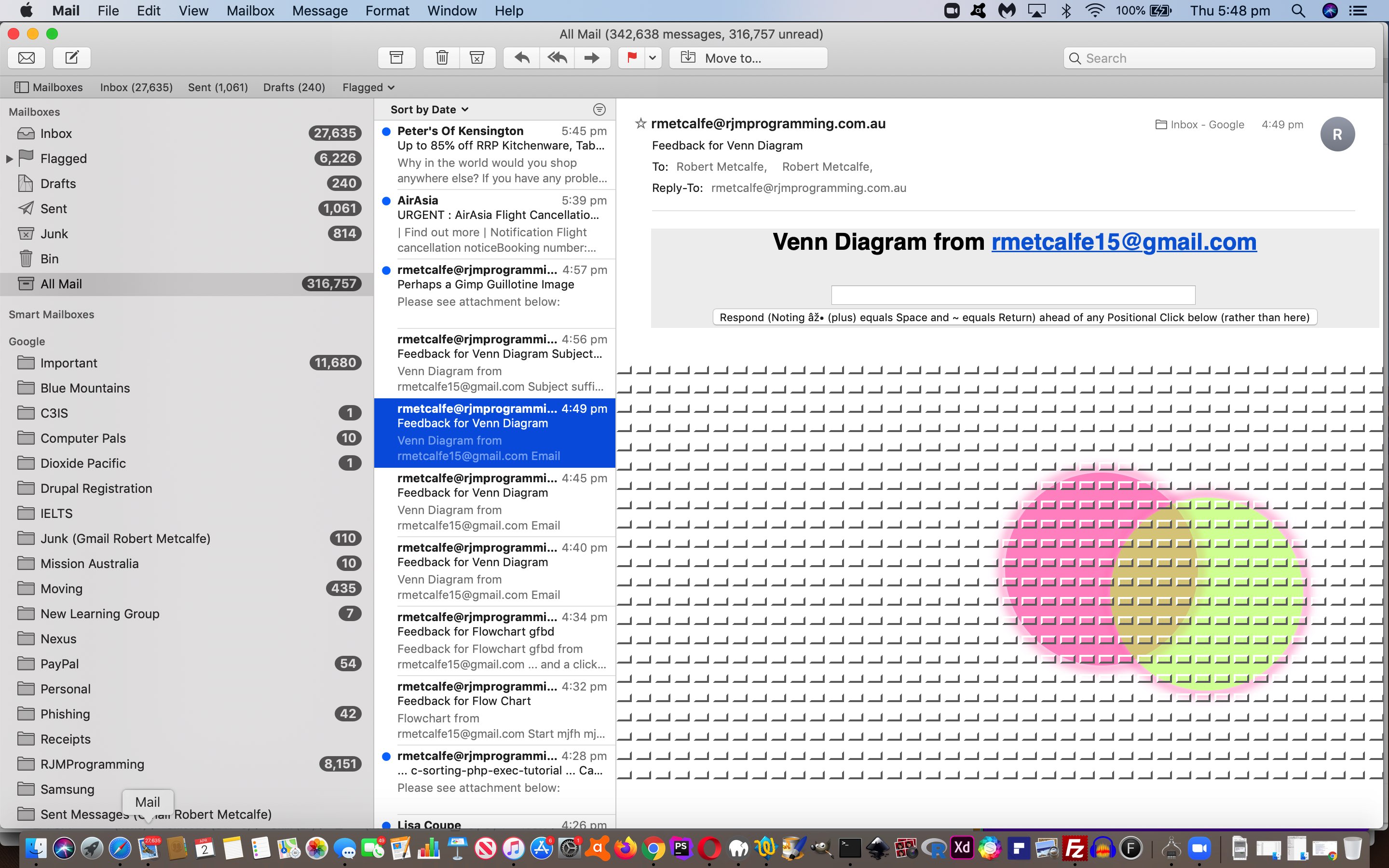
And so today’s progress leaves the changed HTML and CSS and Javascript flowchart.html‘s live run link there for you to again click a reworded “Email/Feedback” button, to which you should supply an email address featuring both uppercase and lowercase letters to avail yourself of this new Feedback functionality we now have working for more than the IP address/web browser of the Feedback originator, and now possible to communicate one positional click/touch. Additionally, today, the changed PHP flowchart.php helps the user not be restricted to the web browser of the Feedback originator, and with these positional Feedback ideas.
Previous relevant Mind Map and Flowchart and Venn Diagram Feedback Form Tutorial is shown below.
Yesterday’s Mind Map and Flowchart and Venn Diagram Feedback Primer Tutorial and today’s continued work plumb the restrictive depths of Inline HTML Email Forms, some issues you have to live with, against the big advantages of seeing webpage like content there and then as you open an email and the communication prompting sending an email involves, are …
- ditch the thought that Javascript can help you, in any way shape or form
- ditch “body” tag styling, though “style” tag code within a “body” section can work
- ditch “animated emojis” working (as it relies on Javascript) though emojis (composite or not) can work
- on some email clients (for example, Apple Mail yes, but Gmail webmail no) CSS position: absolute functions
- on some email clients (for example, Apple Mail yes, but Gmail webmail no) CSS border-radius functions
- on some email clients (for example, Apple Mail no, but Gmail webmail yes) spaces can be entered into input type=text and textarea of Inline HTML Email Forms … so we offer the “+” character as a space alternative and the “~” as a Carriage Return alternative
- Gmail webmail “a” tags seem to strip out the arguments of a URL involving “&” (ie. second argument and on) … didn’t test elsewhere so resorted to a “form” element to replace what we wanted the “a” element to achieve … but if you persist please note that encodeURIComponent(encodeURIComponent()) scenarios can occur
- Gmail webmail “form” action attributes seem to strip out the arguments of a URL involving “&” (ie. second argument and on)
- Gmail webmail rejected our last attempts (but not on this project (though we’ll try again tomorrow)) of including data-URI images
… and we are sure there are many many more restrictions or partial restrictions, as well as what you might call “flakiness”, which is the tabbing behaviour out of textboxes and textareas with regard to Inline HTML Email Forms.
Today’s progress leaves the changed HTML and CSS and Javascript flowchart.html‘s live run link there for you to again click a reworded “Email/Feedback” button, to which you should supply an email address featuring both uppercase and lowercase letters to avail yourself of this new Feedback functionality we now have working for more than the IP address/web browser of the Feedback originator. Additionally, today, the changed PHP flowchart.php helps the user not be restricted to the web browser of the Feedback originator, and we feel some more changes coming on.
Previous relevant Mind Map and Flowchart and Venn Diagram Feedback Primer Tutorial is shown below.
On top of yesterday’s Mind Map and Flowchart and Venn Diagram Make Room Tutorial we’ve started down the road towards a …
- feedback … and …
- sharing and collaboration
… functionality to our …
- Flowchart … and …
- Venn Diagram … and …
- Mind Map
… “Mathematical Graphics Tools Suite” web application we’re currently developing. It needs more refinement, and a “proof of concept” idea we didn’t get up to testing, so stay tuned.
The basic idea, though, is that the rjmprogramming.com.au domain mail server acts as the “honest broker” between an …
- originator of content (as above) as the initial emailer asking for Feedback or Collaboration … and …
- an emailee Collaborator
… back to the “originator of content” via an Inline HTML Email Form.
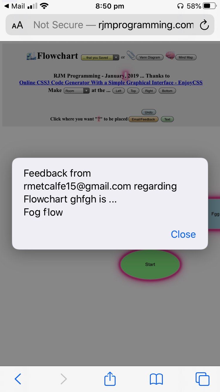
That leaves the changed HTML and CSS and Javascript flowchart.html‘s live run link there for you to click a reworded “Email/Feedback” button, to which you should supply an email address featuring both uppercase and lowercase letters to avail yourself of this new Feedback functionality we hope to improve over time.
Previous relevant Mind Map and Flowchart and Venn Diagram Make Room Tutorial is shown below.
We always find it happening to us, that being that we start graphically representing something, but find out that we need more room on the paper (or whatever) we’re using. That combined with our deep and abiding penchant to try to contain all the ideas on the one piece of paper, we find ourselves wishing we could “make more room”, just like with those occasions Christmas wrapping you have cut out a piece of wrapping paper that ends up too small (and the ol’ “diagonal wrapping plan trick” cannot help enough).
To the human eye, this is not a difficult conceptual job, but to the computer (with its programming … and amended teste.htm …
“proof of concept” code) we need to consider (on top of our work up to Mind Map and Flowchart and Venn Diagram Tutorial‘s) all of …
- narrow the scope of relevant HTML elements that need to move to …
- div
- position: absolute
- work out if they are “link lines” (via there ID attribute starting with “ld”, because of CSS “transform rotate” styling) or Flowchart (class diamond) question elements (because of using CSS ::after selectors)
- cater for 8 scenarios (attended to by one dropdown and four buttons …
<table id=mytable style='display:inline-block;'><tr><td>Make <select ontouchdown='event.stopPropagation();' onmousedown='event.stopPropagation();' id='selroom'><option value=''>Room</option><option value='-'>Less Room</option></select> at the ...</td><td><input ontouchdown='event.stopPropagation(); makeroom(0);' onmousedown='event.stopPropagation(); makeroom(0);' type=button value='Left'></input></td><td><input ontouchdown='event.stopPropagation(); makeroom(1);' onmousedown='event.stopPropagation(); makeroom(1);' type=button value='Top'></input></td><td><input ontouchdown='event.stopPropagation(); makeroom(2);' onmousedown='event.stopPropagation(); makeroom(2);' type=button value='Right'></input></td><td><input ontouchdown='event.stopPropagation(); makeroom(3);' onmousedown='event.stopPropagation(); makeroom(3);' type=button value='Bottom'></input></td></tr></table>
) as per …
 function makeroom(what) {

   var ourrect=[], idivs;

   var sbits=[];

   var spref=document.getElementById('selroom').value;

   if (what == 3) {

        ourrect.push(document.body.getBoundingClientRect());

        document.body.style.height='' + eval(eval(spref + '100') + ourrect[0].height) + 'px';

   } else if (what == 2) {

        ourrect.push(document.body.getBoundingClientRect());

        document.body.style.width='' + eval(eval(spref + '100') + ourrect[0].width) + 'px';

   } else {

   var divs=document.getElementsByTagName('div');

   for (idivs=0; idivs<divs.length; idivs++) {

     if (('' + divs[idivs].style.position).toLowerCase() == 'absolute') {

     ourrect.push(divs[idivs].getBoundingClientRect());

     } else {

     ourrect.push(null);

     }

   }

   for (idivs=0; idivs<divs.length; idivs++) {

     if (ourrect[idivs]) {

     if (what == 1) {

        divs[idivs].style.position='absolute';

        if (('' + divs[idivs].id).indexOf('ld') == 0 || ('' + divs[idivs].className).toLowerCase().indexOf('diamond') != -1) {

        divs[idivs].style.top='' + eval(eval(spref + '100') + eval(('' + divs[idivs].style.top).replace('px',''))) + 'px';

        } else {

        divs[idivs].style.top='' + eval(eval(spref + '100') + ourrect[idivs].top) + 'px';

        divs[idivs].style.left='' + eval(0 + ourrect[idivs].left) + 'px';

        divs[idivs].style.width='' + eval(0 + ourrect[idivs].width) + 'px';

        divs[idivs].style.height='' + eval(0 + ourrect[idivs].height) + 'px';

        }

     } else if (what == 0) {

        divs[idivs].style.position='absolute';

        if (('' + divs[idivs].id).indexOf('ld') == 0 || ('' + divs[idivs].className).toLowerCase().indexOf('diamond') != -1) {

        divs[idivs].style.left='' + eval(eval(spref + '100') + eval(('' + divs[idivs].style.left).replace('px',''))) + 'px';

        } else {

        divs[idivs].style.top='' + eval(0 + ourrect[idivs].top) + 'px';

        divs[idivs].style.left='' + eval(eval(spref + '100') + ourrect[idivs].left) + 'px';

        divs[idivs].style.width='' + eval(0 + ourrect[idivs].width) + 'px';

        divs[idivs].style.height='' + eval(0 + ourrect[idivs].height) + 'px';

        }

     }

     }

   }

   }

 }
… where you can see … - the “ld” div linking lines and class diamond Flowchart question elements needed to reference their own style “left” and “top” whereas all others could reference [divElement].getBoundingClientRect() rectangle “top” and “left” and “width” and “height” properties … being careful to …
- pre-calculate all relevant [divElement].getBoundingClientRect() rectangle objects as a first pass before any moves, else any one move can affect moves further down the list (a trap this relatively young player fell for early on)
- lessened the “impost” of “animated emojis” (to be two and a half times slower than above as far as speed of animation goes)
Computer awkward, humans much better, giving you a feeling for some of the Artificial Intelligence spatial logic required for the least little movement “job” we humans take for granted, we’d say (eh wot guv’!)
While we were at it, today, we also …
- colour code menu webpage parts differently to the “graphics pallette” we encourage the user to use for clicks/touches
- fix a mobile issue regarding three touch linking line operations
- tweak the viewport to become
<meta name="viewport" content="width=device-width, initial-scale=0.5, minimum-scale=0.1, maximum-scale=10, user-scalable=yes" >
… to make the menu text and buttons bigger at the start
The changed HTML and CSS and Javascript flowchart.html‘s live run link is worth testing to see these ideas in action.
Previous relevant Mind Map and Flowchart and Venn Diagram Tutorial is shown below.
Is 3 a …
- crowd … or …
- suite … or …
- sweet gathering?
Well, today, by adding …
- Mind Map … onto existant …
- Flowchart … and …
- Venn Diagram
… onto the (should we call it) “Mathematical Graphics Tools Suite” or “Business Graphics Helper Outerers Suite” we’ve opted for “suite” following on from the work of Flowchart and Venn Diagram Mobile Tutorial … sweet!
And today, for the first time we can remember, we have a new concept of “Animated Emojis” going on. Yes, we’ve had “emoji overlays” when we presented Emoji Overlay Share Tutorial but they behaved like “stacked up onion layers that had to put up with their lot” whereas “animated emojis” give two emojis the chance to “shine” alternatively “twinkle twinkle little star style”, and in between merge to try to describe a concept not currently dovetailing for any one emoji to be the consummate descriptor, by two (with a bit of imagination), courtesy of a small “proof of concept” teste.html …
But, back to Mind Maps, thanks go to Venn vs Tree Diagrams: which to Use in Your Business‘s Mind-Mapping Helps Brainstorm Ideas chapter for crystallizing what role they can play …
If you find that you don’t have a beginning and end point you can use to shape your flowchart, you might need a mindmap. Mindmaps help organize and keep track of thoughts. You organize maps into idea clusters, but everything centers around a main topic.
For example, if your business wants to develop a new feature or product, you’ll need to figure out how you’re going to market it. A mindmap can help you organize all the different possible routes to take and exactly what each route will entail.
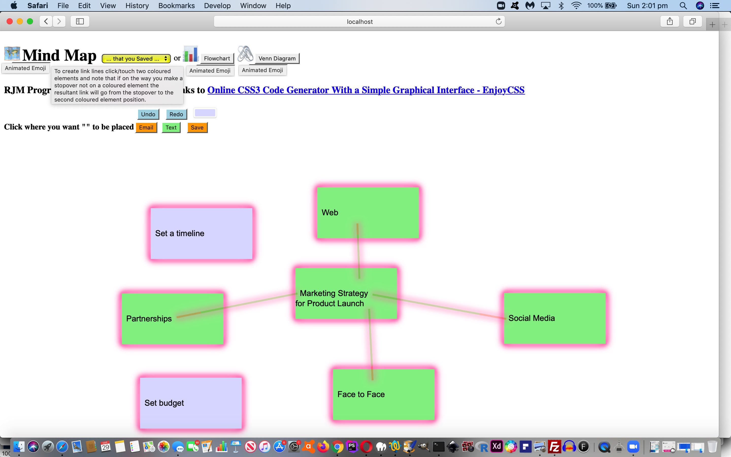
… helping us shape a pared down tutorial picture start, then onto another new “usage concept” for the link lines of Mind Maps (or Flowcharts) …
To create link lines click/touch two coloured elements and note that if on the way you make a stopover not on a coloured element the resultant link will go from the stopover to the second coloured element position.
… allowing people who don’t like “diagonal line” graphics to be “squared off”, as required … to get to …
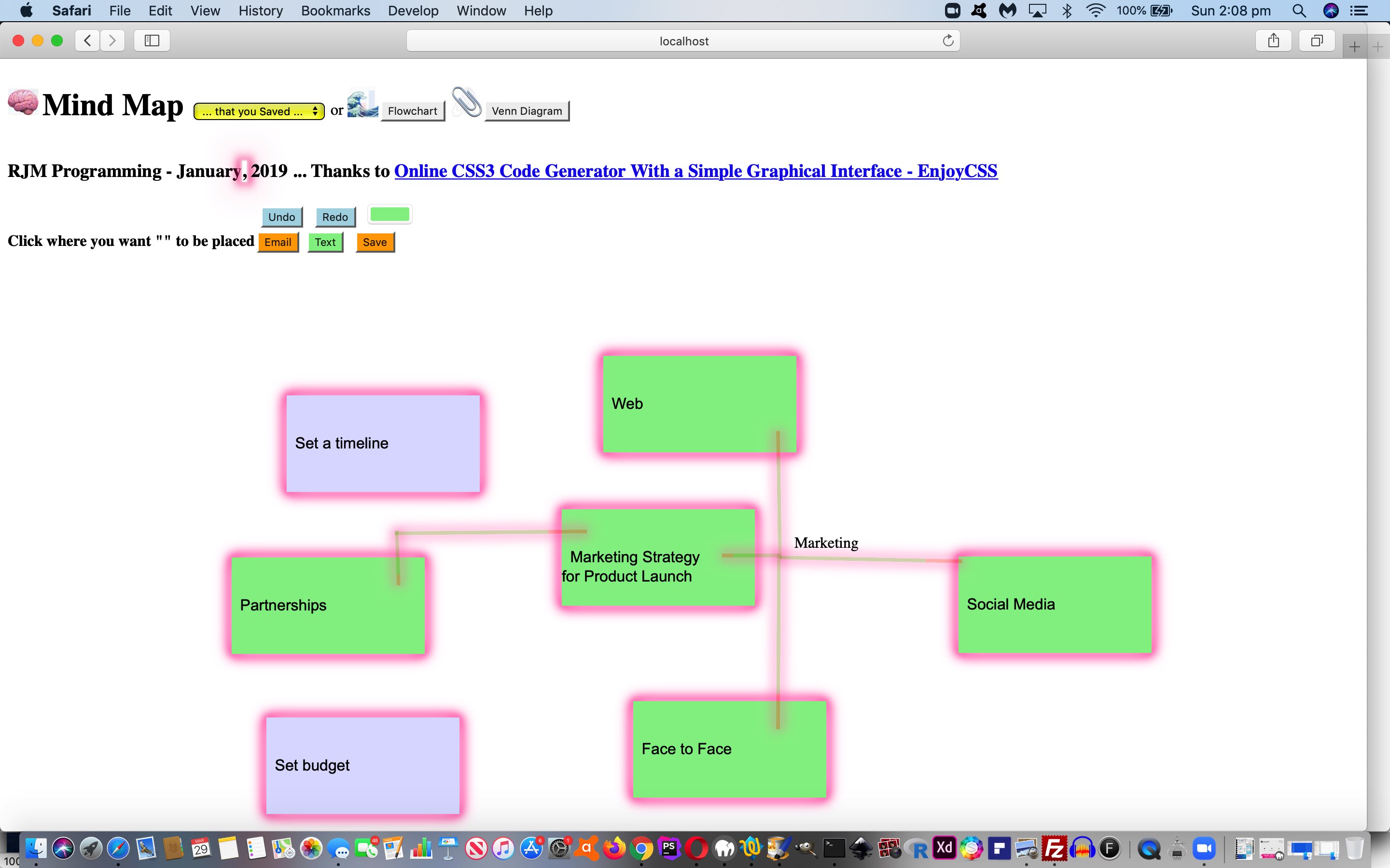
… from which the “accountability” comes with the “Save” button means by which we can save the graphics work to an image like …
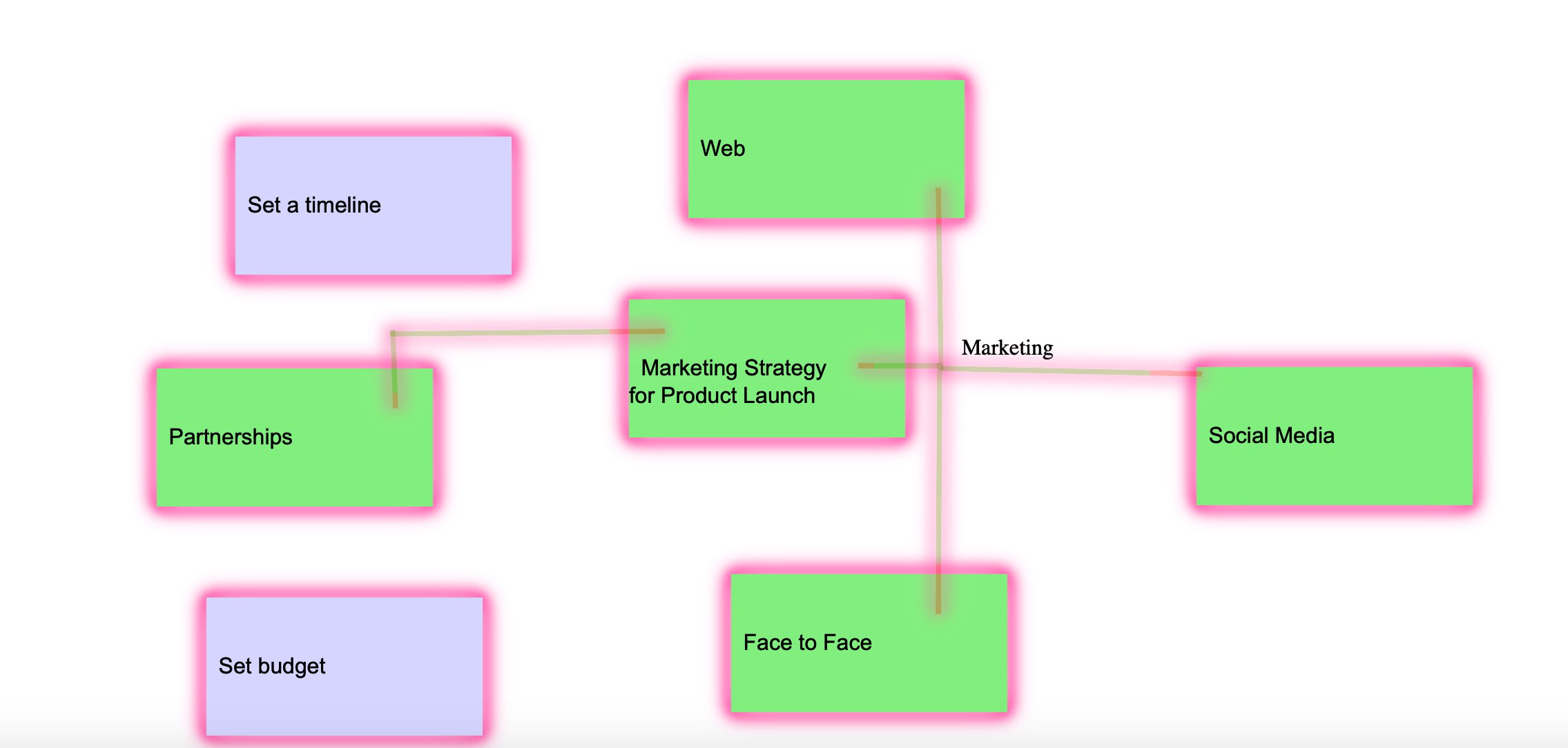
… or be emailed off to an emailee with the “Email” button.
Feel free to try the new Mind Maps (and see the Animated Emojis (feeding time is strictly 3:00pm to 3:05pm AEST)) at the changed HTML and CSS and Javascript flowchart.html‘s live run link.
Previous relevant Flowchart and Venn Diagram Mobile Tutorial is shown below.
It was mainly mobile device usage of the web application of the recent Flowchart and Venn Diagram Loose Text Tutorial that led us to another phase of “revisiting” this web application. We found with …
- the menu buttons were sometimes unclickable due to how it was positioned … so …
<h4 id='instruction' onclick='notc();'><div onclick='notc();' style='display:inline-block;' id=secpoint></div>Click where you want "<div onclick=" if (this.innerHTML.length == 0) { wording=cat; } bodyclick=false; nonbodyclick=-2; setTimeout(resetit,1000); " style='display:inline-block;background-color:pink;' id=dstart contenteditable=true onblur="wording=tfc(this.innerHTML); " title="What wording do you want? (~ is carriage return) ... optional (space to) URL will be a background image (append ' /browse' to browse for background image) ... later an #ffffff type of colour can change a background colour (should the colour picker not work)">Start</div>" to be placed<span id=myh4></span><div id="dsave" style="display:inline-block;"></div></h4>

<!--div id="dsave"></div-->
- flowcharts on a mobile device would wrongly offset the linking lines … so …
 var sxoff=0, syoff=0;

 // later ...

 document.getElementById('dcontent').innerHTML+='<span id=sp' + vscnt + ' style="z-index:56;position:absolute;top:' + eval(syoff + y) + 'px;left:' + eval(sxoff + x) + 'px;">' + vdtitle + wdef + '</span>';

 // at onload ...

 window.addEventListener('scroll', function(e){

   sxoff=eval('' + window.pageXOffset);

   syoff=eval('' + window.pageYOffset);

 });
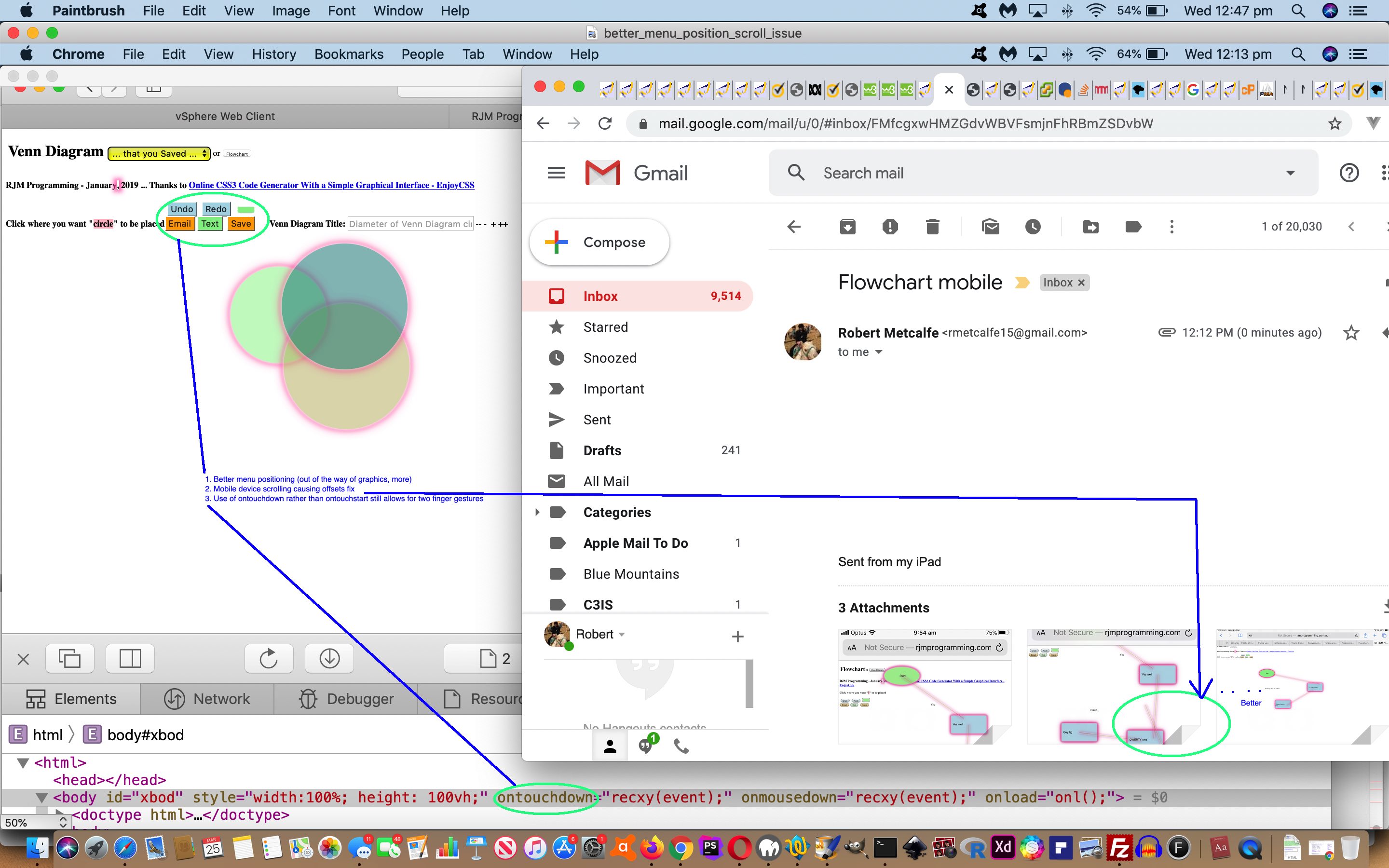
- both Venn Diagram and Flowchart use on mobile devices suffered from the lack of two finger gesture swipe and pinch possibilities … so what used to be “ontouchstart” becomes …
<body id=xbod style='width:100%; height: 100vh;' ontouchdown='recxy(event);' onmousedown='recxy(event);' onload='onl();'>
… and when swipe and pinch feel like they should be a part of a web application’s mobile “workings” you need a meta viewport tag as per (not the usual default incarnation) …
<meta name="viewport" content="width=device-width, initial-scale=0.1, minimum-scale=0.1, maximum-scale=10, user-scalable=yes" >
So feel free to retry the changed HTML and CSS and Javascript flowchart.html‘s live run link, maybe on your mobile device.
Previous relevant Flowchart and Venn Diagram Loose Text Tutorial is shown below.
In constructing yesterday’s Ajax Auto-completion Refinement Tutorial‘s flowchart tutorial picture via Flowchart and Venn Diagram Glow Tutorial‘s Flowchart and Venn Diagram web application, we found it had shortfalls performing the “Yes” and “No” (what we call loose) text annotations that help so much to make sense of the inherent logic of the Flowchart. This new “loose text” consists of …
- that same HTML div element type as for the rest of the work … but …
- drop the CSS styling (including “glow” styling) … and …
- drop any padding that affects element positioning
… so as to allow the “loose text” be precisely (top left) positioned, as required. And while we are talking about positioning, we found with Venn Diagram positioning it was better to consider the user’s click as defining the centre of their circle rather than top left position so that when a second circle is added the user can get close enough (but not within) another circle to achieve the intersections pretty important to many Venn Diagram usefulness scenarios (unless you are modelling “social distancing”, that is?!).
In broad brush terms, to make “loose text” happen we …
- introduce new Javascript global variables and new code …
  var loosetext=false;

  var xoff=0, yoff=0;

  var prevxoff=0, prevyoff=0;


 function butlater() {

       bodyclick=true;

       xoff=prevxoff;

       yoff=prevyoff;

}


 function butlaterstill() {

       loosetext=false;

 }
- introduce a new HTML input element “Text” button as per the HTML (and inline Javascript) …
<input style=background-color:lightgreen; id=itext type=button onclick="bodyclick=false; event.stopPropagation(); loosetext=true; prevxoff=xoff; prevyoff=yoff; xoff=0; yoff=0; setTimeout(butlater, 1500); " value=Text></input>
- and then later if the user has clicked this “Text” button and pressed in a position and entered their text into a Javascript prompt window (and into variable “wording” below) …
if (loosetext) {

    shape="";

    setTimeout(butlaterstill, 1500); //loosetext=false;

}
… happens ahead of Flowchart element Javascript creation …
if (loosetext) {

    document.getElementById('dcontent').innerHTML+="<div id=d" + icnt + " onclick='clickme(this);' style='" + biis + "line-height:20px;position:absolute;left:" + x + "px;top:" + y + "px;'>" + wording + "</div>";

}
… or Venn Diagram element Javascript creation …
if (loosetext) {

    document.getElementById('dcontent').innerHTML+="<div id=d" + icnt + " onclick='recxy(event); clickme(this);' style='" + biis + "line-height:20px;position:absolute;left:" + x + "px;top:" + y + "px;width:" + document.getElementById('idiam').style.width.replace('px','') + "px;height:" + document.getElementById('idiam').style.width.replace('px','') + "px;'>" + wording + "</div>";

}
… when the HTML div element innerHTML attribute starts to play its part
Feel free to retry the changed HTML and CSS and Javascript flowchart.html‘s live run link to try out the new “loose text” possibilities.
Previous relevant Flowchart and Venn Diagram Glow Tutorial is shown below.
Here at RJM Programming, we are coming to realize that (W3School’s glowing text inspired) “glow” ideas can be that “extra dimension” to styling thoughts for so many of our web application efforts. Read more from yesterday’s Horizontal Rule and Div Glowing Lines and Vertices Tutorial as the background to this, but today’s “glow” focus turns to …
- Flowcharts and Venn Diagrams … read background to this at Venn Diagrams Onclick Tutorial link … with their …
- div elements … nothing new here, but today, there are special cases we need to cater for, those being the case of …
- div style=”border-radius:50%;” … and reading the super helpful link, thanks, we realized that box-shadow can (these days, for lots of platforms and browsers) simulate what border can do regarding “rounding its corners” (ie. the CSS border-radius property), got us to …
<style>

.cglow {

  box-shadow-bottom-right-radius: 50%; // thanks to https://stackoverflow.com/questions/2714765/using-border-radius-and-box-shadow-together-css

  box-shadow-bottom-left-radius: 50%;

  box-shadow-top-right-radius: 50%;

  box-shadow-top-left-radius: 50%;

  -webkit-animation: cglow 1s ease-in-out infinite alternate;

  -moz-animation: cglow 1s ease-in-out infinite alternate;

  animation: cglow 1s ease-in-out infinite alternate;

  -webkit-border-radius: 50%;

  border-radius: 50%;

}


@-webkit-keyframes cglow {

  from {

    box-shadow: 0 0 3px #fff, 0 0 5px #fff, 0 0 37px #e60073, 0 0 9px #e60073, 0 0 11px #e60073, 0 0 13px #e60073, 0 0 15px #e60073;

  box-shadow-bottom-right-radius: 50%; // thanks to https://stackoverflow.com/questions/2714765/using-border-radius-and-box-shadow-together-css

  box-shadow-bottom-left-radius: 50%;

  box-shadow-top-right-radius: 50%;

  box-shadow-top-left-radius: 50%;

  }


  to {

    box-shadow: 0 0 24px #fff, 0 0 6px #ff4da6, 0 0 8px #ff4da6, 0 0 10px #ff4da6, 0 0 12px #ff4da6, 0 0 14px #ff4da6, 0 0 16px #ff4da6;

  box-shadow-bottom-right-radius: 50%; // thanks to https://stackoverflow.com/questions/2714765/using-border-radius-and-box-shadow-together-css

  box-shadow-bottom-left-radius: 50%;

  box-shadow-top-right-radius: 50%;

  box-shadow-top-left-radius: 50%;

  }

}

</style>
… that combines with CSS …
<style>

.circle {

  -webkit-box-sizing: content-box;

  -moz-box-sizing: content-box;

  box-sizing: content-box;

  text-align: center;

  width: 200px;

  height: 200px;

  border: none;

  -webkit-border-radius: 50%;

  border-radius: 50%;

  font: normal 100%/normal Arial, Helvetica, sans-serif;

  color: rgba(0,0,0,1);

  -o-text-overflow: clip;

  text-overflow: clip;

  background: pink; //#1abc9c;

  opacity:0.5;

}

</style>
… to help the Javascript be able to dynamically create “Glow Circles” for Venn Diagrams
“Dynamically”, in this case, is, for most intents and purposes, is like the user controllable mechanisms of yesterday’s Horizontal Rule and Div Glowing Lines and Vertices Tutorial which we’ll leave you to read way below, and show you the new version of “function glowit()” just below, as per …
  function glowit() {

    if (doglow) {

      ciss=' class=glow';

      xciss=' class=cglow';

      document.getElementById('dstyle').innerHTML='<style> .circle {  -webkit-animation: cglow 1s ease-in-out infinite alternate;  -moz-animation: cglow 1s ease-in-out infinite alternate; animation: cglow 1s ease-in-out infinite alternate;   } .oval, .rectangle, .glow { -webkit-animation: glow 1s ease-in-out infinite alternate;  -moz-animation: glow 1s ease-in-out infinite alternate; animation: glow 1s ease-in-out infinite alternate;  } </style>';

    } else {

      ciss='';

      xciss='';

      document.getElementById('dstyle').innerHTML='';

    }

  }
Feel free to try the changed HTML and CSS and Javascript flowchart.html‘s live run link to try out the new “glow” possibilities. And just remember …
Glow with
the flow!
Previous relevant Horizontal Rule and Div Glowing Lines and Vertices Tutorial is shown below.
There is another graphical idea we’d like to add some (W3School’s glowing text inspired) “glow” to, like in the spirit of yesterday’s Image Map with Overlay SVG Glowing Polygon Tutorial, but this time, we want it as a user controllable quality, as we realize sometimes people don’t want “glow” in their faces (… but then there’s …)
That (user controllable CSS via Javascript DOM into HTML div) concept involves …
- hr (horizontal rule)
- div (that are CSS transformed) … picking up where we left off with the web application sections of the HTML Square Horizontal Rule Image Map Notice Board Tutorial web application … combined with …
- static CSS animation keyframe arrangements involving box-shadow …
/* Thanks to https://www.w3schools.com/howto/tryit.asp?filename=tryhow_css_glowing_text */


@-webkit-keyframes glow {

  from {

    box-shadow: 0 0 3px #fff, 0 0 5px #fff, 0 0 37px #e60073, 0 0 9px #e60073, 0 0 11px #e60073, 0 0 13px #e60073, 0 0 15px #e60073;

  }


  to {

    box-shadow: 0 0 24px #fff, 0 0 6px #ff4da6, 0 0 8px #ff4da6, 0 0 10px #ff4da6, 0 0 12px #ff4da6, 0 0 14px #ff4da6, 0 0 16px #ff4da6;

  }

}
… that with the “glow” work up to now has been combined with static CSS “call that keyframes animation” … but not today … where we add one more static HTML div at the end of the <body></body> section of the webpage as per …
<div id=dstyle></div>

</body>
… with our HTML and Javascript means by which “glow control” goes back to the user (optionally) via … - dynamic CSS (because CSS is incredibly useful as a dynamically added “tool” statically before document.body onload within the <head></head> section or dynamically via Javascript DOM into the <body></body> section of the webpage …
- within <head></head> webpage section we introduce a new global variable …
var doglow=true; // default to "glow mode is yes" after 5 seconds showing non-glow mode implications
- added to static text “,” of an H3 header element to change this way in HTML …
<h3 id=myh3>RJM Programming - December<a class="glow" onclick="doglow=!doglow; if (!doglow) { this.className='xglow'; } else { this.className='glow'; } glowit(); " style="cursor:pointer;text-decoration:none;" title="Click to toggle glow mode">,</a> 2018<span id=debug></span></h3>
- … which starts as “glowing” to attract the user’s attention to it, though the user has 5 seconds of time not to see this “glow” applied to the application the user is accessing via document.body onload HTML …
<body onload=' draw_hrs(); '>
- … that Javascript function “draw_hrs()” changing at its top to add in that 5 second delay (after document.body onload) logic …
function draw_hrs() {

  setTimeout(glowit, 5000);

  // Rest of "draw_hrs" document.body onload logic follows ...

  // ...

  // End of rest of "draw_hrs" document.body onload logic

}
- … calling that Javascript function “glowit()” which has the dual purpose of being what’s called when the user takes control to click/touch the “,” to toggle “glow mode” for the application section at hand …
  function glowit() {

    if (doglow) {

      document.getElementById('dstyle').innerHTML='<style> hr, .glow, div.vertical { -webkit-animation: glow 1s ease-in-out infinite alternate;  -moz-animation: glow 1s ease-in-out infinite alternate; animation: glow 1s ease-in-out infinite alternate;  } </style>';

    } else {

      document.getElementById('dstyle').innerHTML='';

    }

  }
- within <head></head> webpage section we introduce a new global variable …
The changed square_hr_tracing.htm can glow for you too.
Previous relevant Image Map with Overlay SVG Glowing Polygon Tutorial is shown below.
In the “glowing” CSS styling work we’ve been talking about recently, as with yesterday’s Multiple Choice Quiz with Glowing Box Tutorial “Glowing Box”, today we have for you …
- HTML image map element … with …
- area shape=”poly” (polygon) elements (that represent approximate coverage for Australian Indigenous Language areas in Australia) … overlaid by …
- SVG polygon elements (that come into play when an area element is clicked/touched … all old news you can read from Australian Indigenous Language SVG Overlay Tutorial … but new today we add …
- “Glowing Polygon” animated drop shadow (and thanks to this great link for help here) for that SVG polygon as per the new CSS styling …
<style>


/* Thanks to https://www.w3schools.com/howto/tryit.asp?filename=tryhow_css_glowing_text */


svg {

  font-size: 16px;

  color: #fff;

  text-align: center;

  -webkit-animation: glow 1s ease-in-out infinite alternate;

  -moz-animation: glow 1s ease-in-out infinite alternate;

  animation: glow 1s ease-in-out infinite alternate;

  color: black;

  -webkit-filter: drop-shadow(0 0 5px red);

  filter: drop-shadow(0 0 5px red);

}


@-webkit-keyframes glow {

    0% { -webkit-filter: drop-shadow(0 0 5px red); filter: drop-shadow(0 0 5px red); }

    100% { -webkit-filter: drop-shadow(0 0 8px blue); filter: drop-shadow(0 0 8px blue); }

}

</style>
… an effect quite eye-catching as you click/touch in a language region to find out more.
Perhaps you want to use this changed HTML and Javascript and CSS aboriginal_language_regions.html image map live run link to see how this plays out in actuality, or to explore a little into the oldest continuous culture on this planet?
Previous relevant Multiple Choice Quiz with Glowing Box Tutorial is shown below.
We’re going from “Glowing Text” ideas below, with HTML5 Mark Tag with Glowing Text Tutorial, to “Glowing Box” ideas, starting today, that we apply in the context of a Multiple Choice Quiz.
As far as online quizzes go, don’t know if you agree, but we think our best chance to remember our learning is, particularly regarding incorrect (quiz) answers, to either …
- trap the user with a correct answer with a Javascript popup (eg. alert) window, awaiting the press of a button … and/or …
- really “in your face” highlighting of the correct answer (particularly in the case of a multiple choice scenario) with attention grabbing (CSS) styling
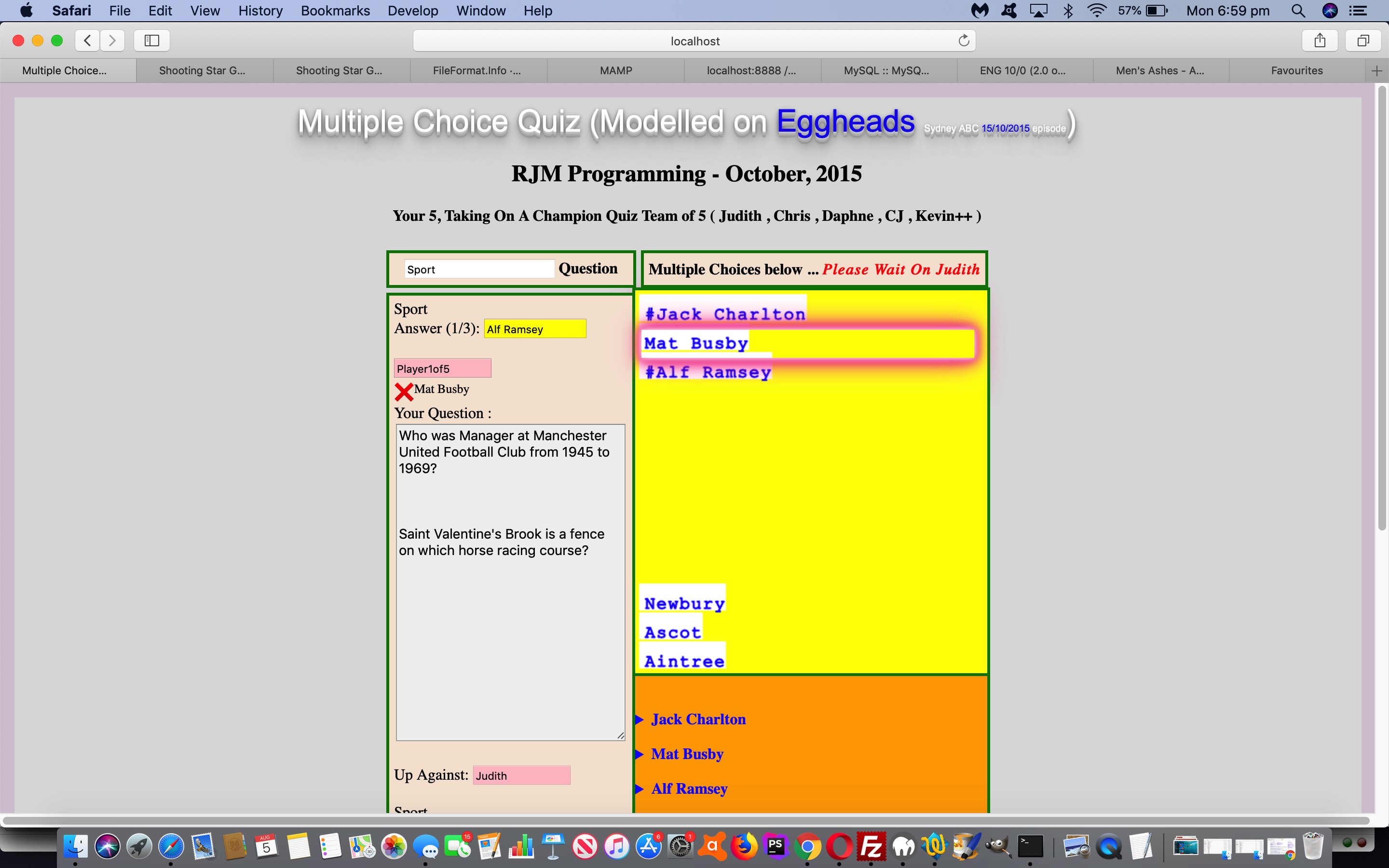
… and so, for the latter, we queue the new “Glowing Box” (CSS) styling, which (to us) is the same as the (brilliant CSS W3schools glowing text idea) “Glowing Text” styling except where you had “text-shadow” in the keyframes section (for “Glowing Text”) we use “box-shadow” in that same keyframes section (for “Glowing Box”). We add this onto our previous efforts with HTML/Javascript Multiple Choice Quiz Reveal Tutorial.
With the changed multiple_choice_quiz.html live run link, you can try out the new CSS “Glowing Box”, as per …
<style>


/* Thanks to https://www.w3schools.com/howto/tryit.asp?filename=tryhow_css_glowing_text */


.glow {

  font-size: 16px;

  color: #fff;

  text-align: center;

  -webkit-animation: glow 1s ease-in-out infinite alternate;

  -moz-animation: glow 1s ease-in-out infinite alternate;

  animation: glow 1s ease-in-out infinite alternate;

  color: black;

}


@-webkit-keyframes glow {

  from {

    box-shadow: 0 0 3px #fff, 0 0 5px #fff, 0 0 37px #e60073, 0 0 9px #e60073, 0 0 11px #e60073, 0 0 13px #e60073, 0 0 15px #e60073;

  }


  to {

    box-shadow: 0 0 24px #fff, 0 0 6px #ff4da6, 0 0 8px #ff4da6, 0 0 10px #ff4da6, 0 0 12px #ff4da6, 0 0 14px #ff4da6, 0 0 16px #ff4da6;

  }

}

</style>
… overlaying correct Multiple Choice (set) answers with a very compelling (div “box” 3D looking) display.
Previous relevant HTML5 Mark Tag with Glowing Text Tutorial is shown below.
To get the background to our attention seeking “mark” tag “glowing text” application please read …
- HTML5 Mark Tag Div Contenteditable Tutorial … along with …
- Glowing Text Validation Primer Tutorial‘s thread of blog postings below inspired by the CSS brilliance of W3School’s glowing text idea
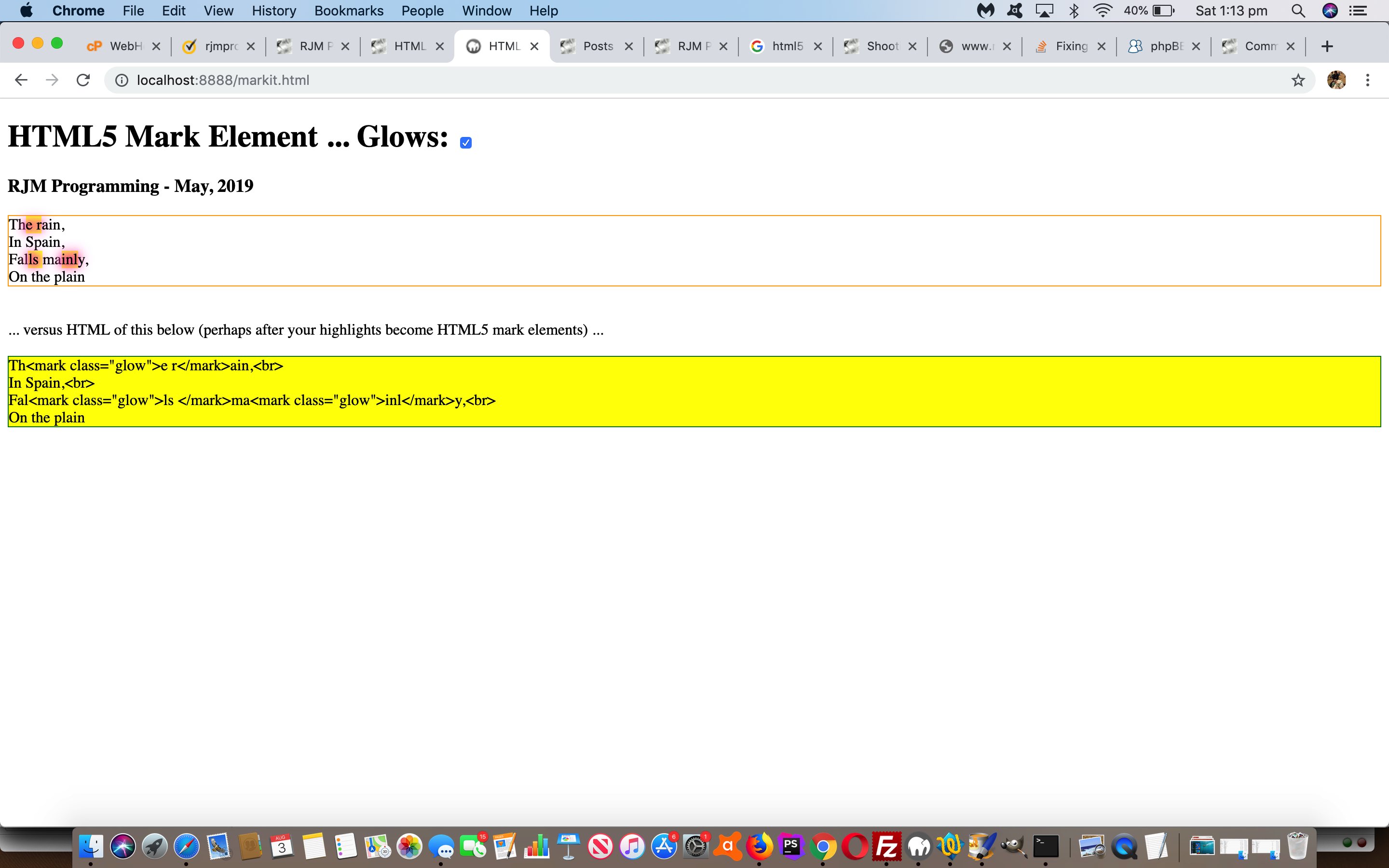
… today’s use quite apt for this “mark” tag’s text highlighting talent. It’s default highlighting is a strong yellow background colour, but you can apply this “glowing text” CSS class to achieve a more “in your face result”, which you can try (the changed markit.html‘s) live run link … or below …
… yourself, to see what the effect is of “mark highlighting” and “glowing text”.
Previous relevant Glowing Text Validation Primer Tutorial is shown below.
Yesterday’s application of the use of CSS brilliance of W3School’s glowing text idea with Shooting Star Game Primer Tutorial was just one idea regarding the use of glowing text. What about using it with form validation?
Yes, that’s “a goer” … see, even the pamplettes are nodding. The reason, of course, is that glowing text is a mechanism whereby you can grab the attention of even the most blasé of online users. And especially if the field you are “form validating” is mission critical, this could be a good ploy.
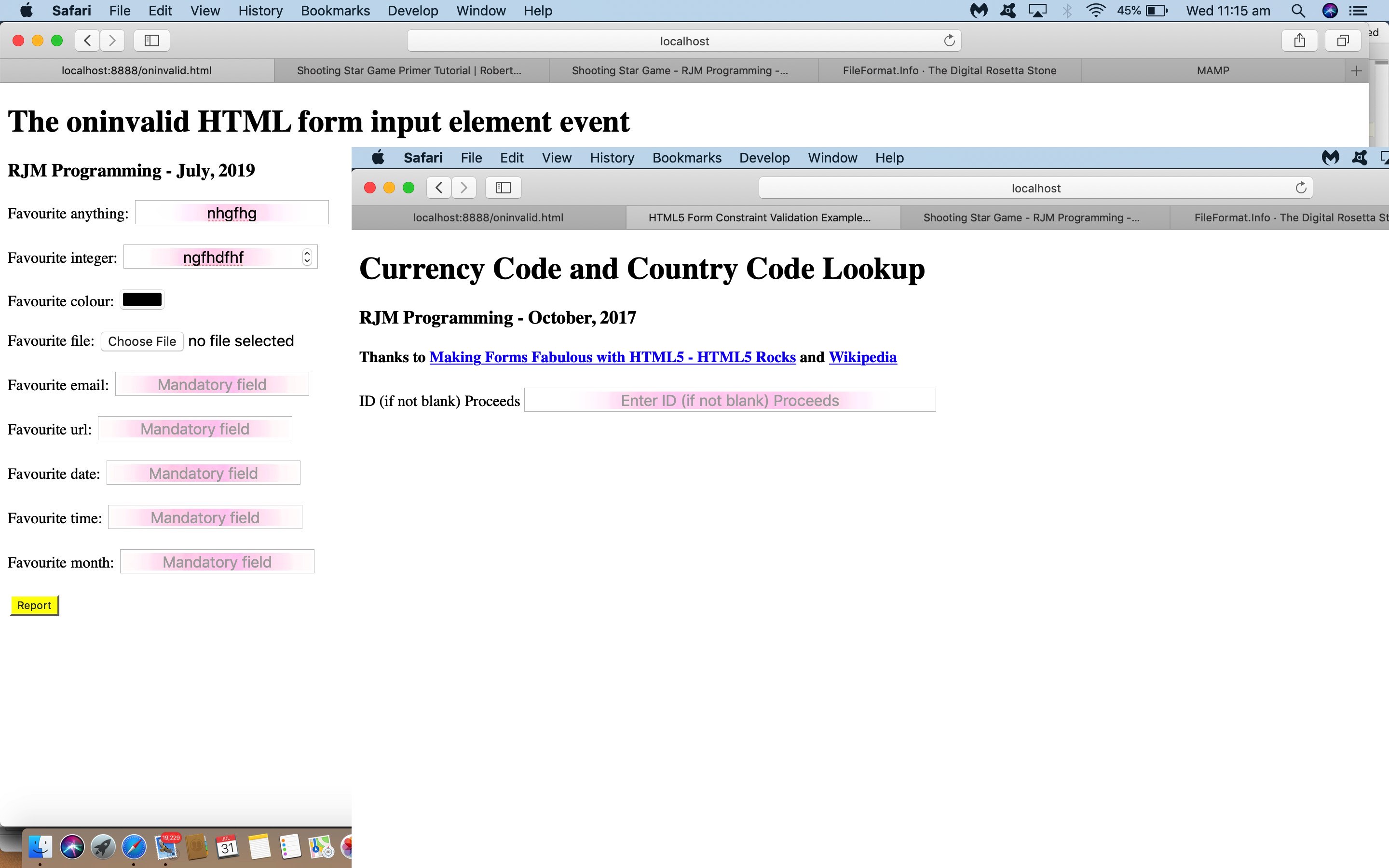
See how we apply this (by making mistakes filling in the forms) with …
- the changed html5_form_constraint_validation.html‘s live run as featured on HTML5 Form API Validation Revisit Tutorial
- the changed oninvalid.html live run as featured on HTML Oninvalid Event Form Validation Primer Tutorial
Previous relevant Shooting Star Game Primer Tutorial is shown below.
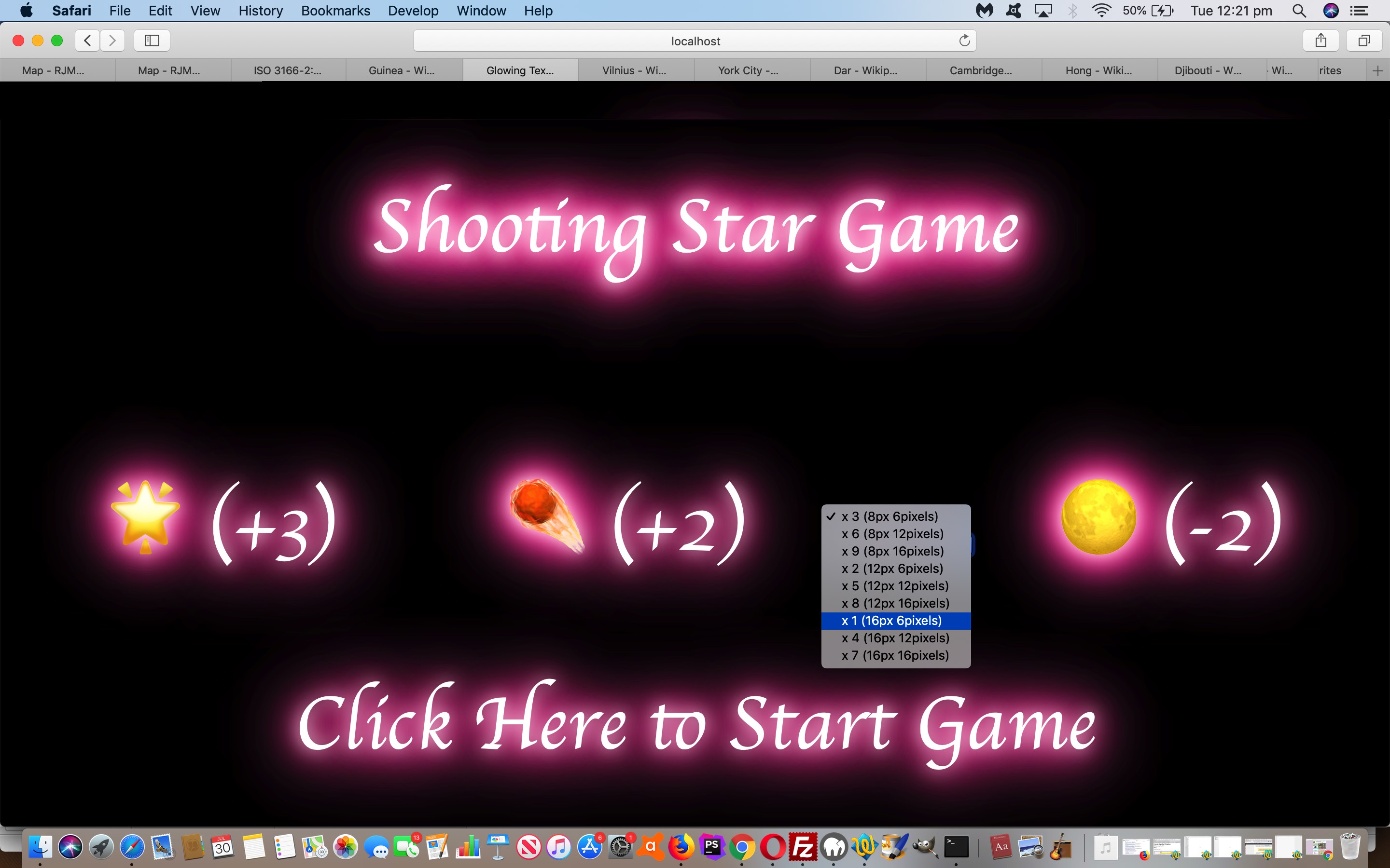
We’ve got one of those pretty simple “click ’em up” games for you today, inspired by the CSS brilliance of W3School’s glowing text idea, thanks.
That set us to thinking of Emojis we could apply (in front of the great background ideas derived from this advice) and looked up Emojipedia (is good for looking up Emoji names or concepts in words) and onto FileFormat Information (is great for HTML Entity determinations for your less complex Emojis) and even Iemoji (is great for HTML Entity determinations for Emojis of all complexities) to determine some components to our game, those being …
- 🌟 … star
- ☄️ … comet
- 🌕 … moon
… which, in turn, led to thoughts regarding a game …
- for one player
- that rewards fast reflexes … and …
- scores via onclick event logic on each component
- according to levels of difficulty … and …
- lessens the score for “blazing away” clicks (or touches) … for that, if a player score is (made up of) score/goes then “goes” is incremented by any document.body onclick event during the game
Levels of difficulty … pour quoi? Well, we can change the …
- Emoji font-size … and/or …
- Movement potential of emoji (in pixels) in any “setTimeout(movecomponents, 100);” 1/10th of a second call cycle
Have a go of today’s shooting_star_game.html game if you like, to see this in action.
If this was interesting you may be interested in this too.
If this was interesting you may be interested in this too.
If this was interesting you may be interested in this too.
If this was interesting you may be interested in this too.
If this was interesting you may be interested in this too.
If this was interesting you may be interested in this too.
If this was interesting you may be interested in this too.
If this was interesting you may be interested in this too.
If this was interesting you may be interested in this too.
If this was interesting you may be interested in this too.
If this was interesting you may be interested in this too.
If this was interesting you may be interested in this too.
If this was interesting you may be interested in this too.
If this was interesting you may be interested in this too.
If this was interesting you may be interested in this too.
If this was interesting you may be interested in this too.

