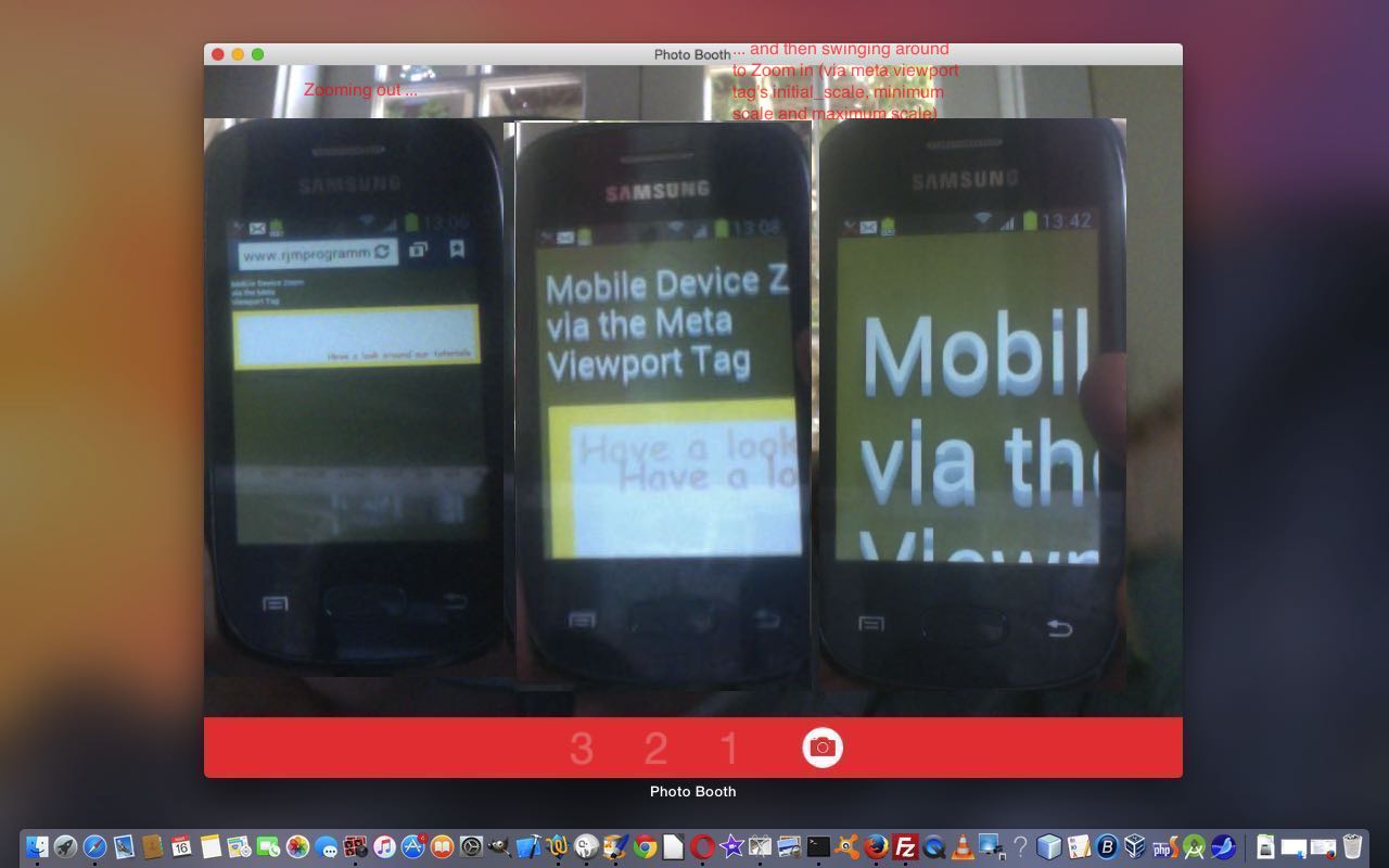
Yesterday, with Mobile Friendly Meta Viewport Tag Primer Tutorial as shown below, we featured the HTML meta tag …
<meta id=”myviewport” name=”viewport” content=”width=device-width, initial-scale=1, minimum-scale=0.25, maximum-scale=8, user-scalable=yes” />
… and explained more of its uses, taking a look at its content definition as per …
- width … most often useful to put device-width here, but doesn’t have to be
- initial-scale … most often useful to put 1 here
- minimum-scale … minimum zoom setting
- maximum-scale … maximum zoom setting
- user-scalable … most often useful to put yes here, but you may want to control everything and put no
Today, if you are on a mobile device, we want to show that the HTML meta viewport tag can be used to zoom in and/or out on your web application run on a web browser of your mobile device.
We start our live run (with the HTML and Javascript code you could call viewport_zoom.html) by starting our “Eat at Joe’s” animated GIF content with …
- width=device-width
- initial-scale=1
- user-scalable=yes (though most of the point here is for you to sit back and watch what the web application does to zoom around your webpage of your web application run on a web browser of your mobile device)
… and change the initial-scale dynamically with Javascript DOM to head towards …
- minimum-scale
… before heading out to …
- maximum-scale
… and then back to infinity and beyond minimum-scale etcetera etcetera etcetera.
We hope you enjoy our spacy feeling web application today. You can control the initial settings via viewport prompting live run.
Stop Press
The ideas above got a tweak in October, 2019 which you can read about on Responsive Design Viewport Width Considerations Tutorial from 12th October, 2019.
Previous relevant Mobile Friendly Meta Viewport Tag Primer Tutorial is shown below.
A couple of days ago we cautioned against thinking the HTML meta tag was a “cure all” to make a web application mobile friendly. Well, lately we’ve had a web application where it made ALL the difference, and so, today, we want to take that opportunity to explain why this tag can help out with web application mobile friendliness, but please don’t think we resile from that original “cure all” warning, because mobile friendly solutions usually do involve more than the inclusion of one of these, albeit, wonderful (and a programmer’s “phew” tool) HTML head elements, the HTML meta viewport tag.
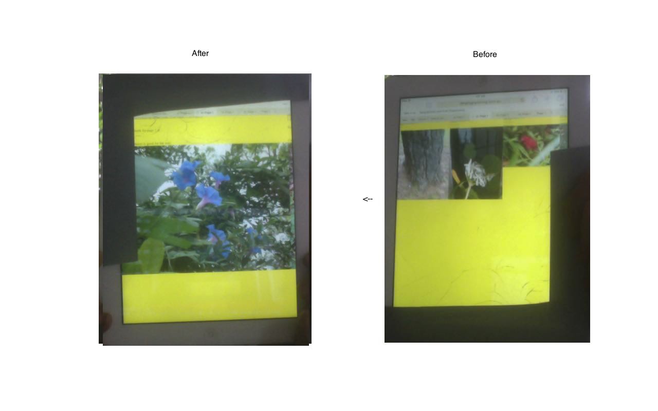
First take a look at our Intelligent Hashtagging Primer Tutorial below and reference that to our BEFORE and AFTER scenario of it illustrated in today’s tutorial picture picture (of an iPad). Without the HTML meta tag the browser has no guidance regarding scale and will choose its own determinations about this, and with our huge width of data with our intelligent hash tagging web application, it will do something that was not wanted, to also live with the window.innerWidth usage web application Javascript internal “intelligence” about knowing which page you are on without you ever going back through an HTML body onload event. Feel at this stage that we should explain … we don’t let loose with the use of this “intelligence” but if you examine the HTML closely you’ll see all the HTML element IDs are based on the page number … so you could add lots more “intelligence” … will leave that for you … am feeling a dumb spell coming on!
Okay, let’s break down parts of that HTML meta tag …
<meta id=”myviewport” name=”viewport” content=”width=device-width, initial-scale=1, minimum-scale=0.25, maximum-scale=8, user-scalable=yes” />
… to explain more of its uses …
- width … most often useful to put device-width here, but doesn’t have to be
- initial-scale … most often useful to put 1 here, and this is what stops the left hand side of today’s tutorial picture happening
- minimum-scale … minimum zoom setting
- maximum-scale … maximum zoom setting
- user-scalable … most often useful to put yes here, but you may want to control everything and put no
Today, if you are on a mobile device, we want to show that the HTML meta viewport tag can be changed dynamically via code like …
   viewport = document.querySelector("meta[name=viewport]"); // thanks to http://stackoverflow.com/questions/3588628/can-i-change-the-viewport-meta-tag-in-mobile-safari-on-the-fly

   viewport.setAttribute('content', 'width=' + width + ', initial-scale=' + initial_scale + ', minimum-scale=' + minimimum_scale + ', maximum-scale=' + maximimum_scale + ', user-scalable=' + user_scalable);
… the idea for which we got from this very useful link.
To try this out (on a mobile device, only, will you see any affect) you can try this viewport prompting live run (as distinct from the run of the mill live run). Here is the new HTML and Javascript source code you could call detect_hashtag_navigation.html changed for all these mobile friendly considerations as per these changes, from a couple of days ago.
Okay, we have another agenda today. On a mobile device, you may or may not want to cater for the user rotating the device, and so changing its “orientation”. The way you can go about knowing this has happened, and we feel compelled to tell our users with today’s web application, because the top.document.title Page Numbers may get out of kilter should they proceed (unawares). We go about detecting by, in general terms …
- storing away global variables for window.innerWidth and window.innerHeight at the HTML body onload event
- in the Javascript function that regularly checks on our Page Number calculations, and puts the findings into top.document.title, we check as per …
function firstCheck() {

  var durl=document.URL.split('#');

  var isok='y';

  top.document.title="You are on Page " + eval(Math.floor((eval(getScrollLeft()) + eval(pw)) / eval(pw)));


  if (eval(pw) > eval(ph) && window.innerHeight > window.innerWidth && !done) {

      done=true;

      isok=prompt("Change of orientation may make top.document.title (ie. Page Number) wrong.  Continue anyway, or change default answer to refresh for new orientation.", isok);

  } else if (eval(pw) < eval(ph) && window.innerHeight < window.innerWidth && eval(window.innerWidth / eval(pw)) < eval(numpages - 1) && !done) {

      done=true;

      isok=prompt("Change of orientation may make top.document.title (ie. Page Number) wrong.  Continue anyway, or change default answer to refresh for new orientation.", isok);

  }


  if (isok != null) {

      if (isok != 'y') {

       if (durl[0].indexOf('?') != -1) {

        location.href=durl[0] + '&huh=' + window.innerHeight + '#page' + eval(Math.floor((eval(getScrollLeft()) + eval(pw)) / eval(pw)));

       } else {

        location.href=durl[0] + '?huh=' + window.innerHeight + '#page' + eval(Math.floor((eval(getScrollLeft()) + eval(pw)) / eval(pw)));

       }

      }

  }


  setTimeout(firstCheck,1000);

}
So we have that tutorial picture BEFORE and AFTER image snapshot, but maybe you are on a mobile device and want to see that AFTER and BEFORE (yes, AFTER is on the left … can you guess why?) scenario yourself? Well, cast your eyes below, and we hope you come back to read more blog posts soon … bye …
… and take a look up at your web browser’s title for this blog posting’s web page … see how top.document.title usage, rather than just document.title usage, has such power … see it change by navigating in either. We last, sort of, raved about this top.document.title thought when we presented Javascript Associative Array Primer Tutorial … and now we’re almost over it.
Previous relevant Intelligent Hashtagging Primer Tutorial is shown below.
The HTML hashtagging navigation technique off an HTML a tag like …
<a href='#page3' title='Go to page 3 via hashtagging'>Go to page 3 via hashtagging navigation</a>
… does not involve a rerun of the Javascript DOM document.body’s onload event, and that may dampen the spirit of some programmers, and they resort to Ajax techniques perhaps, to get more logic in by staying on the same webpage, but we are here to tell you that you should think of using window.getComputedStyle() method techniques teamed with window.innerWidth property and the setTimeout Javascript functionality …
function firstCheck() {

  top.document.title="You are on Page " + eval(Math.floor((eval(getScrollLeft()) + eval(pw)) / eval(pw)));

  setTimeout(firstCheck,1000);

}
… to stay on your one webpage and be able to add intelligence as the user navigates, via hashtagging, to other parts of the webpage, effectively off to the left or right of the screen, controlled by our CSS “usual suspect” (for overlay tutorials) position:absolute.
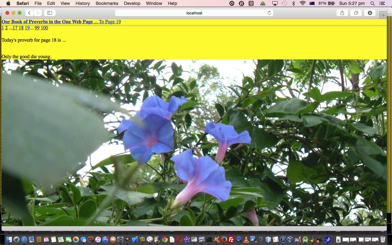
We do it today, with our dynamic “Book of Proverbs” that has …
- Next Page HTML a link hashtagging navigation … plus a rudimentary …
- Breadcrumb hashtagging navigation to some other pages
- A proverb … aw shucks … thanks to http://tww.id.au/proverbs/proverbs.html
- A (homegrown) image from Ephemeral
As you try the live run, look up at top.document.title and it shows the Page number you are on … a small step for man, a giant leap for mankind not … but we do use window.getComputedStyle() to add intelligence (helped along by the great leads this link provided … thanks), as you can tell with our HTML and Javascript source code you could call detect_hashtag_navigation.html
If this was interesting you may be interested in this too.
If this was interesting you may be interested in this too.
If this was interesting you may be interested in this too.


