The benefits of multiple class HTML element definitions came to the fore when we presented CSS3 Button Animation Transition Game Sharing Tutorial and today we find a …
- slideshow … meets …
- animated GIF
… “presentation” way as our theme for today’s “web application”.
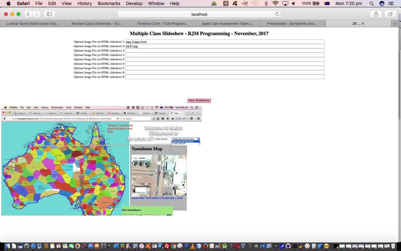
Unlike some other “slideshow” methods we navigate nowhere, but more, “slap” overlay upon overlay onto the one image area, and we’re officially adding it to our list of image presentation ideas you can see listed from PDF on Mac OS X via Images and Finder and Preview Tutorial as shown below.
From above, as you might surmise, and see for yourself trying slideshow_multiple_class.html‘s live run link, what you can end up with are the makings of an animated GIF, effectively created just for your session, though on this side of the thinking we may make improvements as time goes on.
How does it work? Well, the user defines up to nine …
- image URL … and/or …
- HTML URL containing img element src= properties pointing to image URL(s)
… all able to contribute to the contents of the resultant “slideshow” (like animated GIF) presentation.
We’ll leave you with some reruns of past slideshows we’ve presented …
- Yii MVC PHP Framework Hello World Content Tutorial
- Android Camera to Mac iPhoto Primer Tutorial
- NetBeans Backbone.js HTML5 Web Application Primer Tutorial
Previous relevant CSS3 Button Animation Transition Game Sharing Tutorial is shown below.
There are some familiar “items” with today’s additional functionality to yesterday’s CSS3 Button Animation Transition Game Tutorial … and some other matters we encourage you to consider, the primary one of these being …
- the benefits of multiple class HTML element definitions where the Cascading in CSS comes into (its hierarchical) play with first class being a “template” one refined by second class “localizing” styles … we instigated before familiar …
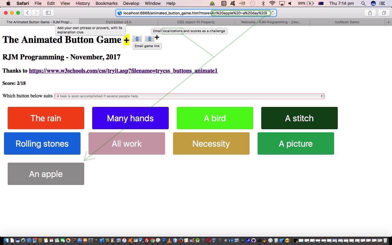
- localization of our Animated Button Game allowing the user to define their own “Phrase or Proverb” versus “Explanation of phrase or proverb” relationship … and our favourite …
- sharing email (via client email a link to mailto: href element) mechanism for …
- email link to game … and/or …
- email link to game with any localizations and as a challenge to an emailee (with the same order of questioning) and a ” versus otherscore/othergoes” flagging of score HTML element
- interfacing to the user via new “character” and emoji and “emoji plus sup button” (as a new means by which we can effect a multiple emoji “feel”)
The (new version of the) game‘s HTML and CSS and Javascript animated_button_game.htm changed this way for this work today, the biggest block of change representing how that CSS started using multiple class definitions like …
class="button button1"
… and reduced the CSS definition from right hand side to left hand side as below …
| New multiple class CSS | Old single class use CSS |
|---|---|
| <style> select { width:70%; border: 2px solid pink; } .button { .button span { .button span:after { .button:hover span { .button:hover span:after { .button1 { .button1 span:after { .button2 { .button2 span:after { .button3 { .button3 span:after { .button4 { .button4 span:after { .button5 { .button5 span:after { .button6 { .button6 span:after { .button7 { .button7 span:after { .button8 { .button8 span:after { |
<style> select { width:70%; border: 2px solid pink; } .button1 { .button1 span { .button1 span:after { .button1:hover span { .button1:hover span:after { .button2 { .button2 span { .button2 span:after { .button2:hover span { .button2:hover span:after { .button3 { .button3 span { .button3 span:after { .button3:hover span { .button3:hover span:after { .button4 { .button4 span { .button4 span:after { .button4:hover span { .button4:hover span:after { .button5 { .button5 span { .button5 span:after { .button5:hover span { .button5:hover span:after { .button6 { .button6 span { .button6 span:after { .button6:hover span { .button6:hover span:after { .button7 { .button7 span { .button7 span:after { .button7:hover span { .button7:hover span:after { .button8 { .button8 span { .button8 span:after { .button8:hover span { .button8:hover span:after { |
Cute, huh?!
Previous relevant CSS3 Button Animation Transition Game Tutorial is shown below.
The recent CSS3 Transition Game Tutorial had us examining CSS3 (Cascading Style Sheet) specification “Transitions” as tools for animation styling. Today we …
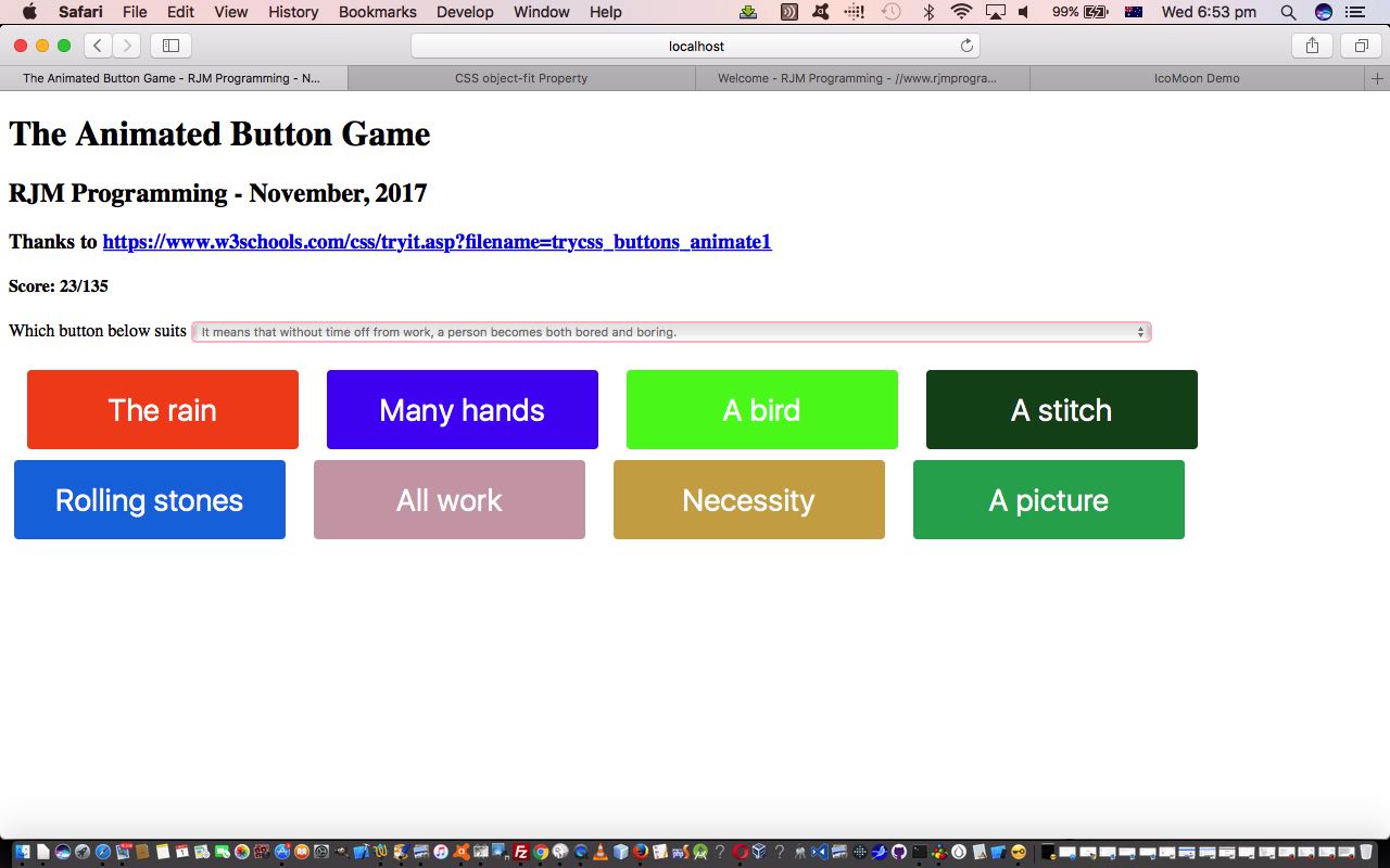
- apply such “transition” thinking to the animation of HTML button elements (as inspired by https://www.w3schools.com/css/tryit.asp?filename=trycss_buttons_animate1 thanks) … in terms of …
- creating a game whereby the user links a (most often based on Wikipedia sources, thanks) “proverb or phrase explanation” the game randomly selects for the user in an HTML select element dropdown (made to be “readonly” via the use of the disabled=”disabled” attribute) … to …
- HTML button elements initially showing a prefix … that when …
- hovered over CSS3 “transition” animation also channelling the checked against the :after selector to show a full proverb or phrase as the user selection …
- Javascript checked against data attributed (to hide from “nosy” users) the link to “explanation” correct matches to …
- increase the user’s score in the game‘s HTML and CSS and Javascript animated_button_game.html
Do you remember a recent “Stop Press” explaining a neat way to get mobile platforms to effectively map their onclick event logic to an onmouseover event based Javascript logic set, via the application of …
onclick=""
… HTML element (today that being a button element) logic? Well, today that is used again to allow for this game to be played on mobile devices, but just with those users clicking buttons rather than the “hover” that a non-mobile user does to play the same game.
Previous relevant CSS3 Transition Game Tutorial is shown below.
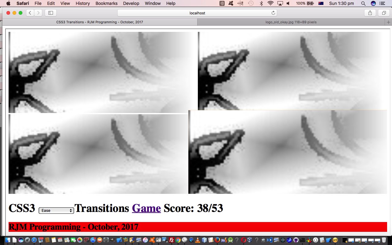
Yesterday’s CSS3 Transition Primer Tutorial started us thinking about CSS3 (Cascading Style Sheet) specification “Transitions”, and there, we intimated that they could be used to serve up to the web application user simple animation functionality. Today, we go a bit further down that road exporing a few more ideas in this line of work, along the way using “transitions” in a simple spider game as below …
Added into the “transitions” usage, building on yesterday, are the concepts (all available to read further on here, thanks) …
- multiple “concept” transitions
- transition-timing-function modes of use
- transition (CSS styling) definition separated out into its 3 constituent parts …
- transition-property
- transition-delay
- transition-duration
… as per …
<style>

.cdiv {

    width: 300px;

    height: 200px;

    background: red;

    -webkit-transition-delay: 3s;

    transition-delay: 3s;

    -webkit-transition-property: height, width; /* Safari */

    transition-property: height, width;

    -webkit-transition-duration: 4s, 22s; /* Safari */

    transition-duration: 4s, 22s;

}


.cdiv:hover {

    width: 600px;

    height: 400px;

}

</style>
The game today recalls the recent CSS3 Background Size Contain and Cover Primer Tutorial use of the CSS background-size contain and cover attribute values that we harness to (lamely, admittedly) make (just one of our) spiders rear up, and mildly scare our web application game users (perhaps a few of which are rolling on the floor in apopleptic laughter).
The HTML and CSS and Javascript live run‘s css3_transitions.htm HTML and CSS and Javascript source code, changed this way.
Previous relevant CSS3 Transition Primer Tutorial is shown below.
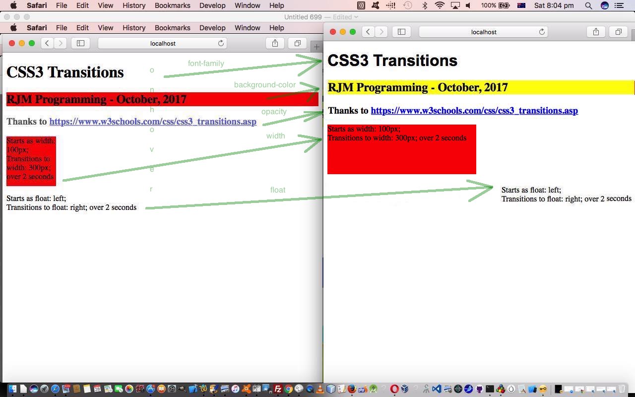
The CSS3 (Cascading Style Sheet) specification introduced “Transitions” to CSS styling of web pages. A CSS3 “transition” …
CSS3 transitions allows you to change property values smoothly (from one value to another), over a given duration.
Today, we use the CSS :hover selector as the basis for transitions in our live run‘s css3_transitions.html HTML and CSS source code.
As you might surmise using this web application, CSS3 “Transitions” can act like simple animations.
Stop Press
The CSS :hover selector is not a “good fit” (euphemism for “it doesn’t work, Bud!”) on mobile platforms. Looking around the “net” got to this great link, thanks, which suggested adding onlick=”” on all relevant :hover selector HTML elements, to allow for (and it only really makes sense when the real onclick event meaning is not needed) the onclick event to be simulating the onmouseover event, for those mobile platforms missing the real onmouseover event.
If this was interesting you may be interested in this too.
If this was interesting you may be interested in this too.
If this was interesting you may be interested in this too.
If this was interesting you may be interested in this too.
If this was interesting you may be interested in this too.
