Call me a troglodyte if you like, but to me, the concept in Information Technology (in the GUI (Graphical User Interface) concept) of “windows” was best understood, on Windows, before Windows 10. Windows 10 has not diminished the possibilities regarding interplay between “windows”, it’s just (to me) diminished in the mind with that “icon app” push of Windows 10.
By “windows”, here, we are talking about opening many windows and having them cascade or separate across your laptop screen. Yes, in macOS (or the older Mac OS X) you can do a bit of this, too, but to me (perhaps troglodyte, perhaps unknowing me), macOS is more your “icon app” type of operating system. As is Apple’s other big operating system, iOS, for mobile devices, and there, as you might imagine, there is sense to this approach, with the lack of “real estate”, with the screen sizes you are dealing with.
But iOS has the “double home button tap”
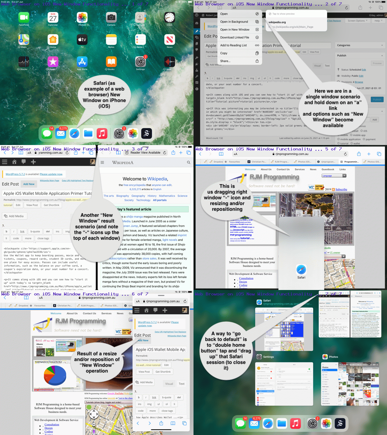
… I hear you say. Yes, that’s true, but speaking personally, I’ve more used this in the past, using the “double home button tap” on iOS to close down apps that are eating up the battery supply. Today, though, we want to show, with the Safari web browser as an example of an iOS (mobile) app, that wooooooorrrrrrllllldddd in iOS tipping its hat more towards that “windows” approach to doing computing work. Our assessment is, as you might expect, a tick of approval, but will it lodge in the brain to change “working behaviours” on iOS, we are not so sure. Perhaps the piece of iOS functionality we can centre this around is the …
Open in New Window
… suboption of menu, off a single application (“a” link “extended touch” (ie. hold down) gesture).
After that “New Window” functionality, two side by side windows present … yayyyyyyy (now you see the point of this blog posting)! As those “-” icons up the top of those “windows” allow you to …
- drag (via “extended touch”) … to (be able to) …
- reposition … and accidentally, that way …
- resize
… “windows” on iOS.
Then, of course, as ever, you have the “double home button tap” (as that alternative “cascade” of windows organizational idea) “swipe up to close” ideas to augment all this as approaches in iOS that can be kind of nifty ways to work, if you are of this mind?!
Feel free to view our exploration of some of these ideas with today’s animated GIF presentation.
If this was interesting you may be interested in this too.


