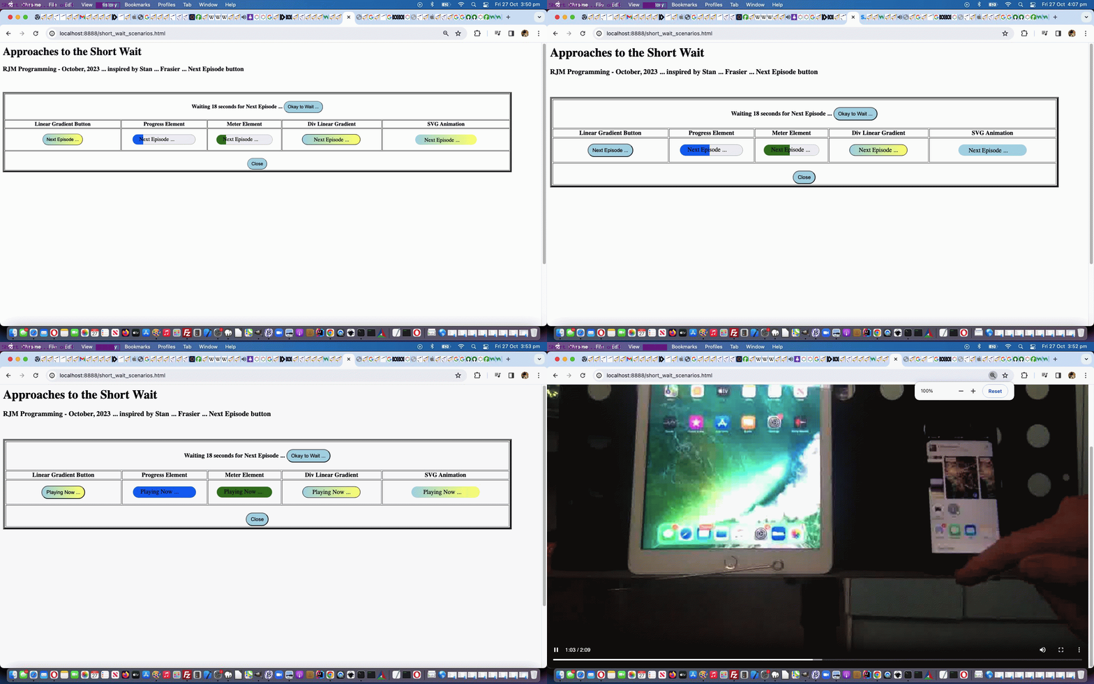
We were streaming episodes of Frasier, effectively “binge watching”, the other day, on Stan, and were impressed by the cuteness of the …
Next episode …
… button “linear gradient” look. So we wrote a “proof of concept” Short Wait Scenario web application featuring five ideas we’ve had …
- button … using linear-gradient background-image … using “keyframes” and “transitions”
- progress … with overlayed span text
- meter … with overlayed span text
- div … using linear-gradient background-image … using “keyframes” and “transitions”
- SVG … using text subelement SVG element class pointing at linear-gradient background-image … using “keyframes” and “transitions”
… to “semi-simulate” what that Stan button achieves (but we can’t entirely with the current restriction with video playing on modern web browsers that a real user created button press should happen on the webpage before any media playing … hence the “Okay to Wait …” button we’re asking you to press to simulate Stan binge watching mode) and found the keyframes transition work not fast enough on this first draft. We’ll do some more research, here.
If this was interesting you may be interested in this too.


