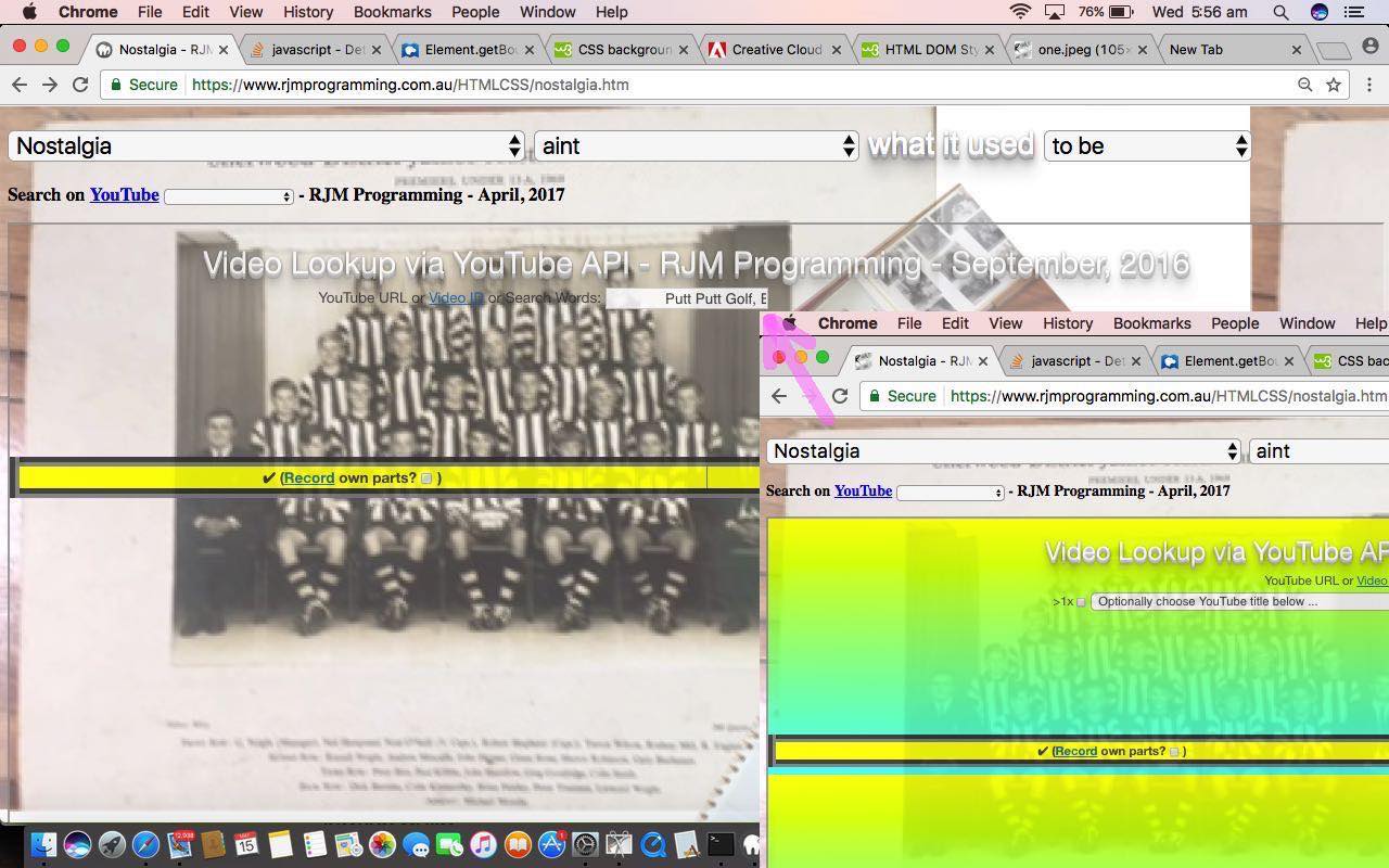
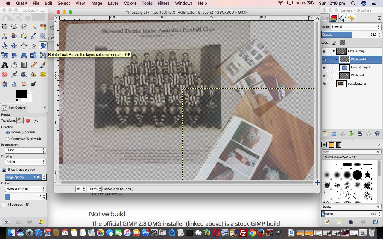
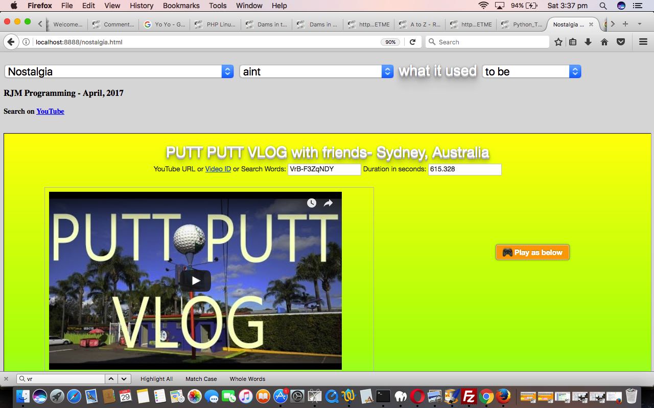
Yesterday’s aesthetically motivated Nostalgia Game Gimp Tutorial as shown below, got us thinking about …
- CSS styling
- child HTML iframe CSS styling
- background images in webpages
- background images in child HTML iframe “inheriting” CSS styling
… and hope you can see the progression of thinking up to that last one, which maybe pulled you up with a wooooaahh! Yes, CSS inheritance in a child HTML iframe webpage from a parent webpage, regarding background image work, is not a default inheritance scenario, because an HTML iframe “child” webpage, is, to all intents and purposes, another (brand new) webpage in the “eyes” of the web browser.
Okay, be that as it may, what could help with facilitating that final list entry thought above? Well, we can think of, just quickly …
- getting the child iframe webpage “call” the same stylesheets as the parent, having set both up to be predominantly working their styling via CSS styling (be that via internal <style></style> styling or external stylesheet file styling) … or …
- use Javascript DOM (be that via internal <script></script> scripting or external Javascript file scripting)
… and for two reasons we plump for the second of those, and lean towards the external Javascript thoughts within that option, because …
- the Nostalgia web application mainly styles via style property of its HTML … and …
- it is less dependent on the nature of the parent, and its “motives” if you will, to use Javascript DOM to do this … and a contination of that thinking is that …
- an external Javascript file is a more generic approach than internal Javascript scripting
- an external Javascript file can be called in a variety of ways to make it tailorable, to add to genericity, as this project progresses … this is just our first draft of an idea, just, at this stage, relating to webpage background image management
… to help have a coding design with increased genericity and flexibility (especially regarding future thinking)
So how does the “first draft” external Javascript keep_parent_background.js get used in a child HTML iframe webpage today? Well, we pick, as the guinea pig idea to fit in with our recent Nostalgia web application, its child HTML iframe webpage partner karaoke_youtube_api.htm (changed in this miniscule way) and place up into its header section between <head> and </head> …
<script type='text/javascript' src='keep_parent_background.js'></script>
… and that external Javascript does not work off any document.body onload event logic, but rather, a Javascript timed setTimeout function scenario. To see what we mean with all this, try this live run link. See this “first draft” external Javascript below …
// keep_parent_background.js

// RJM Programming

// May, 2017

// As an HTML iframe child and parent defines document.body background, and the child has not defined background, adopt that parent one as the background


 function adopt_parent_background_maybe() {

   if (parent.document.body.outerHTML) {

     var parent_style_bits=parent.document.body.outerHTML.split('>')[0].split(' style="');

     if (parent_style_bits.length > 1) {

       var parent_style=(";" + parent_style_bits[1].split('"')[0] + ";").replace(/ ; /g,';').replace(/; /g,';').replace(/ ;/g,';');

       if (parent_style.toLowerCase().indexOf(";background") != -1) {

        if (document.body.outerHTML) {

          var self_style_bits=document.body.outerHTML.split('>')[0].split(' style="');

          if (self_style_bits.length > 1) {

            var self_style=(";" + self_style_bits[1].split('"')[0] + ";").replace(/ ; /g,';').replace(/; /g,';').replace(/ ;/g,';');

            if (self_style.toLowerCase().indexOf(";background") == -1 || 1 == 1) {

              if (parent_style.toLowerCase().indexOf(";background-color:") != -1) {

                document.body.style.backgroundColor=parent_style.toLowerCase().split(";background-color:")[1].split(";")[0].trim();

              }

            }

            if (self_style.toLowerCase().indexOf("url('") == -1) {

              if (parent_style.toLowerCase().indexOf("url('") != -1) {

                var parifs=parent.document.getElementsByTagName('iframe');

                for (var iparifs=0; iparifs<parifs.length; iparifs++) {

                  if (parifs[iparifs].contentWindow === window) { // idea here via http://stackoverflow.com/questions/4691718/determine-current-own-iframe

                    var stylebits = parifs[iparifs].getBoundingClientRect();

                    document.body.style.backgroundPosition=('' + eval(0 - eval(('' + stylebits.left).replace('px','')))).split('.JUNXK')[0] + 'px' + (' ' + eval(0 - eval(('' + stylebits.top).replace('px','')))).split('.JUNXK')[0] + 'px';

                  }

                }

                document.body.style.backgroundImage="url('" + parent_style.replace('URL(','url(').replace('Url(','url(').split("url('")[1].split("'")[0] + "')";

              }

            }

          }

         }

       }

     }

   }

 }


 setTimeout(adopt_parent_background_maybe, 2000);
… featuring …
- an idea to identify the parent enclosing HTML iframe element of a parent webpage from the viewpoint of the child HTML iframe webpage’s external Javascript thanks to ideas of this great webpage, thanks
- use of document.body.style.backgroundPosition (like we did in blog posting thread headed by Legend for and from HTML Map Element Web Server Tutorial) is called into play to correctly position the “parent inherited” background image into the child HTML iframe element, the suitable offsets being the “negatives” of the HTML parent iframe element’s top and left point, calculated using the Javascript method [ourIframeElementObject].getBoundingClientRect‘s .top and .left values
Previous relevant Nostalgia Game Gimp Tutorial is shown below.
Aesthetically, a web application has many and varied “inputs”, some of the main being for us …
- the media resources you add to it
- the stylesheet CSS “smarts” you add to it
- at a user experience (or UX) level, how user friendly the web application is, as a combination of HTML and Javascript client code
- the data available to the web application, managed by HTML and Javascript and perhaps server side code like PHP
… because “aesthetics” is the look of something, but “look” is a lot like “feel” and, at least for us, we think “look” and “feel” (and “hear” for that matter) when we think software application “aesthetics”.
Our emphasis at this “blog” on the theme of web applications tilts strongly towards the “how” of the workings of software code and so we tend to most neglect those first two “inputs” above. Occasionally, though, it is good to get out of the comfort zone, and if the project is apt for it, we like to, regarding those first two “inputs” above …
- the media resources you add to it
- capture the media
- use email to send the media to a place where applications can be used to modify the media, as required
- modify the media, as required, via applications
- send the media to the public website for “publication”
- the stylesheet CSS “smarts” you add to it
- style the webpage to place that media above
- attend to the effects of having that media, on other styling aspects of the webpage, and other Javascript logic aspects to the webpage, and design aspects to the webpage
Before we go on and show you our “aesthetic” changes, in a step by step replay of what we did to our web application, we started with Nostalgia Game Primer Tutorial we need to talk a bit about how these first two “inputs” could fit into the work of a middle sized web agency …
- a graphic designer could create the “media resources” the web agency needs, and may never need to get involved with CSS, but they might, also
- a frontend web developer could take that media from the graphic designer and “aesthetically” make that media work and/or follow a design system (to make it work), like wireframes (a webpage schematic or screen blueprint)
… a workflow that could keep worker skills separated, as required. We say this, because the skills of a graphic designer would be great to have as a frontend web developer but in a busy middle sized web agency office, sounds like too distracting a scenario for any one employee, in our opinion. Our opinion comes from a small sized web agency where I am no graphic designer (in the true sense of the job) but know what it takes to create image media, at least on this MacBook Pro, from a variety of desktop applications …
- Paintbrush … yes, Mac OS X version of Paintbrush … really good for File -> New from Clipboard and moving Pasted clipboard data quickly, Resizing, Horizontal Flip, Vertical Flop, rudimentary Cropping, panning “bigger than” image data into a small rectangular position (which is size set aside for the image), Cut, Copy, Rectangular Selects, rudimentary Annotations via lines and circles, Jpeg density
- Grab (read about this “dynamic duo” (for us) at Paintbrush and Grab Primer Tutorial) or Mac OS X command – control – shift 3 or 4 clipboard screen capture or command – shift 3 or 4 for desktop save of screen capture
- Preview … good for Copy, Paste, 90 degree rotations, Export as PDF
- Gimp … good for Layers, Opacity, Move tool, Rotation tool, Scale tool, Resizing, lots of Filters, Rectangular and Freeform Selections, lots of Export options
… which brings us to the creation of the image media file …
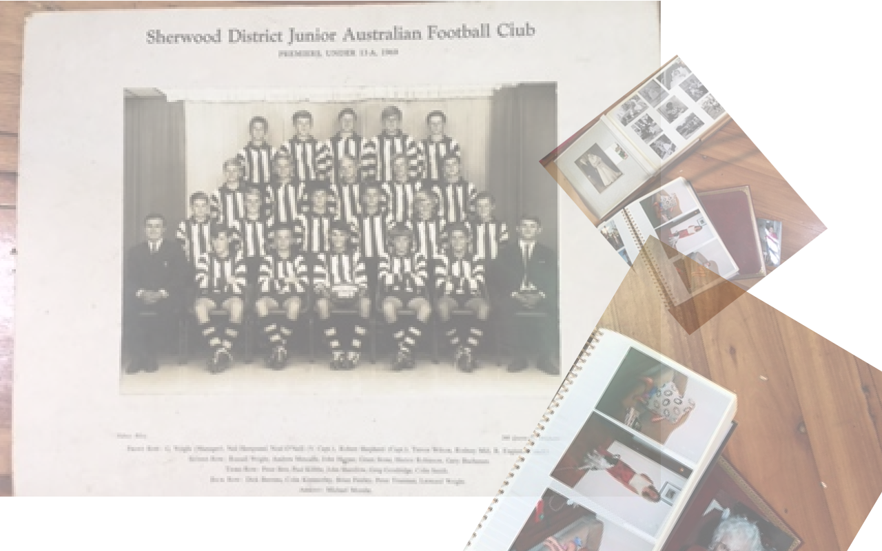
- took photos of Nostalgia realia (old football photo and some photograph albums) in a series of 6 photos (3 used) with an iPhone’s Camera (in Photo mode)
- used the iPhone’s Photos app to Select the six images and Share this to the Mail icon, sending in Small density mode, as the resolution for our job is not supercritical, and you will be able to fit 6 images as attachments in the one email if sent in Small density mode
- from now on, on MacBook Pro, open the Gmail web application and download all 6 image attachments to the Downloads folder
- in Finder, open the image of the football team, and via two finger gesture Open With… Preview
- open Paintbrush and File -> Open a previous tutorial image that we Edit -> Select All then Edit -> Cut and File -> Save As… nostalgia.png
- in Preview, rotate image to the left 90 degrees to make it straight, and Edit -> Copy it to clipboard
- back at Paintbrush use File -> New from Clipboard to create new image that we resize 300% width and 300% height and Edit -> Select All and Edit -> Copy
- in Paintbrush we File -> Open “nostalgia.png” and Edit -> Paste and File -> Save … nostalgia.png
- open Gimp and File -> Open nostalgia.png
- in Gimp at Layer window for the one Layer (so far) called “nostalgia.png” change Opacity from 100.0 to 53.0
- in Finder, open the second image of photo album of black and white photos, and via two finger gesture Open With… Preview
- in Preview, rotate image to the left 90 degrees to make it straight, and Edit -> Copy it to clipboard
- back at Paintbrush use File -> New from Clipboard to create new image that we resize 200% width and 200% height and Edit -> Select All and Edit -> Copy
- in Gimp use Edit-> Paste As… New Layer and the clipboard fully opaque clipboard image falls into its own layer called “Clipboard”
- in Gimp use Move tool to move the fully opaque clipboard “Clipboard” image over to the right more
- in Gimp at Layer window in the Layer called “Clipboard” change Opacity from 100.0 to 47.0
- in Gimp use Rotate tool to rotate the Layer “Clipboard” appropriately
- in Finder, open the second image of photo album of colour photos, and via two finger gesture Open With… Preview
- in Preview, rotate image to the left 90 degrees to make it straight, and Edit -> Copy it to clipboard
- back at Paintbrush use File -> New from Clipboard to create new image that we resize 250% width and 250% height and Edit -> Select All and Edit -> Copy
- in Gimp use Edit-> Paste As… New Layer and the clipboard fully opaque clipboard image falls into its own layer called “Clipboard #1”
- in Gimp use Move tool to move the fully opaque clipboard “Clipboard #1” image over to the right more
- in Gimp at Layer window in the Layer called “Clipboard #1” change Opacity from 100.0 to 55.0
- in Gimp use Rotate tool to rotate the Layer “Clipboard #1” appropriately
- in Gimp use File -> Export As “nostalgia.png” to override its contents, and end up with image above and we …
- send “nostalgia.png” to RJM Programming website via FileZilla (s)ftp protocol file transfer to same folder as nostalgia.htm
… and the use we make of the image media file “nostalgia.png” within the HTML and Javascript and CSS nostalgia.htm via the bold CSS styling with the HTML as per …
- set “nostalgia.png” as the nostalgia.htm background image behind a background colour transparent default document.body styling scenario …
<body style="background-color:transparent;background: url('nostalgia.png');">
- give “nostalgia.png” a change to show a bit under the YouTube video player HTML iframe element but not stop the YouTube video being seen comfortably …
<iframe id='myiframe' src='//www.rjmprogramming.com.au/HTMLCSS/karaoke_youtube_api.htm?emoji=on&nokaraoke=y&youtubeid=%20%20%20%20%20%20%20%20%20%20%20%20%20%20Putt%20Putt%20Golf%2c%20Ermington' style="display:block;width:100%;height:900px;opacity:0.8;"></iframe>
… the changes of which can be seen with this report (for this live run).
Previous relevant Nostalgia Game Primer Tutorial is shown below.
Was sad to hear of the closing of Ermington Putt Putt Golf the other day. Maybe Putt Putt Golf is on the cheesy side, but it is sad to see innocent entertainments like this go in the community, especially regarding great places for children’s birthday parties, as was the case for us the time we got 10 over par (if we fudge the scorecard just a little bit). So 30th April is its last day, sadly. Remember, as kids, my brother and I climbing the “mountain” (=200 mole hills) at Mermaid Beach Putt Putt, rather than paying for the chairlift, to get up to the Putt Putt Golf there.
Then yesterday’s Variety Italian Style got me to thinking “Nostalgia” big time … Mario Milano, Bugs Bunny, school holidays etcetera etceterayada yada, so decided to write a web application channelling …
- YouTube video via its Embedded Iframe API … and/or …
- Google search
… to offer users of our HTML and Javascript web application live run‘s underlying nostalgia.html source code, for your perusal.
Naturally, you’re likely to go … whaaaaatttt … at a lot of the nostalgia reminiscence suggestions that sprung to my mind … a lot by free association … but there is an option there for you to enter in your own “Nostalgia Search Topic” should you want it to be looked up on the huge world wide web resources that YouTube and Google are … thanks.
If this was interesting you may be interested in this too.
If this was interesting you may be interested in this too.
If this was interesting you may be interested in this too.
