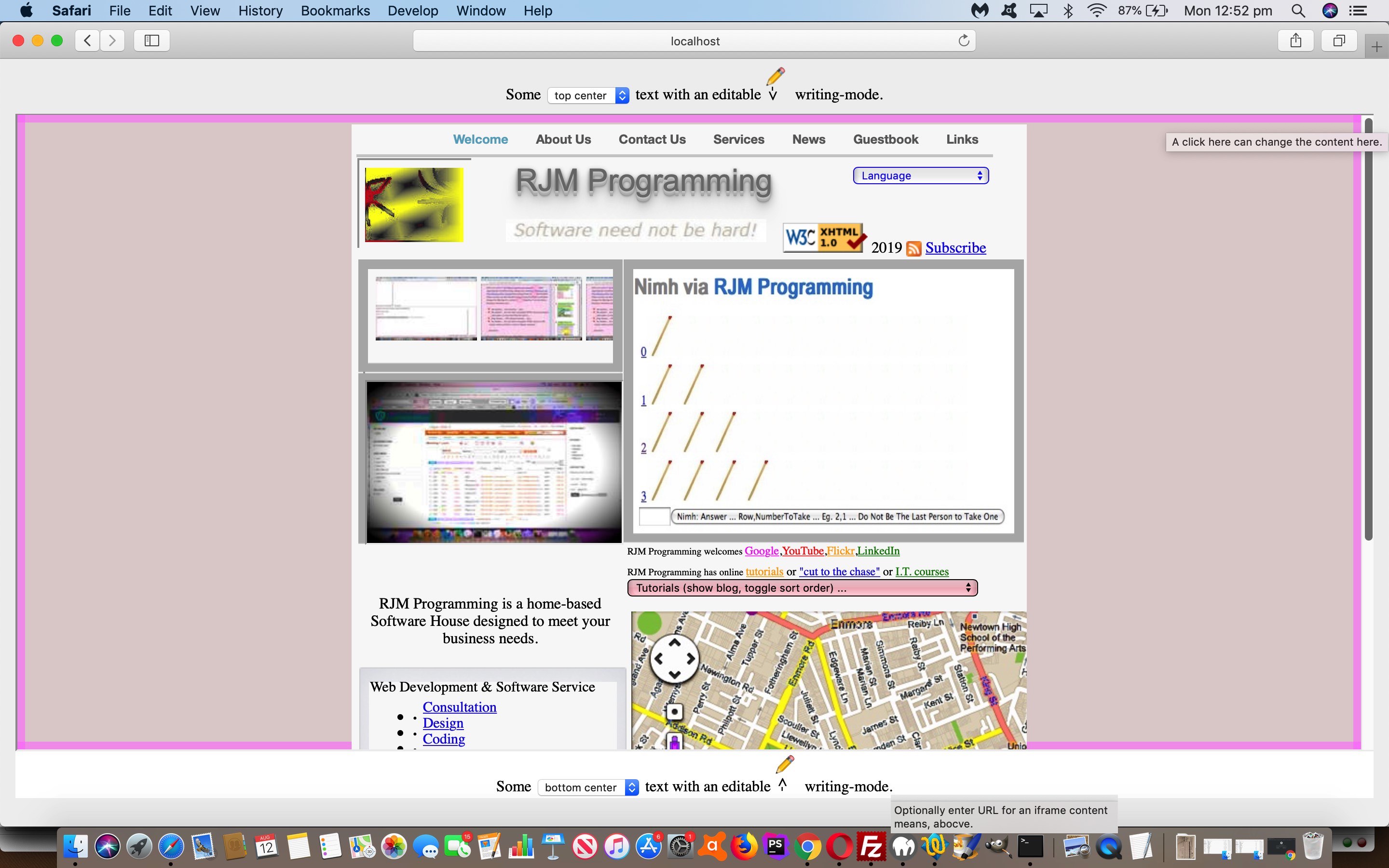
Yesterday’s Screen Corner Horizontal and Vertical Text Primer Tutorial concentrated on a web design for a web application, but today, we turn our attention to …
- some rudimentary ideas regarding the content in the middle of the webpage … bounded by …
- header and footer lines of content that can now be justified left, right or center (via two new HTML select (dropdown) elements) … and …
- header and footer lines of content are editable via contenteditable=true … needed CSS styling …
To control webpage content you can think of it as a form of a Content Management System. This rudimentary means here to do this with the current web application we’re developing we allow for user intervention via …
- the simpler means is to click the last “.” of footer content to user define a URL (as exemplified by today’s tutorial picture, where we entered “HTTP://www.rjmprogramming.com.au”) … or for your adventurous users …
- show the innerHTML content so far of the HTML div element in question and ask the user to enter HTML, optionally, to change that content
So feel free to try the changed hmeetsv.htm‘s live run link.
You can also see this play out at WordPress 4.1.1’s Screen Corner Horizontal and Vertical Text Content Tutorial.
Previous relevant Screen Corner Horizontal and Vertical Text Primer Tutorial is shown below.
We’ve used the CSS property “display: flex;” before when we presented CSS3 Flexbox Table Tutorial. When used “well”, and we say “well” because it takes a bit of practice to work with it, this CSS property can be used to address a question you may want to ask the search engines, as we did …
css calc height minus height of an element
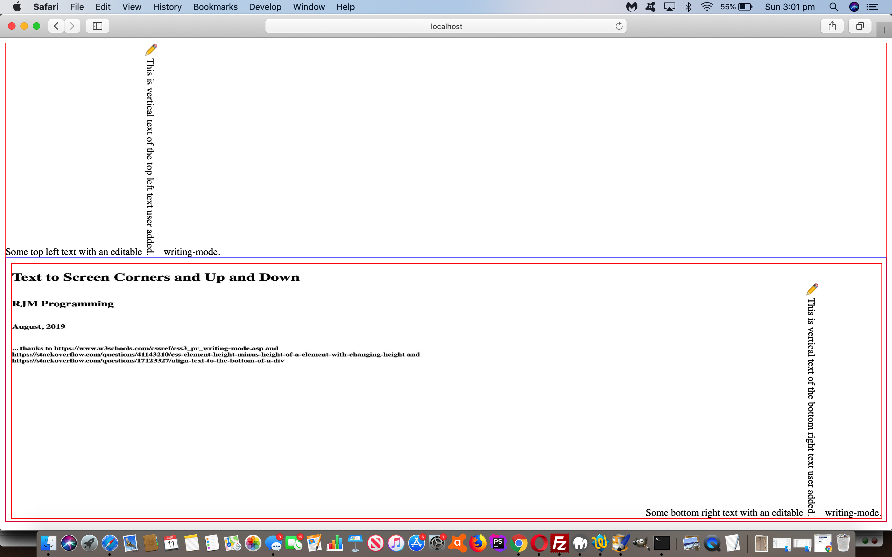
… that got us to “css element height minus height of a element with changing height“, thanks, and thereby to the “design basis” for today’s hmeetsv.html‘s live run link. In fact, this happened secondary to the original idea which involved W3school’s CSS Writing Mode …
The CSS writing-mode property specifies whether lines of text are laid out horizontally or vertically.
… and our aim of creating a bit of a proof of concept of showing this feature wanting us to show text at the top left (easy) of the webpage window and bottom right (not so easy, hence the use of “flex”) of the webpage window, to see this CSS writing-mode in action in a user definable way.
The “flex” aspects to this proof of concept web application are helping us not need to write any “onresize” event logic and are helping a “southerly” HTML iframe element (hosting the bottom right text, where we’d also like to thank Align text to the bottom of a div) live in terms of a total 100% screen webpage height scenario share with a “northerly” HTML div element (hosting the top left text). While we talk about “flex” we want to offer the advice of …
- develop code with lots of CSS like “border: 1px solid red;” …
- get it working and you may need CSS “overflow: hidden;” if scroll bars annoy in some web browsers … then, only at the end you can always replace with …
- finish code with lots of CSS like “border: 0px solid red;” as you “go live”
Previous relevant CSS3 Flexbox Table Tutorial is shown below.
If you were around for the recent CSS3 Flexbox Primer Tutorial and the concept of CSS3’s …
display: flex;

flex-direction: row; // default, or row-reverse or column or column-reverse
… and this was new to you regarding styling that can apply to a “parent” element of “children”, did you wonder as an almost immediate thought, as I had …
What happens with this CSS3 flexbox styling within an HTML table, specifically if you try it on a table’s tr (row) element?
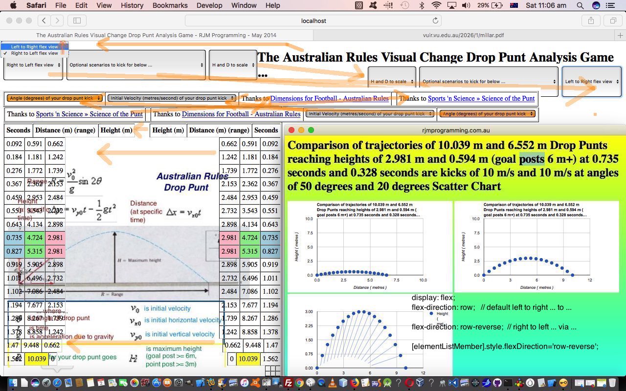
Well, the answer is, you can “warp” a table, just for one or a few rows if you like, using this CSS3 flexbox styling. We found out by incorporating dynamic CSS3 flexbox styling possibilities into a web application (about the trajectory of drop punt in Australian Rules football) of the past that had a set number of table rows (with ID defined) in HTML and CSS and Javascript code you could try yourself at this live run link (with its underlying dropcomparisonpunt.htm changed in this way). We did this via an added HTML select “dropdown” element as per …
<select onchange=" var trs, jtrs, itrs, its=['tr','h1'], wis=window.getComputedStyle(document.getElementsByTagName('table')[1], null).getPropertyValue('width'); if (wis.indexOf('px') == -1 || 1 == 1) { wis='100%'; } for (jtrs=0; jtrs<its.length; jtrs++) { trs=document.getElementsByTagName(its[jtrs]); for (itrs=0; itrs<trs.length; itrs++) { trs[itrs].style.width=wis; trs[itrs].style.display='flex'; trs[itrs].style.flexDirection=this.value; } wis='100%'; document.getElementById('oflex' + jtrs).innerHTML=document.getElementById('oflex' + jtrs).innerHTML.replace('t view','t flex view'); } " id='sflex'><option value='row' id='oflex0'>Left to Right view</option><option value='row-reverse' id='oflex1'>Right to Left flex view</option></select>
… which as you may have surmised applies, optionally, and in a user controlled way, CSS3 flexbox styling (only the row* options, though) to both …
- tr table row elements … and …
- h1 header element
… with interesting visual effects … we think?! Perhaps “you think” too?!
Previous relevant CSS3 Flexbox Primer Tutorial is shown below.
Responsive design is an important aspect to modern web design, because of the realities of the online world’s push to mobile devices, with their smaller device widths. As the W3Schools website says …
The Flexible Box Layout Module, makes it easier to design flexible responsive layout structure without having to use floats or positioning.
… and, yes, using the display: flex property is much more comprehensive a (CSS styling) concept than the float usage options web designers often relied on for this time of styling pre-CSS3.
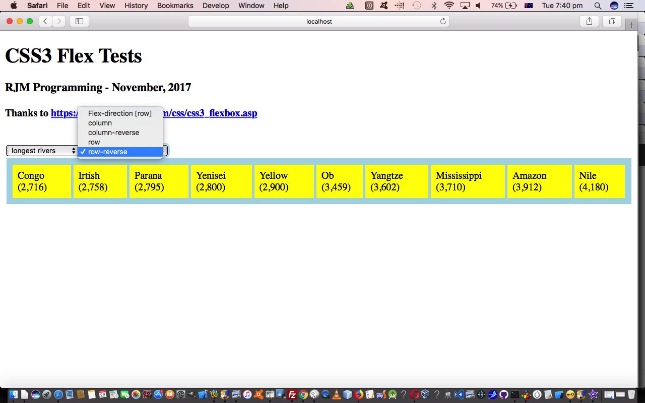
So, today, to try to show you a bit of how this new Flexbox Layout works, we write a proof of concept HTML and CSS and Javascript (source code file) you could call flextest.html offering …
- all the four CSS flex-direction property variations (row, row-reverse, column, column-reverse) are offered for user-definement in an HTML select “dropdown” element … and …
- content of the “parent” HTML element that Flexbox Layout makes sense to apply to, are also offered for user-definement (with some generic lists, which always reminds me of the genius of Paul Kelly’s Careless (whenever I think of lists))
Why not try it out with a live run link yourself.
If this was interesting you may be interested in this too.
If this was interesting you may be interested in this too.
If this was interesting you may be interested in this too.
If this was interesting you may be interested in this too.


