Continuing on from yesterday’s Skeletal System Game Primer Tutorial that started us on a “reveal” and “overlay” and “map element” Skeletal System Game we’re developing, let’s, today, “drill down” a bit into that “reveal” concept. After all, there are so many ways to “reveal” something in real life, and everybody will have their own favourites. What would life be like without this? Pretty dull, we suspect. But a web application can’t do all those imaginative things you can dream up yourself. Robotics hasn’t come along that far. So what types of “reveal” do we add to yesterday’s …
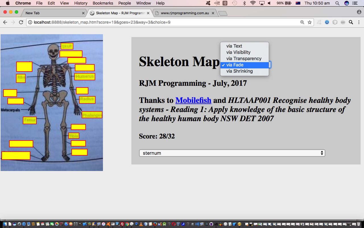
- reveal via Text … is what we’ll call it … are …
- reveal via Visibility
- reveal via Transparency
- reveal via Fade
- reveal via Shrinking
… we compartmentalize into the skeleton_map.htm code via two Javascript global Arrays representing Javascript “coming” commands and Javascript “going” commands (executed later via Javascript eval) and other global variables of interest as below …
var whichway=0, chosenlist=" ", total=0;

var ways=["lasto.innerHTML=labelids[choice]", "lasto.style.display='none'", "lasto.style.backgroundColor='transparent'", "lasto.style.opacity=0.35", "ioff=1"];

var aways=["lasto.innerHTML=''", "lasto.style.display='block'", "lasto.style.backgroundColor='yellow'", "lasto.style.opacity=0.65", "ioff=1"];
… the indexing into of which is controlled by that “whichway” (Javascript) global variable associated with a new HTML select (dropdown) as per …
<select id='way' onchange=" whichway=eval(this.value); if (1 == 1) { location.href=document.URL.split('#')[0].split('?')[0] + '?score=' + score + '&goes=' + goes + '&way=' + whichway + '&choice=' + choice; } "><option value='0'>via Text</option><option value='1'>via Visibility</option><option value='2'>via Transparency</option><option value='3'>via Fade</option><option value='4'>via Shrinking</option></select>
… and you’ll notice from this that we sort of “pack up all our (game) things” like …
- the score
- the number of goes
- the last Skeletal System “bone” choice
- mode of “reveal”, as above
… to effectively “refresh” the web application game when the user changes “reveal” mode. In such a scenario of “known limited and small amounts of data” our advice is just to use the $_GET[] URL approach involving “?” and “&” delimited “name=value” arguments.
Roughly speaking the order of “reveal” options was what came into our head, but we ended up working from simplest to hardest. “Shrinking”, being the “scrunching” up of the “overlayed” HTML div elements until (if you give it time, and are not too impatient) it becomes transparent, is definitely the most difficult “reveal” technique above, followed by the “fade” in difficulty, and the rest are easy. With those more difficult “shrink” and “fade” there is the idea of “masking” (via an image behind another) that we talked about at HTML/Javascript Reveal Image Behind Image Primer Tutorial to consider also, perhaps?! But, like we say, there are so many ways to “reveal” it is, along with “overlay” an approach with web application design, as a topic that can get the creative juices going discussing just how you want your web application to …
- look
- function
- be used by humans … and all other interested parties … down, Nala!
Please feel free to try the skeleton_map.htm‘s live run link, and which changed in this way for those new “reveal” options.
Previous relevant Skeletal System Game Primer Tutorial is shown below.
We think there are two great “concepts” that help us understand the interplay between Javascript DOM and CSS styling when creating client side web applications, those being …
… and today we combine these two concepts with another explained by the recent Body Cavities Game Primer Tutorial …
Piano playing and Anatomy … what do they have in common? Hopefully not that “anatomy leaves you feeling flat” (boom, boom). Or “playing the piano is simply organsmic”. No, for us, it is that we are using the same “online” tool, the much referred to (at this blog) mobilefish HTML map tag creation tool. We like how the map tag links graphics with categorizations or labels for all those visual learners out there. By now, a lot of computer users can predict clickable images that direct you to our navigable webpages, and many of us too, know when to predict that an HTML map element may be in play to allow for the clicking or touching of regions of an image to direct you to different webpages. As the map would imply, a common image type is that of a geographical map, and today we act as though the Human Body, and its body cavities are like that. Our web application “game” quizzes the user about which body cavity contains a body part of interest.
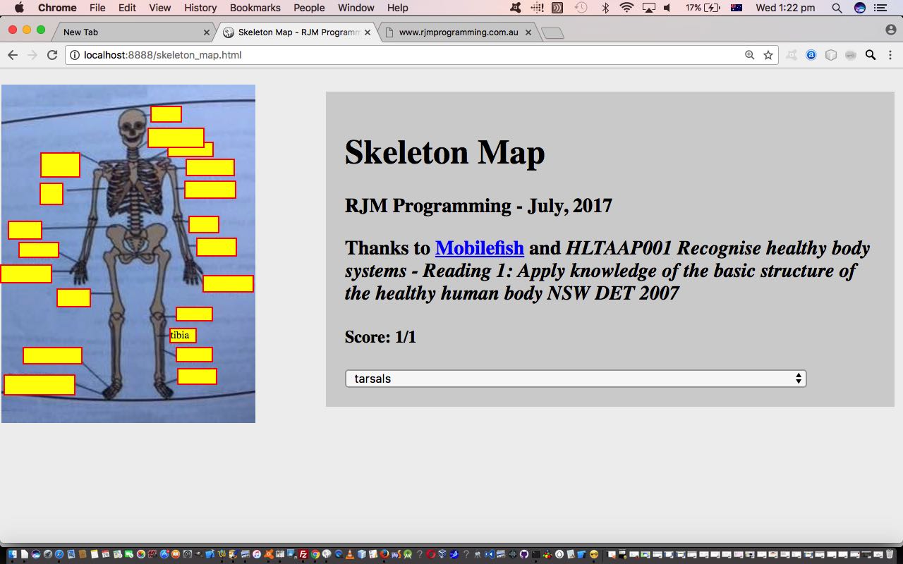
… working together in today’s “Skeletal System Game” web application you can try for yourself at this live run and/or download its HTML and Javascript (DOM) and CSS skeleton_map.html if you like.
Why choose the HTML map approach again? Well, at least for us, we find the visual approach to learning parts of the body a natural way to go, though readily admit there’ll be people out there on your street thinking “the knee bone’s connected to the… thigh bone” and others whispering “the shin bone’s connected to the… knee bone” and yet others shouting “the toe bone’s connected to the… foot bone”. All that being that, you can play today’s game and be able to shout, yourself “the foot phalanges connected to the… metatarsals” and see what it’s like to be misunderstood, for yourself.
Breaking today’s web application into “concept” parts, we might consider the “overlay” build up steps …
- thanks to HLTAAP001 Recognise healthy body systems – Reading 1: Apply knowledge of the basic structure of the healthy human body NSW DET 2007 inspiration upload the skeleton image to mobilefish
- do the work creating HTML map tag area elements in “polygon” form
- download into skeleton_map.html as this “basis for the game”
- add Javascript logic at the document.body onload event (timing) to construct HTML div elements with (two of our … no opacity considerations were required) our usual “overlay” CSS suspects …
- position:absolute property
- z-index
… that harness those “polygon” coords (property’s) minimum and maximum x and y co-ordinates to assist in teaming that “position:absolute” above with …
… in conjunction with a blank innerHTML property along with a background (yellow) colour and a thin red border
… as the “presentation mode” and the “reveal” aspects happen as …
- the user starts the interactivity of the game, guessing where on the skeleton you click a label that points at the Skeletal System bone(s) indicated on an HTML select “dropdown” element, whose value is controlled, randomly, by the web application itself
- if the user clicks correctly, the score is updated and the wording that goes with that clicked label is “revealed” via the populating of that corresponding HTML div element’s innerHTML property
- else if the user is wrong, the score is still updated but the “reveal” does not happen
Previous relevant Body Cavities Game Primer Tutorial is shown below.
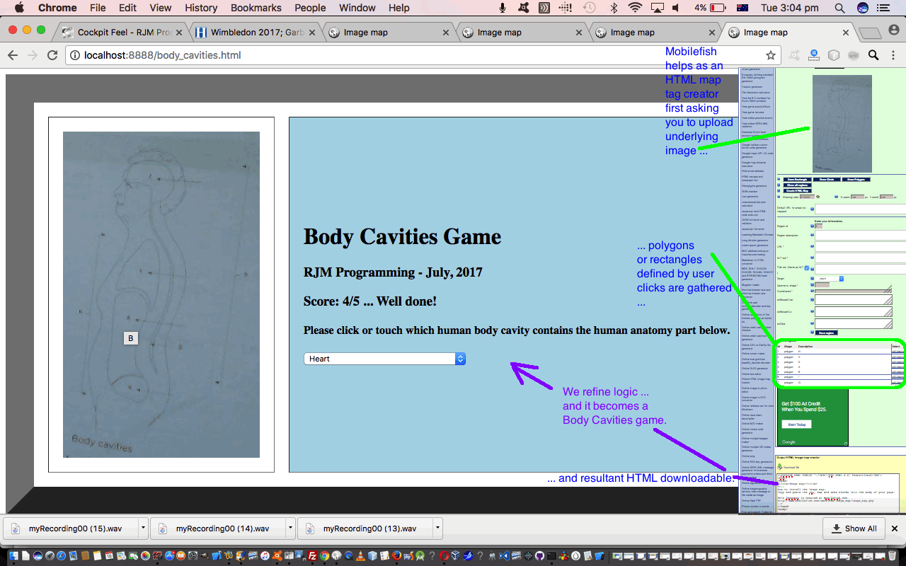
Piano playing and Anatomy … what do they have in common? Hopefully not that “anatomy leaves you feeling flat” (boom, boom). Or “playing the piano is simply organsmic”. No, for us, it is that we are using the same “online” tool, the much referred to (at this blog) mobilefish HTML map tag creation tool. We like how the map tag links graphics with categorizations or labels for all those visual learners out there. By now, a lot of computer users can predict clickable images that direct you to our navigable webpages, and many of us too, know when to predict that an HTML map element may be in play to allow for the clicking or touching of regions of an image to direct you to different webpages. As the map would imply, a common image type is that of a geographical map, and today we act as though the Human Body, and its body cavities are like that. Our web application “game” quizzes the user about which body cavity contains a body part of interest.
There is a lot to learn in anatomy, and where organs and other body parts are located become an important part of its study, pretty naturally, as the way it all works is quite remarkable in its design, with body part adjacency often going hand in hand with bodily functionality … lucky for us. Makes you wonder about those “big questions”, doesn’t it?
Anyway, we hope you enjoy our “Body Cavities Game” powered by …
- the inspiration, and source of the wherewithal to create the underlying map‘s image
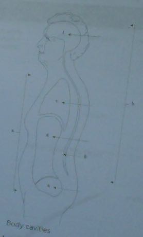 … thanks to Study Guide Individual Support in Australia by TAFE NSW (ISBN: 978-1742365275) …
 - the mobilefish HTML map tag creation tool to create the HTML for the mobilefish HTML map element of today’s
- Javascript global var organinfo[] array built up as elements consisting of “[bodyPart;mapID]” content
- Javascript onload “kicked off” Math.floor(Math.random() * organinfo.length) method of selecting a random body part of interest that the user links to a click or touch of the map body cavities image
- Javascript onclick event logic for the HTML area “polygon” segments coming out of mobilefish also feature the lack of the href property, deliberately … why? … read HTML a Tag Navigation Primer Tutorial about “staying right where you are” by doing away with the href property being defined
Try it yourself at this live run link and/or download the HTML and Javascript source code at this body_cavities.html link.
Stop Press
Here’s some inline CSS we’ve introduced to straighten up our image, which thankfully does not break any map tag functionality. At first we thought we’d try to merge the brightened up image by using the background-clip and background-size and background url but then found that a linear gradient would be less obtrusive, the colours of which we found out via Mac OS X’s Digital Colour Meter utilities desktop application we talked about at Digital Colour Meter on Mac Laptop Tutorial to end up with some inline CSS …
<style>

#lhtd {

    filter: brightness(148%);

    -webkit-filter: brightness(148%);

    -moz-filter: brightness(148%);

    -o-filter: brightness(148%);

    -ms-filter: brightness(148%);

    border: 0px solid #8096B1;

    -moz-transform:    rotate(350deg);

    -o-transform:      rotate(350deg);

    -webkit-transform: rotate(350deg);

    -ms-transform:     rotate(350deg);

    transform:         rotate(350deg);

}


table {

    background: url('body_cavities.jpg');

    background-size:60px 60px;

    background-repeat: repeat;

    background-color: #C1E0FA;

    background: -webkit-gradient(#CAE6F3, #C1E0FA);

    background: -o-linear-gradient(#CAE6F3, #C1E0FA);

    background: -moz-linear-gradient(#CAE6F3, #C1E0FA);

    background: linear-gradient(#CAE6F3, #C1E0FA);

}


#rhtd {

    background-color: lightblue;

}

</style>
Try it, again, yourself at this live run link and/or download the HTML and Javascript source code at this body_cavities.html link, changed this way.
Previous relevant Piano Playing Web Application Mobile Tutorial is shown below.
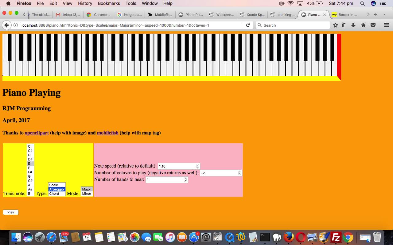
Our Piano Playing web application has moved on to a “second draft”. Nothing has changed about it using those audio mp3 files from the other day when we presented Xcode SpriteKit Game Primer Tutorial to “reframe” their use for creating a client based web application featuring …
- simulated piano keys that can be pressed by the user … and/or …
- the user can play some scales, arpeggios or chords with a nominated tonic note and in major or minor keys
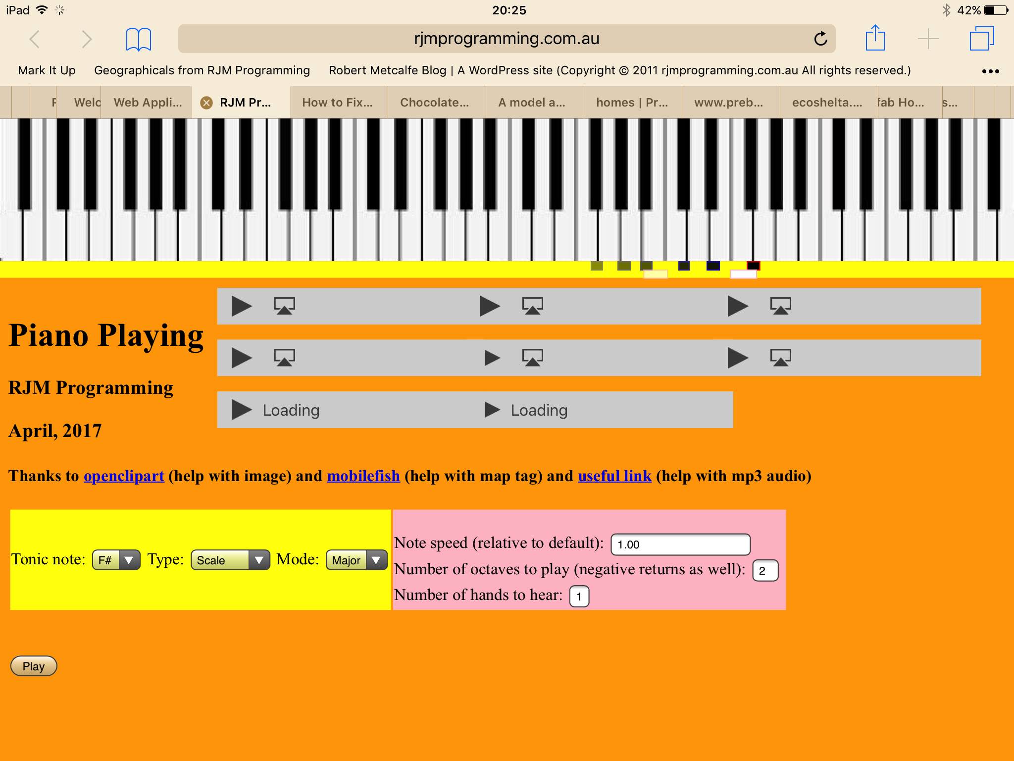
- show a visual “cue” just below the piano keys to show the piano key note last played … we did start out on an SVG type of solution based on the code of Legend for and from HTML Map Element Web Server Tutorial where “overlays” appear in an HTML table “legend”, but trying “overlaying” in this way caused problems, so today we show our “visual” helpers overlaying the border down the bottom of the piano keys comprising …
- iOS mobile users (only) are presented with new HTML audio elements awaiting user “click/touch” intervention, to make the audio happen, as per Apple requirements on audio media, here
So with this second draft we associate audio “cues” with “visual” ones, and include functionality to cater for the mobile device habit of disallowing automated audio plays, by fitting in with this restriction, but use HTML audio elements, showing their controls, for users to push the Play buttons necessary to satisfy iOS media rules. For today, as with WordPress 4.1.1’s Piano Playing Web Application Mobile Tutorial, try the piano playing web application (with the HTML and Javascript piano.htm), changed in this way with respect to that previous “first draft”, at this live run link (where, again, the C major scale, one octave is played first up), or, live also, below, in an HTML iframe …
We hope you like it. Even with the iOS mobile version, you may find a secondary iOS user with the web application can help out the primary piano practicer, playing along with the scales played on a real piano.
Previous relevant Piano Playing Web Application Primer Tutorial is shown below.
We hope you enjoy our new “first draft” of a Piano Playing web application. We’re using those audio mp3 files from the other day when we presented Xcode SpriteKit Game Primer Tutorial to “reframe” their use for creating a client based web application comprising, essentially …
- audio files, thanks to useful link
- image of piano, thanks to openclipart
- map tag creation, thanks to mobilefish
- our Javascript logic to play scales or arpeggios or chords in major and minor keys, for the user’s listening “indulgence”, or perhaps to accompany a user learning the piano
This first draft needs more work regarding tying audio “cues” with “visual” ones, and getting around the mobile device habit of disallowing automated audio plays. That will be for future postings. But for today, as with WordPress 4.1.1’s Piano Playing Web Application Primer Tutorial, try the piano playing web application (with the HTML and Javascript piano.html) at this live run link (where the C major scale, one octave is played first up), or, live also, below, in an HTML iframe, curiously the technique by which we play the audio files (allowing for a bank of 9 HTML iframe elements be able to play up to 9 notes at the same time, hopefully enough for most future functionality thoughts … time will tell) …
If this was interesting you may be interested in this too.
If this was interesting you may be interested in this too.
If this was interesting you may be interested in this too.
If this was interesting you may be interested in this too.
If this was interesting you may be interested in this too.

