Survey Related Topic or Poll Sankey Diagram Primer Tutorial (try twirling round bottom of image for a synopsis ... 'do the twirl now')
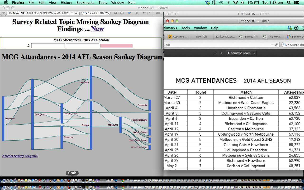
Continuing on (very closely to yesterday‘s Histogram method) with ideas for Google Charts software integration, today, by adding a Google Sankey Diagram Chart, we create a webpage application that asks for numerical findings, and creates a “Moving” Sankey Diagram (sort of like the Moving Average algorithm thought patterns) of some survey topic or poll, where two items of interest have an identical relationship (value) that is the same no matter whose viewpoint you use.
A cute bit of functionality with this pretty simple webpage application idea is the way you can, optionally, create your own dropdown list if your Poll or Survey Topic has a set number of numerical option choices. You can delete a previous mistaken entry with a red cross link, and you may need this should you accidentally create a cyclic relationship, which causes an error when you update your Sankey Diagram (you can use the red cross link to fix this, and then re-enter data).
Here is a link to downloadable HTML/Javascript programming source code you could call surveyrelatedtopic_sankey.html and if you prefer, try the live run. The data of the picture of the tutorial (example relates to some attendances at MCG games in 2014 … thanks for the data ideas goes to this link) can be recreated via this link.
If this was interesting you may be interested in this too.


17 Responses to Survey Related Topic or Poll Sankey Diagram Primer Tutorial