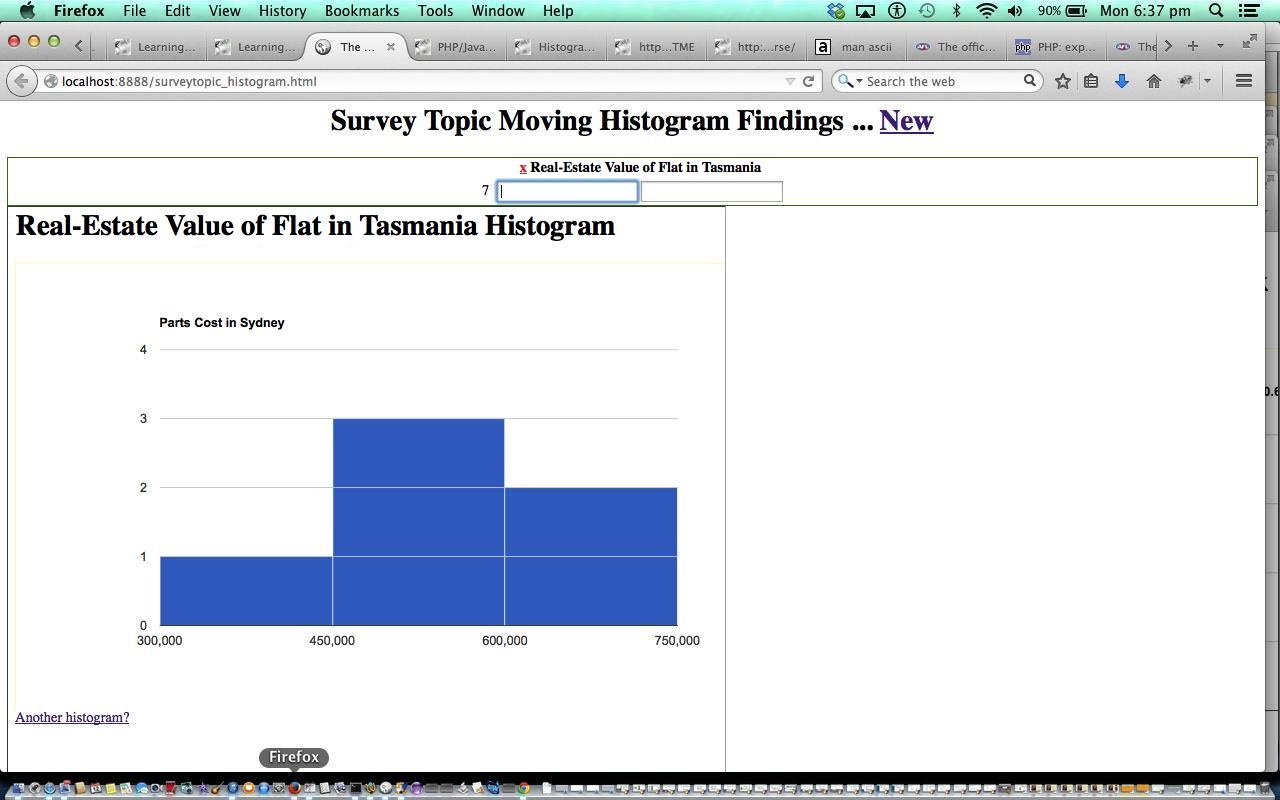
Survey Topic or Poll Histogram Primer Tutorial (try twirling round bottom of image for a synopsis ... 'do the twirl now')
Continuing on with ideas for Google Charts software integration, today, by adding a Google Histogram Chart, we create a webpage application that asks for numerical findings, and creates a “Moving” Histogram (sort of like the Moving Average algorithm thought patterns) of some survey topic or poll.
A cute bit of functionality with this pretty simple webpage application idea is the way you can, optionally, create your own dropdown list if your Poll or Survey Topic has a set number of numerical option choices. This can mean, with the Description text box being optional, you might want to just use your mouse click or (finger) touch to complete the Histograms, once you first create that dropdown, by entering a comma separated numerical list (into the rightmost (numerical) pink textbox), first off. You can delete a previous mistaken entry with a red cross link.
Here is a link to downloadable HTML/Javascript programming source code you could call surveytopic_histogram.html and if you prefer, try the live run.
If this was interesting you may be interested in this too.


