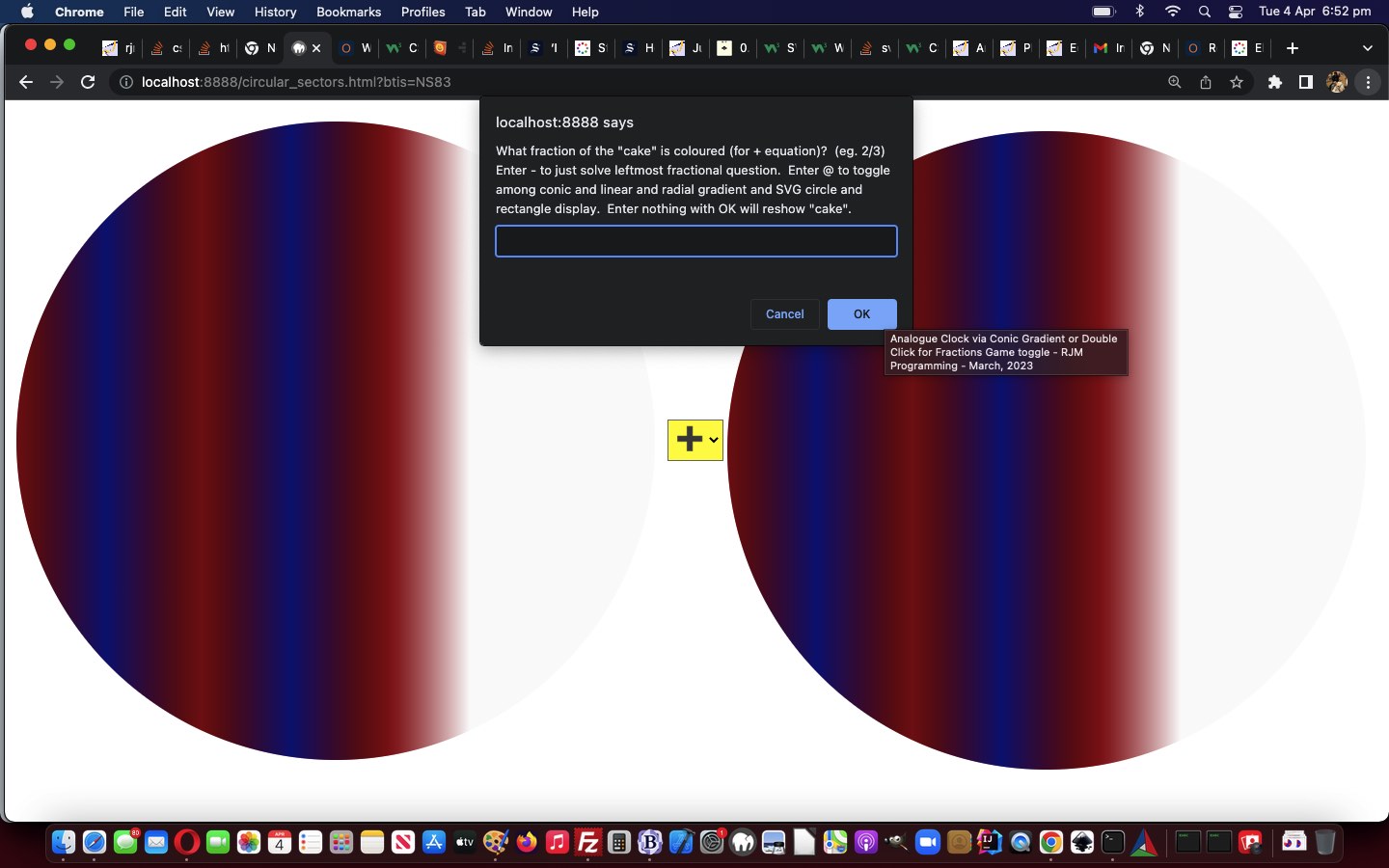
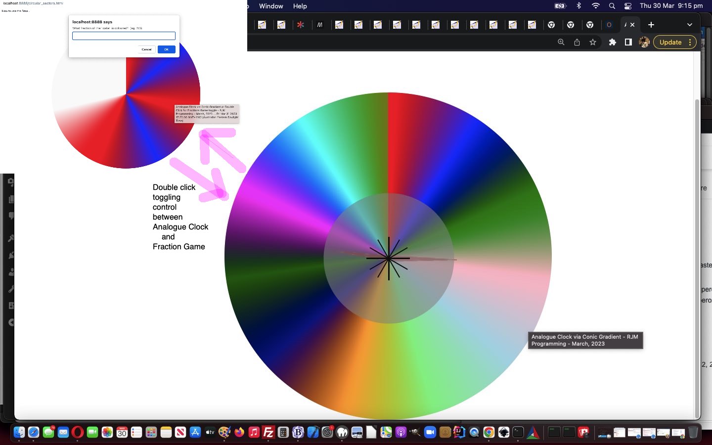
To add onto yesterday’s Gradient Fraction Game Mobile Tutorial …
- exclusively gradient …
- conic
- linear
- radial
… “cake” displays in our Fractions Game … and add in …
- SVG circle and rectangle alternative displays
… it is not hard coding work, only really involving the rearrangement of the “stop colour” element …
  function stopit(incsv) {

    //alert(incsv);

    // <stop offset='0%' stop-color='#f00'/><stop offset='100%' stop-color='#0ff'/>

    var incsvs=incsv.split('%, ');

    var outstops="<stop offset='0%' stop-color='" + incsvs[0].split(' ')[0] + "'/>";

    for (var iis=1; iis<incsvs.length; iis++) {

      outstops+="<stop offset='" + (incsvs[iis].split(' ')[1].trim() + "%").replace('%%','%') + "' stop-color='" + incsvs[iis].split(' ')[0] + "'/>";

    }

    //alert(outstops);

    //document.getElementById('atend').title=outstops.replace(/255/g, '127');

    return outstops.replace(/255/g, '127');

  }
… code syntax.
But before that we went down a garden path thinking we could have all 5 “cake” display options be …
- as the CSS property background-image to a table cell nesting HTML div element … sort of like this webpage‘s (thanks all the same) …
#atright {

 background-image: url("data:image/svg+xml;utf8,<svg xmlns='http://www.w3.org/2000/svg' width='10' height='10'><linearGradient id='gradient'><stop offset='10%' stop-color='%23F00'/><stop offset='90%' stop-color='%23fcc'/> </linearGradient><rect fill='url(%23gradient)' x='0' y='0' width='100%' height='100%'/></svg>");

}

// ... or ...

#atend {

 background-image: url("data:image/svg+xml;base64,PHN2ZyB4bWxucz0naHR0cDovL3d3dy53My5vcmcvMjAwMC9zdmcnIHdpZHRoPScxMCcgaGVpZ2h0PScxMCc+PGxpbmVhckdyYWRpZW50IGlkPSdncmFkaWVudCc+PHN0b3Agb2Zmc2V0PScxMCUnIHN0b3AtY29sb3I9JyNGMDAnLz48c3RvcCBvZmZzZXQ9JzkwJScgc3RvcC1jb2xvcj0nI2ZjYycvPiA8L2xpbmVhckdyYWRpZW50PjxyZWN0IGZpbGw9J3VybCgjZ3JhZGllbnQpJyB4PScwJyB5PScwJyB3aWR0aD0nMTAwJScgaGVpZ2h0PScxMDAlJy8+PC9zdmc+");

}
… and though we had lots of success with work of this ilk with our “Just Javascript” series of blog posts, we found the technique flaky today, so opted to, instead …
-
- fill HTML div element’s innerHTML (ie. content) with “raw” SVG
- set that HTML div element’s CSS style property background-image to “none”
… as the approach we landed upon, allowing for SVG …
        if (issvg > 0) {

        var mySVG = "<svg xmlns='http://www.w3.org/2000/svg' width='10' height='10'><linearGradient id='gradient'><stop offset='10%' stop-color='#F00'/><stop offset='90%' stop-color='#fcc'/> </linearGradient><rect fill='url(#gradient)' x='0' y='0' width='100%' height='100%'/></svg>";

        if (issvg == 1) {

          mySVG="<svg xmlns='http://www.w3.org/2000/svg' width='" + pwidth + "' height='" + pheight + "' viewport='0 0 100 100'><linearGradient id='test'>" + stopit(newlist) + " </linearGradient><circle fill='url(#test)' cx='" + eval(pwidth / 2) + "' cy='" + eval(pheight / 2) + "' r='" + eval(pwidth / 2) + "' stroke='none' stroke-width='12'/></svg>"; //.replace(/\~/g, String.fromCharCode(10));

        } else if (issvg == 2) {

          mySVG="<svg xmlns='http://www.w3.org/2000/svg' width='" + pwidth + "' height='" + pheight + "' viewport='0 0 100 100'><linearGradient id='test'>" + stopit(newlist) + " </linearGradient><rect fill='url(#test)' width='" + eval(pwidth / 1) + "' height='" + eval(pheight / 1) + "' stroke='none' stroke-width='12'/></svg>"; //.replace(/\~/g, String.fromCharCode(10));

        }

        document.getElementById('atend').innerHTML=mySVG;

        if (issvg == 1) {

         mySVG="<svg xmlns='http://www.w3.org/2000/svg' width='" + pwidth + "' height='" + pheight + "' viewport='0 0 100 100'><linearGradient id='testr'>" + stopit(newlistr) + " </linearGradient><circle fill='url(#testr)' cx='" + eval(pwidth / 2) + "' cy='" + eval(pheight / 2) + "' r='" + eval(pwidth / 2) + "' stroke='none' stroke-width='12'/></svg>"; //.replace(/\~/g, String.fromCharCode(10));

        } else if (issvg == 2) {

         mySVG="<svg xmlns='http://www.w3.org/2000/svg' width='" + pwidth + "' height='" + pheight + "' viewport='0 0 100 100'><linearGradient id='testr'>" + stopit(newlistr) + " </linearGradient><rect fill='url(#testr)' width='" + eval(pwidth / 1) + "' height='" + eval(pheight / 1) + "' stroke='none' stroke-width='12'/></svg>"; //.replace(/\~/g, String.fromCharCode(10));

        }

        document.getElementById('atright').innerHTML=mySVG;

        document.getElementById('dstyle').innerHTML+='<style>' + ' #atend { background-image: none !important; } </style>';

        document.getElementById('dstyle').innerHTML+='<style>' + ' #atright { background-image: none !important; } </style>';

        } else {

        document.getElementById('atend').innerHTML='';

        document.getElementById('atright').innerHTML='';

        document.getElementById('dstyle').innerHTML+='<style>' + ' #atend { background-image: ' + gprefix.toLowerCase() + '-gradient(' + newlist + ') !important; } </style>';

        document.getElementById('dstyle').innerHTML+='<style>' + ' #atright { background-image: ' + gprefix.toLowerCase() + '-gradient(' + newlistr + ') !important; } </style>';

        }
… in the changed circular_sectors.html Fractions Game.
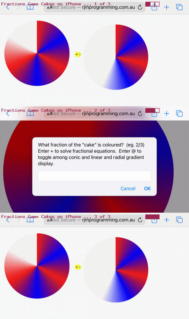
Previous relevant Gradient Fraction Game Mobile Tutorial is shown below.
Many responsive web design purists will push the web developers out there to never …
- express HTML element dimensions in “static” “px” types of units … but rather …
- express HTML element dimensions in “%” or “vx” or “vh” proportional style of units … and, of course, their advice has a lot of merit, but, sometimes, like today, we want to be a bit pragmatic here and say …
- a third way, particularly suiting an initial development phase that suited a display on a laptop (and deploying “static” “px” types of units that look okay on a laptop), for instance, but then wanting to look more apt on your smaller mobile devices, you could …
- ensure you have within the webpage head element a “meta” viewport element such as (our) …
<meta id='myviewport' name='viewport' content='width=device-width, initial-scale=1, minimum-scale=0.1, maximum-scale=8, user-scalable=yes' >
- stay with “static” “px” types of units but if analysis (which can be before document.body “onload” event (and, you couldn’t possibly have heard it from me, cough cough, but dovetail findings within Javascript document.write statements within the document.body static HTML)) of either/both screen.width and/or screen.height indicates lack of suitablility …
  var fromprefix='border-radius: 612px;', toprefix="margin-top: 0px;";

  var pwidth=602, pheight=602, pbr=612, ptop=17.3594, pleft=386.5, thirtytwo=32, ocbit='';

  var worry=false;


  if (navigator.userAgent.match(/Android|BlackBerry|iPhone|iPad|iPod|Opera Mini|IEMobile/i) && btoas.trim() == '' && denominator == '0' && numerator == '0') {

     ocbit=' onclick=" viadb=true; ask(); " ';

  }

  if (eval(eval('' + screen.width) - eval(eval('' + pbr) * 2)) < 0 && (btoas.trim() != '' || denominator != '0' || numerator != '0')) {

     thirtytwo=Math.floor(eval(eval('' + thirtytwo) * Math.floor(eval(eval('' + screen.width) / 2.1)) / eval('' + pbr)));

     ptop=eval(eval('' + ptop) * Math.floor(eval(eval('' + screen.width) / 2.1)) / eval('' + pbr));

     pleft=eval(eval('' + pleft) * Math.floor(eval(eval('' + screen.width) / 2.1)) / eval('' + pbr));

     pbr=Math.floor(eval(eval('' + screen.width) / 2.1));

     fromprefix='border-radius: ' + pbr + 'px;'

     pwidth=eval(-10 + pbr);

     pheight=eval(-10 + pbr);

     worry=true;

     //alert('width,height,br,top,left=' + pwidth + ',' + pheight + ',' + pbr + ',' + ptop + ',' + pleft);

  }
… Javascript “head” code affecting the “body” …
<body>

<script type='text/javascript'>

  document.write('<table id=mytable><tbody id=mytbody><tr id=mytr><td id=mytd>');

  if (denominator == '0' && btoas == '') {

    if (worry) {

    document.write('<div' + ocbit + ' ondblclick=" viadb=true; ask(); " title="Analogue Clock via Conic Gradient or Double Click for Fractions Game toggle - RJM Programming - March, 2023" id="atend" style="position: absolute; left: ' + pleft + 'px; top: ' + ptop + 'px; width: ' + pwidth + 'px;  height: ' + pheight + 'px; border-radius: ' + pbr + 'px; ">');

    } else {

    document.write('<div' + ocbit + ' ondblclick=" viadb=true; ask(); " title="Analogue Clock via Conic Gradient or Double Click for Fractions Game toggle - RJM Programming - March, 2023" id="atend" style="position: absolute; left: 386.5px; top: 17.3594px; width: 602px;  height: 602px; border-radius: 612px; ">');

    }

    document.write('<iframe scrolling="no" frameborder="0" style="z-index:23;margin-left:127px;margin-top:130px;height:400px;" src="analogue_clock.htm?backcol=transparent&x=7654#xbody"></iframe>');

  } else {

    if (worry) {

    document.write('<div' + ocbit + ' ondblclick=" viadb=true; ask(); " title="Analogue Clock via Conic Gradient or Double Click for Fractions Game toggle - RJM Programming - March, 2023" id="atend" style="width: ' + pwidth + 'px;  height: ' + pheight + 'px; border-radius: ' + pbr + 'px; ">');

    } else {

    document.write('<div' + ocbit + ' ondblclick=" viadb=true; ask(); " title="Analogue Clock via Conic Gradient or Double Click for Fractions Game toggle - RJM Programming - March, 2023" id="atend" style="width: 602px;  height: 602px; border-radius: 612px; ">');

    }

  }

  if (worry) {

    document.write('</div></td><td id=mymtd style=display:none;vertical-align:middle;>  <select id=ssign style=font-size:' + thirtytwo + 'px;background-color:yellow; readonly disable><option value="+">➕</option><option value="-">➖</option><option value="x">✖</option><option value="/">➗</option></select></td><td id=myrtd style=display:none;>  <div ondblclick=" viadb=true; ask(); " title="Analogue Clock via Conic Gradient or Double Click for Fractions Game toggle - RJM Programming - March, 2023" id="atright" style="width: ' + pwidth + 'px;  height: ' + pheight + 'px; border-radius: ' + pbr + 'px; "></div></td></tr></tbody></table>');

  } else {

    document.write('</div></td><td id=mymtd style=display:none;vertical-align:middle;>  <select id=ssign style=font-size:' + thirtytwo + 'px;background-color:yellow; readonly disable><option value="+">➕</option><option value="-">➖</option><option value="x">✖</option><option value="/">➗</option></select></td><td id=myrtd style=display:none;>  <div ondblclick=" viadb=true; ask(); " title="Analogue Clock via Conic Gradient or Double Click for Fractions Game toggle - RJM Programming - March, 2023" id="atright" style="width: 602px;  height: 602px; border-radius: 612px; "></div></td></tr></tbody></table>');

  }

</script>

<div id=dstyle></div>

</body>
… element, to lean on “hardcodings become parameter” types of thinking to proceed with a more apt dimensional display (that is all sorted out ahead of document.body “onload” event, still not associated with any Javascript code, above)
- ensure you have within the webpage head element a “meta” viewport element such as (our) …
Yes, you can develop web applications on mobile. There are ways. But we find it much more natural and easy to develop web applications on a laptop, here it being a MacBook Air at the moment. One reason we’d give, is that the quality of laptop web browser web inspectors is sky high, and all the modern browsers seem to have a (laptop) version now.
And as such, improving mobile usage of yesterday’s Gradient Fraction Game Equations Tutorial we have in a changed circular_sectors.html Fractions Game.
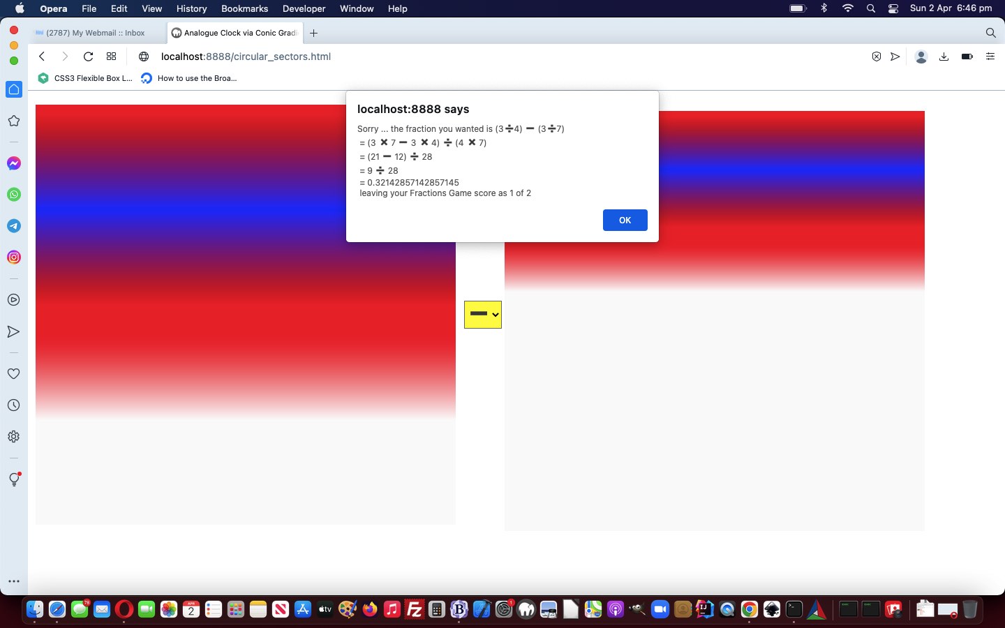
Previous relevant Gradient Fraction Game Equations Tutorial is shown below.
There are three styles of CSS gradient …
- conic
- linear
- radial
… and “different folks may learn via diff’rent CSS strokes”, so we incorporate a way for the user, when using the Fractions Game component of our latest web application, so that they can toggle the “cake” display among these three styles of gradient display.
Also, extending yesterday’s Conic Gradient Fraction Game Equations Tutorial, we …
- allow, during the Fractions Game mode usage, have a window.prompt Cancel click send the user back to the Analogue Clock, so that unnecessary and errant window.prompt popup windows are avoided … and …
- we incorporate “lowest common denominator” …
  function lcdextra(varn, vard) {

    var retv='', iv=0;

    for (iv=Math.min(Math.abs(varn),Math.abs(vard)); iv>=2; iv--) {

      if (eval(Math.abs(varn) % iv) == 0 && eval(Math.abs(vard) % iv) == 0) {

        varn /= iv;

        vard /= iv;

        retv+=' = ' + varn + ' / ' + vard + String.fromCharCode(10);

      }

    }

    return retv;

  }
… calculations into our “show workings” section as Ms Trimpole would have wanted - involve emoji operators in that same “show workings” section to better mimic how we were taught at school in Mathematics class
… in the changed circular_sectors.html Fractions Game.
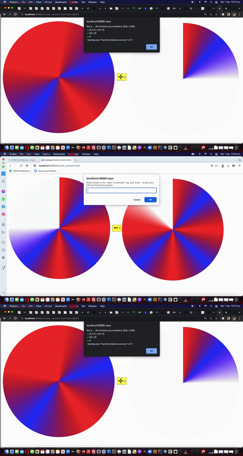
Previous relevant Conic Gradient Fraction Game Equations Tutorial is shown below.
We’re extending the functionality started with yesterday’s Dual Purpose Conic Gradient Primer Tutorial‘s second “dual purpose” …
- Fractions Game piece of functionality …
- Adding to its possibility the optional user job of solving operator …
- +
- –
- x
- /
… types of fraction based equations
Simply put, changes to allow for this involved …
- forsaking position:absolute “cakes” for your usual default position:relative positioning … within …
- single row, three cell (cake, sign, cake) display … prior to …
- hardly changed window.prompt user interaction, to answer … but …
- more complex analysis for equation based scenarios …
  function showworking(instr, realans) {

    var outstr=instr;

    var xnumerator=numerator, xnumeratortwo=numeratortwo, xdenominatortwo=denominatortwo;

    var varw='';

    if (document.getElementById('ssign').value == '+') {

      if (denominatortwo == denominator.slice(-1)) {

        varw+=' = (' + numerator + ' + ' + numeratortwo + ') / ' + denominatortwo + String.fromCharCode(10);

        varw+=' = ' + eval(eval('' + numerator) + eval('' + numeratortwo)) + ' / ' + xdenominatortwo + String.fromCharCode(10);

      } else {

        varw+=' = (' + numerator + ' x ' + denominatortwo + ' + ' + numeratortwo + ' x ' + denominator.slice(-1) + ') / (' + denominator.slice(-1) + ' x ' + denominatortwo + ')' + String.fromCharCode(10);

        xnumerator*=denominatortwo;

        xnumeratortwo*=eval('' + denominator.slice(-1));

        xdenominatortwo*=eval('' + denominator.slice(-1));

        varw+=' = (' + xnumerator + ' + ' + xnumeratortwo + ') / ' + xdenominatortwo + String.fromCharCode(10);

        varw+=' = ' + eval(eval('' + xnumerator) + eval('' + xnumeratortwo)) + ' / ' + xdenominatortwo + String.fromCharCode(10);

      }

    } else if (document.getElementById('ssign').value == '-') {

      if (denominatortwo == denominator.slice(-1)) {

        varw+=' = (' + numerator + ' - ' + numeratortwo + ') / ' + denominatortwo + String.fromCharCode(10);

        varw+=' = ' + eval(numerator - numeratortwo) + ' / ' + xdenominatortwo + String.fromCharCode(10);

      } else {

        varw+=' = (' + numerator + ' x ' + denominatortwo + ' - ' + numeratortwo + ' x ' + denominator.slice(-1) + ') / (' + denominator.slice(-1) + ' x ' + denominatortwo + ')' + String.fromCharCode(10);

        xnumerator*=denominatortwo;

        xnumeratortwo*=eval('' + denominator.slice(-1));

        xdenominatortwo*=eval('' + denominator.slice(-1));

        varw+=' = (' + xnumerator + ' - ' + xnumeratortwo + ') / ' + xdenominatortwo + String.fromCharCode(10);

        varw+=' = ' + eval(eval('' + xnumerator) - eval('' + xnumeratortwo)) + ' / ' + xdenominatortwo + String.fromCharCode(10);

      }

    } else if (document.getElementById('ssign').value == '/') {

        varw+=' = (' + numerator + ' / ' + denominator.slice(-1) + ') x (' + denominatortwo + ' / ' + numeratortwo + ')' + String.fromCharCode(10);

        varw+=' = ' + eval(eval('' + numerator) * eval('' + denominatortwo)) + ' / ' + eval(eval('' + denominator.slice(-1)) * eval('' + numeratortwo)) + String.fromCharCode(10);

    } else if (document.getElementById('ssign').value == 'x' || document.getElementById('ssign').value == '*') {

        varw+=' = (' + numerator + ' / ' + denominator.slice(-1) + ') x (' + numeratortwo + ' / ' + denominatortwo + ')' + String.fromCharCode(10);

        varw+=' = ' + eval(eval('' + numerator) * eval('' + numeratortwo)) + ' / ' + eval(eval('' + denominator.slice(-1)) * eval('' + denominatortwo)) + String.fromCharCode(10);

    }

    return outstr + String.fromCharCode(10) + varw + ' = ' + realans + ' ' + String.fromCharCode(10);

  }
… in the changed circular_sectors.html Fractions Game.
Previous relevant Dual Purpose Conic Gradient Primer Tutorial is shown below.
Yes, today, we have a “proof of concept” circular_sectors.html …
- dual purpose … as a …
- local time analogue clock (also, below) … calling on a changed analogue_clock.html … or …
- Fractions Game
- ondblclick (double click) event … ondblclick=” viadb=true; ask(); “ … toggling …
  var viadb=false;


  function ask() {

    var ans='';

    if (!viadb) {

    while (('' + ans).indexOf('/') == -1 && ('' + ans.replace(/^1$/g, '1.0')).indexOf('.') == -1) {

      ans=prompt('What fraction of the "cake" is coloured?  (eg. 2/3)', '');

    }

    if (ans == '' + numerator + '/' + denominator.substring(1) || Math.abs(eval('' + numerator + '/' + denominator.substring(1)) - eval('' + ans)) < 0.005) {

      score++;

      goes++;

      alert('Well done!  This makes your Fractions Game score to be ' + score + ' of ' + goes);

    } else {

      goes++;

      alert('Sorry ... the fraction you wanted is ' + numerator + '/' + denominator.substring(1) + ' leaving your Fractions Game score as ' + score + ' of ' + goes);

    }

    }

    numerator='' + eval(1 + Math.floor(Math.random() * 7));

    denominator='0';

    while (eval('' + denominator) < eval('' + numerator)) {

     denominator='' + eval(0 + Math.floor(Math.random() * 9));

    }

    if (viadb) {

     if (btoas == '') {

      location.href=document.URL.split('?')[0].split('#')[0] + '?btis=' + encodeURIComponent(btoa('' + numerator + '/' + denominator));

     } else {

      location.href=document.URL.split('?')[0].split('#')[0]; // + '?btis=' + encodeURIComponent(btoa('' + numerator + '/' + denominator));

     }

    }

    viadb=false;

  }
… control … using … - CSS conic-gradient background …
<style>

  #atend {

  background: conic-gradient(rgba(255,0,0,0.5) 0deg, rgba(0,0,255,0.5) 30deg, rgba(0,255,0,0.5) 60deg, rgba(255,192,203,0.5) 90deg, rgba(0,0,139,0.5) 120deg, rgba(144,238,144,0.5) 150deg, rgba(255,165,0,0.5) 180deg, rgba(173,216,230,0.5) 210deg, rgba(2,48,32,0.5) 240deg, rgba(255,0,255,0.5) 270deg, rgba(0,100,100,0.5) 300deg, rgba(128,128,0,0.5) 330deg);

  }

</style>
… scenario, building on what we learnt when we presented CSS Gradient Creations Conic Tutorial a little while back.
Previous relevant CSS Gradient Creations Conic Tutorial is shown below.
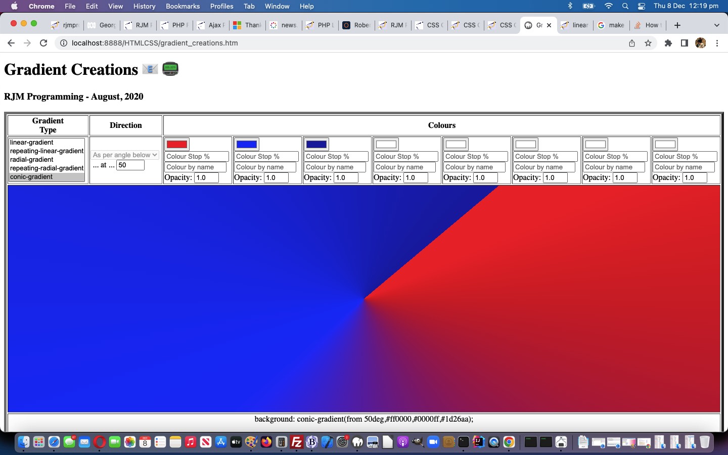
Yesterday’s CSS Conic Gradient Primer Tutorial set us to thinking about integrating these Conic Gradients into our “Gradient Central” web application where you can create your own gradients which we last talked about with CSS Gradient Creations Mobile Width Tutorial.
These gradients …
- linear-gradient
- radial-gradient
- conic-gradient
… are helping our webpage designs allow for colour gradation and subtlety we appreciate around here. They can often effectively fill in for that “graphic flair” not all of us possess, in our webpage designs.
What came up that was a bit new to us with this Conic Gradient integration? And yes, most tutorials bring up something new! Input element textboxes can be made inoperable by the setting of the Javascript DOM readOnly attribute, as with (Javascript code like) …
document.getElementById('mytextbox').readOnly=true; // and to make readable again use false instead
… but we found we couldn’t do that with select (ie. dropdown) elements. This useful link, thanks, put us right in our thinking to do this when conic-gradient selected …
document.getElementById('sdirection').disabled=true; // and to make enabled again use false instead
… because a conic-gradient direction value is much less nuanced than a linear-gradient direction value.
Feel free to try this changed gradient_creations.htm “Gradient Creations” live run link, or try below …
Stop Press
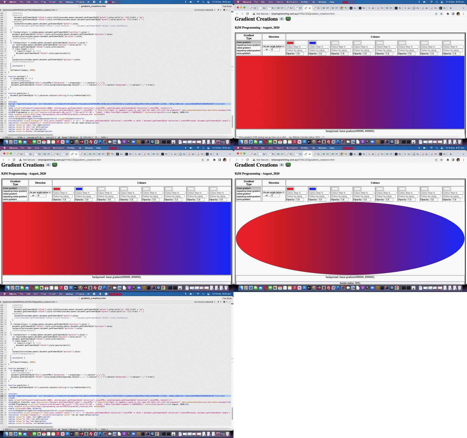
Today’s CSS Gradient Creations Conic Tutorial‘s integration of yesterday’s CSS Conic Gradient Primer Tutorial‘s work was missing some of the features of that latter web application, involving its textarea flexibility to add user additional dynamic CSS into the mix. No problems any longer, as we make use of the work we’ll talk about tomorrow, integrating into CSS Gradient Creations Conic Tutorial‘s web application one new line of code …
<script type='text/javascript' src='/divceditin.js?todowith=tdlook&after=tdcss&blurb=%2F*%20More%20gradient%20CSS%20styling%20can%20go%20here%20via%20a%20click%20...%20eg.%20border-radius%3A%2050%25%3B%20%20*%2F'></script>
… to offer that possibility. That will outline our use of element type div contenteditable=true with an input type=text value=”” placeholder=[Some Blurb] readonly prototype tool enabling users to add in their own dynamic CSS in the tweaked gradient_creations.htm “Gradient Creations” live run link, as also shown above this …
Previous relevant CSS Gradient Creations Mobile Width Tutorial is shown below.
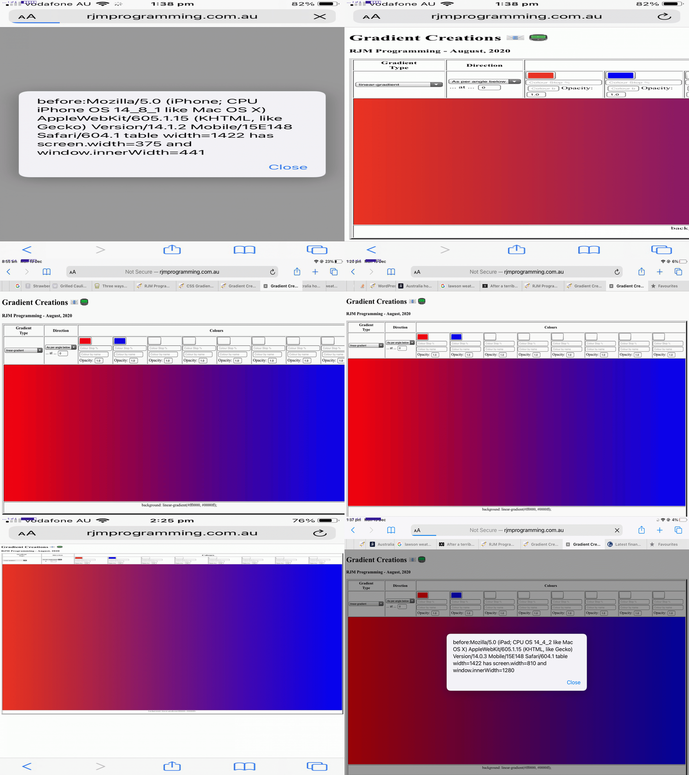
When it comes to “width” (CSS styling) considerations with webpage design on mobile platforms where you are not prepared to “de-complex-ify” (if you know what I mean) the webpage contents you can run into the dual issues …
- you want to show HTML elements legibly … and …
- you also want to show the big picture
You see, with yesterday’s CSS Gradient Creations Width Makeover Tutorial we did hint when we said …
… we saw that it overshot the right hand border on the MacBook Air webpage screen.
… that the work yesterday was suited more towards your laptop usage rather than mobile phone (and to a less extent mobile tablet) usage.
There is a CSS styling “tool” to hand just for this scenario, though, the meta name=viewport (within <head> … </head> header element, usually) element, ours being, initially, for today’s work …
<meta id="myviewport" name="viewport" content="width=device-width, initial-scale=1, minimum-scale=0.1, maximum-scale=8, user-scalable=yes" >
… the “red rag to a bull” signs that Javascript might come into it (to allow initially become eventually) being …
- the id=”myviewport” unusual attribute for a header element
- the big range difference between minimum-scale and maximum-scale but initial-scale being so conventionally valued
… in other words, today …
- we start mobile platform web application “first few seconds” of display in “you want to show HTML elements legibly” mode … and that “first few seconds” of display tells us … anyone, anyone? … yes, Ariel … we use setTimeout to delay …
<body onload="setTimeout(fixmobilewidth,5000); sdih=document.getElementById('sdirection').innerHTML; osdih=document.getElementById('rdirection').innerHTML; checkol();">
… five seconds before … - we use Javascript DOM to adjust the meta name=viewport element as per …
 function fixmobilewidth() {

  if (navigator.userAgent.match(/Android|BlackBerry|iPhone|iPad|iPod|Opera Mini|IEMobile/i)) {

    var rectt=document.getElementsByTagName('table')[0].getBoundingClientRect();

    document.getElementById("myviewport").setAttribute("content", "width=device-width, initial-scale=" + eval(-0.35 + eval('' + (window.orientation == 0 ? window.innerHeight: window.innerWidth)) / eval('' + rectt.width)) + ", minimum-scale=0.1, maximum-scale=8, user-scalable=yes");

  }

 }
… “to show the big picture” (of what’s available to the user to work the web application’s full functionality)
The control of whitespace came into the picture too. We replace in a lot of the table cells the non-breaking spaces (ie. ) as per …
<td><input onblur="changeit();" onchange="changeit();" type=color id=c1 value='#ff0000'></input> <input onblur="changeit();" onchange="changeit();" type=text id=hcs1 value='' placeholder='Colour Stop %' style=width:120px;></input> <input onblur='lookup(this.value,this);' type=text id=sc1 placeholder='Colour by name'></input> Opacity: <input onblur="changeit();" onchange="changeit();" type=number id=o1 min=0.0 max=1.0 step=0.1 value='1.0'></input></td>
<td><input onblur="changeit();" onchange="changeit();" type=color id=c2 value='#0000ff'></input> <input onblur="changeit();" onchange="changeit();" type=text id=hcs2 value='' placeholder='Colour Stop %' style=width:120px;></input> <input onblur='lookup(this.value,this);' type=text id=sc2 placeholder='Colour by name'></input> Opacity: <input onblur="changeit();" onchange="changeit();" type=number id=o2 min=0.0 max=1.0 step=0.1 value='1.0'></input></td>
<td><input onblur="changeit();" onchange="changeit();" type=color id=c3 value='#ffffff'></input> <input onblur="changeit();" onchange="changeit();" type=text id=hcs3 value='' placeholder='Colour Stop %' style=width:120px;></input> <input onblur='lookup(this.value,this);' type=text id=sc3 placeholder='Colour by name'></input> Opacity: <input onblur="changeit();" onchange="changeit();" type=number id=o3 min=0.0 max=1.0 step=0.1 value='1.0'></input></td>
<td><input onblur="changeit();" onchange="changeit();" type=color id=c4 value='#ffffff'></input> <input onblur="changeit();" onchange="changeit();" type=text id=hcs4 value='' placeholder='Colour Stop %' style=width:120px;></input> <input onblur='lookup(this.value,this);' type=text id=sc4 placeholder='Colour by name'></input> Opacity: <input onblur="changeit();" onchange="changeit();" type=number id=o4 min=0.0 max=1.0 step=0.1 value='1.0'></input></td>
<td><input onblur="changeit();" onchange="changeit();" type=color id=c5 value='#ffffff'></input> <input onblur="changeit();" onchange="changeit();" type=text id=hcs5 value='' placeholder='Colour Stop %' style=width:120px;></input> <input onblur='lookup(this.value,this);' type=text id=sc5 placeholder='Colour by name'></input> Opacity: <input onblur="changeit();" onchange="changeit();" type=number id=o5 min=0.0 max=1.0 step=0.1 value='1.0'></input></td>
<td><input onblur="changeit();" onchange="changeit();" type=color id=c6 value='#ffffff'></input> <input onblur="changeit();" onchange="changeit();" type=text id=hcs6 value='' placeholder='Colour Stop %' style=width:120px;></input> <input onblur='lookup(this.value,this);' type=text id=sc6 placeholder='Colour by name'></input> Opacity: <input onblur="changeit();" onchange="changeit();" type=number id=o6 min=0.0 max=1.0 step=0.1 value='1.0'></input></td>
<td><input onblur="changeit();" onchange="changeit();" type=color id=c7 value='#ffffff'></input> <input onblur="changeit();" onchange="changeit();" type=text id=hcs7 value='' placeholder='Colour Stop %' style=width:120px;></input> <input onblur='lookup(this.value,this);' type=text id=sc7 placeholder='Colour by name'></input> Opacity: <input onblur="changeit();" onchange="changeit();" type=number id=o7 min=0.0 max=1.0 step=0.1 value='1.0'></input></td>
<td><input onblur="changeit();" onchange="changeit();" type=color id=c8 value='#ffffff'></input> <input onblur="changeit();" onchange="changeit();" type=text id=hcs8 value='' placeholder='Colour Stop %' style=width:120px;></input> <input onblur='lookup(this.value,this);' type=text id=sc8 placeholder='Colour by name'></input> Opacity: <input onblur="changeit();" onchange="changeit();" type=number id=o8 min=0.0 max=1.0 step=0.1 value='1.0'></input></td>
… with line breaks (ie. <br>) as per …
<td><input onblur="changeit();" onchange="changeit();" type=color id=c1 value='#ff0000'></input><br><input onblur="changeit();" onchange="changeit();" type=text id=hcs1 value='' placeholder='Colour Stop %' style=width:120px;></input><br><input onblur='lookup(this.value,this);' type=text id=sc1 placeholder='Colour by name'></input><br>Opacity: <input onblur="changeit();" onchange="changeit();" type=number id=o1 min=0.0 max=1.0 step=0.1 value='1.0'></input></td>

<td><input onblur="changeit();" onchange="changeit();" type=color id=c2 value='#0000ff'></input><br><input onblur="changeit();" onchange="changeit();" type=text id=hcs2 value='' placeholder='Colour Stop %' style=width:120px;></input><br><input onblur='lookup(this.value,this);' type=text id=sc2 placeholder='Colour by name'></input><br>Opacity: <input onblur="changeit();" onchange="changeit();" type=number id=o2 min=0.0 max=1.0 step=0.1 value='1.0'></input></td>

<td><input onblur="changeit();" onchange="changeit();" type=color id=c3 value='#ffffff'></input><br><input onblur="changeit();" onchange="changeit();" type=text id=hcs3 value='' placeholder='Colour Stop %' style=width:120px;></input><br><input onblur='lookup(this.value,this);' type=text id=sc3 placeholder='Colour by name'></input><br>Opacity: <input onblur="changeit();" onchange="changeit();" type=number id=o3 min=0.0 max=1.0 step=0.1 value='1.0'></input></td>

<td><input onblur="changeit();" onchange="changeit();" type=color id=c4 value='#ffffff'></input><br><input onblur="changeit();" onchange="changeit();" type=text id=hcs4 value='' placeholder='Colour Stop %' style=width:120px;></input><br><input onblur='lookup(this.value,this);' type=text id=sc4 placeholder='Colour by name'></input><br>Opacity: <input onblur="changeit();" onchange="changeit();" type=number id=o4 min=0.0 max=1.0 step=0.1 value='1.0'></input></td>

<td><input onblur="changeit();" onchange="changeit();" type=color id=c5 value='#ffffff'></input><br><input onblur="changeit();" onchange="changeit();" type=text id=hcs5 value='' placeholder='Colour Stop %' style=width:120px;></input><br><input onblur='lookup(this.value,this);' type=text id=sc5 placeholder='Colour by name'></input><br>Opacity: <input onblur="changeit();" onchange="changeit();" type=number id=o5 min=0.0 max=1.0 step=0.1 value='1.0'></input></td>

<td><input onblur="changeit();" onchange="changeit();" type=color id=c6 value='#ffffff'></input><br><input onblur="changeit();" onchange="changeit();" type=text id=hcs6 value='' placeholder='Colour Stop %' style=width:120px;></input><br><input onblur='lookup(this.value,this);' type=text id=sc6 placeholder='Colour by name'></input><br>Opacity: <input onblur="changeit();" onchange="changeit();" type=number id=o6 min=0.0 max=1.0 step=0.1 value='1.0'></input></td>

<td><input onblur="changeit();" onchange="changeit();" type=color id=c7 value='#ffffff'></input><br><input onblur="changeit();" onchange="changeit();" type=text id=hcs7 value='' placeholder='Colour Stop %' style=width:120px;></input><br><input onblur='lookup(this.value,this);' type=text id=sc7 placeholder='Colour by name'></input><br>Opacity: <input onblur="changeit();" onchange="changeit();" type=number id=o7 min=0.0 max=1.0 step=0.1 value='1.0'></input></td>

<td><input onblur="changeit();" onchange="changeit();" type=color id=c8 value='#ffffff'></input><br><input onblur="changeit();" onchange="changeit();" type=text id=hcs8 value='' placeholder='Colour Stop %' style=width:120px;></input><br><input onblur='lookup(this.value,this);' type=text id=sc8 placeholder='Colour by name'></input><br>Opacity: <input onblur="changeit();" onchange="changeit();" type=number id=o8 min=0.0 max=1.0 step=0.1 value='1.0'></input></td>
… to lessen the table cell width innards (at the expense, perhaps, of the table cell innard heights) that might become involved in our changed gradient_creations.htm “Gradient Creations” live run link.
Is the 5 seconds enough on your thinner mobile platform widths? That’s debatable, but the “spreading” gesture awaits those more accepting mobile phone users!
Previous relevant CSS Gradient Creations Width Makeover Tutorial is shown below.
Revisits to a web application, after some time, can bring “adverse” categories of reaction to me …
- UX (user experience) Javascript criticism …
- styling CSS annoyance
… and today’s work, on our “Gradient Creations” web application, is as a result of that second “styling CSS annoyance”.
Possibly the second is “less serious” in our mind, but, nonetheless, invariably we learn (or remember) quite a bit, researching them.
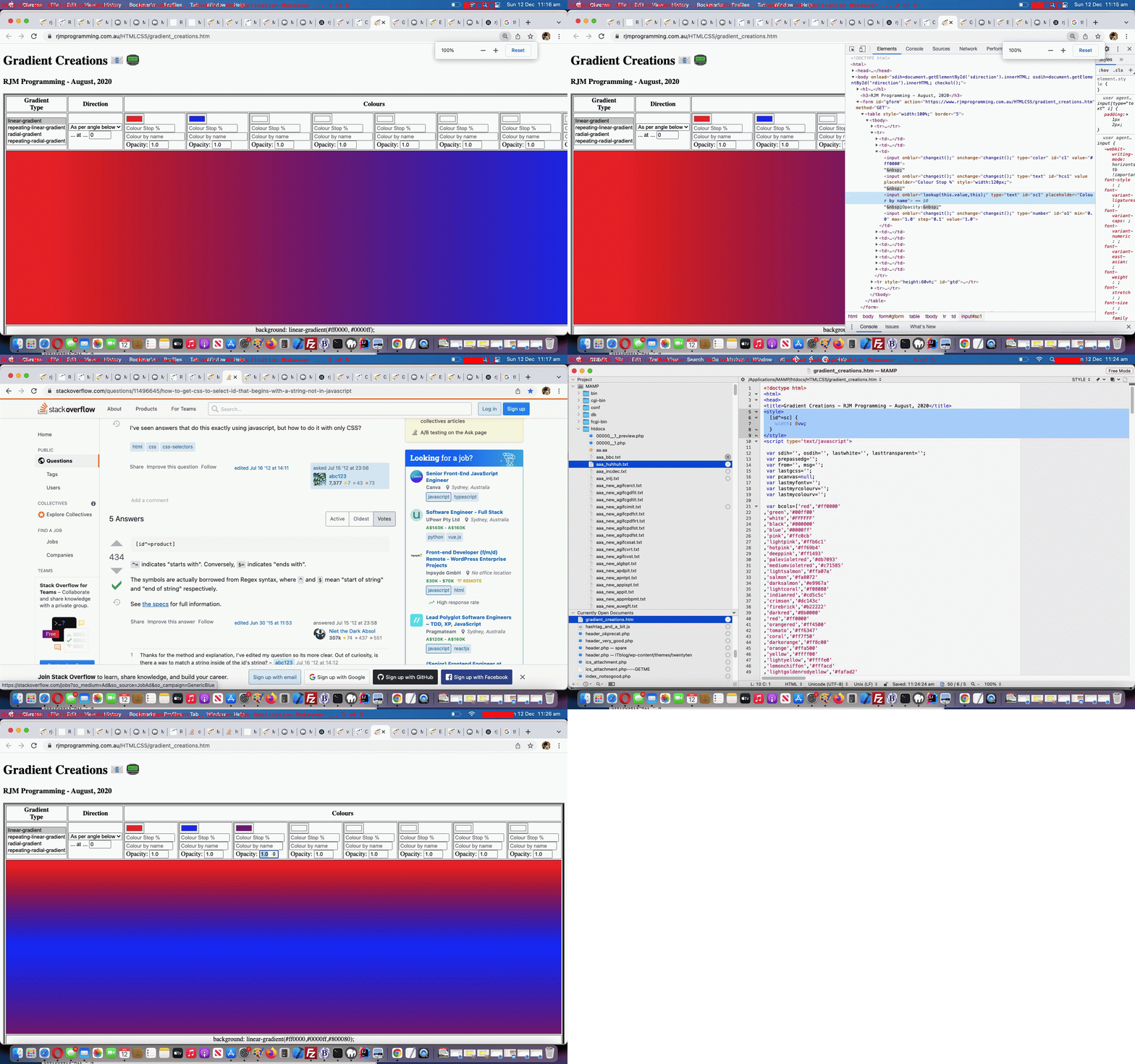
Maybe you can see from today’s tutorial animated GIF picture we categorized the slides into …
| Slide … | … with our commentary regarding our changed gradient_creations.htm “Gradient Creations” live run link |
|---|---|
| The problem … | At 100% zoom level with the Google Chrome browser pointing at the previous “Gradient Creations” web application incarnation we saw that it overshot the right hand border on the MacBook Air webpage screen. |
| The culprit … | Looking at the web page in Crome’s web inspector we identify the “Colour Name” textboxes (whose “id” starts with “sc” (as we mention later, to our advantage)) as being too wide and to lessen that width could improve the aesthetics. |
| The pathway … |
|
| The intervention … | Within the webpage’s <head> … </head> section we add … |
| The improvement … | The test shows improved aesthetics. Yay! |
By the way, further reading on this topic (and web application) is available with CSS Gradient Creations Sharing Tutorial below.
Previous relevant CSS Gradient Creations Sharing Tutorial is shown below.
Turning a web application like yesterday’s CSS Gradient Creations Tutorial “Gradient Creations” one into a web application where you can share your discoveries is an exercise in both …
- sharing and collaboration … as well as …
- accountability
… opening up something that used to be just for private use only, to being one that is open to the rest of the online wooooorrrrllllddd.
As well as this new email and SMS sharing capability we add another contenteditable=true incursion into the mix as another selling product for our web application. Just quietly, perhaps you can use it as a “digital card” creator, as we offer to augment …
- the table cell with a gradient background … with the idea that the user …
- can write their wording (of say, a card) in the foreground of that same table cell
… and then allow the user to append a space to their Javascript prompt window answering of the emailee address to indicate to the web application that the email should just be that table cell content. On the way a collaboration phase is possible by tweaking the HTML …
xform.append('body',(document.body.outerHTML.split('</form>')[0] + '</form></body>').replace(/NONE\;/g, 'inline-block;').replace('<div ','<input type=text style=width:50%; ').replace('>background:', ' value="').replace('</div>', '"></input>').replace('"></textarea>', '">' + document.getElementById('tdlook').innerHTML.replace(/\<br\>/g,String.fromCharCode(10)) + '</textarea>'));
… to work with a form method=GET way for the emailee to adjust the gradient CSS to send off a return email (or one to a third party) in response to that first email. No collaboration here, but we also allow for SMS communications too.
Also, along the way, we allow for a colour to be defined by its name, if it makes the web application’s colour array list.
You can try our our changed gradient_creations.htm live run link, to see what we mean.
Previous relevant CSS Gradient Creations Tutorial is shown below.
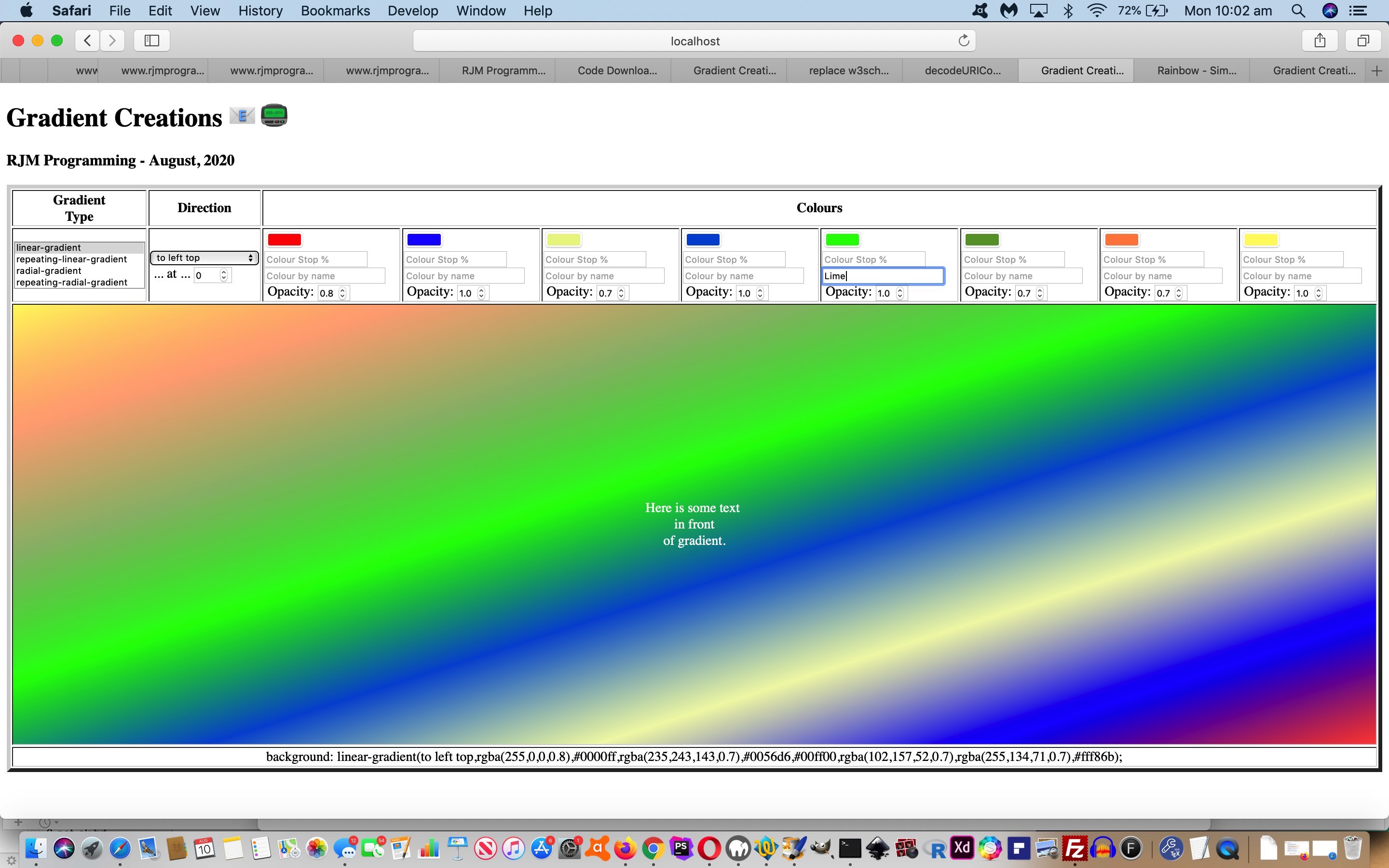
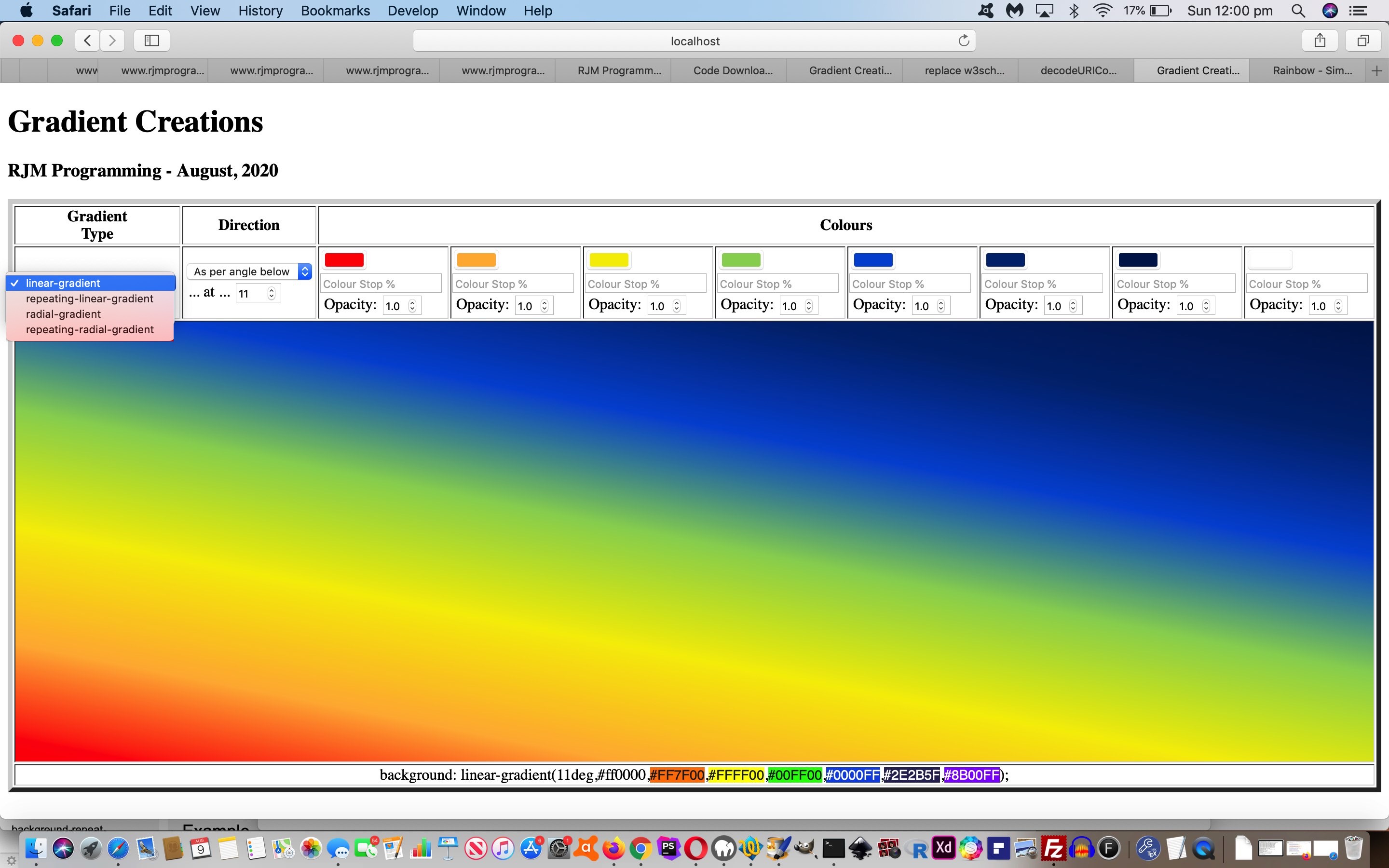
The great CSS background “gradient” functionalities can come in four forms, those being …
- linear gradient (and repeating linear gradient)
- radial gradient (and repeating radial gradient)
… as a means to add background interest, even to the point where the background can have some (different) transparency (level) compared to the foreground, as per example CSS like …
<style>

html::before {

 background: linear-gradient(rgba(255,255,255,0.8),rgba(255,255,255,0.8)),URL('//www.rjmprogramming.com.au/MyBusinessUnidad/Welcome_files/logo.jpg') repeat;

}

</style>
With tutorials like CSS Repeating Radial Gradients Primer Tutorial we allowed you to create some gradients, but we wanted a more detailed approach that was generic in its approach and left you with some CSS of use, which is often not the go with many other (albeit useful and inspiring) websites on the net.
There are a whole range of what you might call “directional” nuances you can apply to your gradients. There is opacity to allow for. There are “hard colour stops” you can apply. For linear gradients you can apply a variable angle. For radial gradients there are positional nuances that can be applied.
And then there are the colours. We are not sure of the limits, but we allow for up to eight colours. Enough to simulate the seven colours of the rainbow we go for with today’s tutorial picture arrangement whereby it tweaked with us that the HTML input type=color elements are all well and good but we needed to allow our CSS be editable by nesting into an HTML div contenteditable=true elements that can be tweaked for exact rgb or rgba colour definitions (thanks, Wikipedia), as we could look up for the purposes of displaying a rainbow coloured gradient background (we hope you like)!
Or see a repeating radial gradient example below …
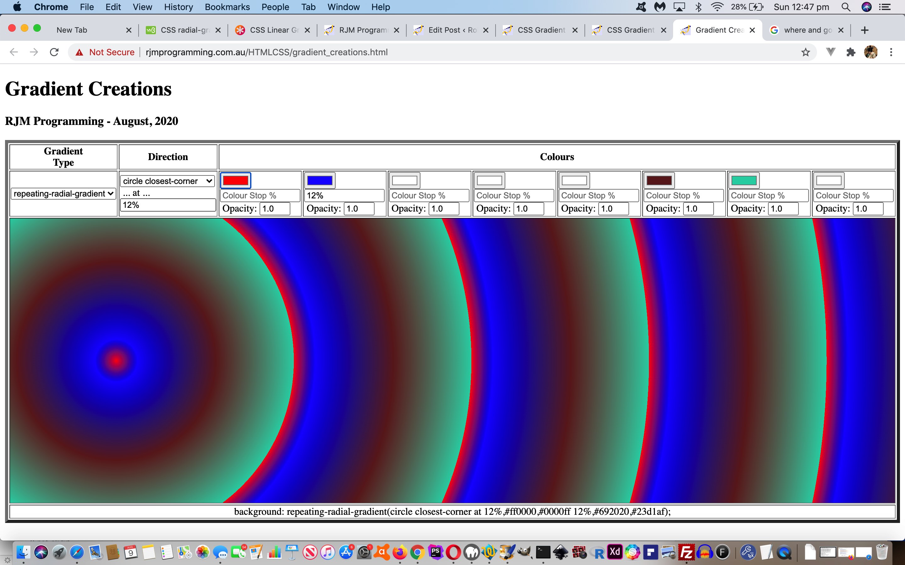
So feel free to try our gradient_creations.html live run link, to see what we mean.
Previous relevant “CSS Gradient Creations Tutorial is shown below.
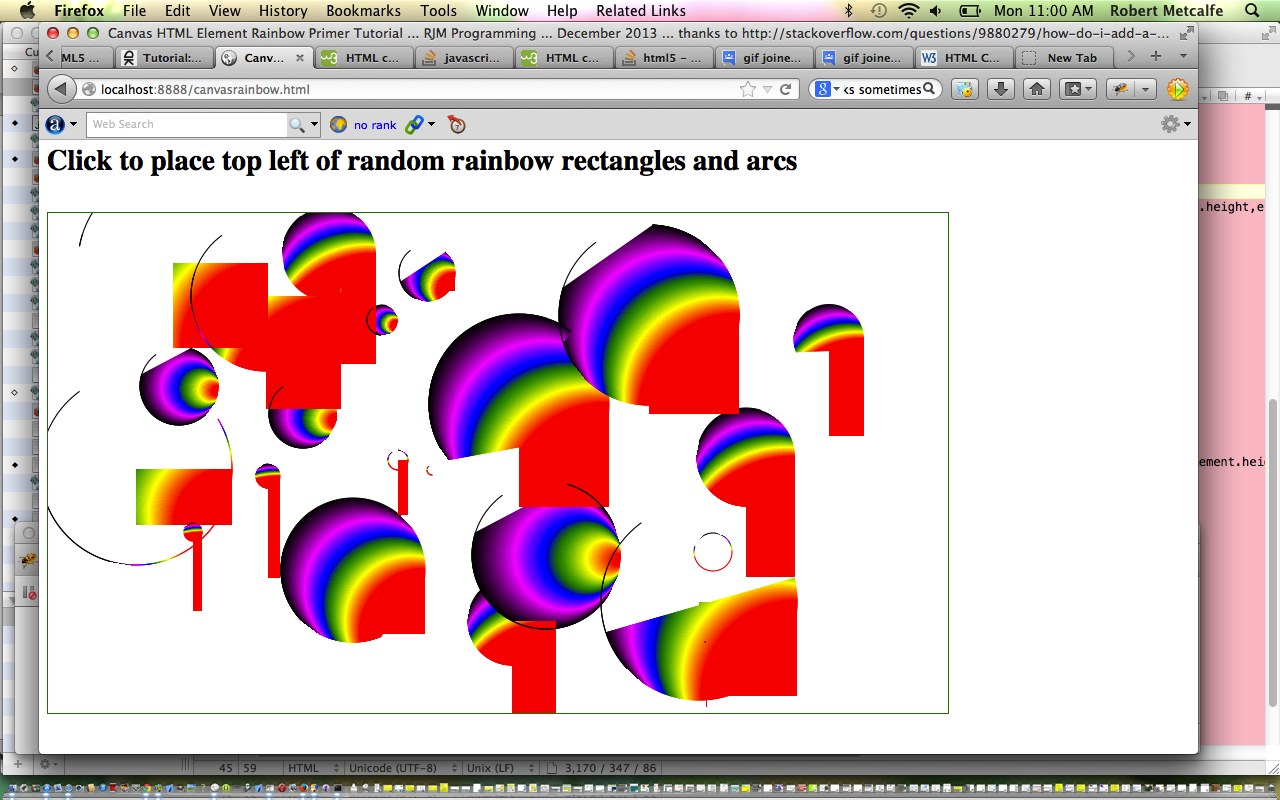
Way back when with HTML/Javascript Canvas Rainbow Primer Tutorial we talked about CSS linear gradients and radial gradients in the one blog posting, but ever since then, it has so much more that linear gradients have been useful to us here at this blog.
Today, though, we turn a bit of attention to radial gradients, specifically repeated radial gradients.
We’ve got a simple web application to play around with them in terms of …
- ellipse versus circle
- coloured versus black and white
- extent keyword (closest-corner, closest-side, farthest-corner, farthest-side)
Below is one example of the CSS …
.circlefarthest-corner {

  background: repeating-radial-gradient(circle farthest-corner,

      red, black 5%, blue 5%, green 10%);

}
Feel free to play away at this live run that has this radial_gradients.html downloadable underlying HTML and CSS (and event logic Javascript that changes the HTML div element className property, to suit).
Previous relevant HTML/Javascript Canvas Rainbow Primer Tutorial is shown below.
The Canvas HTML element tag can be used as the container to draw graphics on the fly usually via the use of Javascript functions for rendering and event management.
In today’s tutorial we touch on a couple of the two dimensional Javascript functions to draw a rectangle or arc, but in the two dimensional context, canvas HTML elements can be used to draw text, lines, boxes and circles as well. We also touch on two functions to create a linear or radial gradient to the fillStyle and/or strokeStyle of your HTML element placed onto the canvas.
You may want to read more at HTML Canvas Reference as a generic reference, or here, at the tutorial javascript – How do I add a simple onClick event handler to a canvas element? – Stack Overflow.
As you can imagine, this HTML canvas element, new to HTML5, can be very useful for some practical client-side web functionality.
Link to some downloadable HTML programming code … rename to canvasrainbow.html
Here is a new link to some downloadable HTML programming source code explaining changes made (from HTML/Javascript Canvas Primer Tutorial) here.
You’ll notice heavy use of the Javascript Math.random() function.
We hope you enjoy this tutorial as a rainbow coloured live run.
Yes … you’ve reached the end … have a top supportive rainbow coloured day!
If this was interesting you may be interested in this too.
If this was interesting you may be interested in this too.
If this was interesting you may be interested in this too.
If this was interesting you may be interested in this too.
If this was interesting you may be interested in this too.
If this was interesting you may be interested in this too.
If this was interesting you may be interested in this too.
If this was interesting you may be interested in this too.
If this was interesting you may be interested in this too.
If this was interesting you may be interested in this too.
If this was interesting you may be interested in this too.
If this was interesting you may be interested in this too.

