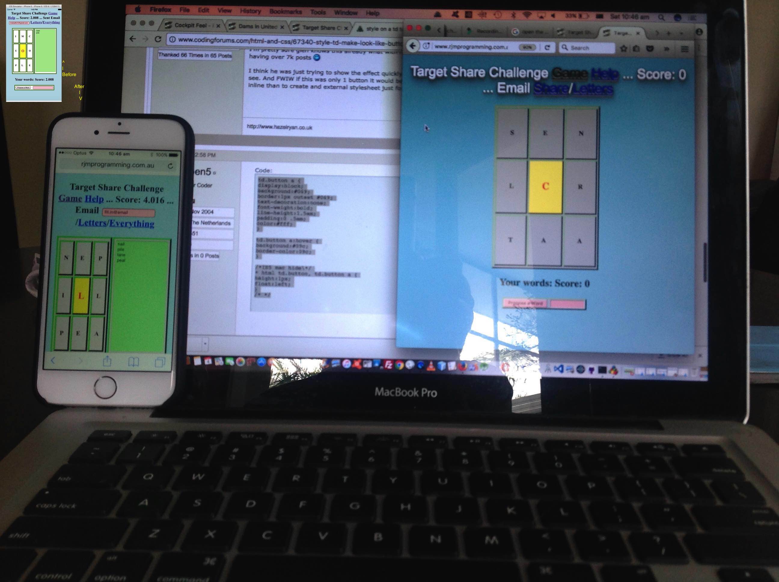
Today we have a mix of CSS makeover and common sense UX design themes. We recently revisited our PHP Target Word Game Mobile Friendly Tutorial, playing it via the Safari web browser on an iPhone, and noticed two annoying things about it, those being …
- we think we’d like to have the 3×3 grid of letters to chose to be more impactive looking …
- we think we’d like to have the 3×3 grid of letters be clickable and that functionality be like clicking the Propose a Word button
… where, with that second one, it would be like killing two birds with one stone because that Propose a Word button sometimes falls below the fold, an UX sin, albeit minor, from way back.
Today, we’d like to thank this great link regarding CSS ideas for these changes …
$ diff target_share_challenge.php--GETME target_share_challenge.php-GETME

172c172

<  td {  border: 4px outset green; background-color: lightgray; text-decoration:none; cursor:pointer; }

---

>  td {  border: 4px solid green; background-color: white;  }

316c316

< <tbody id='tbletters' onclick='ask();' title='Propose a Word'>

---

> <tbody id='tbletters'>

$
… a lead that came from asking Google search engine making a td look like a button in css … thanks everyone.
Coding wise we have some PHP you could call target_share_challenge.php that you can try for yourself with this live run link, and which changed for the small Target Game “makeover” in this way.
We really hope this is food for thought for you.
If this was interesting you may be interested in this too.


