Yesterday’s Viewport and CSS Calc Intersection Algorithm Tutorial showed no issues with …
- mobile “pinch” and “spread” gestures … no issues surprisingly … but there were with …
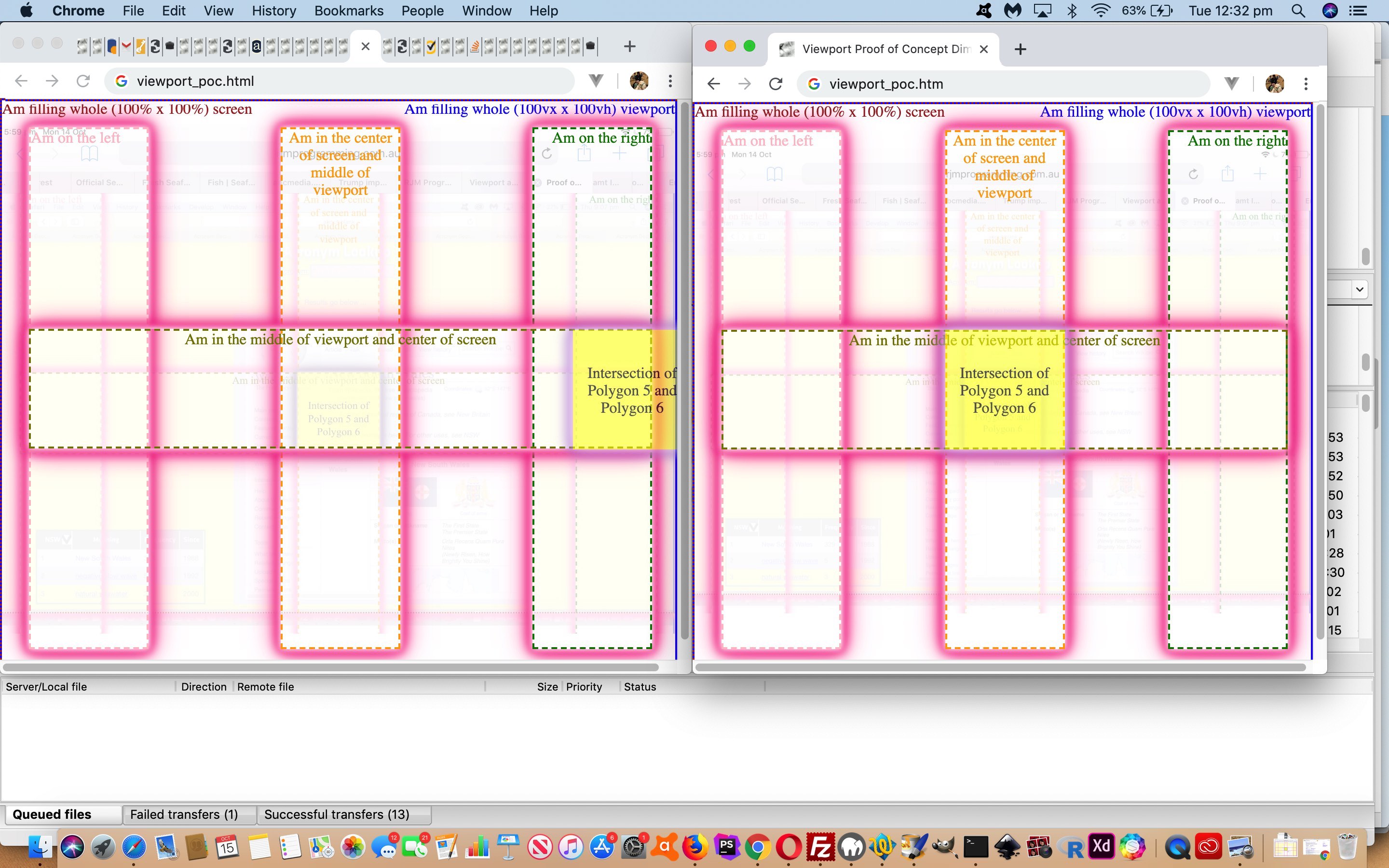
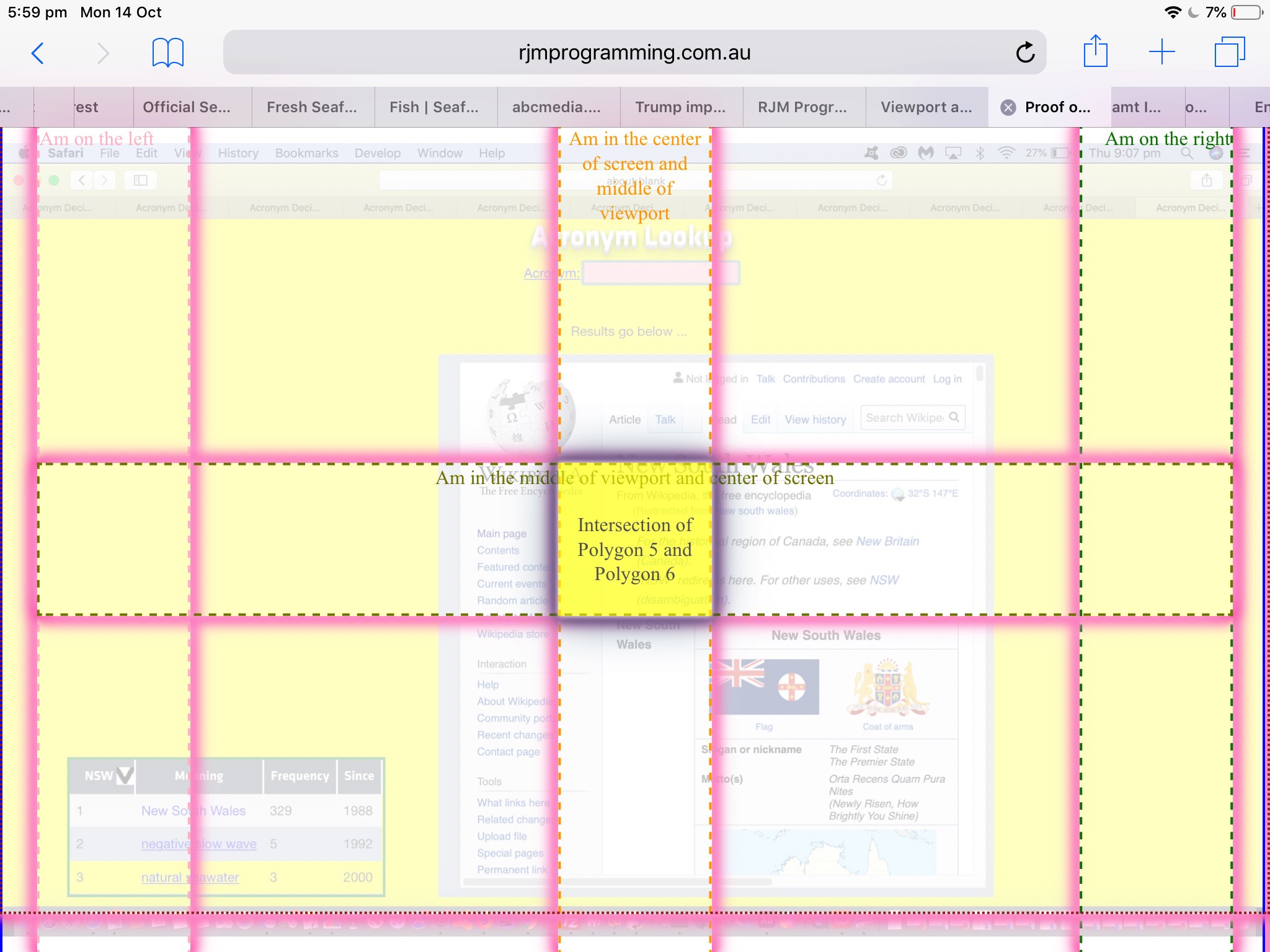
- non-mobile “onresize” (of window) created issue of a misplaced yellow intersection HTML div
Fixing this bug was interesting. At first we thought that yesterday’s …
… we can just create overlayed HTML div elements (position:absolute; opacity:0.7; z-index:11; top and left and width and height in px specified) to represent the intersection of Polygon 5 and 6.
… should be arranged to be …
... we can just create overlayed HTML div elements (position:absolute; opacity:0.7; z-index:11; top and left and width and height in % specified) to represent the intersection of Polygon 5 and 6.
… but found that that (idea that “W% = (WpxValue * 100.0 / screen.width)”) was not really the silver bullet here.
What was better was to create a bit of a “rubber band” feel (for 1/20 of a second of flexibility) to onresize events as per …
// HTML

<body onload='dbih=document.body.innerHTML; divpolys();' onresize='if (!rdone) { rdone=true; setTimeout(reloadit, 50); divpolys(); } else { divpolys(); }'>

// Javascript

var rdone=false;

function reloadit() {

   location.href=document.URL;

}
Yet again, take a look at the changed viewport_poc.htm‘s live run link …
| Now |
|---|
| Was |
Previous relevant Viewport and CSS Calc Intersection Algorithm Tutorial is shown below.
Do you eat “separatist style”? I used to, leaving the good stuff until last, until one day a grandparent kindly taught me the weakness with this system, quietly pinching the best stuff during the prelude period. The recent Viewport and CSS Calc Primer Tutorial has set us on a “separatist course” (which we hope does not lead to any tears at bedtime) …
- initially talking just HTML and CSS (and no Javascript) with that first incarnation of the “Viewport and CSS Calc” proof of concept web application as above … and now today …
- we add Javascript (that dynamically creates its own HTML and CSS via two conduit helpers … those being …
-
<body onload='divpolys();'>
-
function divpolys() {

  var divsii;

  divs=document.getElementsByTagName('div');

  for (var ii=0; ii<divs.length; ii++) {

    divsii=divs[ii].getBoundingClientRect();     // the way CSS proportionate styling can become co-ordinate reality

    // co-ordinate finding processing continues

  }

  // More work here

}
… helping us show, in another “proof of concept” that will get nuanced and genericized (we hope) to show “Two Convex Polygon Intersections”)
-
“Nuanced and genericized”? Yes, as our case is even simpler (because in our case the polygons are always rectangles) than the premise of our muse for today’s work, the wonderful algorithmic ideas for Intersection of Convex Polygons Algorithm (and also helped out by the great PNPOLY – Point Inclusion in Polygon Test) but we plump for an array of structures data arrangement (rather than classes) reminiscent of our book web application discussion at Javascript Array of Structures Primer Tutorial (and also see MySql Polygon Spatial Relations via Image Map Tutorial for GIS MySql Spatial functions regarding some of this same line of thinking). And so, being that simple, we can just create overlayed HTML div elements (position:absolute; opacity:0.7; z-index:11; top and left and width and height in px specified) to represent the intersection of Polygon 5 and 6.
Again, take a look at the changed viewport_poc.html‘s live run link …
… or HTML iframe supervision to see what we are getting at here.
Previous relevant Viewport and CSS Calc Primer Tutorial is shown below.
Keeping on with some themes of yesterday’s Responsive Design Viewport Width Considerations Tutorial, today, we combine ideas around …
… in a “proof of concept” web application we are using to explore ideas from the ground up … hello, wormies!
This is precise pixel placement 101, bringing us to a division of concept with webpage design …
| Screen | Viewport | |
|---|---|---|
| Width and Height Unitary Units | px | px |
| Width Proportionate Units | % | vx |
| Height Proportionate Units | % | vh |
| Width (or Left) Calc-friendly | %,px | %,px,100vx |
| Height (or Top) Calc-friendly | %,px | %,px,vh,100vh |
… where our “proof of concept” findings (on Safari, Firefox, Chrome, Opera and Safari simulations of Edge and Internet Explorer) so far make us believe the Viewport width: calc(100vx – 60px); CSS definition type of syntax that sounds great on paper does not appear to work in practice.
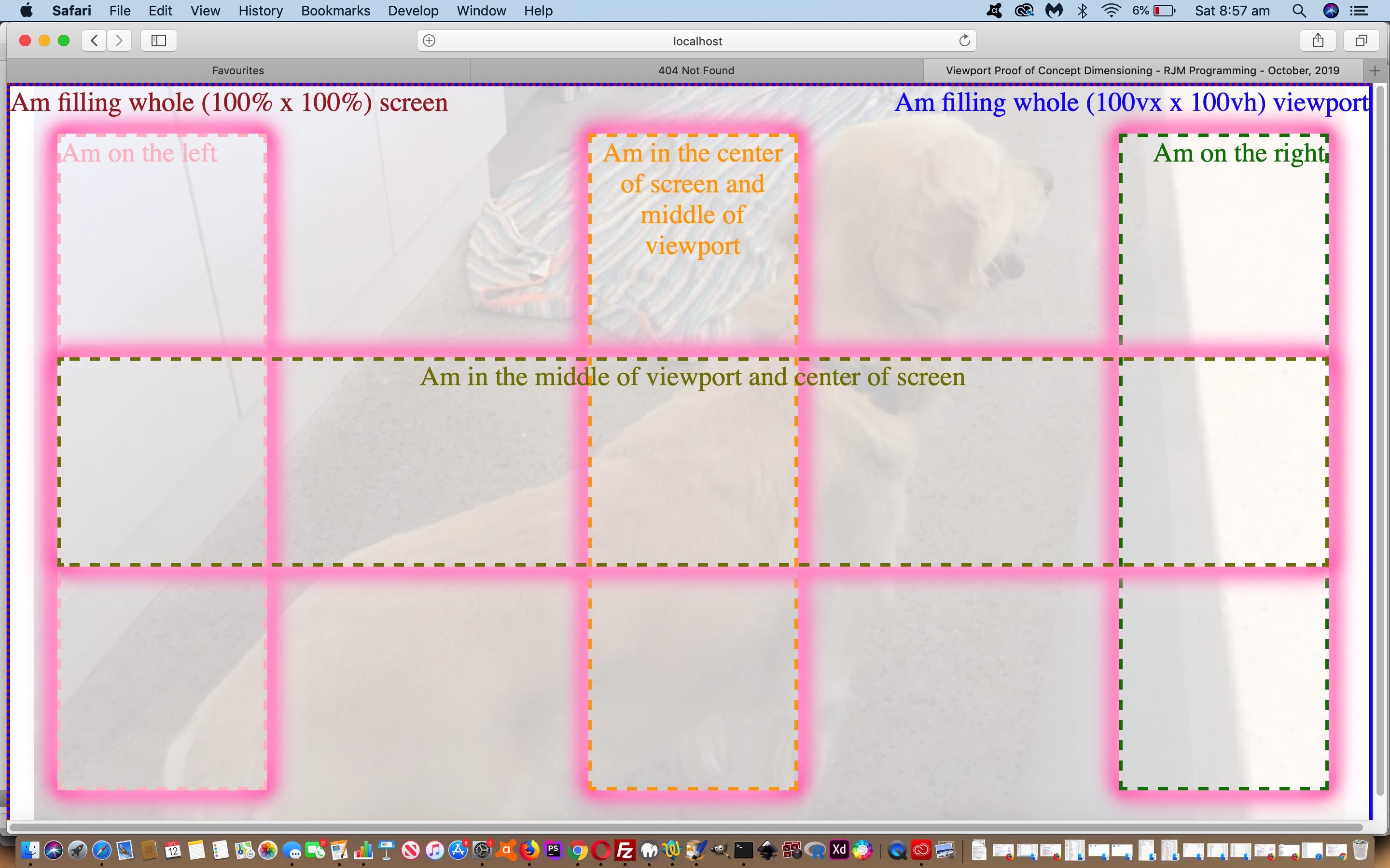
So take a look at our very symmetric viewport_poc.html‘s live run link …
… or HTML iframe supervision to see what we are getting at here.
Previous relevant Responsive Design Viewport Width Considerations Tutorial is shown below.
Regarding our Landing Page series of HTML/Javascript/CSS webpages here at RJM Programming, we’re streamlining our device width (Responsive Web Design) considerations of …
- Mobile Friendly Meta Viewport Tag Zoom Tutorial by now going with …
Was .. Now is …
<meta id=”myviewport” name=”viewport” content=”width=device-width, initial-scale=1, minimum-scale=0.25, maximum-scale=8, user-scalable=yes” />
<meta name="viewport" content="width=device-width, initial-scale=1.0">
- Google PageSpeed and Firebug Mobile Friendly Primer Tutorial by now going with …
Was ..
function widthfix() {  //

 if (navigator.userAgent.match(/Android|BlackBerry|iPhone|iPod|Opera Mini|IEMobile/i)) { // it is a mobile device

   document.getElementById('body_content').style.width='100%';

   document.getElementById('nav_layer').style.width='100%';

   document.getElementById('widget0').style.width='100%';

 }
Now is …
function widthfix() {  //

 if (1 == 7 && navigator.userAgent.match(/Android|BlackBerry|iPhone|iPod|Opera Mini|IEMobile/i)) { // it is a mobile device

   document.getElementById('body_content').style.width='100%';

   document.getElementById('nav_layer').style.width='100%';

   document.getElementById('widget0').style.width='100%';

 }
Why?
- viewport advice of W3School’s Responsive Web Design – The Viewport useful link, thanks … to keep it simple …
<meta name="viewport" content="width=device-width, initial-scale=1.0">
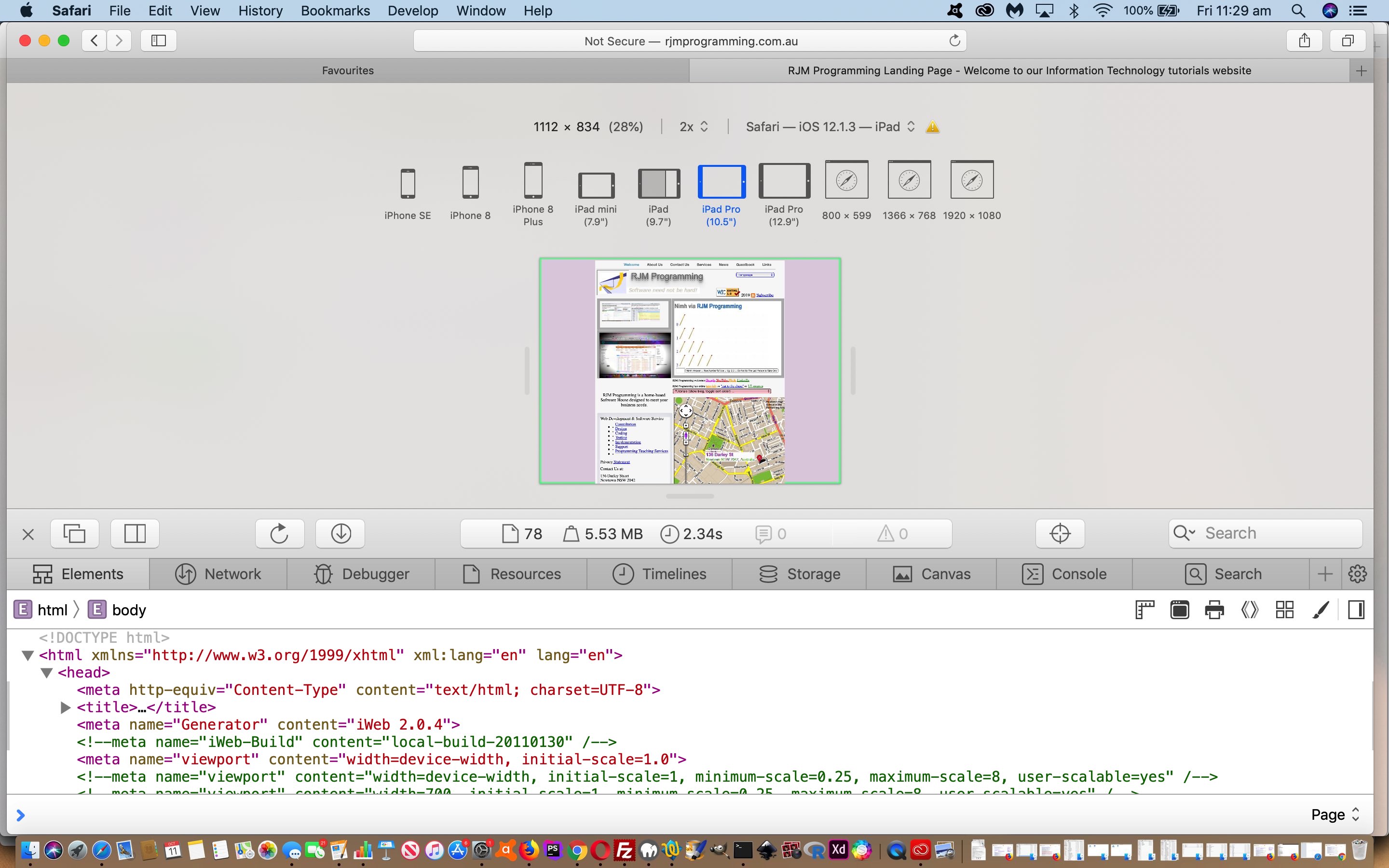
- we were able to use Safari (web browser) Develop Menu “Responsive Design Mode” functionality (as per Safari Develop Menu Responsive Design Primer Tutorial) to see for ourselves the improvement where our previous width based Javascript logic amendments had been interfering with the meta viewport suggestions better in keeping with Responsive Design thoughts
Food for thought, we hope, for those chipping away at responsive design amalgamations!
If this was interesting you may be interested in this too.
If this was interesting you may be interested in this too.
If this was interesting you may be interested in this too.
If this was interesting you may be interested in this too.


