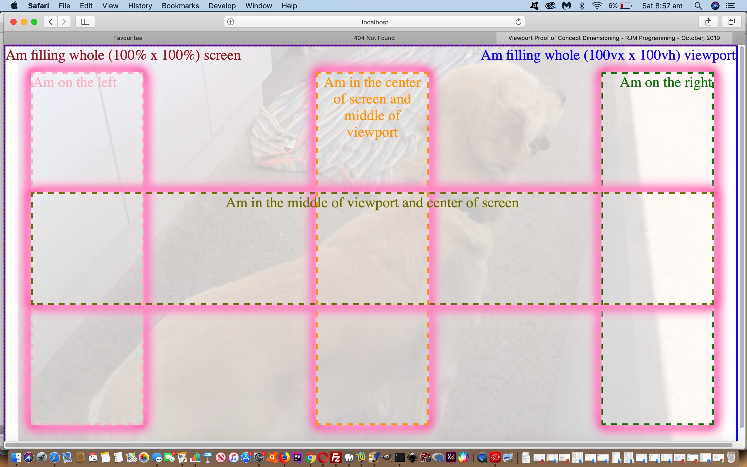
Keeping on with some themes of yesterday’s Responsive Design Viewport Width Considerations Tutorial, today, we combine ideas around …
… in a “proof of concept” web application we are using to explore ideas from the ground up … hello, wormies!
This is precise pixel placement 101, bringing us to a division of concept with webpage design …
| Screen | Viewport | |
|---|---|---|
| Width and Height Unitary Units | px | px |
| Width Proportionate Units | % | vx |
| Height Proportionate Units | % | vh |
| Width (or Left) Calc-friendly | %,px | %,px,100vx |
| Height (or Top) Calc-friendly | %,px | %,px,vh,100vh |
… where our “proof of concept” findings (on Safari, Firefox, Chrome, Opera and Safari simulations of Edge and Internet Explorer) so far make us believe the Viewport width: calc(100vx – 60px); CSS definition type of syntax that sounds great on paper does not appear to work in practice.
So take a look at our very symmetric viewport_poc.html‘s live run link …
… or HTML iframe supervision to see what we are getting at here.
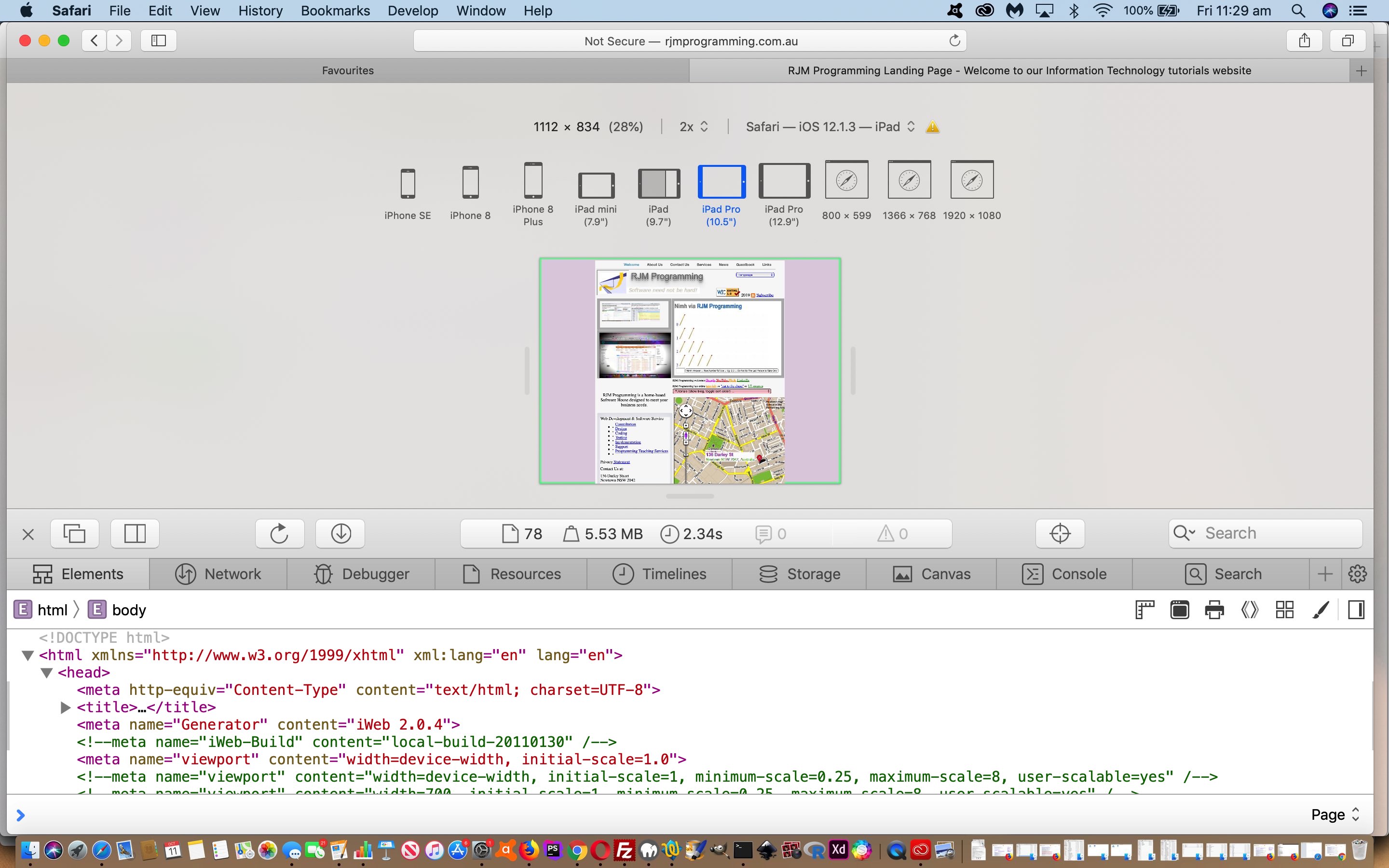
Previous relevant Responsive Design Viewport Width Considerations Tutorial is shown below.
Regarding our Landing Page series of HTML/Javascript/CSS webpages here at RJM Programming, we’re streamlining our device width (Responsive Web Design) considerations of …
- Mobile Friendly Meta Viewport Tag Zoom Tutorial by now going with …
Was .. Now is …
<meta id=”myviewport” name=”viewport” content=”width=device-width, initial-scale=1, minimum-scale=0.25, maximum-scale=8, user-scalable=yes” />
<meta name="viewport" content="width=device-width, initial-scale=1.0">
- Google PageSpeed and Firebug Mobile Friendly Primer Tutorial by now going with …
Was ..
function widthfix() {  //

 if (navigator.userAgent.match(/Android|BlackBerry|iPhone|iPod|Opera Mini|IEMobile/i)) { // it is a mobile device

   document.getElementById('body_content').style.width='100%';

   document.getElementById('nav_layer').style.width='100%';

   document.getElementById('widget0').style.width='100%';

 }
Now is …
function widthfix() {  //

 if (1 == 7 && navigator.userAgent.match(/Android|BlackBerry|iPhone|iPod|Opera Mini|IEMobile/i)) { // it is a mobile device

   document.getElementById('body_content').style.width='100%';

   document.getElementById('nav_layer').style.width='100%';

   document.getElementById('widget0').style.width='100%';

 }
Why?
- viewport advice of W3School’s Responsive Web Design – The Viewport useful link, thanks … to keep it simple …
<meta name="viewport" content="width=device-width, initial-scale=1.0">
- we were able to use Safari (web browser) Develop Menu “Responsive Design Mode” functionality (as per Safari Develop Menu Responsive Design Primer Tutorial) to see for ourselves the improvement where our previous width based Javascript logic amendments had been interfering with the meta viewport suggestions better in keeping with Responsive Design thoughts
Food for thought, we hope, for those chipping away at responsive design amalgamations!
If this was interesting you may be interested in this too.
If this was interesting you may be interested in this too.


