WordPress makes it pretty easy to create blog websites, and you have that inbuilt styling structure inherent in a WordPress theme (this website uses theme TwentyTen) to work with. When you use a particular WordPress theme you stamp that website with a “default” personality, but that does not mean you have to stop there.
So today we build on the experiences of the previous WordPress CSS Change helped by FireBug Follow Up Tutorial as shown below and we show how useful Firebug (using the Firefox web browser) can be to make styling changes to your website. The three changes are simple ones dealing with some annoyances introduced by tinkering over time.
You often find that you are presented with (styling) problems looking after a website (will include server-side PHP in the list, because am feeling very server-like, it being a day not so close to Friday (every time it IS Friday) and all) when there is a choice among:
- CSS (best for styling solutions where all the parameters and resources required are static)
- Javascript (can do some (perhaps not all) styling solutions where the parameters are static or dynamic (but only in name, ie. you can’t create any other resource than an HTML document as a window.open scenario … you need PHP for all the myriad of other scenarios here))
- HTML (vessel can have both above and with style= for CSS and the events, the CSS and Javascript above can be handled … but remember the worthy ideas of MVC)
- PHP (good for all dynamic styling issues, in name and/or content, because it can write out all three forms above (as well as creating media files) dynamically, and static styling is that little bit of a “doddle” easier than the dynamic scenario)
- Javascript/CSS
- HTML/CSS
- HTML/Javascript
- PHP/HTML
- PHP/Javascript
- PHP/CSS
- HTML/Javascript/CSS
- PHP/HTML/CSS
- PHP/HTML/Javascript
- PHP/Javascript/CSS
- PHP/HTML/Javascript/CSS
Today we tackle three annoyances regarding style at this blog, though there are many more than three, especially if you ask those tree fellas over ‘dere … chortle, chortle:
- fix the way the images jut out to the right, sometimes into the areas of the right side menus … to fix this, if you analyze the tutorial today, you’ll notice we use FireBug edit functionality to prove an HTML change will work, then implement this change for good by adjusting some Javascript via header.php … you’ll notice it may still jut out when hovering over the image (sorry mobile users without hover functionality) but see this as a good idea to focus the mind, spirit, spirits (yooooze knowsss wotss eyezz meansss mannnn), minds (for those with multiple minds, but surely not Simple Minds … chortle, chortle) of our beloved users (sound like Phillip Adams … except he has listeners) … you’ll see this below
- fix the way the Course Titles can get lost in among the background image “tiling” by setting the style=background-color:white; for all a link tags in design_a_course.php and the changes are described design_a_course.php
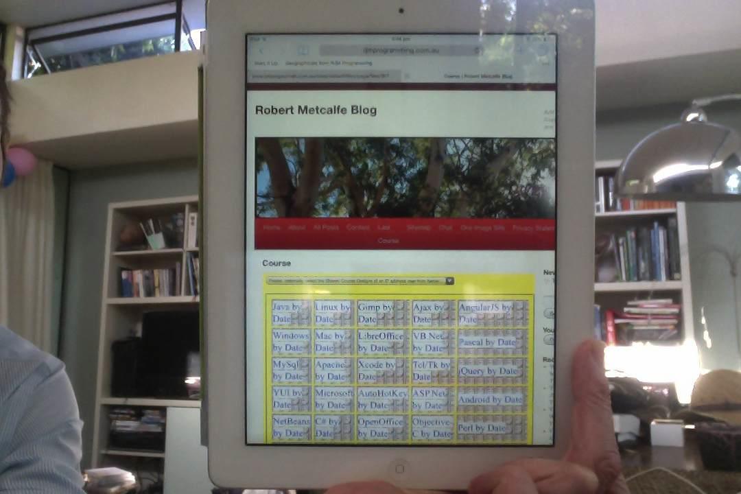
- the same design_a_course.php (and the changes are shown with design_a_course.php) code covers a change to try to alleviate more right side right menu interference with the Course Design code by changing the number of cells across to 5 rather than 6 (which was causing problems for iPads, in particular)
It’s interesting with styling issues how many different ways there are to do the job, especially if you have a server-side language coming into the picture as we do here with this PHP based WordPress blog website.
This tutorial uses the techniques of Firefox and Favourite Plugins Tutorial way below.
This kind of work is carried out by the administrator of a website, or blog, and Firefox and its plugins come in handy for such work, but please know with this, as with many other things in I.T. there are many other ways to do things.
Did you know?
A CSS file can be viewed (as a piece of text) using the web browser … in the tutorial down the bottom right of the first slide you will see a link hovered over to do just that … here it is here.
And, then, did you know?
…
function checkMarginLeftImages() {
var imyi;
var myimgs=document.getElementsByTagName(“img”);
if (myimgs.length > 0) {
for (imyi=0; imyi<myimgs.length; imyi++) {
if (myimgs[imyi].style.border.indexOf(“15”) != -1) {
myimgs[imyi].style.marginLeft = “-20px”;
}
}
}
}
function courseCookies() {
checkMarginLeftImages();
…
Above is the code snippet inclusion (changed bits in bold) into the WordPress blog’s TwentyTen theme’s header.php code to fix the right side jutting out of the images on the blog postings, using a (PHP writing out) Javascript DOM approach, caused in the first place by making the big thick border with the tutorial WordPress Change Primer Tutorial as shown below. To get some context to this (ie. wtbh is function courseCookies()?) you might want to read Quiz Software Integration into WordPress Blog Courses Tutorial. Alternatively, without Course Design functionality just call checkMarginLeftImages() on the body element’s onload event via HTML like <body onload=’ checkMarginLeftImages(); ‘>
Previous relevant WordPress CSS Change helped by FireBug Follow Up Tutorial is shown below.
WordPress makes it pretty easy to create blog websites, and you have that inbuilt styling structure inherent in a WordPress theme (this website uses theme TwentyTen) to work with. When you use a particular WordPress theme you stamp that website with a “default” personality, but that does not mean you have to stop there.
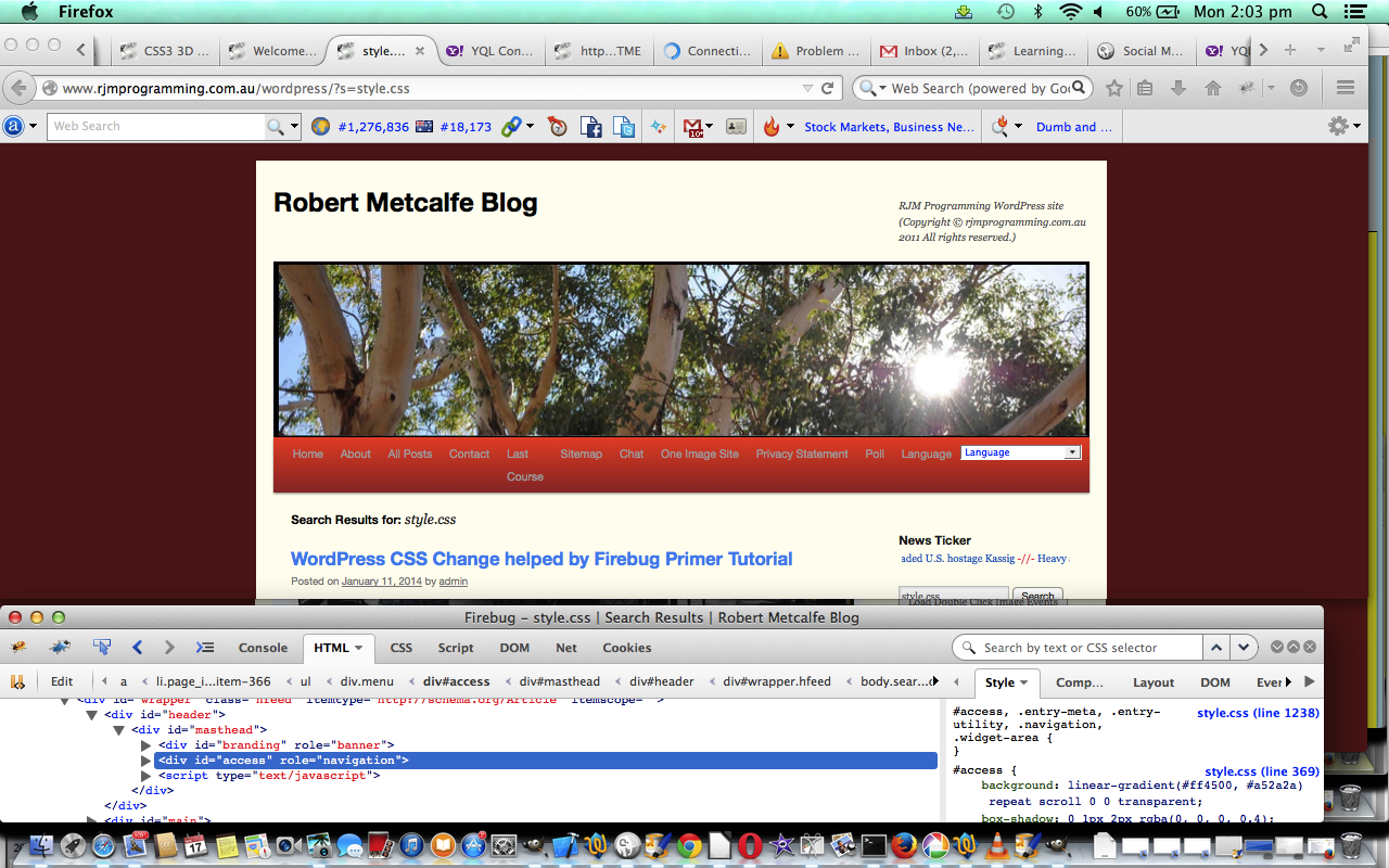
So today we build on the experiences of the previous WordPress CSS Change helped by FireBug Primer Tutorial as shown below and we show how useful Firebug (using the Firefox web browser) can be to make styling changes to your website. The change is a simple one that introduces a linear gradient colour arrangement for the menu.
You often find that you are presented with (styling) problems looking after a website (will include server-side PHP in the list, because am feeling very server-like, it being Friday (every time it is Friday) and all) when there is a choice among:
- CSS (best for styling solutions where all the parameters and resources required are static)
- Javascript (can do some (perhaps not all) styling solutions where the parameters are static or dynamic (but only in name, ie. you can’t create any other resource than an HTML document as a window.open scenario … you need PHP for all the myriad of other scenarios here))
- HTML (vessel can have both above and with style= for CSS and the events, the CSS and Javascript above can be handled … but remember the worthy ideas of MVC)
- PHP (good for all dynamic styling issues, in name and/or content, because it can write out all three forms above (as well as creating media files) dynamically, and static styling is that little bit of a “doddle” easier than the dynamic scenario)
- Javascript/CSS
- HTML/CSS
- HTML/Javascript
- PHP/HTML
- PHP/Javascript
- PHP/CSS
- HTML/Javascript/CSS
- PHP/HTML/CSS
- PHP/HTML/Javascript
- PHP/Javascript/CSS
- PHP/HTML/Javascript/CSS
This tutorial uses the techniques of Firefox and Favourite Plugins Tutorial way below.
This kind of work is carried out by the administrator of a website, or blog, and Firefox and its plugins come in handy for such work, but please know with this, as with many other things in I.T. there are many other ways to do things.
Of great help with the concepts of this tutorial were this link and this Wikipedia one … so, thanks.
By the way, linear gradients do not work with the Internet Explorer web browser.
Did you know?
A CSS file can be viewed (as a piece of text) using the web browser … in the tutorial down the bottom right of the first slide you will see a link hovered over to do just that … here it is here.
And, then, did you know?
#access { background: #FF4500;
background: -moz-linear-gradient(#FF4500, #A52A2A) repeat scroll 0 0 transparent;
background: -o-linear-gradient(#FF4500, #A52A2A) repeat scroll 0 0 transparent;
background: -webkit-gradient(#FF4500, #A52A2A) repeat scroll 0 0 transparent;
background: -webkit-linear-gradient(#FF4500, #A52A2A) repeat scroll 0 0 transparent;
box-shadow: 0 1px 2px rgba(0, 0, 0, 0.4);
clear: both;
display: block;
float: left;
margin: 0 auto 6px;
width: 100%; }
Above is the inclusion into WordPress TwentyTen’s style.css to make this change or see the differences link here.
Previous relevant WordPress CSS Change helped by FireBug Primer Tutorial is shown below.
WordPress makes it pretty easy to create blog websites, and you have that inbuilt styling structure inherent in a WordPress theme (this website uses theme TwentyTen) to work with. When you use a particular WordPress theme you stamp that website with a “default” personality, but that does not mean you have to stop there.
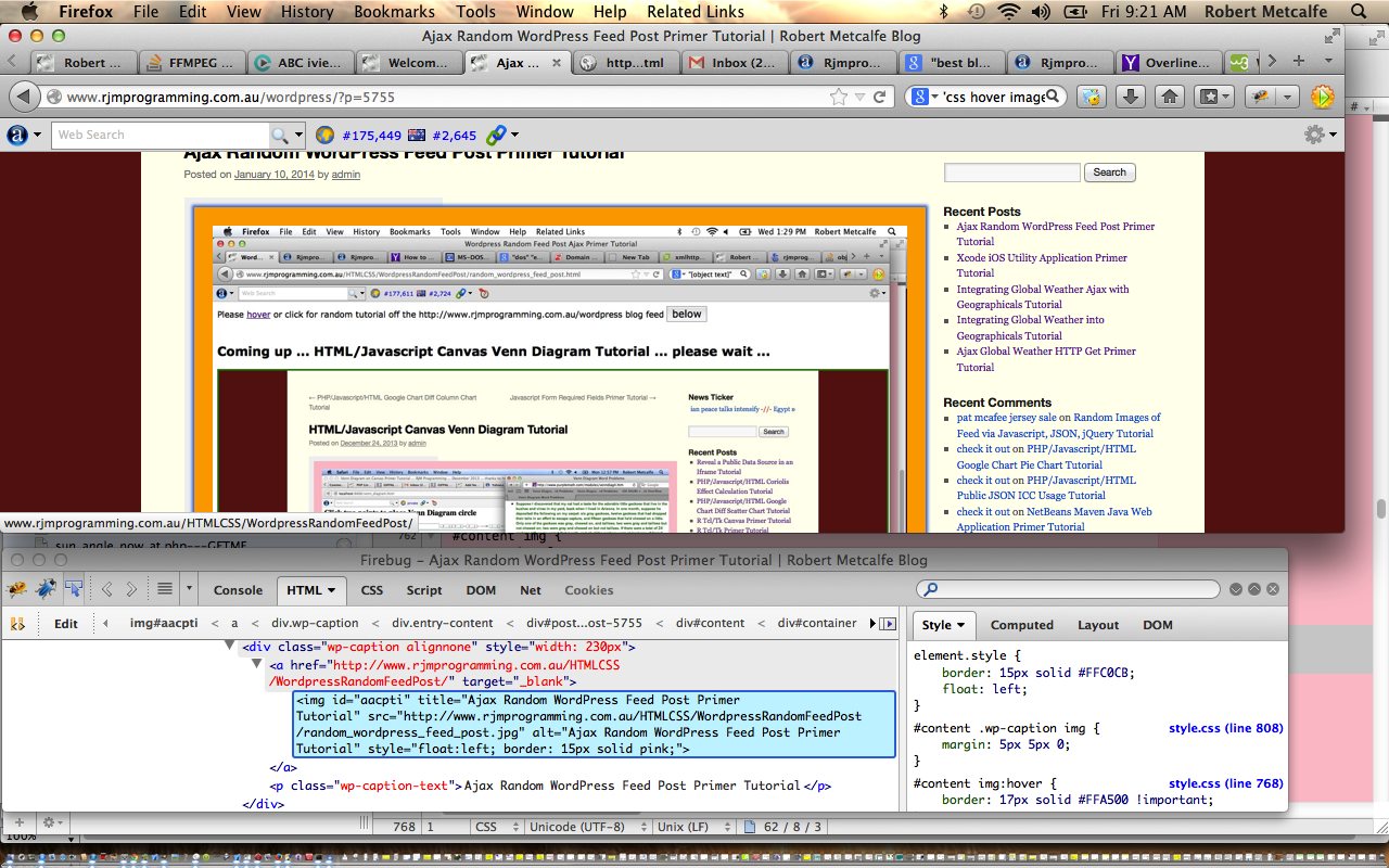
So today we build on the experiences of the previous WordPress Change Primer Tutorial as shown below and we show how useful Firebug (using the Firefox web browser) can be to make styling changes to your website. The change is a simple one that when you hover over one of this blog’s explanatory tutorial images the border colour changes from pink to orange, and it expands a little to give the impression of a tiny bit of animation. In tutorials to come we will address CSS3 Animation and CSS3 @keyframes Rule to round out more styling thoughts.
You often find that you are presented with (styling) problems looking after a website (will include server-side PHP in the list, because am feeling very server-like, it being Friday (every time it is Friday) and all) when there is a choice among:
- CSS (best for styling solutions where all the parameters and resources required are static)
- Javascript (can do some (perhaps not all) styling solutions where the parameters are static or dynamic (but only in name, ie. you can’t create any other resource than an HTML document as a window.open scenario … you need PHP for all the myriad of other scenarios here))
- HTML (vessel can have both above and with style= for CSS and the events, the CSS and Javascript above can be handled … but remember the worthy ideas of MVC)
- PHP (good for all dynamic styling issues, in name and/or content, because it can write out all three forms above (as well as creating media files) dynamically, and static styling is that little bit of a “doddle” easier than the dynamic scenario)
- Javascript/CSS
- HTML/CSS
- HTML/Javascript
- PHP/HTML
- PHP/Javascript
- PHP/CSS
- HTML/Javascript/CSS
- PHP/HTML/CSS
- PHP/HTML/Javascript
- PHP/Javascript/CSS
- PHP/HTML/Javascript/CSS
This tutorial uses the techniques of Firefox and Favourite Plugins Tutorial way below.
This kind of work is carried out by the administrator of a website, or blog, and Firefox and its plugins come in handy for such work, but please know with this, as with many other things in I.T. there are many other ways to do things.
Did you know?
A CSS file can be viewed (as a piece of text) using the web browser … in the tutorial down the bottom right of the first slide you will see a link hovered over to do just that … here it is here.
And, then, did you know?
#content img:hover {
border: 17px solid orange !important;
}
Above is the inclusion into WordPress TwentyTen’s style.css to make this change. Note the use of !important which can, occasionally, be the only way to buck the true CSS cascading hierarchy system. So this usage may be maligned as a kludge because this technique bucks the essence of how CSS should work. However, am sure others can come up with a better idea … one that immediately springing to mind would involve using id= on all of these images, or you can define more than one class, in (the HTML, for) CSS (use), for any HTML element group, but sadly, didn’t start using any/all of these preferable regimes all those months ago (only snaps for planners) … unchortle, unchortle.
Previous WordPress Change Primer Tutorial is shown below.
Often get asked what CMS is this? Answer is WordPress.
Then often get asked what theme is it using? Answer is default WordPress theme Twenty Ten.
Finally we have a tutorial where this is relevant! Yayyyyyyyyyyyyyyyyyyyyyyyyy!!!!!!
In what follows * = as seen when all posts showing.
We are doing a tutorial here where we make a change to our WordPress website’s CSS style. Am going to change a heading colour from black to dark blue (of the Google icon) on this blog *. The smart alecs or should that be silly alecs (how come Alec has such a tortured time?!) who say this is already done can laugh away, and indeed be correct, because you are seeing the website changed … so if you have been here below … “once upon a time there lived a modest little website … it had black subheadings, but one day dreamed of the day when all its subheadings would become a blue * … the shade of blue sky, blue water …. and then it came to pass that there was a travelling computer I.T. pilgrim passing by that website … and what did they behold … yayyyyyyyyyyy … a black subheadinged website * … and the wind that day brought a message … a plea … ‘Whoever shall make my subheadings blue * they shall inherit the secret of the pond near the mote across from the river. Ooooh OoooooOhhhh’ … and so it came to pass that the Intel Chip was invented … but I digress … zzzzz zzzzzz zzzzzzzzzzzzzzzzzzzz … hang on, what was an I.T. pilgrim doing in I.T. without the Intel Chip?”
To find the colour of the Google icon am going to use techniques of Digital Colour Meter on Mac Laptop Tutorial below.
Other parts of the tutorial use the techniques of Firefox and Favourite Plugins Tutorial way below.
This kind of work is carried out by the administrator of a website, or blog, and Firefox and its plugins come in handy for such work, but please know with this, as with many other things in I.T. there are many other ways to do things.
Below see Firefox and Favourite Plugins Tutorial …
Tutorial …
Transcript:
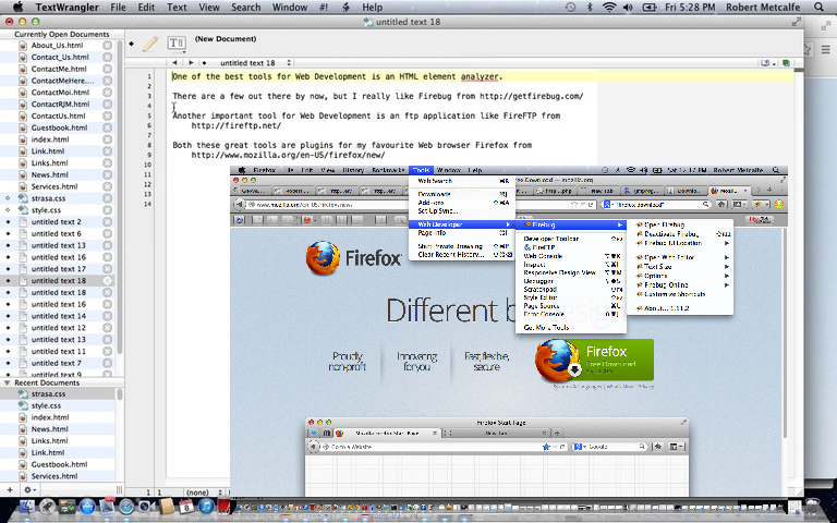
One of the best tools for Web Development is an HTML element analyzer.
There are a few out there by now, but I really like Firebug from http://getfirebug.com/
Both these great tools are plugins for my favourite Web browser Firefox from
http://www.mozilla.org/en-US/firefox/new/
Another important tool for Web Development is an ftp application like FireFTP from
http://fireftp.net/
So let’s have a look at Firefox, briefly, and Firebug and FireFTP …
If this was interesting you may be interested in this too.
If this was interesting you may be interested in this too.
If this was interesting you may be interested in this too.
If this was interesting you may be interested in this too.


