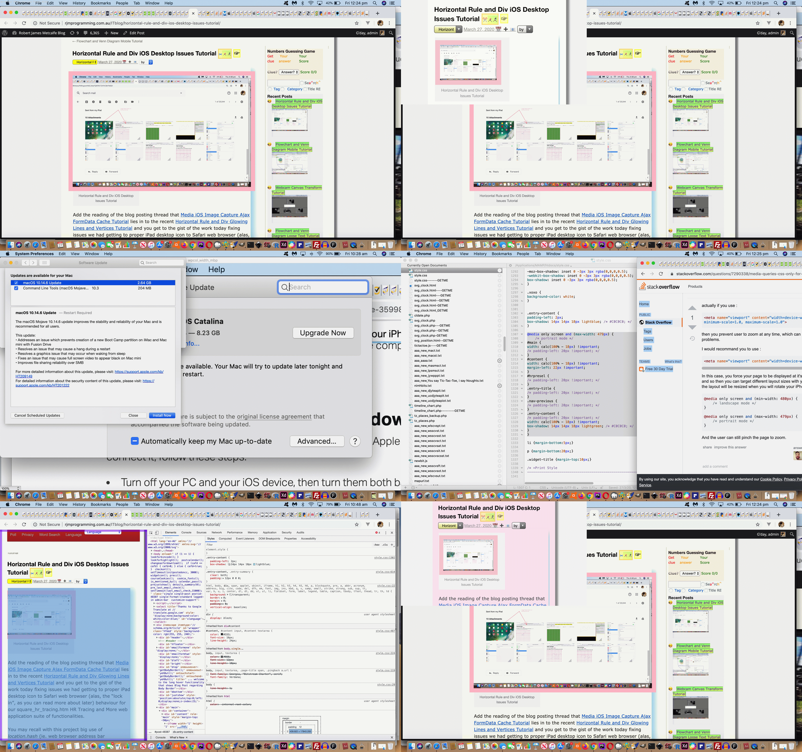
We’ve had months and months of annoyance with this WordPress Blog (TwentyTen themed) content display on our iPhone 7 only in Portrait mode. The reason for our slothfulness on a fix was that the content width “deficit” wasn’t even a full character width too wide for the iPhone device width, and so for those months and months we put up with a combination of …
- “feather brained” pinch operations … and/or …
- guessing last to right characters
… until today, when we finally broached the CSS styling via WordPress Blog (TwentyTen themed) style.css stylesheet issue.
We like CSS Stylesheet @media specific rules that can narrow down fixes to individual device type usage in (individual) orientations (even). “Cute, huh?!” in the extremus!
And so, what is the form of fix (augmenting WordPress CSS Rounded Shadowed Border Tutorial box-shadow work of the past) to this WordPress Blog’s Twenty Ten theme’s style.css stylesheet …
.entry-content {

padding-left: 2px;

box-shadow: 14px 14px 18px lightblue; /* #C0C0C0; */

}


@media only screen and (max-width: 479px) {

    /* portrait mode */

#header {

width: calc(100% - 12px) !important;

padding-left: 20px !important;

}

#main {

width: calc(100% - 12px) !important;

/* padding-left: 20px !important; */

}

#content {

width: calc(100% - 12px) !important;

margin-left: 22px !important;

}

#hrpresel {

/* padding-left: 20px !important; */

}

.entry-title {

/* padding-left: 20px !important; */

}

.nav-previous {

/* padding-left: 20px !important; */

}

.entry-content {

/* padding-left: 20px !important; */

width: calc(100% - 12px) !important;

box-shadow: 14px 14px 18px lightgreen; /* #C0C0C0; */

}

}
… and how did we get the information regarding …
-
“CSS @media for iPhone portrait”?
Useful link, thanks …Via … Media Queries – CSS only for iPhone landscape media css portrait iPhone -
“Few Pixels Less Width”?
Useful link, thanks …Via … CSS: Setting width/height as Percentage minus pixels css reduce width by pixels
Maybe you are on an iPhone now in Portrait mode not squinting nor doing any “feather-brained” pinching … we hope so it’s so unbecoming!
Previous relevant WordPress CSS Rounded Shadowed Border Tutorial is shown below.
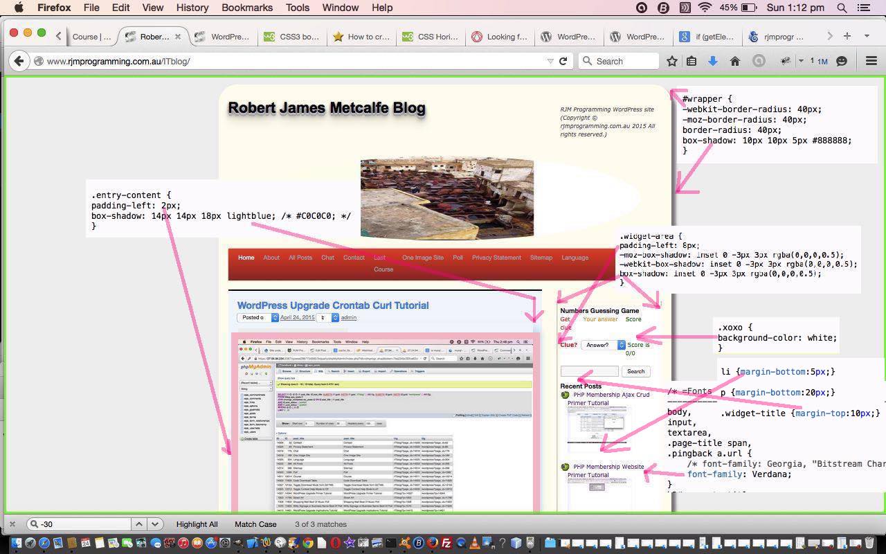
Today we wanted to show you some recent CSS work on this WordPress Blog.
We’ve made some styling changes …
- rounded border (thanks to this link for good advice)
- box shadow (in two places) (thanks to this link for good advice)
- padding-left increases (in two places)
- margin-bottom increases (in two places)
- margin-top increase
… and hope some of the ideas might help you perhaps. To get some context take a look at either or both of …
If this was interesting you may be interested in this too.
If this was interesting you may be interested in this too.


