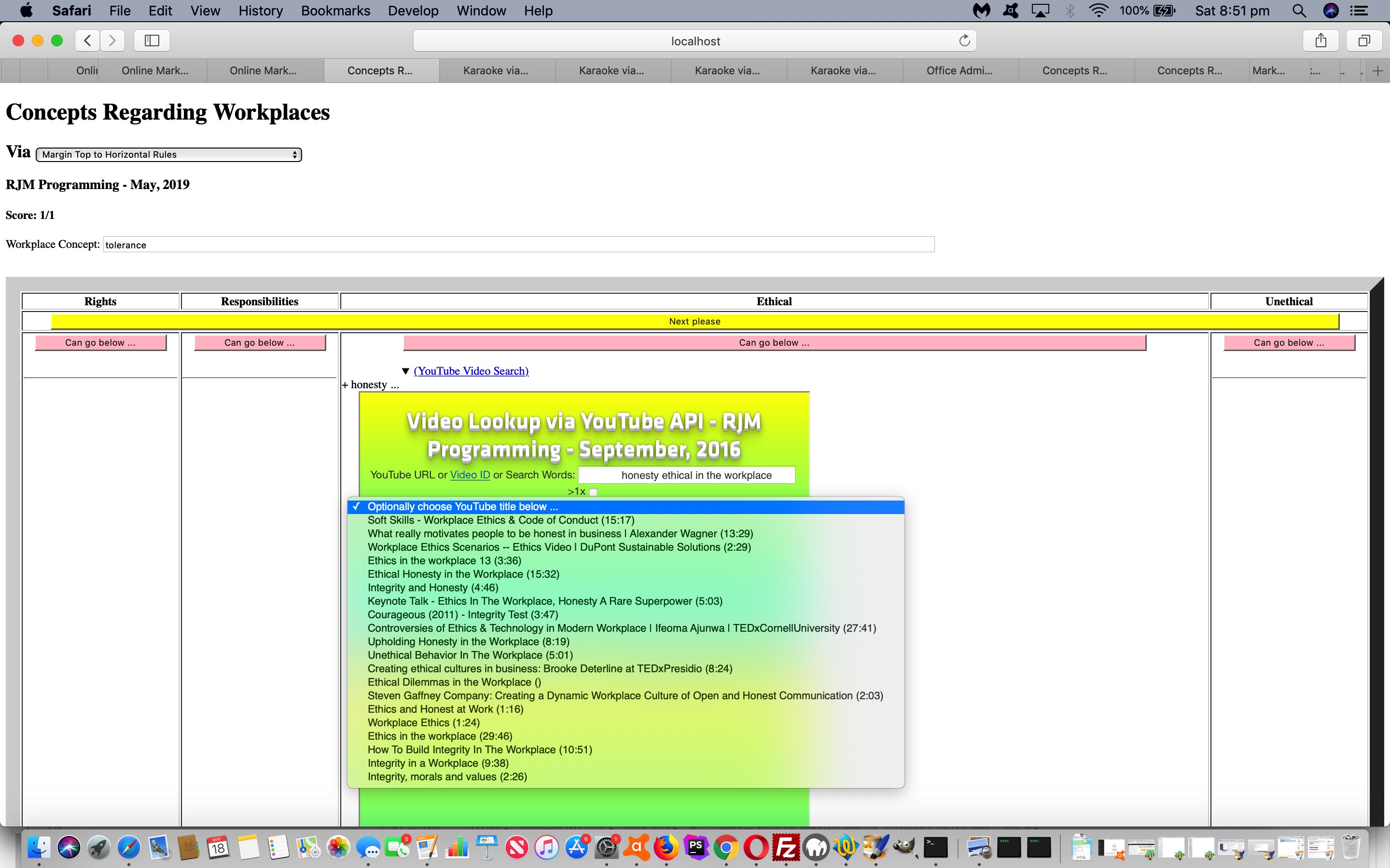
Today we want to add a “reveal” feel to the previous Workplace Concepts Game Horizontal Rule Cell Tutorial.
Our favourite “reveal” element combination is the team of details tag and its nested summary tag partner. The great thing about these two new HTML5 inclusions (which don’t work with InternetExplorer nor Microsoft Edge) are a great means to “reveal” optional functionality. For today’s work, that is to include in an HTML iframe element a pointing to a YouTube Video search (using the YouTube video via its Embedded Iframe API) interface.
It can even be that our Horizontal Rule element alignment is not ruined if the user closes details tags before clicking the yellow button.
Here is the changed workplace_concepts.htm‘s Workplace Concepts Game for you to try this out for yourself.
Previous relevant Workplace Concepts Game Horizontal Rule Cell Tutorial is shown below.
Yesterday’s Workplace Concepts Game Primer Tutorial used …
- an HTML table … with …
- one static row of 4 column “header cells” … and … one static Next button row … and …
- one dynamic row of 4 column “data cells” updated with our Workplace Concept user controlled information
… a turn in a game (user) “go” separated by 4 “data cell” positioned “Horizontal Rule” (hr) elements.
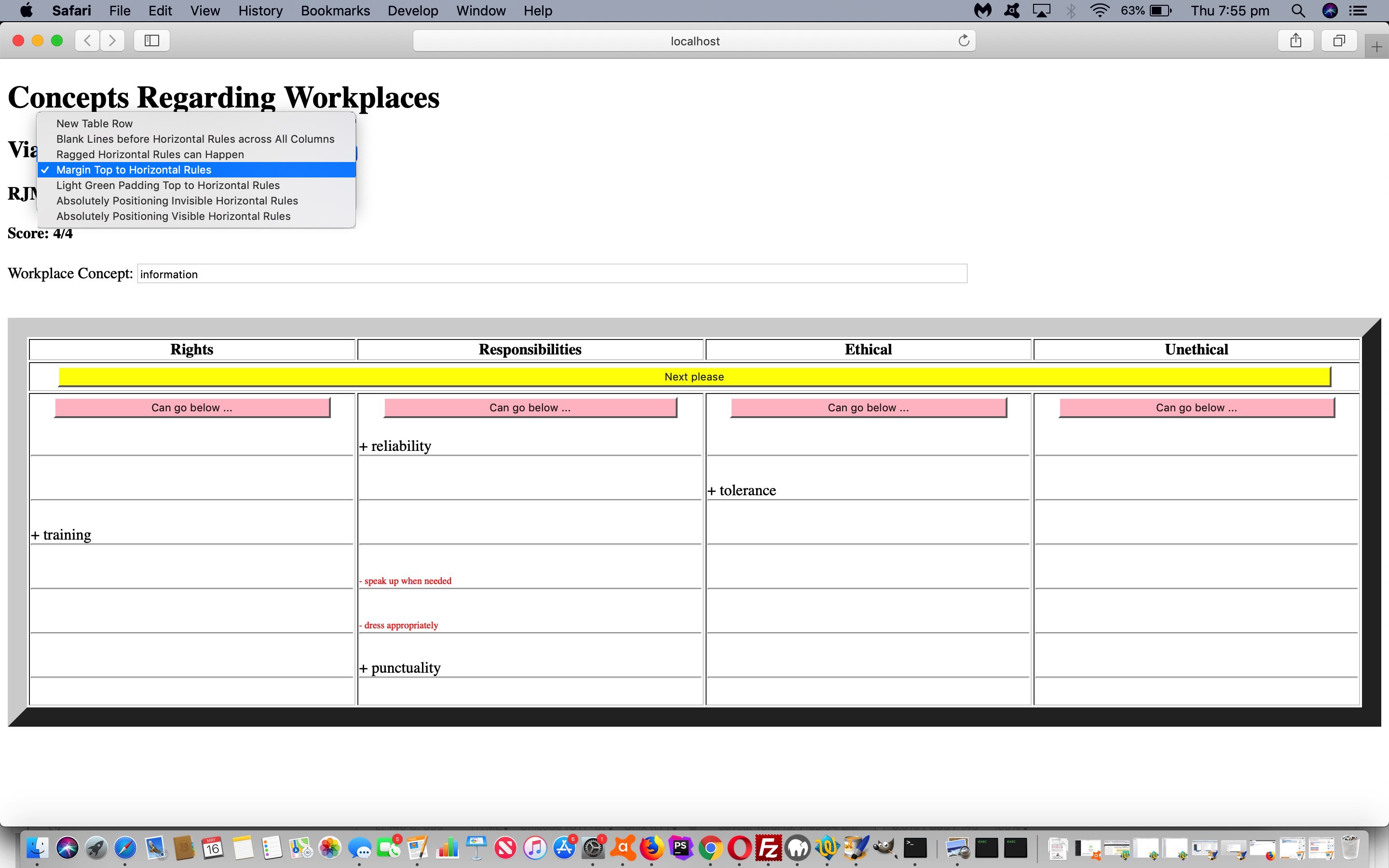
The trouble with this insistence on the one dynamic row of 4 column “data cells” is that unless the programmer is careful the Horizontal Rules will be ragged in their “top” positioning. This scenario remains the “Ragged Horizontal Rules can Happen” of the …
- New Table Row
- Blank Lines before Horizontal Rules across All Columns
- Ragged Horizontal Rules can Happen
- Margin Top to Horizontal Rules
- Light Green Padding Top to Horizontal Rules
- Absolutely Positioning Invisible Horizontal Rules
- Absolutely Positioning Visible Horizontal Rules
… set of new “separation of go” methodologies we have for you to try in today’s incarnation of the changed workplace_concepts.htm‘s Workplace Concepts Game.
All bar that “New Table Row” methodology perseveres with one dynamic row of 4 column “data cells” thoughts. Of course, this “new row” idea may seem the more obvious way to go, but the slightly less imposing Horizontal Rule element has always been a favourite of mine, and can still be worked not to have that annoying raggedness in that variety of ideas of the list above … as per …
- New Table Row … loses (hr) raggedness with a new row created each go
- Blank Lines before Horizontal Rules across All Columns … loses (hr) raggedness with equal numbers of content lines (as necessary just ) added for each column before any Horizontal Rule placement each go
- Ragged Horizontal Rules can Happen
- Margin Top to Horizontal Rules … loses (hr) raggedness with a margin-top is given to the Horizontal Rules too high up the webpage to bring them back in line each go
- Light Green Padding Top to Horizontal Rules … loses (hr) raggedness with a padding-top is given to the Horizontal Rules too high up the webpage to bring them back in line each go
- Absolutely Positioning Invisible Horizontal Rules … loses (hr) raggedness with the Horizontal Rules initially not placed in the table but appended to a separate div in the webpage then the Horizontal Rules are position:absolute left:[like the left of its “data cell” top:[the biggest “data cell” bottom co-ordinate] width:[undefined and so is zero]
- Absolutely Positioning Visible Horizontal Rules … loses (hr) raggedness with the Horizontal Rules initially not placed in the table but appended to a separate div in the webpage then the Horizontal Rules are position:absolute left:[like the left of its “data cell” top:[the biggest “data cell” bottom co-ordinate] width:[“data cell” width] opacity:0.2 z-index:-1 marginTop:-25px
Feel free to try any/all these new ideas below …
You can also see this play out at WordPress 4.1.1’s Workplace Concepts Game Primer Tutorial.
Previous relevant Workplace Concepts Game Horizontal Rule Cell Tutorial is shown below.
Here’s a new web application project. Content wise we take …
- a workplace concept …
- link that concept to one or more categories namely “rights”, “responsibilities”, “ethical”, “unethical” …
- organized into a single dimension array with semicolon and plus sign delimitation … in order to create …
- a web application game where the user presses buttons to categorize workplace concepts
As you might imagine one person’s categorize can overlap and confuse for another person, but that is another matter.
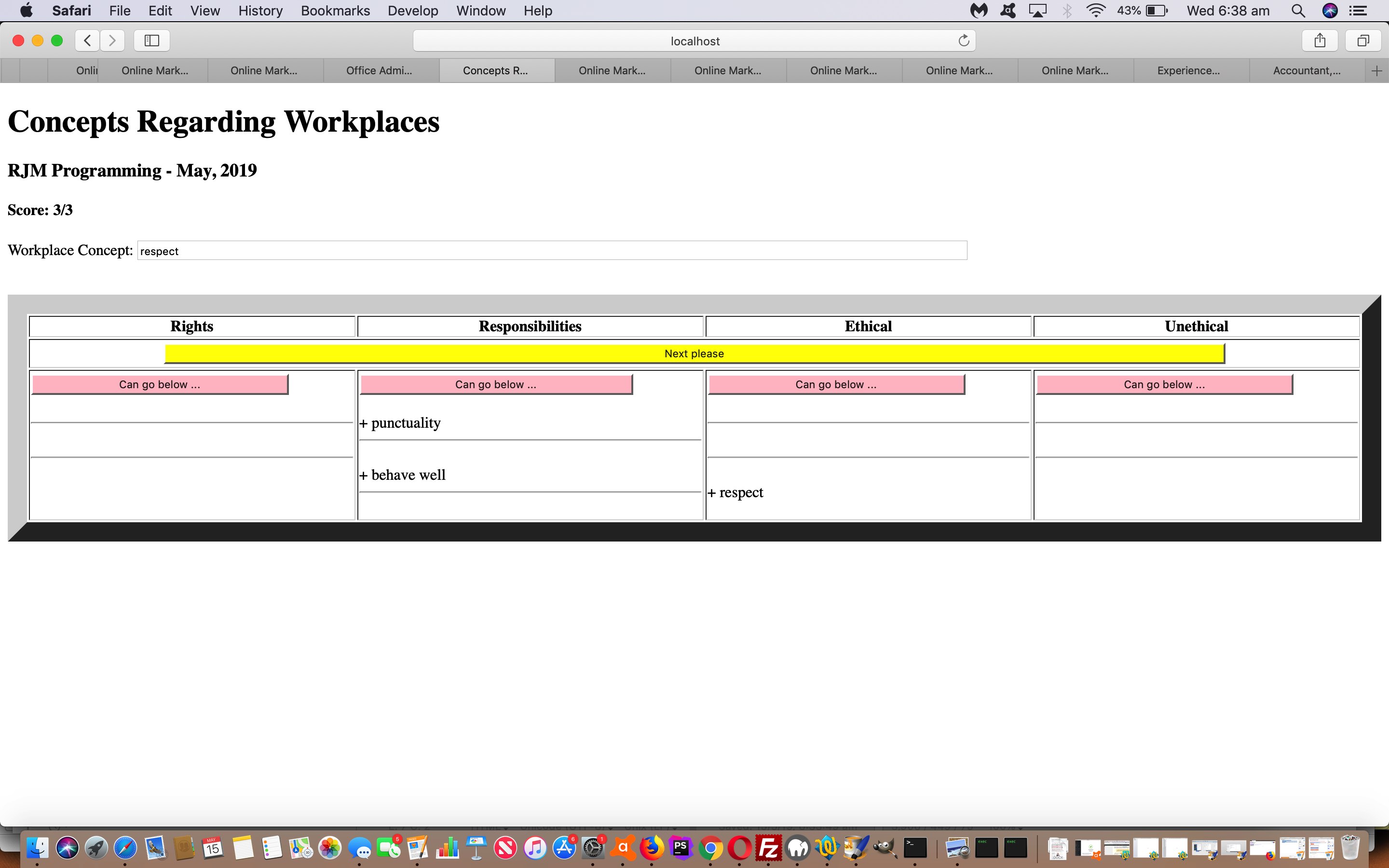
We organize the categories “rights”, “responsibilities”, “ethical”, “unethical” into HTML table heading (th) elements with associated (ie id is same as category name) non-header row cell (td) elements that get appended to by the user answers.
New today was an idea we had to separate answer groups by td cells receiving a new hr (horizontal rule) element, but we want to improve that look (that gets ragged) over time.
Why not try the workplace_concepts.html‘s live run link to see what we mean.
If this was interesting you may be interested in this too.
If this was interesting you may be interested in this too.
If this was interesting you may be interested in this too.


