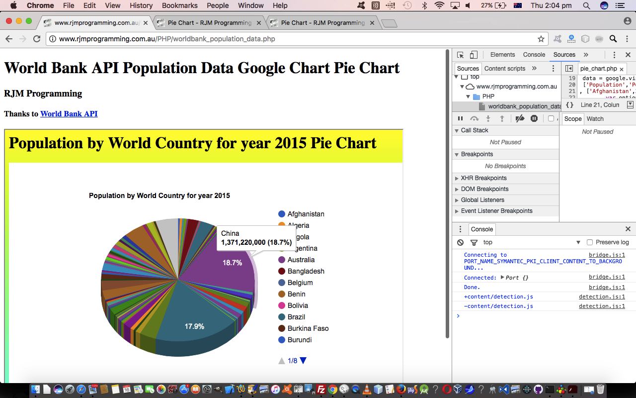
In yesterday’s Worldbank API World Country Population Primer Tutorial, as shown below, we noted …
the data is presented in some way shape or form with the Pie Chart, but for all the advantages of lots of information in the one place, it does suffer a bit with clutter
… and today we show some practical strategies to be more clear (less cluttered) with the data, should the user, optionally, be interested, here.
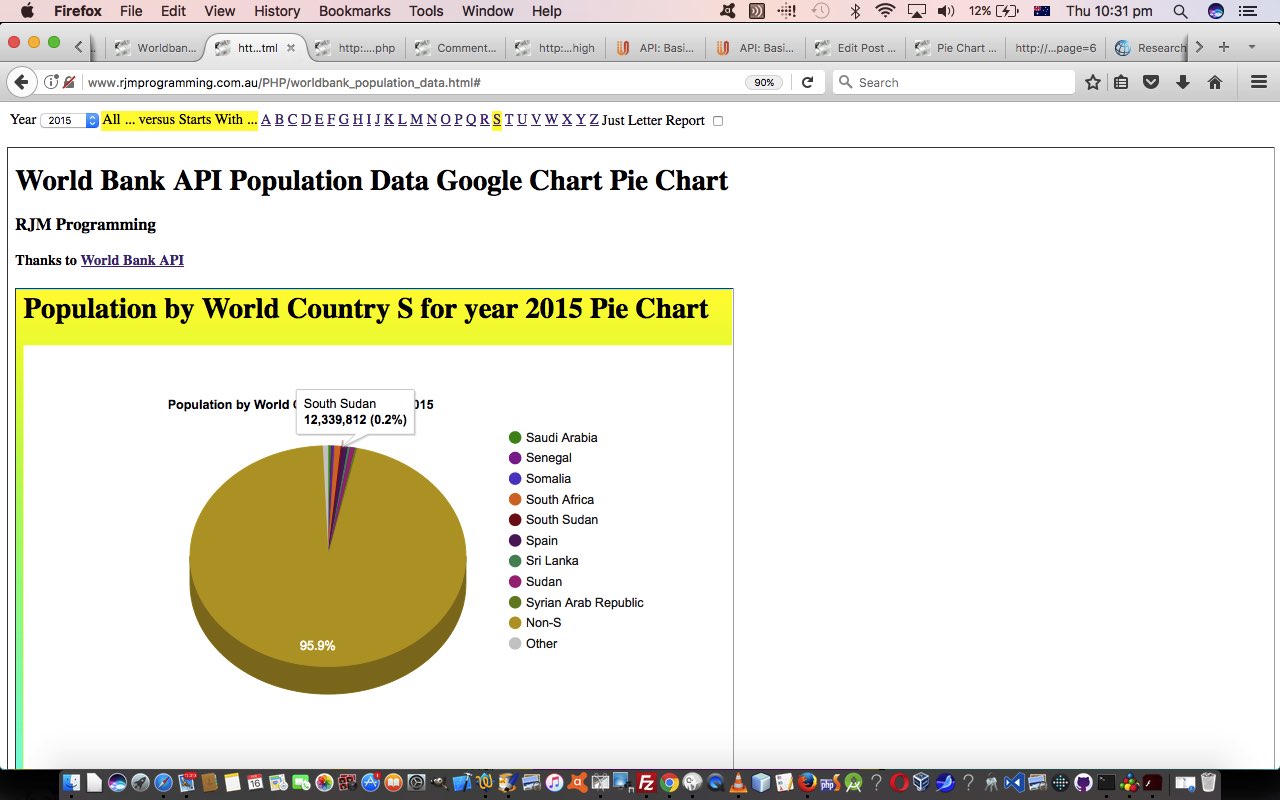
In practical terms, we built a supervisory HTML “parent” you could call worldbank_population_data.html (with this new live run link) on top of yesterday’s “duck with the legs moving fast” hard working “child” HTML iframe element housed PHP worldbank_population_data.php (changed this way to accomodate this move).
If you had to break up a huge chunk of Worldbank API data related to World Countries and their Population, what would you research as an idea to do this? No doubt a lot of people would agree with how we approach it, that being …
report via a "starting with" alphabetic criteria
Makes sense? We hope so, and we’ll also ask for a Year of interest, with the caveat that we should offer the user the “absolute thinking” that would say if you are doing a report on …
Population by World Country A for year 2015
… for example, you should offer the user to show Pie Charts for the two scenarios below …
- World Country A Populations compared to each other … or …
- World Country A Populations compared to each other and a Non-A Population entry (which totals all non-A country populations)
We could present these functionality options in an HTML select element “dropdown”, but we think today, we’ll use a top menu of HTML a links to interface to the user of this “parent” supervisory web application we welcome you to try out for yourself.
Previous relevant Worldbank API World Country Population Primer Tutorial is shown below.
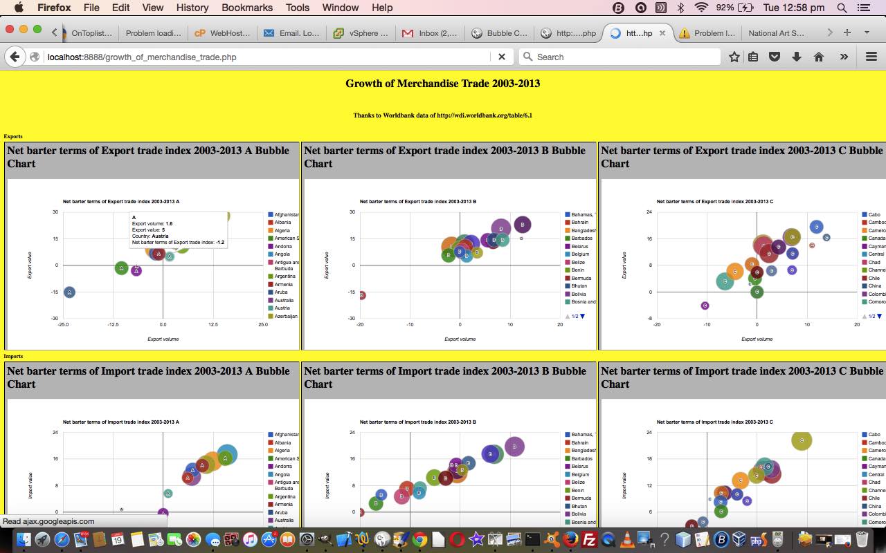
Today we’re revisiting the absolutely astonishing resource that the Worldbank API website provides. Such free public sources of data are very much appreciated in our books. Not so much in our pamphlets, but definitely in the books. Revisiting we thought, perhaps, we heard you ask … or were you passing wind? Glad you asked. Remember when we presented PHP Worldbank Growth of Merchandise Trade Tutorial, as shown below? Then, we used Google Chart Bubble Chart to present reams of information. Today, we again broach “reams” of Wordbank Population data per country to present a Google Chart Pie Chart report.
On our “first draft” of this web application project we create just the one pie chart, but we do that, along the way showing you a couple of things …
- the “reams” of data is processed on the understanding it could be sent to an HTML iframe as a URL plonked into that iframe element’s src property (as if), or if that URL is too long then that data is plugged into the HTML form and then sent (POSTed) to that same HTML iframe (whose name is the same as the form element’s target=name) via an HTML form element whose action property is set to …
http://www.rjmprogramming.com.au/PHP/PieChart/pie_chart.php
- the data is presented in some way shape or form with the Pie Chart, but for all the advantages of lots of information in the one place, it does suffer a bit with clutter
… and so we try some strategies to help with those clutter issues above in blog postings to come.
In the meantime, why not try a live run of the underlying PHP (serverside) web application you could call worldbank_population_data.php featuring …
- use of PHP file_get_contents() to extract …
- JSON data is extracted and parsed to help piece together that URL to the Google Chart Pie Chart, as mentioned way above
Previous relevant PHP Worldbank Growth of Merchandise Trade Tutorial is shown below.
We’ve said it before, and (no doubt) we’ll say it again … there are great public data sources out there for you to explore.
As far as international data goes the Worldbank series of statistics is great, so, thanks.
Today we combine the Worldbank data for Growth of Merchandise Trade 2003-2013 with the wonderful Google Chart Bubble Chart to create (52 = (first letters of country name) 26 x 2 (concepts: Exports and Imports)) reporting charts of interest, we hope. Again, as with any reporting subject, it is a personal thing, whether the subject matter of a report is of interest, but you could say that about so many things in life.
So, we offer some PHP source code you could call growth_of_merchandise_trade.php and a live run link as well, the full loading of which requires patience.
Stop Press
Tomorrow we go over what was needed to change PHP code above to be more mobile friendly …
- growth_of_merchandise_trade.php changes (to cater for select event (mobile touch) functionality) and live run link for yesterday’s web application
If this was interesting you may be interested in this too.
If this was interesting you may be interested in this too.
If this was interesting you may be interested in this too.


