Today’s work concerns what we like to call the “End Game” part of the creation or update of an iOS Mobile Application compiled on the Mac OS X Xcode IDE (Version 9.2 (9C40b)). With our “End Game” thoughts we are talking about the finish of coding and attempts to, in Xcode …
- Product->Archive
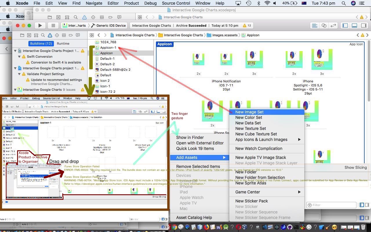
- sends you to (Xcode’s) Organiser and we click the Validate… button, where we get the error messages …
iTunes Store Operation Failed
ERROR ITMS-90022: "Missing required icon file. The bundle does not contain an app icon for iPhone / iPod Touch of exactly '120x120' pixels, in .png format for iOS versions >= 10.0."iTunes Store Operation Failed
WARNING ITMS-90704: "Missing App Store Icon. iOS Apps must include a 1024x1024px App Store Icon in PNG format. Without providing the icon in the Asset Catalog or via iTunes Connect, apps cannot be submitted for App Review or Beta App Review. Refer to https://developer.apple.com/ios/human-interface-guidelines/icons-and-images/app-icon/ for more information."
At this point if you want some background to this, read below Xcode Swift iOS Application End Game Follow Up Tutorial and Xcode Swift iOS Application End Game Primer Tutorial.
In this early part of the “End Game”, as you can see by the error messages above, mobile applications can compile okay in Xcode but not satisfy requirements up at the App Store, especially regarding Image Assets for your mobile application, ours, today, called “Make Your Own Charts”.
Today’s posting wants to let you in on techniques here to get over these error messages, as well as (error message) interpretation thoughts (I wish I’d been more mindful about approaching). Firstly, one of those messages talked about an image 120x120px, and yet, in our Appicon section of the Xcode project’s Images.xcassets no image matched that size. Two things occur here …
- the sheepish thought that I hadn’t, on first thinking about all this, taken into account “2 x” and “3 x” labels to be just that “2 x” or “3 x” bigger than the nominal size label below … but even so …
- it hadn’t occurred to me that new models of mobile devices get invented along with new version of iOS (the Deployment Target 10.3 today, for iPad and iPhone) and all this can mean that you may well not see any matching 120x120px image, because your Appicon “look” is not comprehensive enough for the current device scenarios
… and so we asked the “net” community about all this and this great link (a little) indirectly got me towards the solution, that for my scenario, involved, in Xcode …
- be in Images.xcassets Appicon section
- two finger gesture in whitespace and select Add Assets->New Image Set … that sets up a new …
- Appicon-1 section with a whole new and extended set of blank image places to fill where, taking into account the “2 x” and “3 x” ideas as well, a couple of images were, in fact, 120x120px … a good sign …
- filling all these involved for us using a good 1024x1024px image in Paintbrush and using its Image->Image Size… pixel setting to a Save As… name reflecting needed size …
- open Finder next to Xcode and drag Paintbrush created file in Finder over to the blank image, which becomes filled
- then transfer Appicon-1 section images not in the Appicon section over to Appicon by being in Appicon-1 and selecting such an image that you drag and drop into the Appicon section “folder” place
Voila! Everything then compiles and validates. Ready now, in Organiser to Upload to the App Store, and from there deal with iTunes Connect negotiation with Apple about the new version satisfying standards for the App Store.
Previous relevant Xcode Swift iOS Application End Game Follow Up Tutorial is shown below.
Lots of us hope to learn something new each day?! Overnight, was expecting the “Make Your Own Charts” iOS mobile application to go through to the Apple App Store for sale, and it didn’t, so, having read an email saying that it can take up to 24 hours sometimes, it occurs to me that it’s just like with exams really when people say “read the question”, sometimes you should “reread the email”. Where the email says … “If your contracts are not in effect at this time, your app status will be Pending Contract.” … looking back at “MyApps” in iTunes Connect, that scenario of the email was indeed the case, and could have saved myself some time by thinking clearer the day before when, later in the email, I figured what was in play was the statement … “It can take up to 24 hours before your app is available on the App Store.”
Even though with this app, that is not free, I’d defined banking information earlier, there is another step, which I’d been wondering about in the back of my mind about how that is linked directly to any single app, and this is done by establishing a “Contract” with Apple to allow them to negotiate the payment at the App Store, as you see with the “Agreements, Tax, and Banking” link in the email. This is our first app to reach this stage (available for iPad users on the Apple App Store … search for “Make Your Own Charts”) and think maybe this same “Contract” applies to sales of apps at the App Store from then on … looks a bit like it. Anyway, as I say, you (hopefully) learn something, every day … yayyyyyyyyyyy!!!!!!!
And so … cue the lyrics … optionally queue the background music … queue the karaoke machine … our iOS app “quest” reaches a new phase … the maintenance of the app … the “end game” swings round to possibilities of the “start game” (perhaps) and “middle game” (definitely) cycle again … hopefully … with feedback. This is all part of what used to be (more often than now) called SDLC … feels a bit like nature’s water cycle that you may or may not have learnt about at school.
Pardon me while I think back to Wish me luck … 1 of ?) iOS Hello World on iPhone 5 simulator … from all that time ago. The “quest” has given many days of learning … and learning is great (as is the encouragement of the readers or supporters of this blog (thanks), all the advice from all those users of blogs and forums out there of the I.T. community (thanks), the search engines (thanks), the big I.T. companies running the “mobile shows” (iOS and Android) (thanks) … ?!) … doesn’t matter what that learning consists of, it nourishes the soul.
So to see that iOS mobile app “end game” follow up tutorial watch this … and hope to see you next time.
Previous relevant Xcode Swift iOS Application End Game Primer Tutorial is shown below.
The iOS app “quest” continuing on from yesterday’s “middle game” Xcode Swift Resizable UIWebview Primer Tutorial as shown below enters the “end game” today, on a MacBook Pro laptop, using the Xcode IDE (plus the ubiquitous white USB lead and that cute thing at its end, an iPad) … yay!!!!!!!
There is a lot to the “end game” of an iOS mobile app, and there is a lot to consider after today’s “first shot” at our “Make Your Own Charts” mobile application we’ve been overviewing lately at this blog, but today we get you into the loop, in that you ask the question about whether your app can go public at the Apple Store.
Let’s break it down into some of its major steps, several of which are only possible if you join up with Apple officially as an iOS Developer on the Apple iOS Developer Program (which we’d see as part of the “start game”) …
- be in the Xcode project
- check Swift code is as you want it to be for a Release version
- in the Project settings General tab make sure you have a “Team” that is an Apple iOS Development team (you may already have this set)
- in the Project settings General tab in the “Deployment info” section we’ve decided this mobile app is best to be only available for an iPad, so specify this now (if not already set that way) … obviously, this stringency is local to this iOS mobile app
- in Product->Scheme->Edit Scheme… select Archive
- connect your iPad real device to MacBook Pro via the white USB lead … where you see the iPad (connected) in iTunes (and this is where, later, you can eject the iPad, as well)
- in Product->Destination-> … select that real iPad
- go Product->Run (to check icons work and app works, on the iPad … again)
- if all okay go Product->Stop as necessary then Product->Archive
- in Window->Organizer “Archives” tab there should now be an entry for “Make Your Own Charts”
- Validate it, Submit it (to Apple) to create an iTunes Connect record for this new proposed iOS (iPad) mobile app, to be sellable through the Apple Store
- while you are there also Export it for safe keeping somewhere on the MacBook Pro hard disk
- log in to iTunes Connect at https://itunesconnect.apple.com iTunes Connect and sign in with your Developer Apple ID
- click the “My Apps” button
- click the new “Make Your Own Charts” button … woah! …
- check, in the Build section at the “+” link, that your bundled build is recognized … though it is hard to believe you’d be here, if not
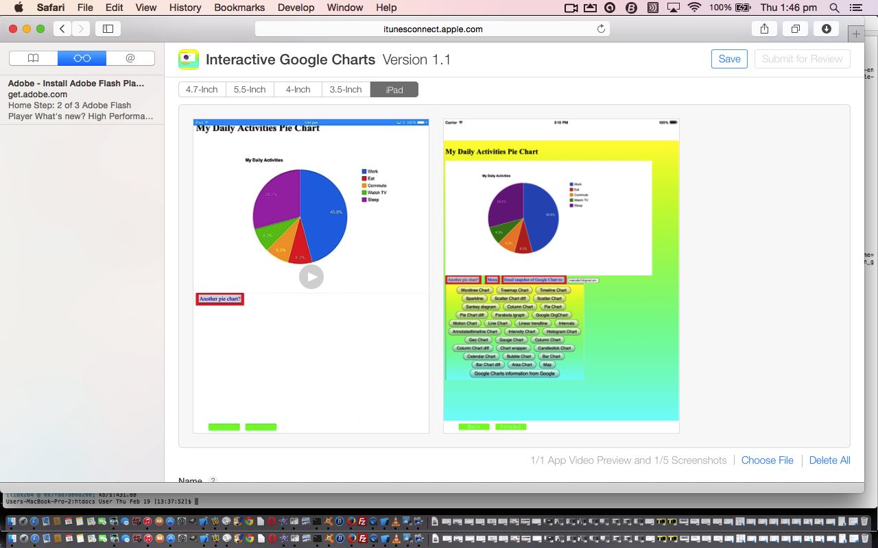
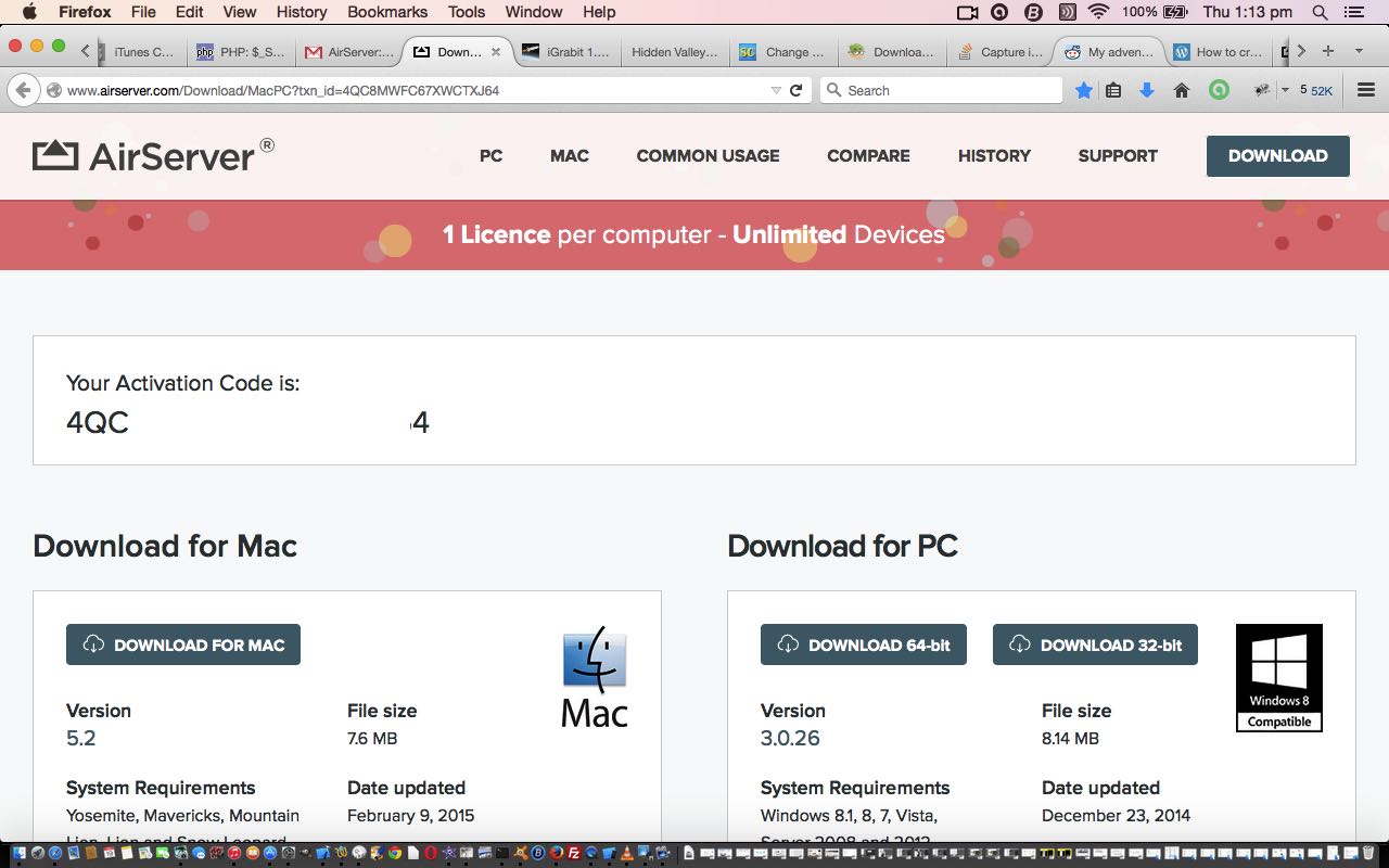
- the rest is about the filling in of the form from here down … there are some quite difficult bits and below we discuss, in particular, the App Video Preview required (if you had more than “iPad” it would be “Previews” … for that very same reason, we only have to worry about the iPad tab in this section, and not with all those other such and such (inches) tabs for other mobile device types … again, this simplicity is local (thinking) to our particular app, today … the research for the tutorial today went down a lot of “garden paths” regarding this (thanks for writing everyone), and looked up a lot of worthy websites which were helpful in trying to help here, but the most brilliant link of all, that worked for me, was this brilliant link … whose ideas will be talked about below (and tomorrow with AirServer on Mac Primer Tutorial) …
- install (the brilliantissimo) AirServer … thanks
- capture video via AirServer called IGCag55.mov
 … video needs to be 15 to 30 seconds long
 - at Mac Terminal application with Linux Bash session (because we did a portrait iPad ((AirServer) video) run) …
ffmpeg -i IGCag55.mov -strict -2 -vf scale=900:1200 igc5ag.mp4 - be in Safari (web browser) as you follow the advice of 3 – How to upload on Safari? section 3
- then drop igc5ag.mp4 into the App Video Preview drop zone (OMG! … how many hours was that?!)
- in this same area make sure there is at least one properly sized screenshot … as with video, tend to “suck and see” to get dimension ideas … or you can consult this Apple link (for a more scientific approach) … thanks
- also get a 1024×1024 pixel general application image together for one of the fields
- as you go, probably in a piecemeal fashion, it is wise to hit the “Save” button a lot, but when the form is all filled out to satisfaction, click “Submit for Review” button
- now you wait to see how the Apple review of your app proceeds …
… so there you go … quite a lot to take in … and hope it gives you some good information that you are looking for, today.
Previous relevant Xcode Swift Resizable UIWebview Primer Tutorial is shown below.
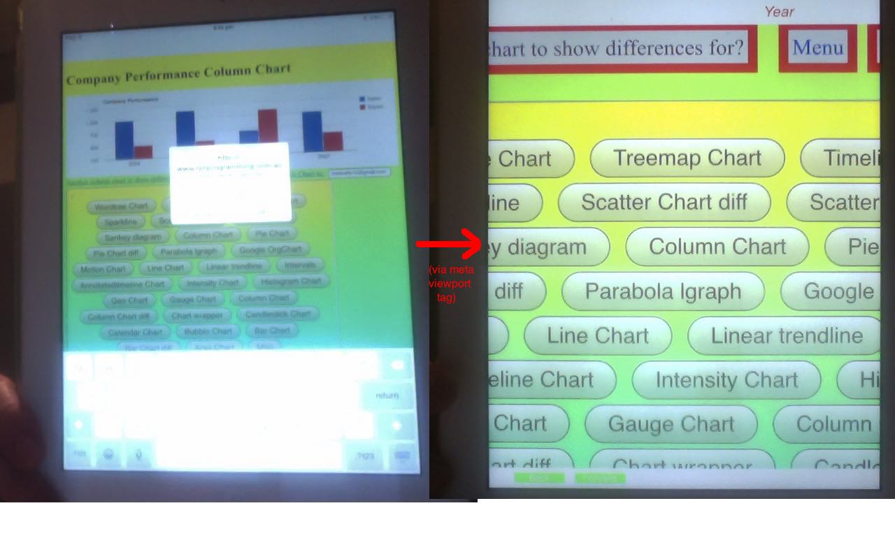
Today we continue on our iOS app “quest” (from Xcode Swift Image Assets Primer Tutorial as shown below) … and address a “middle game” topic when we consider a usability issue with the UIWebView we use … or to be exact, the PHP/HTML/Javascript innards of this UIWebView (though in practice it looks like the UIWebView itself). The usability matter at hand is the ability many users like to be able to resize their applications using the two finger zoom and pinch gestures … to not be able to resize feels kind of claustrophobic and restrictive.
So how is the resizing of an iOS mobile app using a UIWebView achieved? You can probably do things in the Xcode Swift application code, but we choose to make the change in the PHP/HTML/Javascript by the configuration of a <head></head> viewport meta tag, which we first talked about here at this blog with jQuery Mobile Primer Tutorial, and if you zoom down to Google Charts Emailing Primer Tutorial as shown way below, the code difference links will show some of these. We visited every bit of code to make sure that …
<meta name="viewport" content="width=device-width, initial-scale=1, minimum-scale=0.5, maximum-scale=4, user-scalable=yes" />
… became the go, after a bit of experimentation and personal preference coming into play. You may want to read more about meta viewport tags regarding mobile platforms here.
Hopefully you can imagine that such usability is very advantageous for your mobile platform users.
Previous relevant Xcode Swift Image Assets Primer Tutorial is shown below.
Today we continue on our “quest” … and have to admit to you here … it really is a “quest” to get a mobile app accepted by the Apple Store … today we are in an area you might consider part of what, we, here, refer to as the mobile app development “middle game” or perhaps you put the consideration of all your launch application icons and marketing images as part of your “end game”. Your decision probably hinges on the nature of the app and also how you like to work. For me, it feels like part of the “end game” but … and there’s always a “but” isn’t there … as much as you’d like to get on with it, and give that “quest” another shot … you always forget how long this part takes … because, even if you have a previous Xcode project you can use to arrange all the image sizes and such, it is an eye opener to see, if you haven’t built an app for a while, the number of new device formats you’ve missed out on in the meantime, that you then have to cater for.
My thinking on our “Make Your Own Charts” app is that, for Apple Store, we’ll only say that it is suitable for iPad usage, but can’t see that this lessens the size of this job … but please don’t get the idea that that means you can’t find a way to lessen the task.
So, if you are a graphic artist, am sure all this is a doddle … sadly, we are lacking that graphic artist expertise … but even so, you can use tools you have and add a dose of patience … my advice, for what its worth is to, roughly …
- make one image about 1024×768 that you find apt
- make one image about 200×200 that you find apt
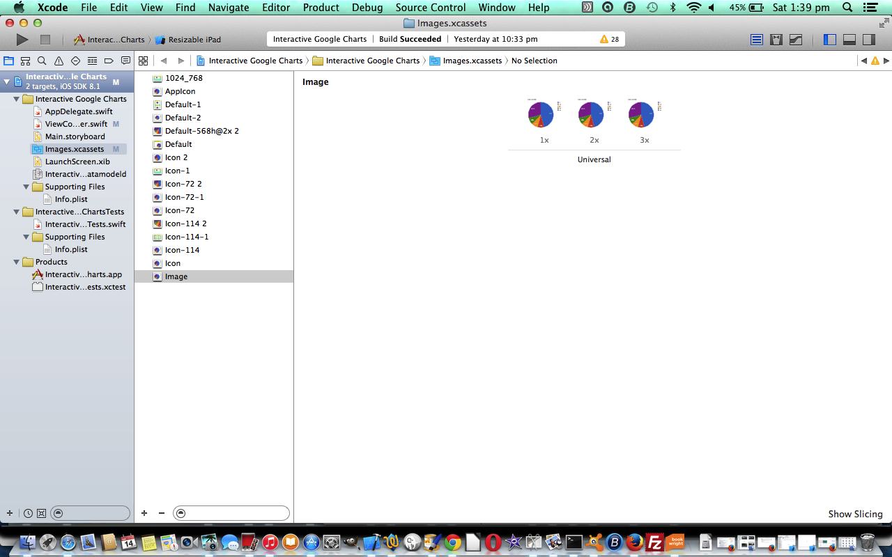
- in Xcode double click Images.xcassets folder and you see all the formats of images needing attention for various ihone and iPad sizes and configurations
- you can import images from another Xcode project (Objective-C or Swift) you have from the past and use the click subfolder->Import from Project… as a way to get over some images with sizes you can work with
- think drag and drop into place for the rest … and how do you get the “drag” bit … either
- get it via image editor like Paintbrush (or Gimp) with one of those first two image ideas, respectively regarding big and small requirements … resizing there as necessary
- click an image as with a right click->Open in External Editor (which is preview here) and have a buffer ready to Paste in from some other means (like step 1.) and move it around to be in a correct position
- you’ll probably reach points when you wonder … “am I there yet?” … try a Run to see and pick up on the error messages (which you’ll probably get initially) as a way to keep moving forward on your “quest”
So, today, have a look at work here for the “Make Your Own Charts” app in our “middle game” / “end game” discussion ahead of pure “end game” ideas when we try to get the app onto the Apple Store, for another day. The previous “middle game” flow towards where we are here came from Xcode Swift UIWebView Back and Forward Button Tutorial as shown below. Hope this helps in some way, and good luck yourselves, if you are doing this yourself.
Previous relevant Xcode Swift UIWebView Back and Forward Button Tutorial is shown below.
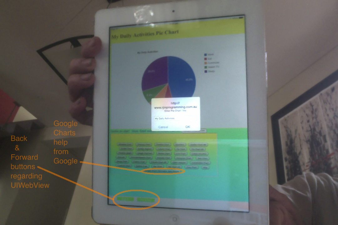
Meanwhile … after sporadic days of testing … back in mobile development “land” … and any maritime mobile development “sea” members (perhaps in the bath) … we’ve got to admit defeat on our Google Charts mobile app as far as minimal designing goes trying to do away with (UI)WebView “Back” and “Forward” buttons. We do need them, and the main reason is that opening the app to the Pandora’s Box of many Google Chart functionalities in the one app is not very good without the possibility of getting technical advice from Google themselves … so, today, we bite the bullet … boysenberry, today … and put them in … so this is an opportunity to show you in Swift how to dynamically add in “Back” and “Forward” buttons that interact with your UIWebView (we are doing an iOS mobile app in Xcode today).
Now supposing you’re here and you haven’t already been in the loop from a few days ago with Google Charts Mobile WebView Menu Tutorial as shown below … well, welcome … dew do drop inn in … chortle, chortle … what’s the deal with a (UI)WebView on its lonesome …
Well, it is to do with navigating outside the “realms” of your mobile application’s WebView innards page in both a backward and forward sense. In other words you can not worry at all if all of the pages possible to navigate to, can eventually have navigation that would lead you back to that original webpage of the WebView, but if you go outside that, the WebView (without its “back button” and “forward button”) will lose touch with the original webpage without some complete resetting of the mobile application. If this explanation baffles, you may prefer to think of the concept of a mobile WebView as being like a web browser which is not capable of having multiple tabs nor new multiple windows. So to make the system work write “small” for the matter at hand. This shouldn’t be too hard to do if your mobile application has a small defined task, or aim.
So what of the changes … what do they involve? This change, that is, to allow these Google Chart web applications to access help from Google … and be able to find their way home to WebView “land” …
- gchartgen.js is same as below
- butsel.php is the changed PHP programming source code as per changes
- webviewemail.php is same as below
At the mobile IDE (eg. Xcode) for iOS code end of integration, the two main Swift programming source code files of interest are …
- AppDelegate.swift is same as below
- ViewController.swift is the changed Swift programming source code as per changes
Lesson 7896293: You have to have patients patience to be in mobile development “land” … and/or “sea” … or, for a proportional response … “sea” vs “land”
Lesson 7896295: (just went down to the kitchen and learnt something about red chillies) You sometimes have to compromise (indeed perhaps bite boysenberry or raspberry bullets) to be in mobile development areas of interest
Trap for young players 789629500: A UIButton in version iOS 8.1 is white … hopefully for you, it will be “all white on the night” … chortle, chortle.
Previous relevant Google Charts Mobile WebView Menu Tutorial is shown below.
We left you yesterday “popping off” to create a mobile app, but having an initial “pop” (after we “snarp” and “cackle” … darn those ornery consonants), we realized there was another bit of suitable functionality … that is, to make a menu of other Google Chart applications, and allow you to swap from one to another.
So yesterday’s Google Charts Emailing Mobile WebView Tutorial as shown below gets built upon today, for this.
So what of the changes … what do they involve? This change, that is, to allow these Google Chart web application codes to be used as the innards to a mobile application using a WebView (both no “back button” nor “forward button”), only involves changes to that last tutorial’s Javascript and to add one new PHP generic piece of code and change yesterday’s PHP code as per …
- gchartgen.js is the changed Javascript programming source code as per changes
- butsel.php is the new PHP programming source code that builds a menu of Google Chart relevant applications, as buttons for mobile devices and as a select dropdown for other platforms
- webviewemail.php is the changed PHP programming source code as per changes
Bits of the logic used PHP to try to detect a WebView scenario and would recommend a Google search here.
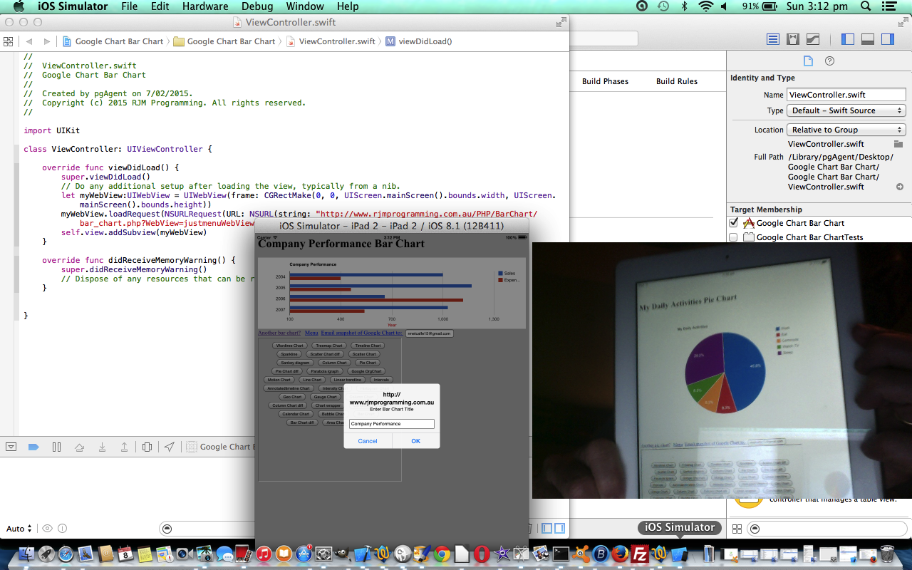
At the mobile IDE (eg. Xcode) for iOS code end of integration, the two main Swift programming source code files of interest are …
- AppDelegate.swift
- ViewController.swift is the changed Swift programming source code as per changes
Thanks for dropping by at today’s tutorial. The menu effect can be shown with a web application live run for a Pie Chart link today, if you want to peruse. Will be popping off again now to test lots more. Bye for now.
Previous relevant Google Charts Emailing Mobile WebView Tutorial is shown below.
Hope if you are a regular reader of this blog that you are getting the hang of the idea of …
- surfing the net with a web browser on a mobile device
- using the net on a mobile device via a mobile application that is using a WebView (Android or iOS)
… can have quite differing considerations regarding any HTML or PHP (or ASP.Net) code you write if your mobile application does away with “back buttons” or “forward buttons”. Of course, the IDE you may use to set up your mobile application WebView may make it so easy it is like “falling off a log” to implement the “back button” and “forward button” functionalities into your mobile application. Or, if you think this way (and there are many who don’t), you can write HTML and PHP to accomodate for a mobile application world using WebViews, but not relying on the use of “back buttons” nor “forward buttons”.
So what is the nature of the issue differences?
Well, it is to do with navigating outside the “realms” of your mobile application’s WebView innards page in both a backward and forward sense. In other words you can not worry at all if all of the pages possible to navigate to, can eventually have navigation that would lead you back to that original webpage of the WebView, but if you go outside that, the WebView (without its “back button” and “forward button”) will lose touch with the original webpage without some complete resetting of the mobile application. If this explanation baffles, you may prefer to think of the concept of a mobile WebView as being like a web browser which is not capable of having multiple tabs nor new multiple windows. So to make the system work write “small” for the matter at hand. This shouldn’t be too hard to do if your mobile application has a small defined task, or aim.
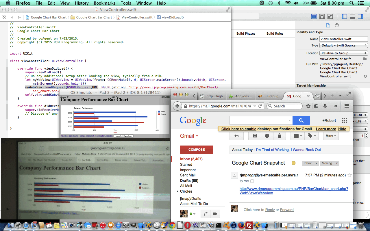
So, do you remember when we made quite a few changes to all our Google Charts web applications to allow for some email functionality, when we showed the Google Charts Emailing Primer Tutorial as shown below? Well, those changes work fine for desktop and laptop web surfing of the net, and work for the mobile usage case 1 as above as well. It is just with case 2 (with no “back buttons” nor “forward buttons”, and using a WebView method to access the net) that the new (snapshot Google Chart (link)) email functionality that was designed for an HTML a tag mailto: href value (client-side method, that relies on an email client program), would be a case of spilling outside the “realm” of the innards of any WebView that mobile application might use to do this job.
So what of the changes … what do they involve? This change, that is, to allow these Google Chart web application codes to be used as the innards to a mobile application using a WebView (both no “back button” nor “forward button”), only involves changes to that last tutorial’s Javascript and to add one new PHP generic piece of code as per …
- gchartgen.js is the changed Javascript programming source code as per changes
- webviewemail.php is the new PHP programming source code that uses a PHP mail method of emailing when using a mobile application’s WebView
At the mobile IDE (eg. Xcode) for iOS code end of integration, the two main Swift programming source code files of interest are …
Ideally it would be good in Javascript to be able to differentiate in a generic way the difference in usage of case 1 versus case 2 as shown above, but this is not straightforward, as you can see here, for instance. So, without that neat solution, probably the next best approach is to, within your mobile application code where you define the URL for the WebView you set up a GET parameter to indicate that extra information that the accessor of the HTML and/or PHP (or ASP.Net), is a WebView in a mobile application. In ViewController.swift above, where this happens, the URL used has “?WebView=WebView” added to the normal URL to flag to the the (UI)WebView innards that a WebView supervises it … by the way, as we’ve seen before, the innards, in Javascript, or PHP, would be very capable of working out that they are working for a mobile (device) platform. For instance, in Javascript, use a test like …
if (navigator.userAgent.match(/Android|BlackBerry|iPhone|iPad|iPod|Opera Mini|IEMobile/i)) {

  // it is a mobile device

}
… great thanks to this link for this advice and idea, and don’t forget that it can be done with PHP too (and no doubt ASP.Net).
Guess this falls under a cross-platform issue, but that term does not encompass the idea, for me, that you can have a cross-platform issue for the same mobile device using the same underlying code … maybe we need the term cross-environment, or cross-caller.
Pardon us while we pop off and start on being able to produce the equivalent of a “live run” link for you … ie. a mobile application … chortle, chortle. Hope you enjoy today’s tutorial.
Previous relevant Google Charts Emailing Primer Tutorial is shown below.
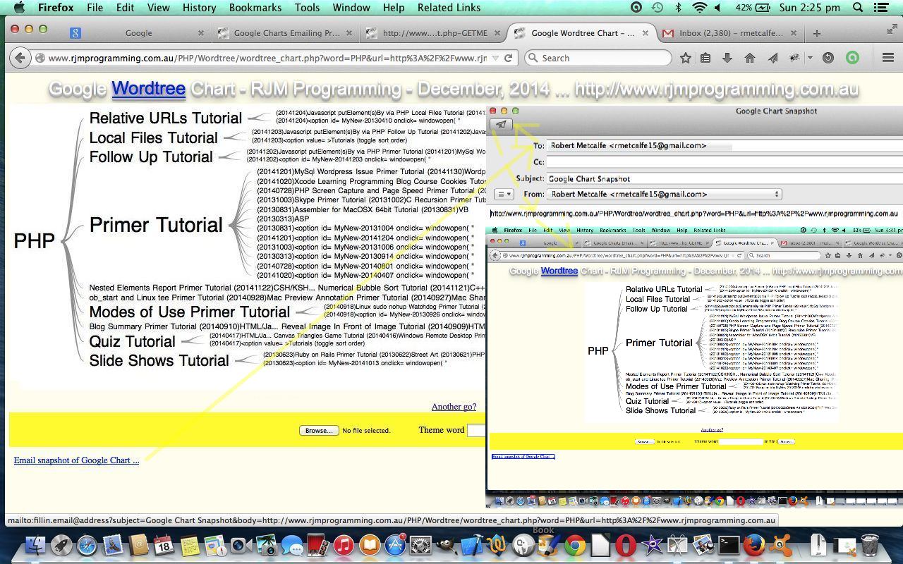
The Google Charts (derived) webpages here at this rjmprogramming.com.au WordPress blog have all changed to add functionality for emailing snapshots of the Google Charts “midstream”. You can see a table of tutorials, and corresponding PHP code (with the last row being our one new bit of Javascript code) affected below …
Let’s now discuss some tactics that can work to be a bit objective about the task of making these changes in a methodical and systematic way.
- If possible, have the change amount to the adjustment of one line of code … so we looked at one bit of Javascript called gchartgen.js called by each Google Chart application via …
<script type="text/javascript" src="http://www.rjmprogramming.com.au/gchartgen.js"></script>… the one (extra) line of code ( that is placed between <head> and </head> ) - So where can gchartgen.js intervene to do its thing (which is to add an Email link down the bottom and allow HTML h1’s be clickable to Email, as well (quite often))? … onload functionality proved to be too crowded, and as this functionality is not mission-critical it is decided that it can be created with setTimeout(gcinit, 2000); … ie. roughly 2 seconds after onload event
- Unit test this on one Google Chart scenario on local (MAMP) web server
- When happy bring all Google Charts code over to local (MAMP) web server
- Make a file of *GETME files via Linux command something like find . -name ‘*GETME’ 2> /dev/null > gclist.xxx
- Manually filter out the entries that are not “relevant latest” from this list using vi (for instance) adjusting each relevant latest to go up one (eg. _GETME goes to -GETME or -GETME goes to –GETME)
- Write a Korn shell script whose main lines of functionality look like
 #!/bin/ksh

for f in `cat gclist.xxx`; do

  pf=`echo $f | sed '/-GETME/s///g' | sed '/_GETME/s///g'`

  nf=`echo $f | sed '/-GETME/s//--GETME/g' | sed '/_GETME/s//-GETME/g'`

  cat $f | sed '/<head>/s//<head> <script type="text/javascript" src="http://www.rjmprogramming.com.au/gchartgen.js"></script>/g' > $nf

  cat $pf | sed '/<head>/s//<head> <script type="text/javascript" src="http://www.rjmprogramming.com.au/gchartgen.js"></script>/g' > ${pf}_new

  cat ${pf}_new > $pf

  rm ${pf}_new

done

exit - Run this Korn Shell on the local (MAMP) web server (Linux) environment (on Mac, is Terminal application’s Bash environment)
- Now for each Google Chart application …
- test it works on local (MAMP) web server
- upload it to live rjmprogramming.com.au place
- retest on live rjmprogramming.com.au place
- To get the table above constructed we, roughly …
- updated this blog’s All Posts table … why? pourquoi? … the All Posts functionality has a lot in common to what we want, in a table, here … good to find linkages and commonalities with software
- went to the All Posts “code download table” and sorted for latest changed source code up the top
- start up Firefox web browser’s Firebug add on … why? pourquoi? … we want to get in under any Javascript client side (in this case, sorting) rearrangements (which View->Page Source is not good enough to show) .. so we can use a dynamic Javascript DOM tool like Firebug effectively (and strategically) here
- point at the table and use the Copy HTML option to paste the buffer over to a TextWrangler (text editor) session and create a standalone piece of HTML (with only the top “today” parts of the buffer) on the local (MAMP) web server, where it is unit tested on a local web browser ( eg. http://localhost:8888/sometest.html ) over and over again until it works, in preparation for copying this into the live rjmprogramming.com.au WordPress blog post (ie. what you are reading here)
- check that it still looks okay, or not, in the scenario of being in the blog post
Here is a link to Google Chart Tools “spiritual home” … via Google.
Hope you try out some of the newly tweaked Google Charts functionality.
If this was interesting you may be interested in this too.
If this was interesting you may be interested in this too.
If this was interesting you may be interested in this too.
If this was interesting you may be interested in this too.
If this was interesting you may be interested in this too.
If this was interesting you may be interested in this too.
If this was interesting you may be interested in this too.
If this was interesting you may be interested in this too.
If this was interesting you may be interested in this too.

